- TYPE TALK -
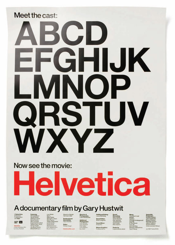
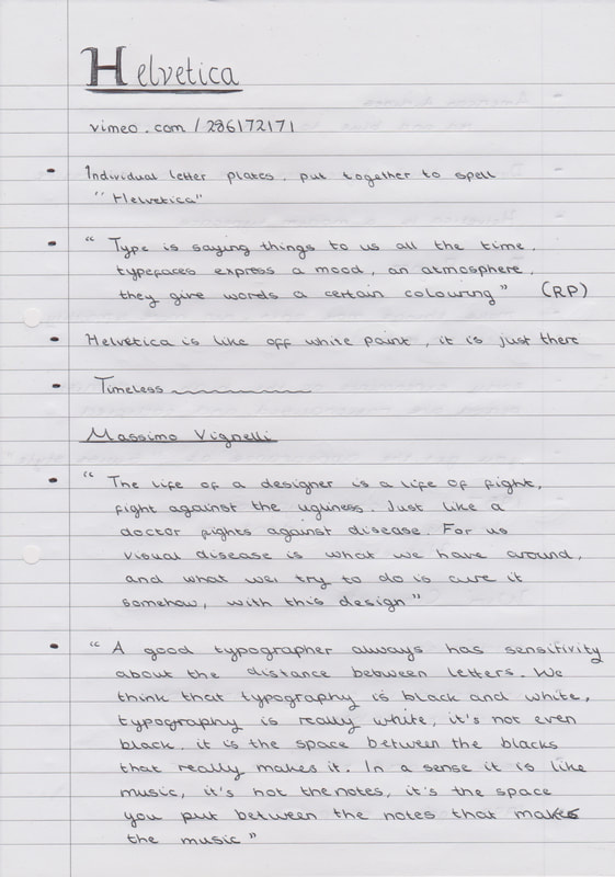
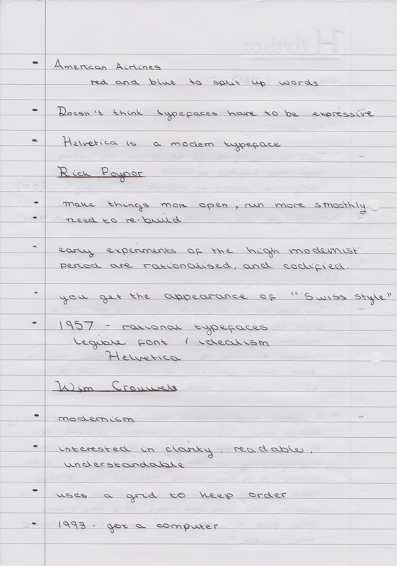
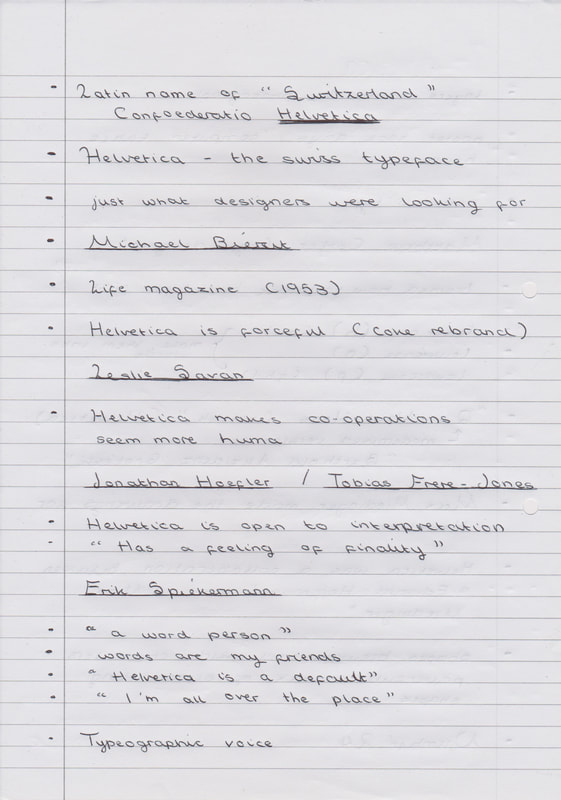
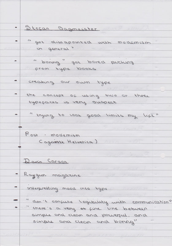
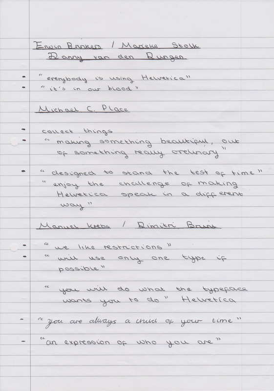
The holiday task was to watch the film Helvetica and write some notes, along with discussing our thoughts about the documentary.
"Helvetica is a feature-length independent film about typography, graphic design and global visual culture. It looks at the proliferation of one typeface as part of a larger conversation about the way type affects our lives. The film is an exploration of urban spaces in major cities and the type that inhabits them, and a fluid discussion with renowned designers about their work, the creative process, and the choices and aesthetics behind their use of type."
|
|
Is Helvetica Good or Bad?
Helvetica was created in 1957 by the Swiss typeface designer “Max Miedinger”. Miedinger’s goal was to create a new sans-serif typeface that was completely neutral. In this way the typeface could be clear to read, and additionally not add any additional meaning to the illustration or poster that it is used alongside. Originally this typeface was called “Neue Hass Grotesk”, it was renamed in 1960 to “Helvetica” which is the Latin name of Switzerland. From watching the film “Helvetica” I have learned that people have very split opinions on the typeface of “Helvetica”. The main split is between the Modernism and Post-Modernism movements. Helvetica is a simple typeface that can be found all around us, it is a neutral font so it can be used in a lot of different contexts. This font has become a representation of the modernism period, this was a period of time between 1920 and 1970, artists within the Modernism movement believed that type design should be simple and without expression, so that it could convey any meaning. Modernist designers believe that the way that Helvetica is easy to read and its simplicity makes this font a typeface that can be used in any situation. However not everyone has such a high opinion of Helvetica, believing that its simplicity makes this typeface sterile with no personality. In response to the dissatisfaction with Helvetica the Post-Modernism started to gain momentum in the late 20th century. In contract to the ridged and simplistic designs of the modernism period, the designs created I the Post-Modernism period focused of type being expressive and reflecting the imagery it represents. Post-Modernist artwork was bold, exciting, and by ignoring the restrains that were put into place by the Modernists these designers were able to create more artistic images. After watching the film “Helvetica” I believe that Helvetica has its place as a simple typeface, which works in a wide variety of situations. But for me as an illustrator I want my fonts to speak and reflect the mood or genre it is meant to represent, I just can’t see how using one font for every situation could possibly give someone creative freedom. So my opinions sit closer to the opinions of the Post-Modernist movement, I think type should communicate and add something to a piece of artwork. Otherwise why add text at all? |
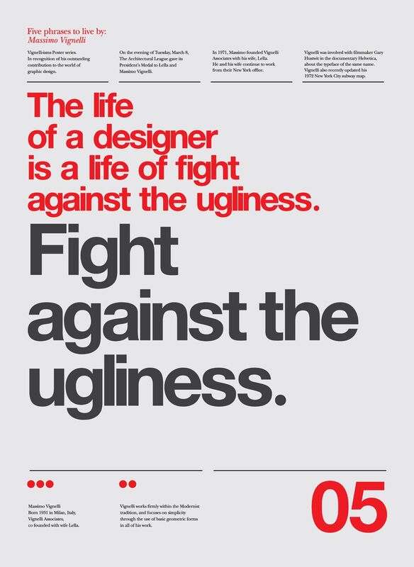
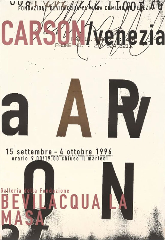
Some of the Artists featured within "Helvetica"
Notes on the "Helvetica" Film
Week 1
|
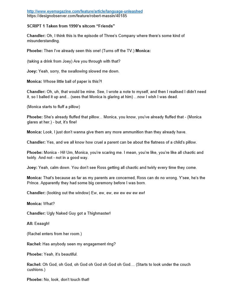
For part two of the Visual Problem Solving Module we have been given a project called Type Talk. In this project we have to "translate" a script into typography, we were given the choice of four different scripts. The four scripts were excerpts taken from the 1990s sitcom "Friends", "Harry Potter and The Philosopher's Stone", "Blackadder IV" and "Pulp Fiction". I have chose to work on the "Harry Potter" script, not only is it the only script that I recognise however I think it is the script that I could have the most fun with. Additionally for this project we have to use our DIY Typefaces from part one of this module within our final ISSUU document, so I thought that my typeface would be most applicable to the "Harry Potter" script due to footprints being used within the Marauders Map.
|
Research
Within the briefing for this project the word "grids" was mentioned, and although I have heard of grids before. I actually have never used any grids before.
Seen as though I was quite confused I decided to research how grids are used in books and editorial design.
Within the briefing for this project the word "grids" was mentioned, and although I have heard of grids before. I actually have never used any grids before.
Seen as though I was quite confused I decided to research how grids are used in books and editorial design.
- Initial Grid Research -
This initial research has given me a better understanding about how grids work, however I think I need to read it it some more.
This initial research has given me a better understanding about how grids work, however I think I need to read it it some more.
|
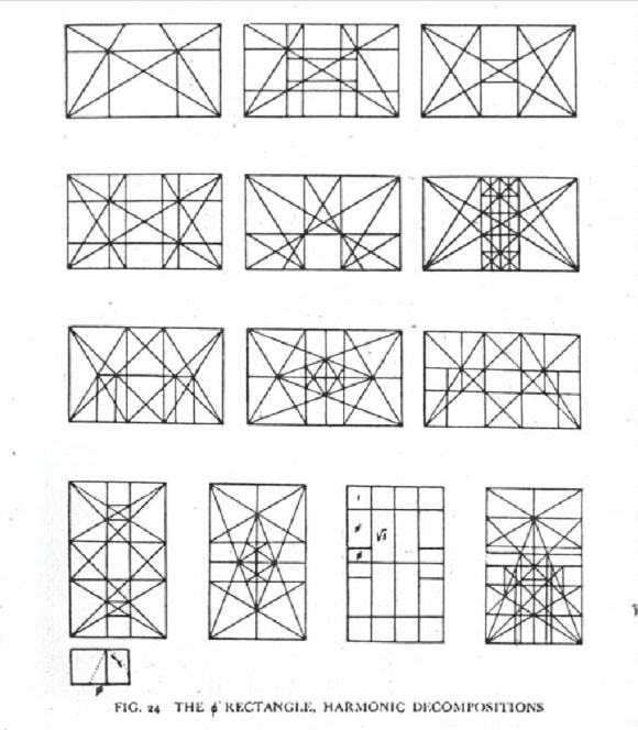
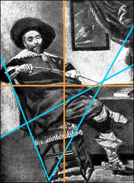
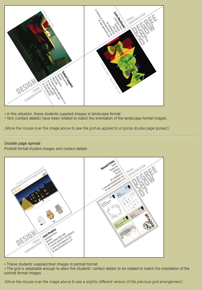
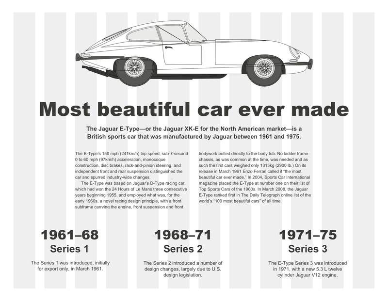
While I was researching grids I found an educational webpage about grids, this web page showed how layouts are used in practice. I also found it interesting to see that composition lines that are now used within editorial design can also be applied to painting.
|
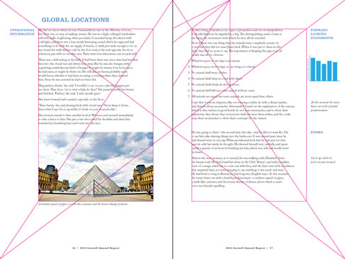
All of the lines within this webpage look very confusing to me, but this has helped me to find a better understanding of how this type of design works. I think having two solid outlines then adding lines to add dynamic additions.
|
|
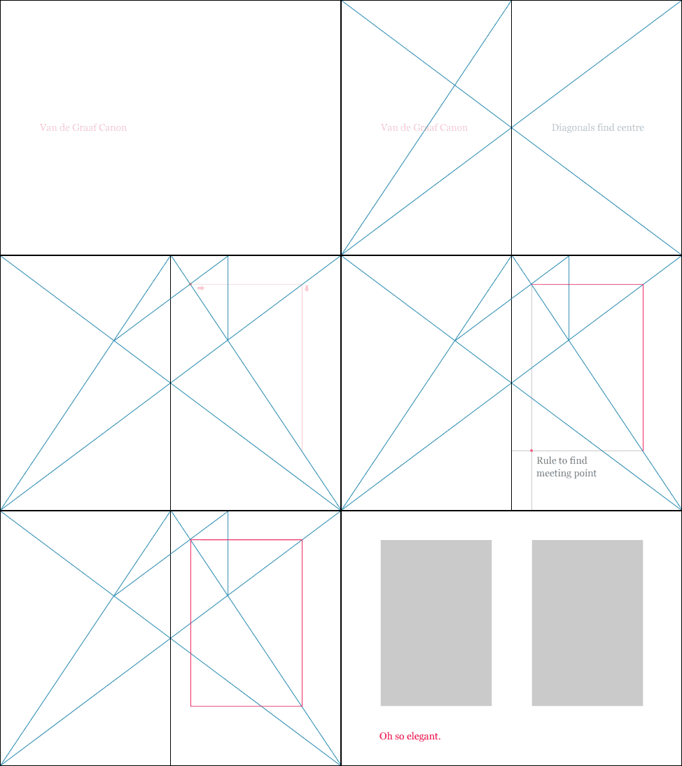
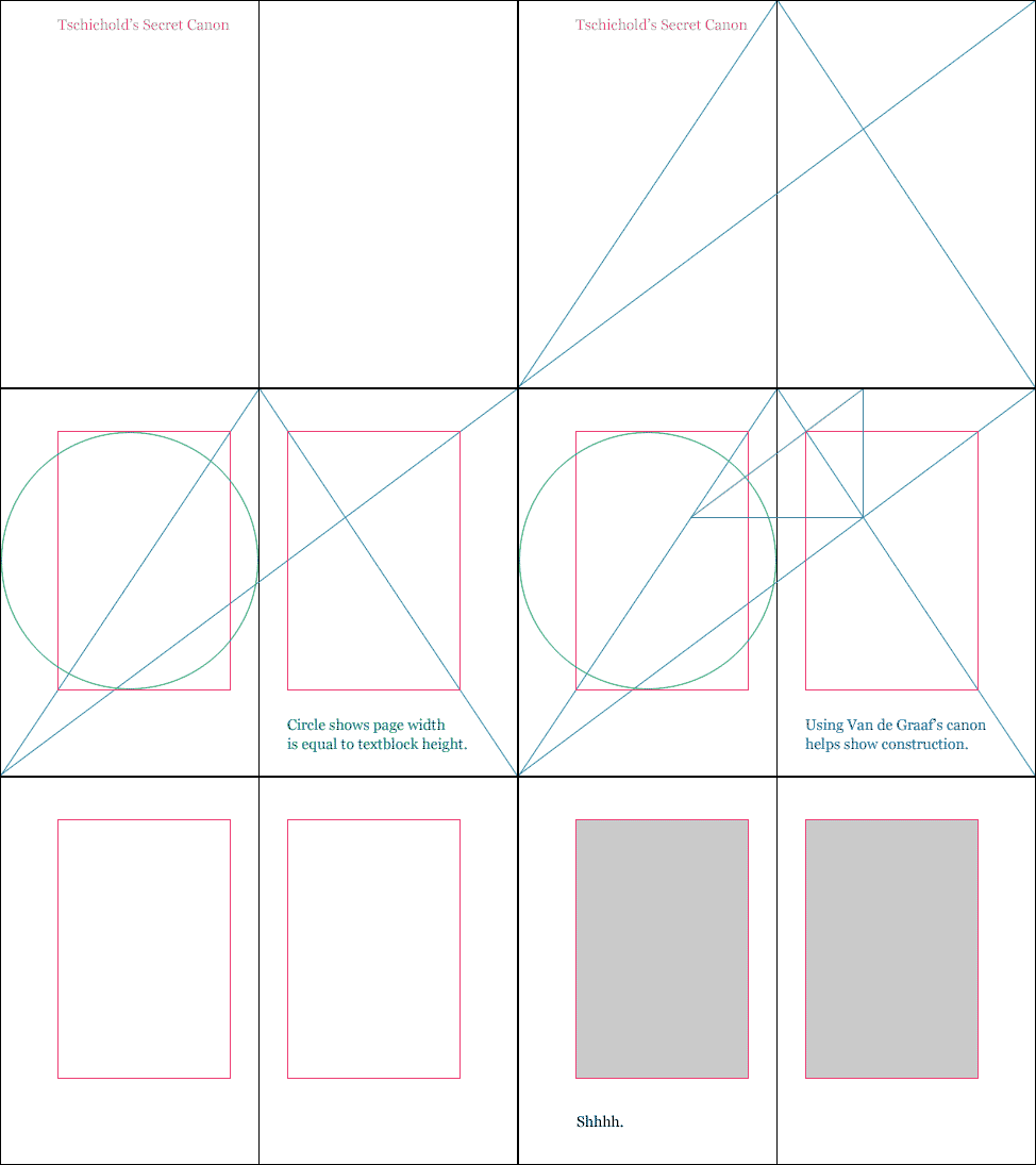
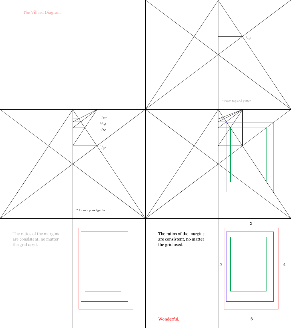
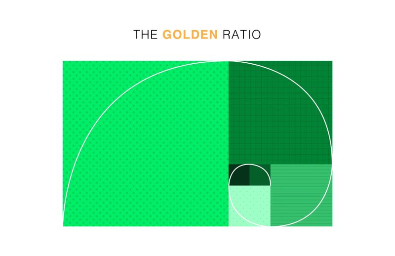
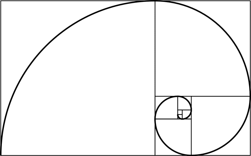
Whilst researching grids I came across "The Golden Ratio" again, this seems like an interesting way to create the grids that would make the final images more visually pleasing overall.
|
I found this article useful because it showed me how a grid could be used to create a lot of different compositions, but still have even page seem like it is part of a set.
|
Typography Design Inspiration
|
|
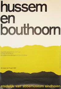
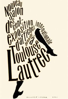
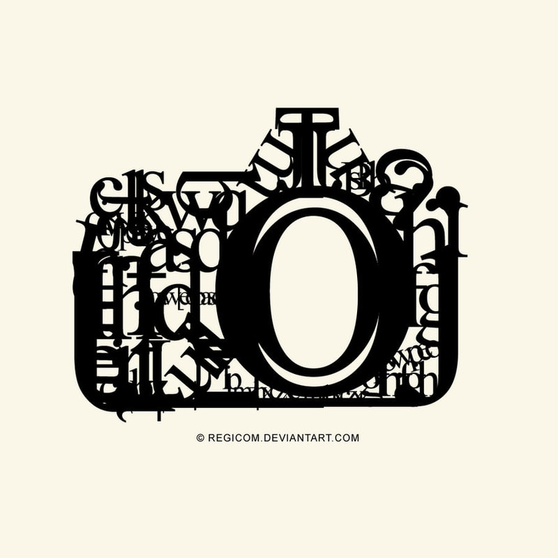
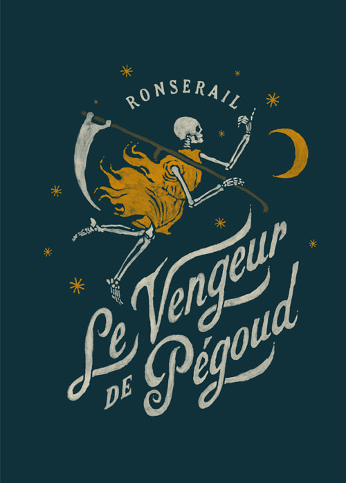
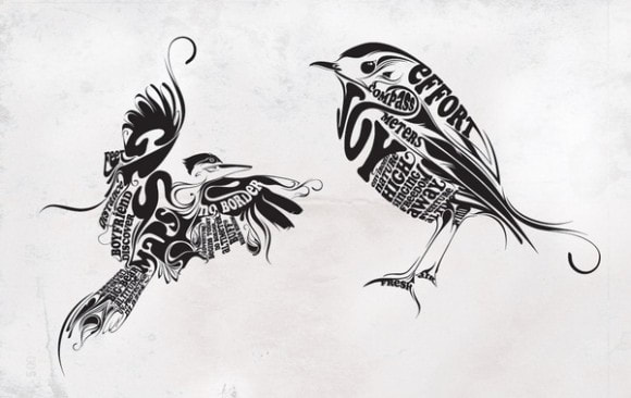
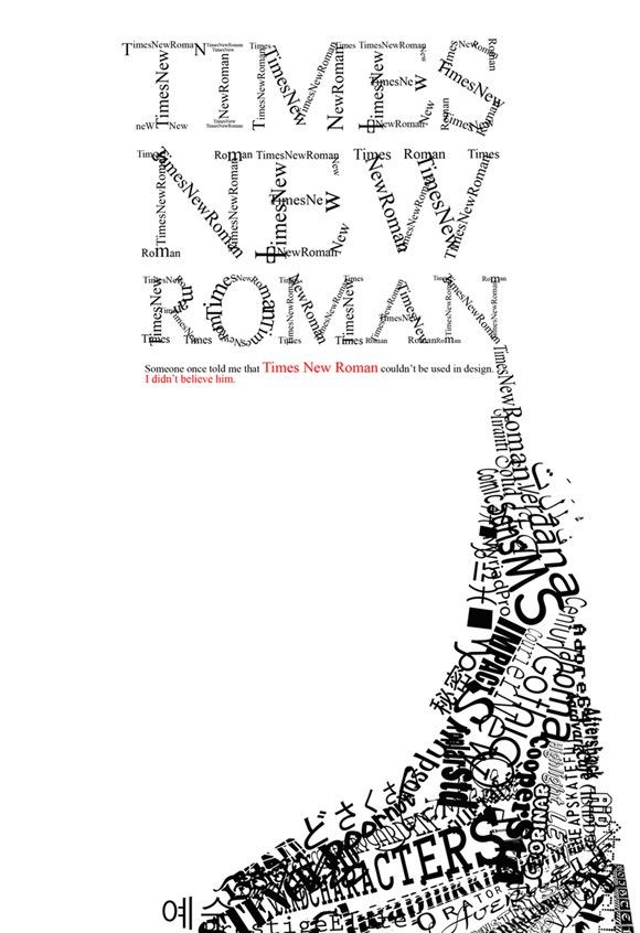
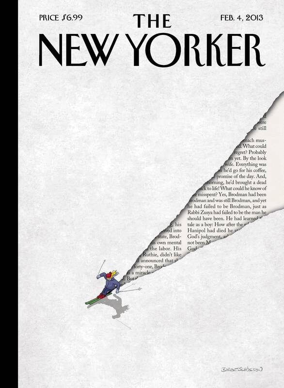
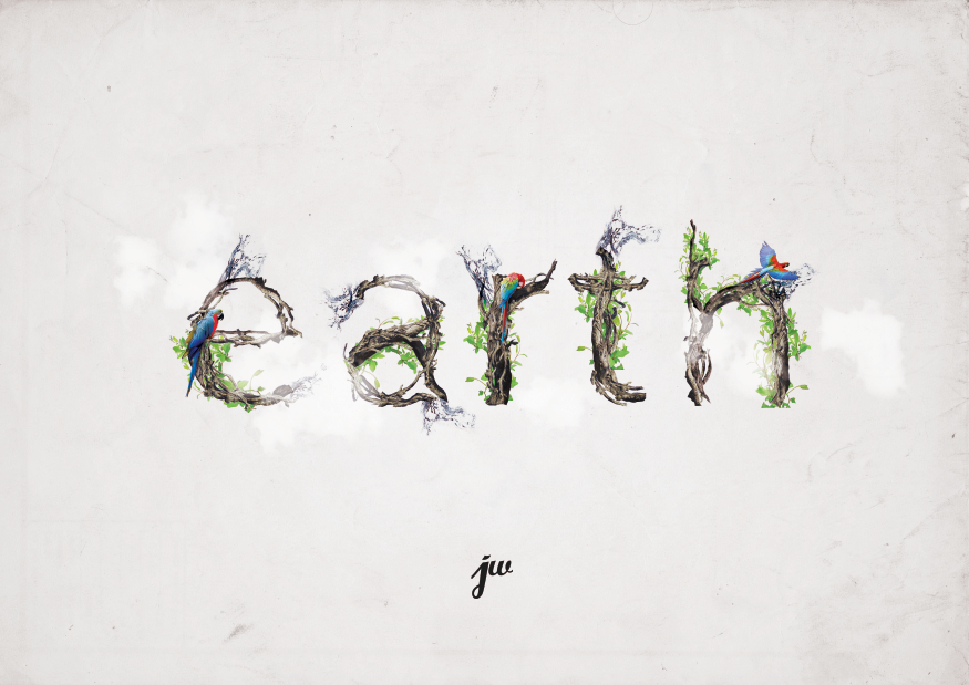
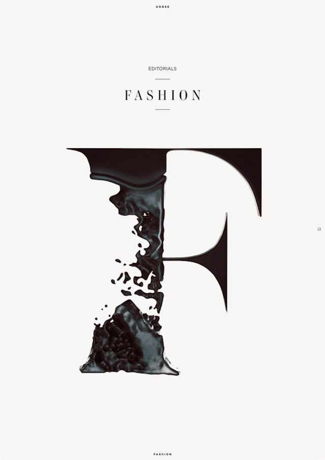
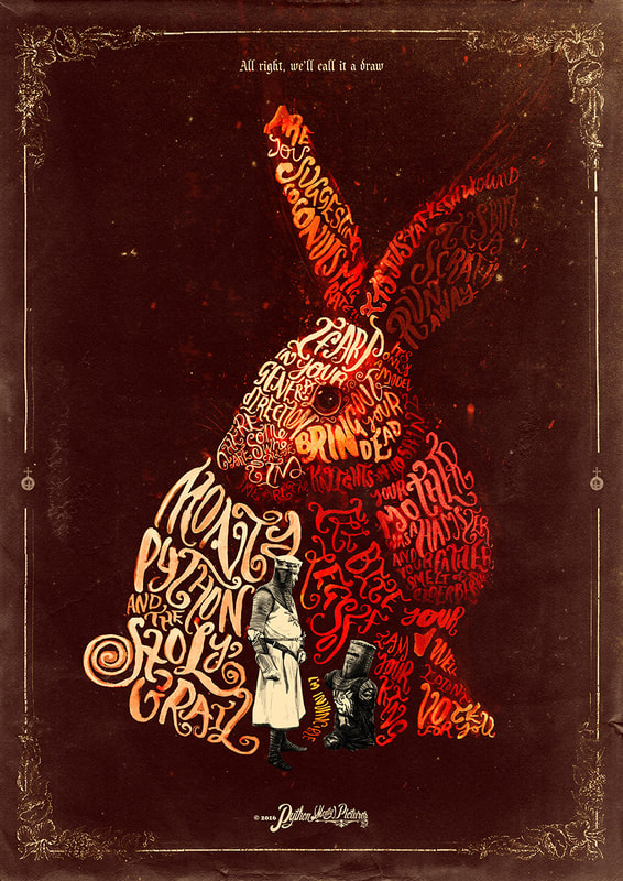
To inspire my typographic "translation" of the "Harry Potter" script I researched a lot of type designs. Within my research I found a lot of people that made pictures out of typefaces, I'm not sure if that is allowed because we are only supposed to add 20% illustration to 80% type. I did find a lot of interesting black and white type deigns which has made me feel more positive about the colour restrictions of this project. I think I will need to experiment with whether I like black on white, or white on black in my designs because that really changes how the designs come across. This research has made me think that I would like to use a blue or a red as my accent colour, alongside the black and which. These seem to create a nice contrast whilst also not overpowering the image overall. |
Initial Ideas
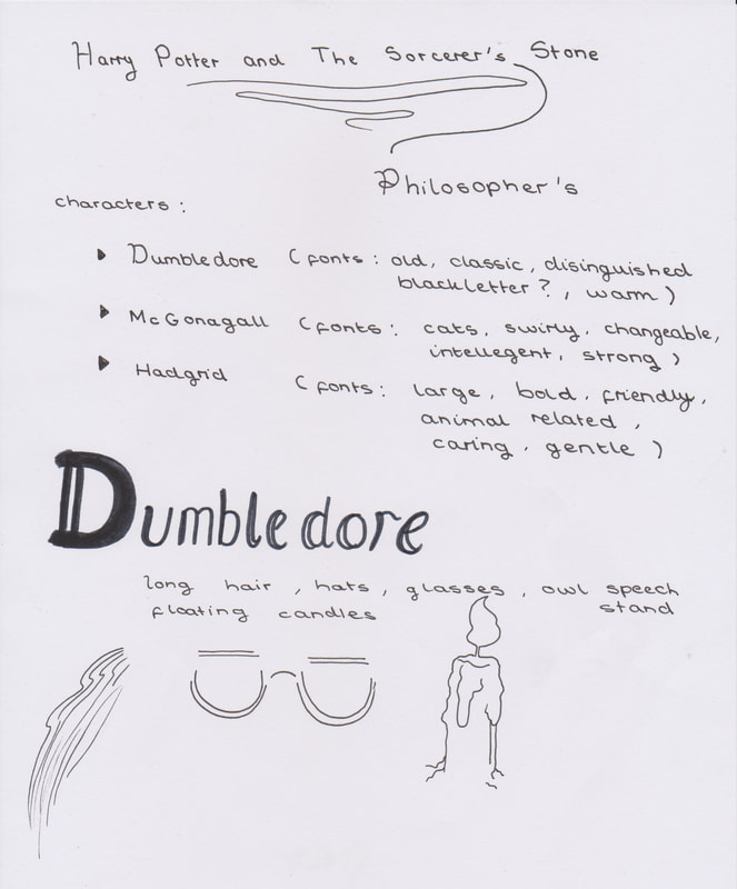
To start the practice part of this project I wrote down the characters and any traits that came to mind when I thought about them.
Then I moved onto making some very quick thumbnails of initial designs, but I think I should decide on my grid before I make any more thumbnail visuals.
After that I planned out how many pages I think i will need, this might change after I start to make the thumbnails,
but right now I have decided on fourteen pages in total including the front an back covers.
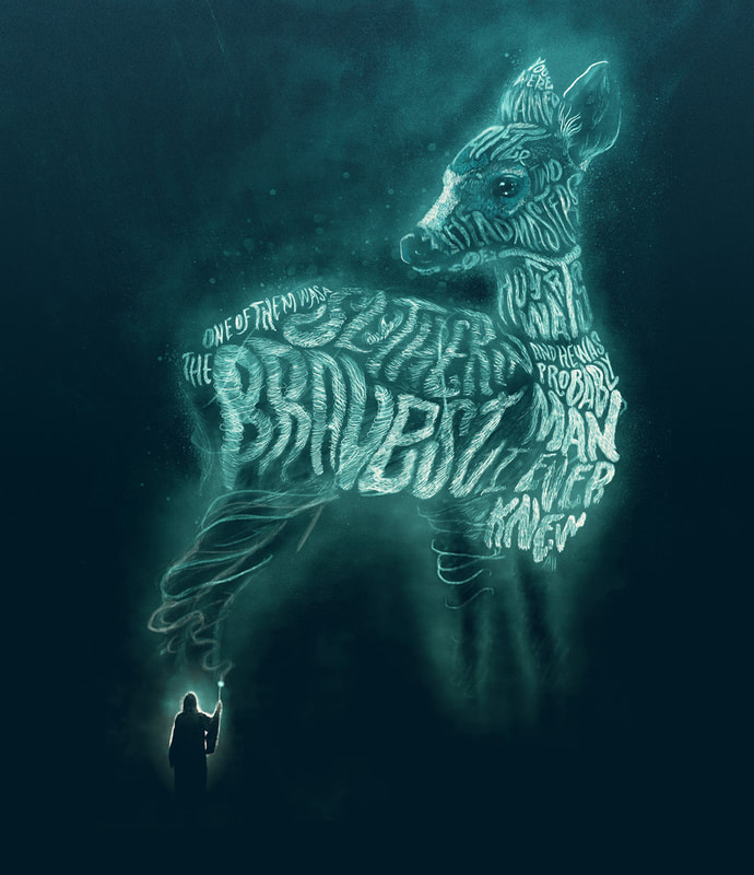
During my research into typographic designs I came across the work of Peter Strain
Which lead me to find an article called "Peter Strain brings alive some of Harry Potter's most iconic quotes in a series of quotes for Pottermore"
Seeing these quotes brought to life using a limited collection of colours and mostly typography is really beautiful, and I think this is definitely something I want to try out myself.
Grids
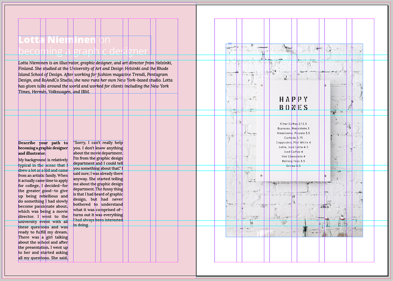
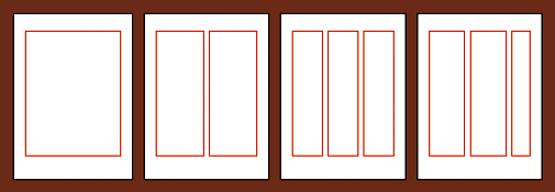
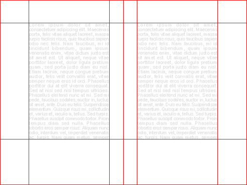
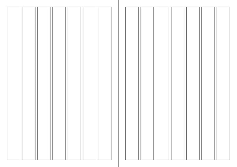
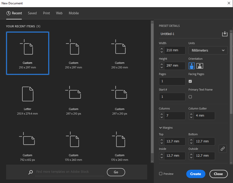
To prepare for my thumbnails I created some grids, I decided to use the more general seven column layout for the majority of my thumbnails.
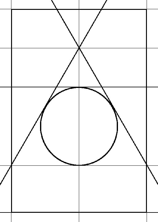
But I do like the idea of trying to incorporate the deathly hallows symbol into my grid for the final designs, I think this would be an interesting challenge to work around.
Thumbnails
After setting out my grid I printed a copy of it off and used my lightbox to trace the outline and use the lines as guides.
Because the thumbnail boxes were small I decided to represent the sentences and words as squiggly lines.
After setting out my grid I printed a copy of it off and used my lightbox to trace the outline and use the lines as guides.
Because the thumbnail boxes were small I decided to represent the sentences and words as squiggly lines.
|
Pages One and Sixteen
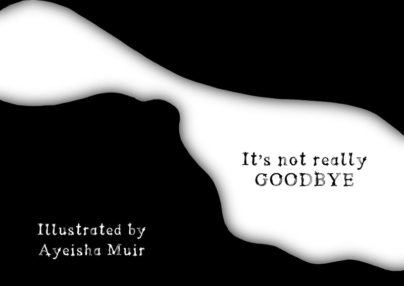
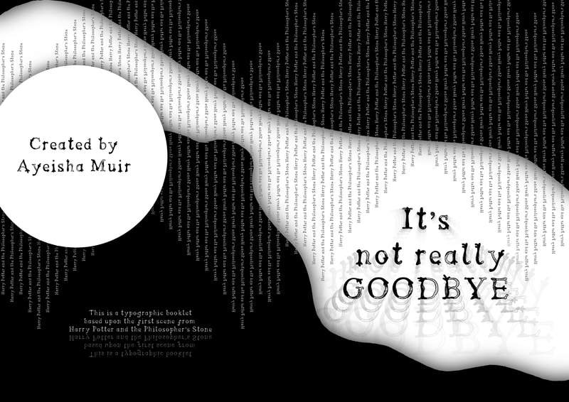
I was unsure what to do with the front and back cover, because there is no text from the script that has to go onto it, however I think that I will need to work on a title for this small script selection. Because calling it "Harry Potter and The Philosopher's Stone" might make people think I have deigned this for the whole book instead of just a small section. |
Pages Two and Three
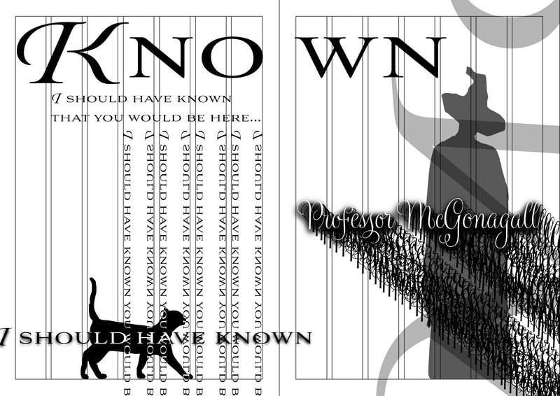
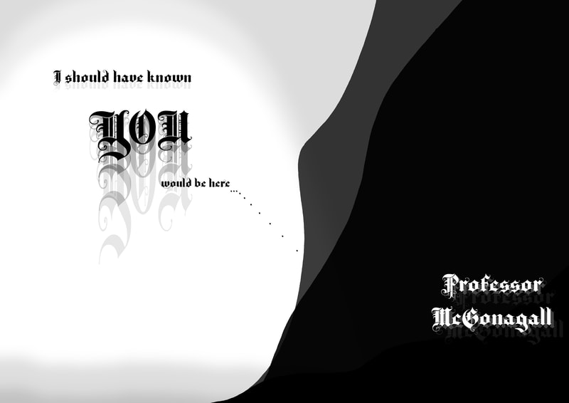
Dumbledore: I should have known that you would be here...Professor McGonagall. [The cat meows, sniffs out and the camera pans back to a wall. We see that the cat's shadow progressing into a woman with a tall hat. There are footsteps and Minerva McGonagall is revealed.] |
|
Pages Four and Five
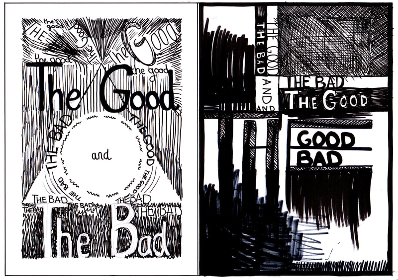
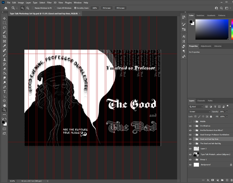
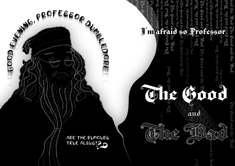
McGonagall: Good evening, Professor Dumbledore. Are the rumours true, Albus? Dumbledore: I'm afraid so, Professor. The good, and the bad. I especially like how the good and bad imagery turned out, along with the idea of repeating the word rumours. I think I should try to expand upon this idea and figure out visual solutions to demonstrating the appearance of a word, like how repeating the word rumours shows people are talking amongst themselves and spreading the rumours. |
Pages Six and Seven
McGonagall: And the boy? Dumbledore: Hagrid is bringing him. McGonagall: Do you think it wise to trust Hagrid with something as important as this? Dumbledore: Ah, Professor, I would trust Hagrid with my life. [There is a motor sound, and the two professors look up to see a flying motorcycle coming down from the air. It skids on the street and halts. A large man with shoulder length black hair and beard named Rubeus Hagrid, takes off his goggles.] |
|
Pages Eight and Nine
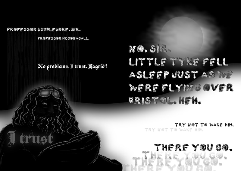
Hagrid: Professor Dumbledore, Sir. Professor McGonagall. Dumbledore: No problems, I trust, Hagrid? Hagrid: No, sir. Little tyke fell asleep just as we were flying over Bristol. Heh. Try not to wake him. There you go [Hagrid hands a baby wrapped in a bundle over to Dumbledore.] |
Pages Ten and Eleven
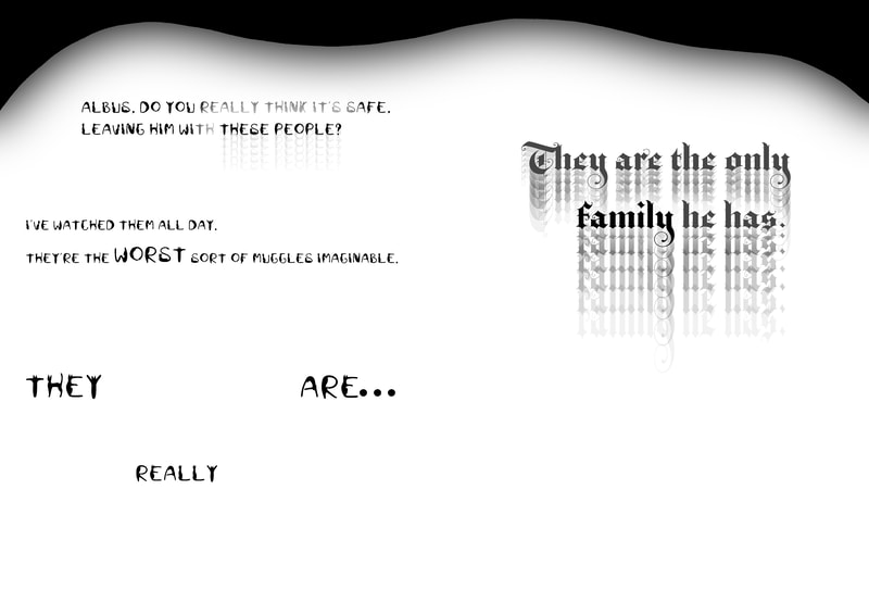
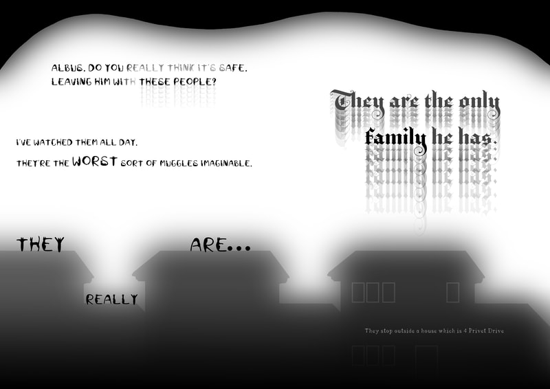
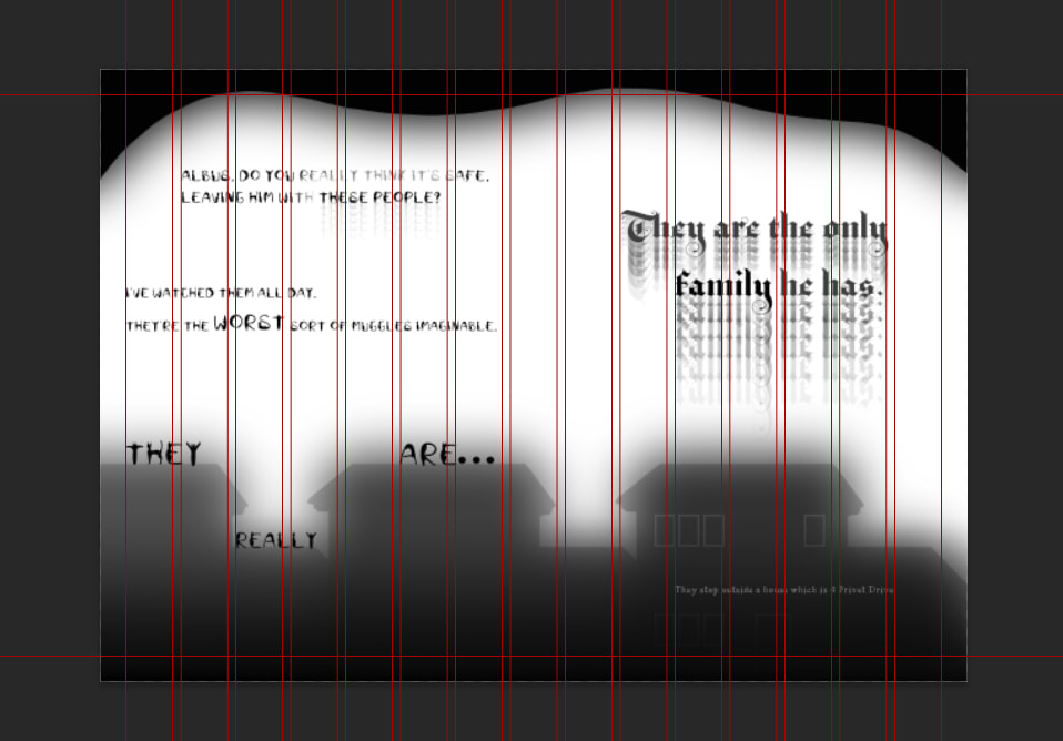
McGonagall: Albus, do you really think it's safe, leaving him with these people? I've watched them all day. They're the worst sort of Muggles imaginable. They really are... Dumbledore: The only family he has. [They stop outside a house which is 4 Privet Drive.] |
|
Pages Twelve and Thirteen
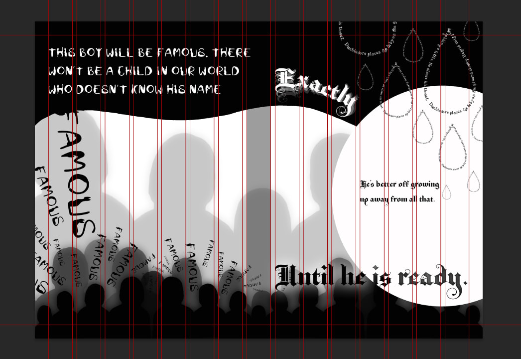
McGonagall: This boy will be famous. There won't be a child in our world who doesn't know his name. Dumbledore: Exactly. He's better off growing up away from all that. Until he is ready. [Dumbledore places the baby on the ground slowly. Hagrid sniffles, he is sobbing a little. He clears his throat.] |
Pages Fourteen and Fifteen
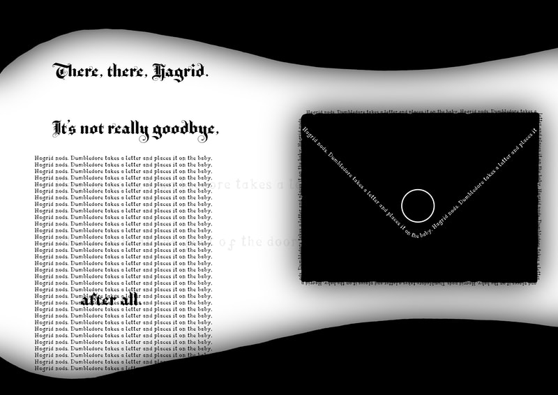
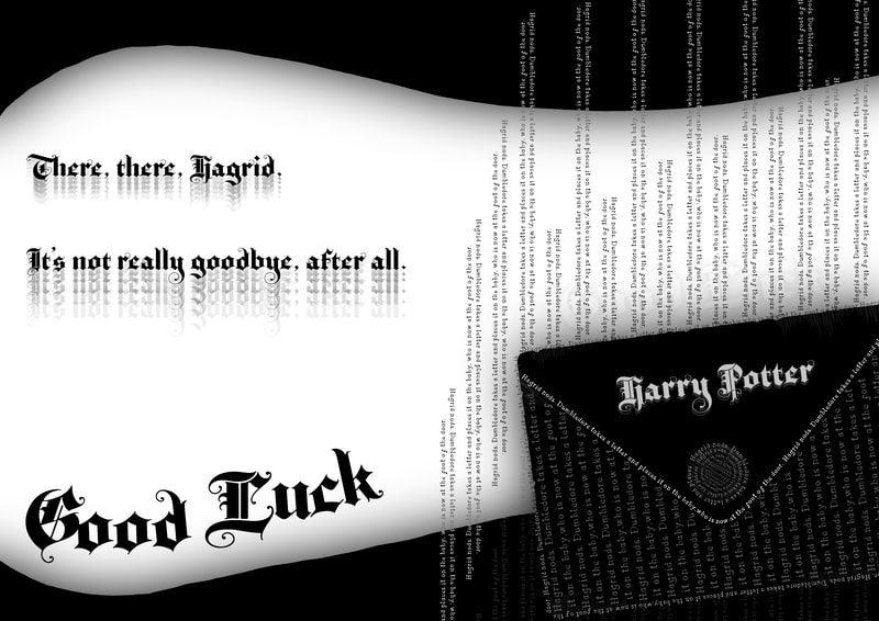
Dumbledore: There, there, Hagrid. It's not really goodbye, after all. [Hagrid nods. Dumbledore takes a letter and places it on the baby, who is now at the foot of the door.] Dumbledore: Good luck...Harry Potter. |
Font Selection
After creating some thumbnails I moved onto selecting some fonts that I thought reflected the characters within the script.
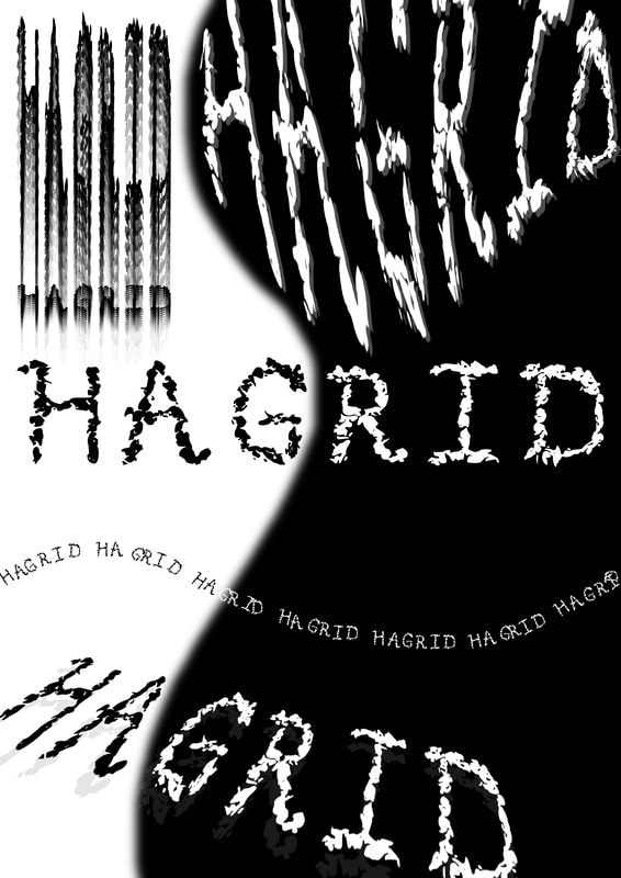
I included my font "Merula" in the Hagrid selection because he likes all animals, however I would prefer to use my font for the stage directions because
I think the bird footprints in my typeface could reflect the footprints that are used in the Marauders Map.
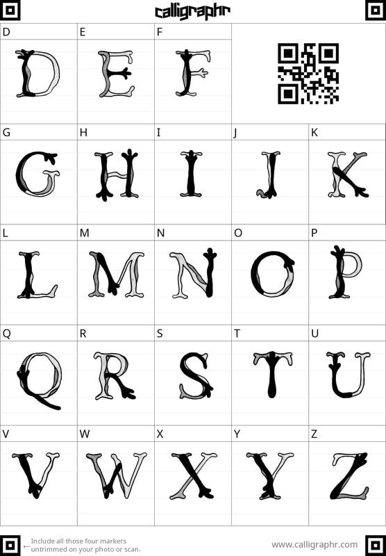
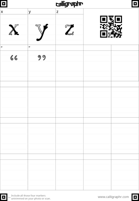
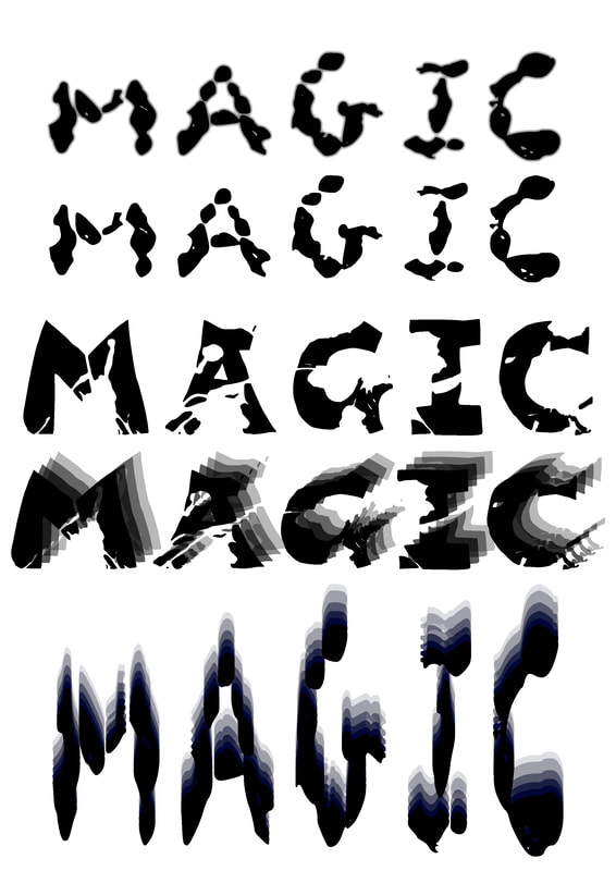
Making My DIY Alphabet Typeable
|
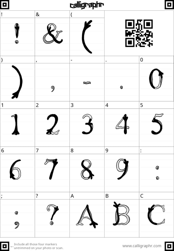
I initially thought that this would be an easy process however after I placed all of the letters on the sheet. But when I put it into the Calligraphr font creator the software removed the grey tones in my DIY Alphabet that made my typeface distinctive. I was a bit disappointed that my font didn't turn out how I thought it would, but I am unsure what could have done to change it to be more like the original. I found it very difficult to line up my font, I'm not sure why. But I think that it looks quite messy which isn't very pleasing to me. I think I should just mess around with the font a little and see how it works in practice, because it seems to type in wiggly lines at the moment. I also would like to see how this font works in inversed colours or in different colours. |
Testing How Text Design Works
This project is out of my comfort zone so I decided to do some initial testing to see if I am on the right train of thought.
After doing this I think I just need to do a bit more thinking about how the positioning and scale of the text could affect the way it comes across.
This project is out of my comfort zone so I decided to do some initial testing to see if I am on the right train of thought.
After doing this I think I just need to do a bit more thinking about how the positioning and scale of the text could affect the way it comes across.
Week 2
DIY Alphabet Collection
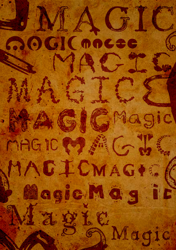
After realising that we were only mean to be using fonts from the DIY Alphabet I created a layout page of all the fonts that are in the OneDrive so far.
After realising that we were only mean to be using fonts from the DIY Alphabet I created a layout page of all the fonts that are in the OneDrive so far.
Taking a design into InDesign
I initially tried to create designs within InDesign but I found it very complicated to make shapes
Due to think I switched back to Photoshop to make my design the took it back into InDesign to add the characters lines.
I initially tried to create designs within InDesign but I found it very complicated to make shapes
Due to think I switched back to Photoshop to make my design the took it back into InDesign to add the characters lines.
Final Font Selection
After Zoe told me last week that we had to use DIY Alphabet's for all but one of the character's within our script.
I decided to download all of the DIY Alphabets and try to assign some of them to the character's within the the text.
I have also decided to include stage directions so I will assign them a font as well..
Albus Dumbledore
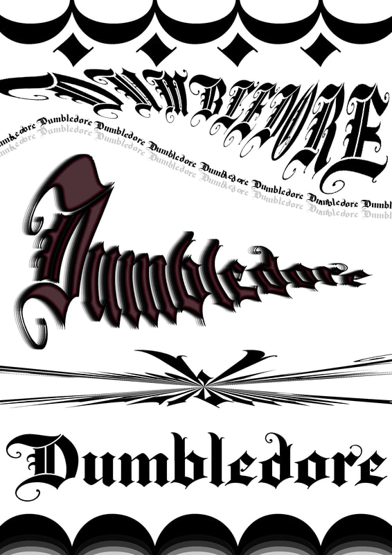
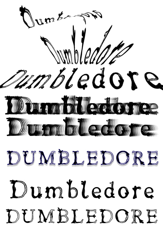
For Dumbledore I tested three fonts including "Crescent" by Harrison Aiken. An Adobe font called "Baroque Text JF" and my own font "Merula".
Overall I think that the Baroque font fits Dumbledore best, however I loved playing around with "Crescent" to see some of the interesting effect that I could create.
I did think of picking "Merula" for Dumbledore, however after seeing how well the Baroque font fits with his character, I think that I want to use Merula for the stage directions.
Minerva McGonagall
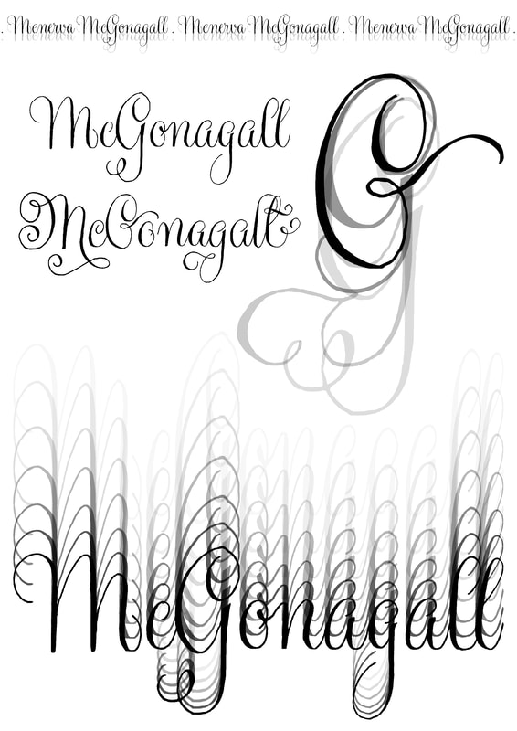
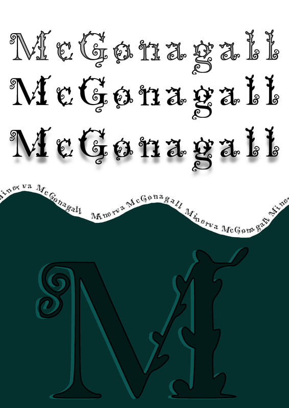
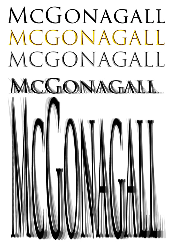
For McGonagall I tested out four fonts including "Cattitude" by Amy Farrell, an Adobe font called "Gratitude Script", as well as "Kudarat" by Manisha Samra
The final font I tested was another Adobe font which has two versions, "Trajan" and "Trajan Colour".
I loved all of these fonts, the swirls within "Kudarat" are very pretty and "Gratitude Script" is very elegant. However I have decided that I am going to use "Cattitude" for McGonagall.
I feel like the imagery of a cat not only fits her personality it also directly reflects the script where McGonagall turns from a cat back into a human.
Rubeus Hagrid
I tested three fonts for Hagrid including "Nature's Breath" by Clare Dickins, "Bedded Parsnip" by Jasmine Gill as well as a font by Laura Fulton called "Slowpoke" (I couldn't find her blog link).
I think I am going to use "Slowpoke" as the font for Hagrid because to me the font looks like it is made out of slugs, especially the "I" and I think the fact it is big fits Hagrid well.
Stage Directions
For the stage directions I have decided to use my font "Merula" I think it is simple but effective and has worked well in the images of the cat and Dumbledore that I constructed out of words.
So I think it only makes sense to continue to use it for this purpose. As an additional test I created an image inspired by the Marauders Map".
Trying to work with InDesign
I went back to trying to work with InDesign, but I honestly can't get my head around it. It feels like the options are incredibly limited which makes it frustrating to work with.
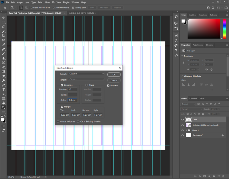
So I decide to try and find a way to get a working grid in Photoshop so I can create the images in Photoshop then transfer them into InDesign to create the publication.
Moving to Photoshop
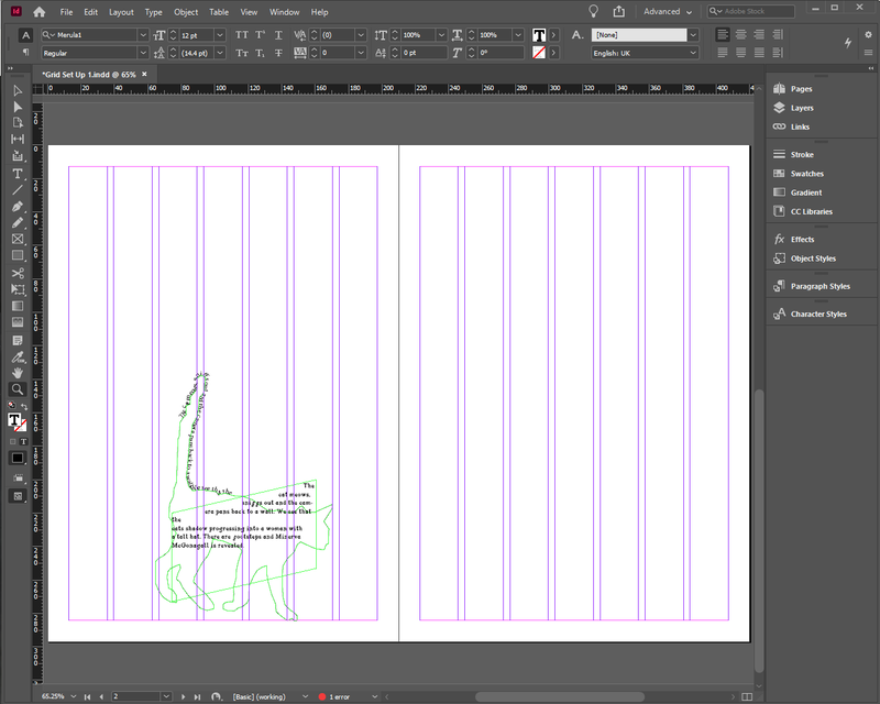
After I figured out how to make grids within Photoshop I moved onto working within this software instead, and as expected it was a lot more enjoyable.
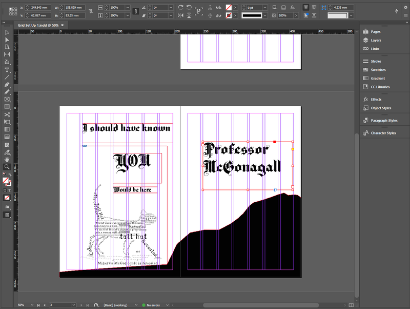
I have included a screenshot of the working grid, as well as a purely type test I made.
I also created a sample of all the fonts that I chose working together, I did this to make sure none of them clashed with each other.
After seeing them all together I actually think they contrast nicely with each other and reflect the characters well.
Double Page Spreads
To test if the concept of making images out of test works I created these two double spreads, I actually really like them.
I just need to check if this counts as less than 20% illustration, because to me it is just type organised to appear like an image not actual illustration.
If this is an acceptable amount of imagery I will probably just play around with these images a bit more, before creating some more pages for the ISSUU document.
I have also added images of the double spreads I have made so far including the grid within the screenshots.
Week 3
Heteronyms
Overview: Heteronyms are words that are spelled the same but have different meanings and (sometimes) different pronunciation. For example ‘wind’ can mean the thing that blows leaves around or to wrap something around… These things cause real nightmares for people learning English as a second language but we’re going to have fun with them.
The Brief: Choose two sets of heteronyms and produce a typographic solution for each set that clearly explains the two different meanings of the one word as a single,
integrated composition in a vertical A4 format. You should initially work by hand in your sketchbook on small-scale ‘thumbnails’ and then moving to
the computer only when you have a good range of ideas to explore.
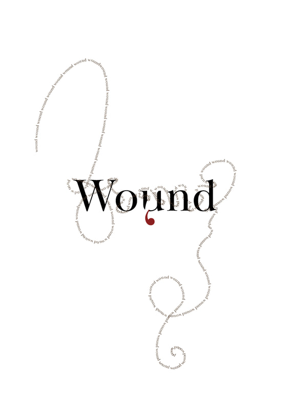
Wound
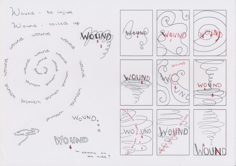
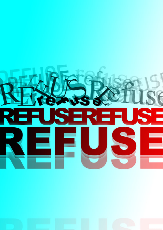
After thumbnailing my designs I picked to create digital versions of "Wound" and "Refuse", overall I liked the end result of this design better.
After thumbnailing my designs I picked to create digital versions of "Wound" and "Refuse", overall I liked the end result of this design better.
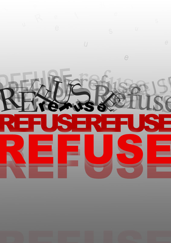
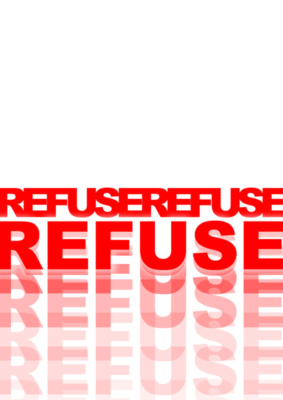
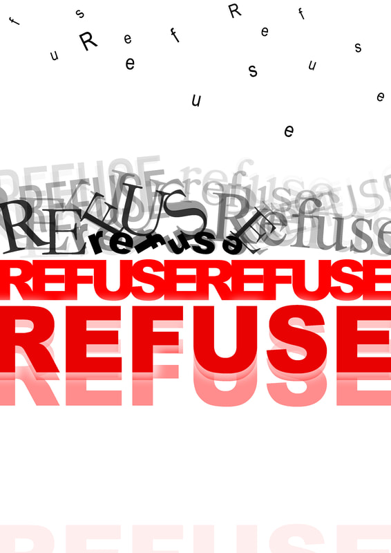
Refuse
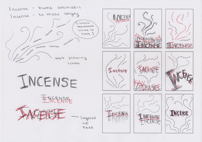
I struggled more the create an image for "Refuse"" that I was happy with, however this was an interesting exercise to do.
I struggled more the create an image for "Refuse"" that I was happy with, however this was an interesting exercise to do.
Double page designs with Grids
I have included some screenshots of my new double pages to show how they work with the grid.
With these pages I have allowed some things to go across two pages, however I may need to change this.
I have included some screenshots of my new double pages to show how they work with the grid.
With these pages I have allowed some things to go across two pages, however I may need to change this.
Double Page Collection
I have collected all of the double pages I have created so far and added them next to each other so I could see if they are working as a unified piece.
I think the work well but I am looking forward to getting feedback tomorrow to see some other people's opinions.
I have collected all of the double pages I have created so far and added them next to each other so I could see if they are working as a unified piece.
I think the work well but I am looking forward to getting feedback tomorrow to see some other people's opinions.
Removing Imagery Test
I decided to see what my designs would look like with the imagery removed, although they still look okay, I think
that my additional stage direction imagery works well alongside the typography to bring more life into the story.
I decided to see what my designs would look like with the imagery removed, although they still look okay, I think
that my additional stage direction imagery works well alongside the typography to bring more life into the story.
Week 4
|
Editing Designs
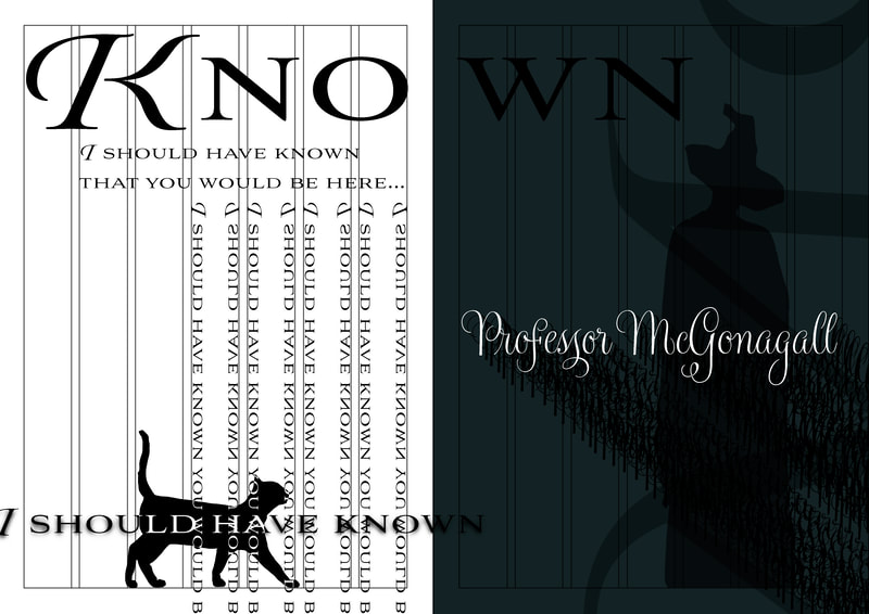
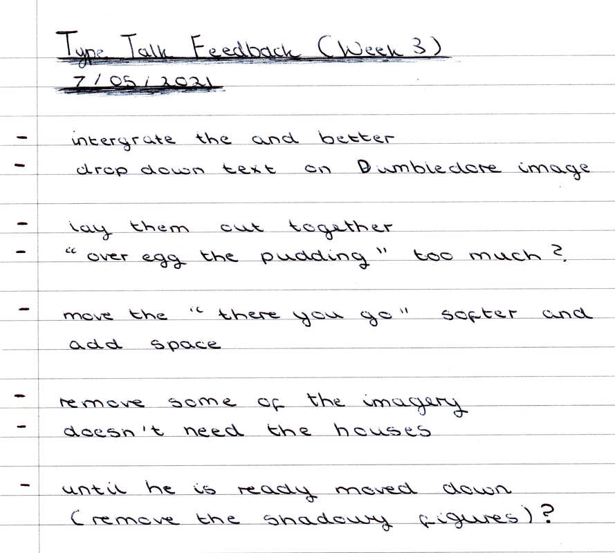
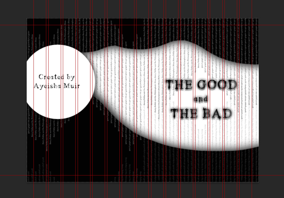
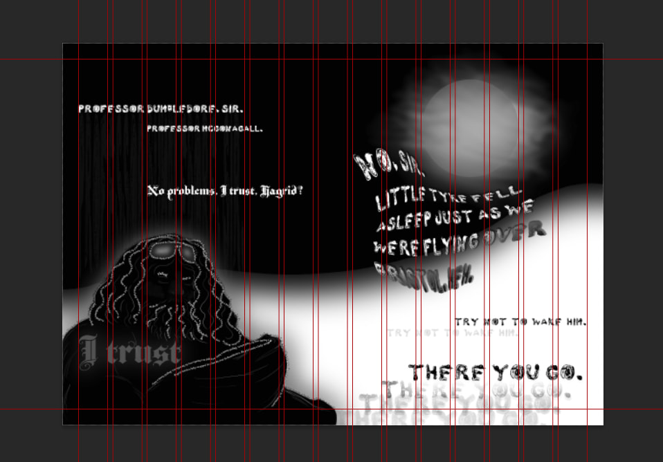
After last week's feedback I went back and edited some of my previous pages based on the feedback that Zoe gave me, I found that I liked the edited designs better so these are the ones that I am going to use in my final ISSUU publication. I tried to integrate the and on pages 4-5 more, as well as bringing down the top lines so they sit better within the whole composition. Additionally I blurred out the house shapes in pages 10-11 so make the black less stark, this has given them a ghostly appearance which I really like. On the surface it seems like this suburban environment to raise a child, however the Dursley's are not a good fit for Harry which I think the foggy atmosphere eludes to. For pages 8 - 9 I changed the test on the right page, it felt too stiff before so I used a warp tool on the first bit of text that edited the scale of the other text to add some more variety. Finally I edited pages 12 -13 to remove the majority of the imagery, it made the whole spread cleaner and allowed for a bit more of a light double page spread |
Ending Double Page Spread Design
After I finished editing my designs I moved onto creating the last two double page spreads, I am quite pleased with how this turned out however I am still slightly unsure about how the "Good Luck" sits within the page. However I do think that the duplication of the words in various opacities helps to make the words sit better within the page.
After I finished editing my designs I moved onto creating the last two double page spreads, I am quite pleased with how this turned out however I am still slightly unsure about how the "Good Luck" sits within the page. However I do think that the duplication of the words in various opacities helps to make the words sit better within the page.
Cover Design
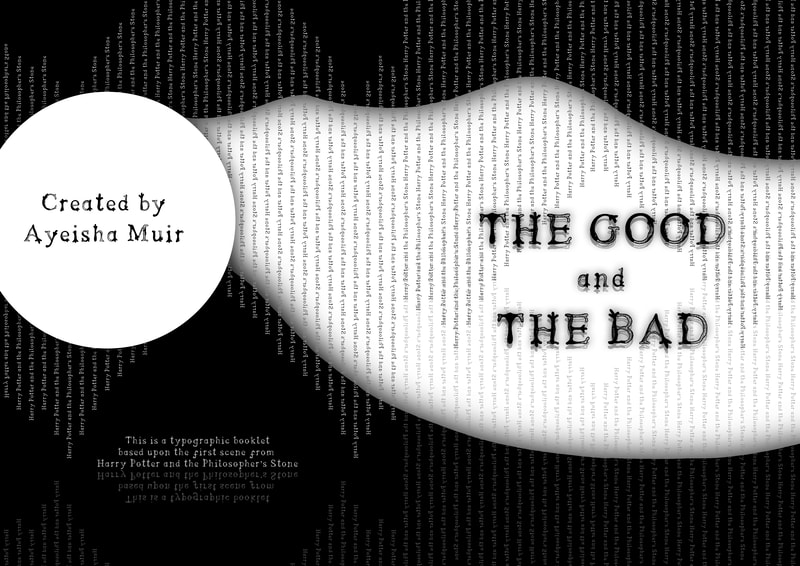
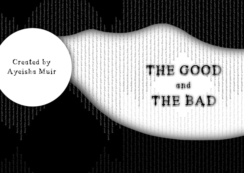
I experimented a bit with the design of the cover for my ISSUU document, I found it very difficult to come up with a design for the front cover as I had no text to inspire me. I chose to either call this document "It'd not really goodbye" or "The Good and the Bad" in the end I settled on the latter because I think the representation of good and bad represents Harry Potter's story very well.
I experimented a bit with the design of the cover for my ISSUU document, I found it very difficult to come up with a design for the front cover as I had no text to inspire me. I chose to either call this document "It'd not really goodbye" or "The Good and the Bad" in the end I settled on the latter because I think the representation of good and bad represents Harry Potter's story very well.
The double page spreads with grids
Final Page Collection
|
Pages 1 - 16
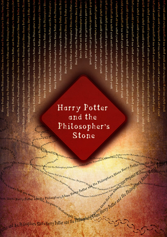
For this design I wanted to keep it quite simple as it is the cover design, I used lines of "Harry Potter and the Philosopher's Stone" to add some texture to the background. I also used the black sections with shadows that I have used within the other pages to add continuity. |
Pages 2 - 3
This is the first design that I worked on, overall I kept this design more open and simple to introduce the booklet, I really like the cat however the fact that McGonagall is in the shadows is interesting and makes the design more interesting overall as it hints to the stage directions. |
|
Pages 4 - 5
For this design I created Dumbledore using the stage directions, I really enjoyed doing this and it gave the double page spread an interesting quality. Additionally after some editing I think that the words "Good and Bad" are better integrated with each other. |
Pages 6 - 7
For this design I was inspired by the idea of protection I created a white space in the middle of a revolving circle of text to show that Hagrid id keeping Harry safe, however it also did end up looking like Hagrid's motorbike light as he lands within this scene which I really liked. |
|
Pages 8 -9
I like glowing "I trust" that is on top of Hagrid, it really stands out. I additionally like how the warped text cusps the moon, I think that this text reflects Hagrid being playful, then the next line shows Hagrid remembering to be quite as he tells Dumbledore to "try not to wake him". |
Pages 10 -11
Foe this design I decided to make it quite simple, the layout helps to give this double page spread a slightly empty feeling. I especially like how the edited buildings gave this spread a foggy and ghostly environment which highlights the text. |
|
Pages 12-13
I really like how this double page spread looks without the dark shadowy figures, I also think that the layout of the text helps to give this spread movement. The collection of "famous" words being shouted was arranged to give the appearance of shouting and I think it achieves that. |
Pages 14 -15
I think that the letter in this double page spread helps to tie these pages together alongside the lines of text that reflect the previous designs. Overall I don't think this is the most interesting on my designs for this project, but I do still like how it turned out. |
