- HISTORY AND PRACTICE -

Session 1
Weekly Task:
- Ensure you have a functioning blog.
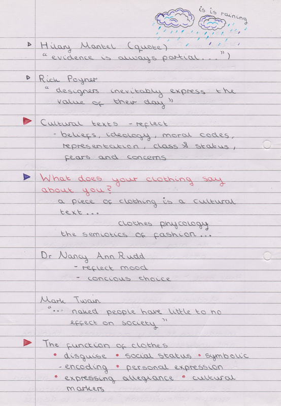
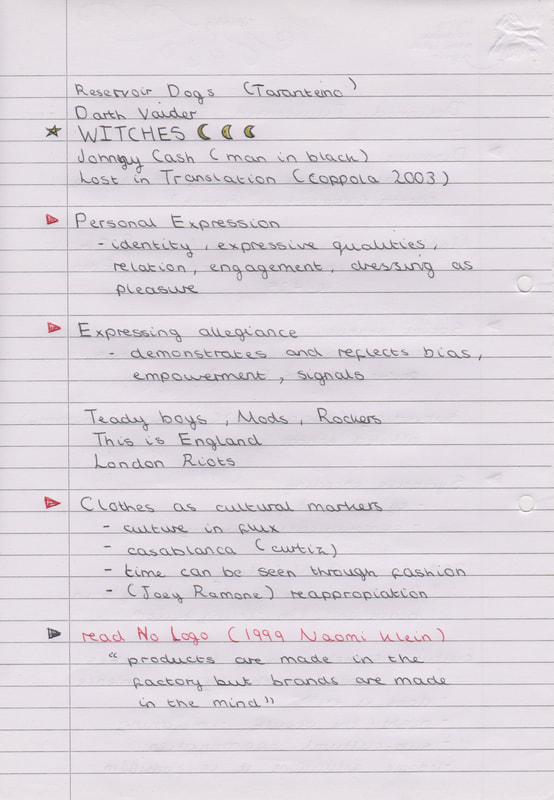
- Drawing upon the key ideas in the session – how a cultural text (i.e. a piece of clothing) can reflect the culture in which it was created.
- Photograph a piece of clothing from your own wardrobe and critique: design, materials and manufacture details, form v function, colour, cultural connotations etc (250 – 300 words). Upload photograph, critique (& any session notes) to your blog.
So after exploring my wardrobe I came up with three options. a velvet dress, an embroidered pinafore and a transparent top with a pinafore I have dyed to be a different colour from what it was originally. So which should I pick?
|
So what does my clothing say about me? Before this week I would have been inclined to say it means nothing, but after this week’s lecture I am ready to look into it more thoroughly. For this task I have picked to look at a velvet skater dress. The function of a skater dress is quite simply to accentuate your body by giving it an hour glass shape while also being practical and not overly tight. It is a fun and free style of dress which can be worn casually or in a more elegant setting. The way is moves is what brings me back to this style of dress time and time again; how you can twirl and the dress moves with you - which makes sense as this style originated from the outfits that figure skaters wear. But this is a velvet skater dress, a material that is often thought to be more decadent – a material that people think should only be worn in the winter at elegant events, but where is the fun in that! I have always been a bit of a magpie being drawn to shiny things so what could be better than wearing something that shimmers and glistens as you move. As the light reflects the colours change and alter making the dress a moving changing piece of art in my eyes. However it is also the colours that made me want to own this dress – the mix of red, black and grey just appealed to me. But what do those colours mean? Black is a subdued colour, a colour that blends into the background while also looking professional. Whereas red is a powerful colour that presents an air of confidence, red is such a bright colour that it draws attention. While grey blends like black, being a subtle and inconspicuous. So is my dress having a personality crisis or am I? For me this dress isn’t about standing out or fitting in, it is just about personal expression. |
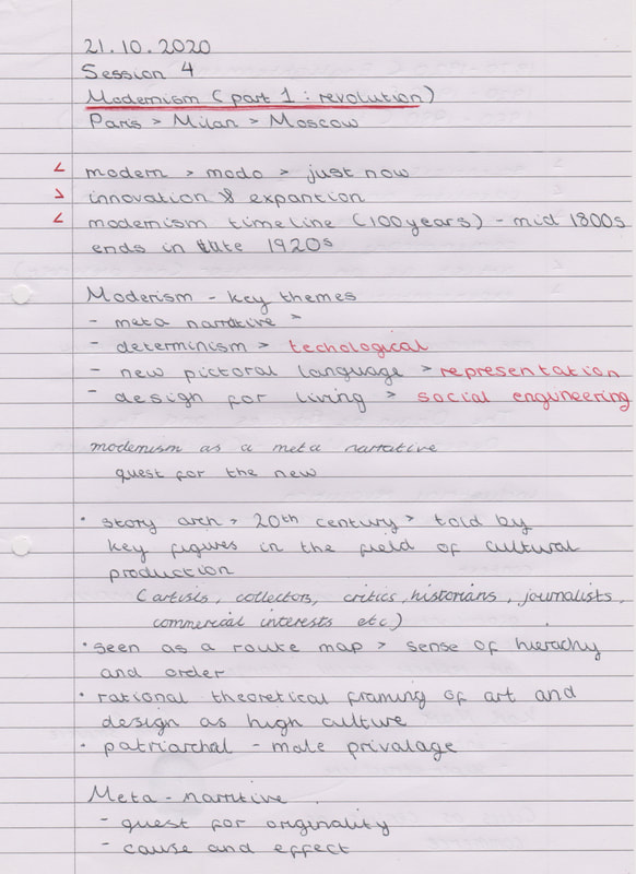
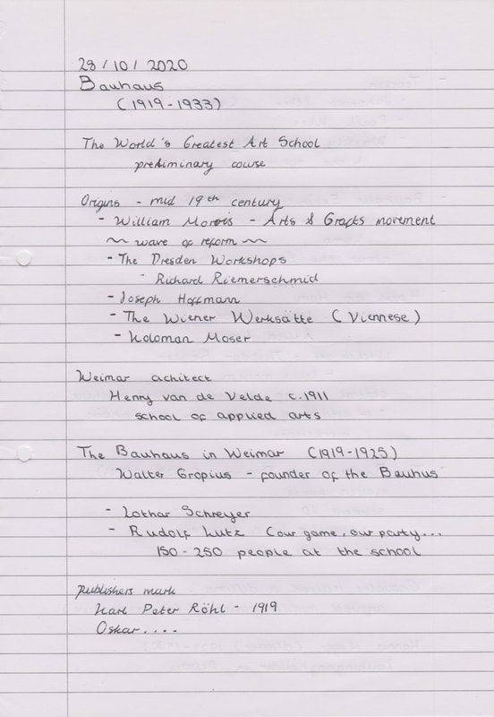
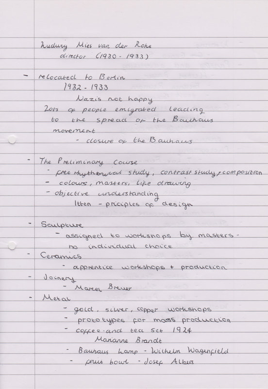
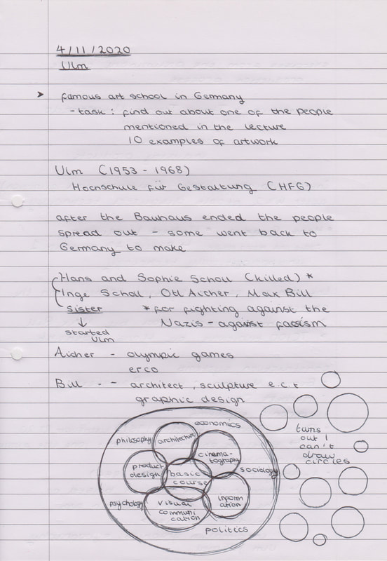
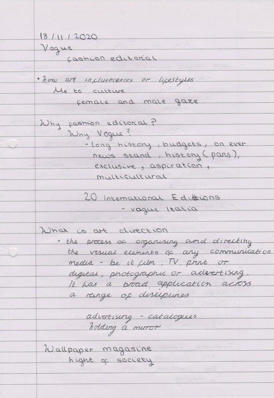
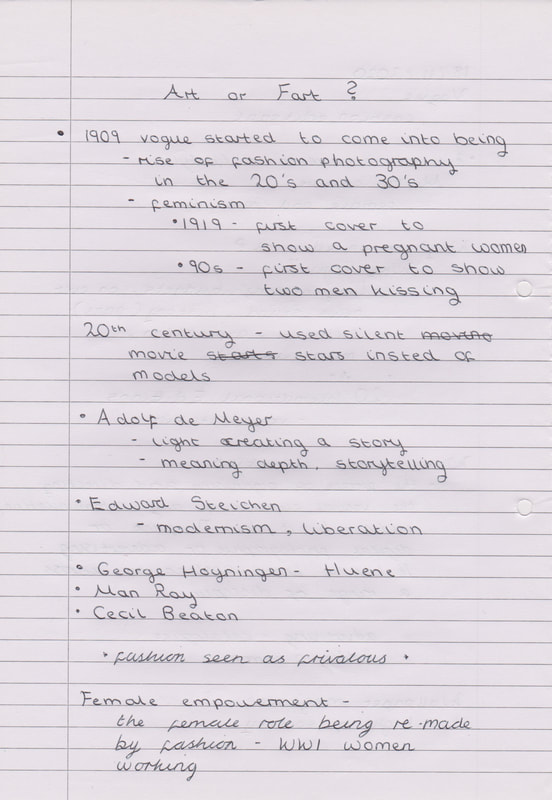
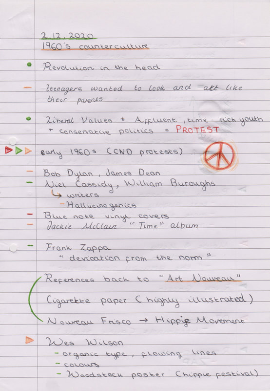
Notes (Week 1)
Session 2
Weekly Task:
Weekly Task:
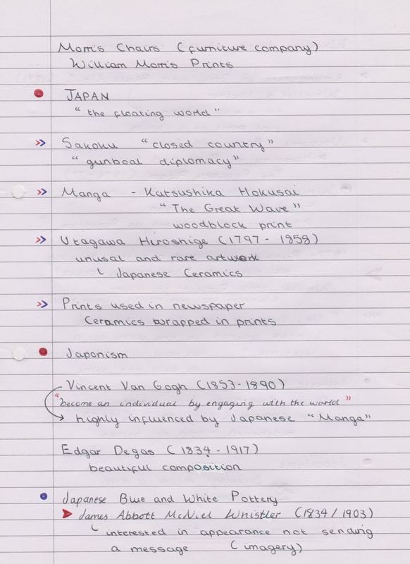
- Take two differing pieces of art or design from the late nineteenth or early twentieth century and explain how the Art of Japan influenced their form, function or manufacture.
- Contrast this with examples that show no influence from Japan.
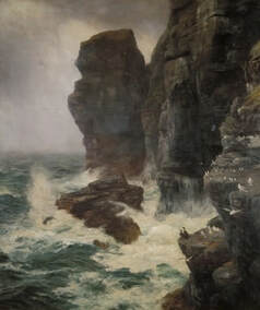
For my examples of artwork that is influenced by Japan I picked "Nasturtiums" by Gustave Caillebotte" and The Japanese Parisian" by Alfred Stevens. To contrast with these pieces of artwork I have chosen to discuss "Ribbed and Scaled by Rocks" by Peter Graham and ""Veronica Veronese" by Dante Gabriel Rossetti.
The first image "Nasturtiums" is influenced by the Art of Japan; this influence is shown through the colour tone and space within the painting. I have noticed that many of the more "traditional" paintings are very cramped and full, whereas Japanese woodblock prints are more muted and spacious in appearance which is part of their appeal. This painting in contrast to "traditional" artwork is quite empty which reflects Japanese artwork along with the beautiful colour palette of muted reds, greens, blues and purples, it creates a very visually pleasing image. The form of this painting presents the viewer with the opportunity to envisage the area surrounding this image - this also reminds me of Japanese woodblock prints.
I have chosen to contrast "Nasturtiums" with "Ribbed and Scaled Rocks" by Peter Graham, as both of these paintings are based on an environment and they don't include people. However, they are greatly different in appearance; where "Nasturtiums" is a calm and subtle image, the other painting is a lot darker. Showing a stormy day with waves crashing on the rocks, the whole mood of this painting is entirely different. The painting is very detailed and has a mysterious appearance like something could be hidden within the fog. Whereas "Nasturtiums" is a lot more open and it is easy to see everything that exists within the painting.
Moving onto "The Japanese Parisian" by Alfred Stevens; in this painting there is a clear influence from Japan. Alfred Stevens was an avid collector of Japanese trinkets after the first trade treaties were signed in 1855, he had a private room full of many Japanese items such as kimono's, umbrella and ceramics. Almost all of the items that can be seen in this painting are authentic Japanese items - which provides a clear link and inspiration from Japan. However this painting also has similarities to Japanese artwork through the colour tones that are present in this painting and the dream like quality that the painting portrays. Additionally, the form of this painting gives the impression of space created through the addition of a mirrored image. This painter has also created an intimate feeling in this painting like the viewer is getting an insight into someone else's personal space, which to me seems like a reflection of how the western world came into Japan. While the reflection in the painting could represent the two cultures coming together.
"The Japanese Parisian" and "Veronica Veronese" were both painting in 1872 however the differences between them are plain to see. Though the subjects are both quite similar in appearance, the colour scheme and subjects surroundings have drastically effected the mood of the paintings. One is a bright and beautiful painting, adorned with gold tones and delicate flowers, whereas the other shows more traditionally medieval patterns and dark and luxurious tones most commonly linked with the art movement Romanticism and their strong links to Arthurian legends. This colour scheme has also affected the demeanour of the models, in "The Japanese Parisian" the lady has a curious and relaxed stance, whereas in contrast in "Veronica Veronese" the model seems quite disinterested like she doesn't want to be painted. The only things that these two paintings have in common is that both the ladies have titian hair and that both have used the colour yellow.
Notes (Week 2)
Session 3
Weekly Task:
- Document, describe and explain the major differences of ‘Art Nouveau’ as it was interpreted by artists and designers in Glasgow, Vienna, Madrid and Nancy.
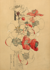
Art Nouveau is a style that varied greatly across the world, from the common roots of being a decorative style inspired by nature and geometry. This art movement originated it Britain, through the nature inspired patterns of William Morris and the Arts and Crafts movement.
Glasgow
Scotland
In Glasgow the Art Nouveau style was known as the “Glasgow Style” this style was prominent in Glasgow from the 1890s to 1914. This style is still impactful to this day and is appreciated throughout the world. The artists that were a part of this style had the commonality of being trained in the Glasgow School of Art, taking inspiration from both the Arts and Crafts Movement and Art Nouveau. Charles Rennie Mackintosh is the name that is most commonly mentioned when discussing the Art Nouveau style within Glasgow.
This style was interpreted into stained glass, ceramics, illustration, textiles and both the interiors and exteriors of buildings. The key features of the Art Nouveau style within Glasgow that I have noticed are strong lines within the architecture and art, these lines are often bold and black containing subtle colours. The "Glasgow Style" designers most often used light and subtle tones within their artwork, using colours like green, pink and purple with black or white outlines to add contrast.
The most notable artists within the "Glasgow Style" were Charles Rennie Mackintosh, Herbert MacNair and the MacDonald sisters. This collection of artists were know as "The Four". This style of Art Nouveau that formed within Glasgow is less dramatic and flamboyant that that of the other countries that I have researched. This style is set apart from other forms of Art Nouveau by long straight or curved rectilinear lines and lattice designs. These natural designs were kept simple and light, so that the geometric background of the art, allowed the artwork to be accentuated by both the artworks setting and colours. I know this style most commonly from the stained glass that is throughout Glasgow.
Research Links for the Edinburgh Art Nouveau Style
Vienna
Austria
The name that has came up most commonly while I have been researching Art Nouveau in Vienna is "Otto Wagner". I had never heard about him before this but I really like the Majolika Haus that he created - this is a unique take on Art Nouveau. Although Majolika Haus is a flat rectangular shape, it is still considered to be in the Art Nouveau style because of the use of ornamentation within the floral designs, balconies, and the decorated façade. Otto Wagner was one of the architects that created the Vienna that can be seen today. He preferred a geometric inspired Art Nouveau style, which influenced others within the Vienna area to also use this as an inspiration. What sets this style apart from other forms of Art Nouveau is the way that they used organic ornamentation on the exteriors of the buildings, using tiles, glass, gilding and coloured accents to embolden the buildings.
I have noticed that within Vienna the Art Nouveau is more decadent and decorative, using gold frequently along with bright and vibrant colours. These colours are more modern and rich than the colours that have been used within the "Glasgow Style". I have also noticed the appearance of the "duck egg blue" colour on both the "Anker Clock" and "Majolika Haus", this is a colour that seems to be unique to the Vienna style as it compliments the gold tones.
The Art Nouveau style in Vienna has more structurally stable shapes, which gives them more of a presence within their surroundings. This is a very interesting development from the traditional "Art Nouveau" which focused heavily around delicate artwork that is inspired by both nature and geometry. The contrast between the detail within these buildings and the large blocky shapes that the decoration is on, gives this style a very unique feel.
Research Links for the Vienna Art Nouveau Style
Madrid
Spain
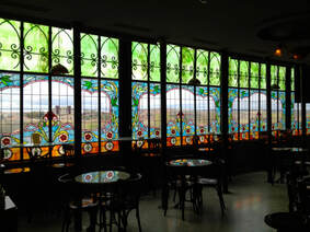
From what I have observed through researching the "Art Nouveau" style within Madrid; what sets this style apart from other Art Nouveau styles is the great amount of colour that it contained in the stained glass and architecture. The colour palette of this style is lighter than the style in "Nancy" but more vibrant than that of "Glasgow". Both the Palacio Longoria and Casa Lis have stained glass windows that feature a great array of vibrant and unique colours. The most common colour that I have seen appearing within this style is yellow.
The Art Nouveau style in Madrid is set apart by the symmetrical appearance of the architecture and furniture, alongside the highly decorated moulding on the exteriors of the buildings. The addition of the white detailing creates a conducive appearance of the buildings and adds to the symmetry of the building. Like Vienna these buildings often have decorative balconies however these balconies are darker in appearance - being made of what appears to be wrought iron, which often include the naturalistic shapes commonly associated with Art Nouveau.
Joan Busquets created a pair of these Art Nouveau armchairs for Antonio Gaudi's Palacio Güell. As you can see from the image this furniture was extremely decadent and highly decorative. It is not just a piece of furniture this is an art piece, from the curved lines and floral patterns this armchair perfectly encapsulates the style of Art Nouveau that was highly sought after in Spain at the time. These shapes that are a part of the Madrid Art Nouveau style are an elegant simplified version of an Art Nouveau style, instead of the highly decorative style of Vienna this style is cleaner and could be considered to be more refined.
Research Links for the Madrid Art Nouveau Style
Nancy
France
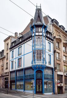
The École de Nancy (Nancy School) was a group of Art Nouveau artists and designers that worked within Nancy between 1890 and 1914. Émile Gallé was a well know designer that worked within this group, their work was most commonly inspired by natural forms. The Nancy School produced a wide range of designs that were inspired by the local fauna.
The colour palette of this style is a very natural muted palette, including blues and yellows. The artistry within this version of Art Nouveau is very detailed and soft. All of the art pieces created within the "Nancy School" include soft natural lines that accentuate the subject, whether it is a buildings exterior design, stained glass or furniture, the shapes bind this style together. I have noticed that this style doesn't lean so heavily on bold black or white outlines to make the floral forms stand out. This style is most like the Glasgow style if I was to compare them, they both use muted tones however this style is even more natural.
I have also noticed that within this style there is more mixing of colours instead of the normal separation of colours, this colours within the vase and stained glass window have an added depth to them that has been created by adding colour gradients and added details. The lines within the doors and windows have the appearance of tree branches witch also sets this version of Art Nouveau, as the other places that I have researched more commonly include straight or polished curved lines within their architecture.
Research Links for the Nancy Art Nouveau Style
Notes (Week 3)
Session 4
Weekly Task:
- Text analysis - compare two constructivist posters/ paintings of your choice.
- Exploring key formal attributes: Materials, composition, use of text and image, use of photography and illustration, line, colour, readership and audience.
I have chosen to compare a poster for “Five Minutes” and “Beat the Whites with the Red Wedge” by El Lissitzky.
To start off I am going to look at how these pieces of constructivist artwork have been composed. The film poster for “Five Minutes” has a very dynamic composition as the drawing of a man has been put at a very unique angle in comparison to the city below. There is a juxtaposition between the way that the character is at such a large scale and how the city below seems to be so far away. This composition gives the whole image a dramatic presence; which highlights the importance of the “main character” by the way that the cars below are so small in comparison. Whereas “Beat the Whites with the Red Wedge” has a more flat composition as the image seems to be very flat and unimposing, however it is a composition that creates a greater sense of movement to the film poster. The shapes that are pointing in lots of different directions helps to keep the viewer interested in this image, as well as having the appearance of small projectiles that are firing towards the right side of the image. I also think that the empty white space has made it look more clean and open, which in turn makes this image more visually pleasing to me.
The colours that are present in both of these images have made them both visually interesting, the poster for “Five Minutes” has used a warmer colour scheme with a great amount of yellow on the buildings and the man’s face as well as having a greater amount of colours in the poster in comparison to the other artwork. El Lissitzky’s artwork has a stricter contrasting colour scheme using only red, white and black; this has given the poster a minimalistic and professional appearance as well as reinforcing the message that is present in this artworks title.
Text plays a more important role within the “Five Minutes” poster, creating an interesting split to the image by extending a red line from the end of the last letter of the title, this has given this poster a more dynamic appearance as well as hinting at the fact that five minutes can go by very quickly. Whereas, the text in “Beat the Whites with the Red Wedge” faded into insignificance. The typography also fits into the general colour scheme of this image, so the typography and painting are combined together. Whereas the movie poster used a bright red which makes sense as the text is the title of the movie, so it is important that the name is memorable. The thing that both of these images seem to have in common where text is concerned, is that both images have used a similar typeface, which is bold and imposing which helps it to stand out against the intense imagery.
The audience that these images are appealing to are very different from each other; “Beat the Whites with the Red Wedge” is a piece of propagandistic artwork to show Lissitzy’s support of the Red Army which represents the revolutionaries, who were trying to penetrate into the anti-Communist White Army. Whereas the film poster for “Five Minutes” is a piece of commercial artwork made to appeal to a film audience and encourage people to spend their money to view this film in the theatre at the time.
Notes (Week 4)
Session 5
Weekly Task:
- Take one of the artists or designers mentioned in the presentation and research their life and visual output.
- Collate a minimum of 10 pieces of their work and write a short biography (300-500 words).
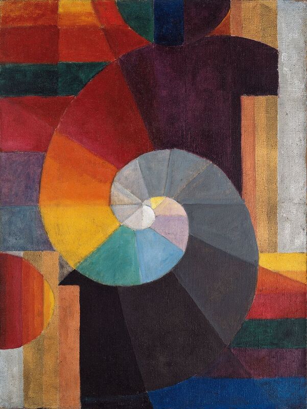
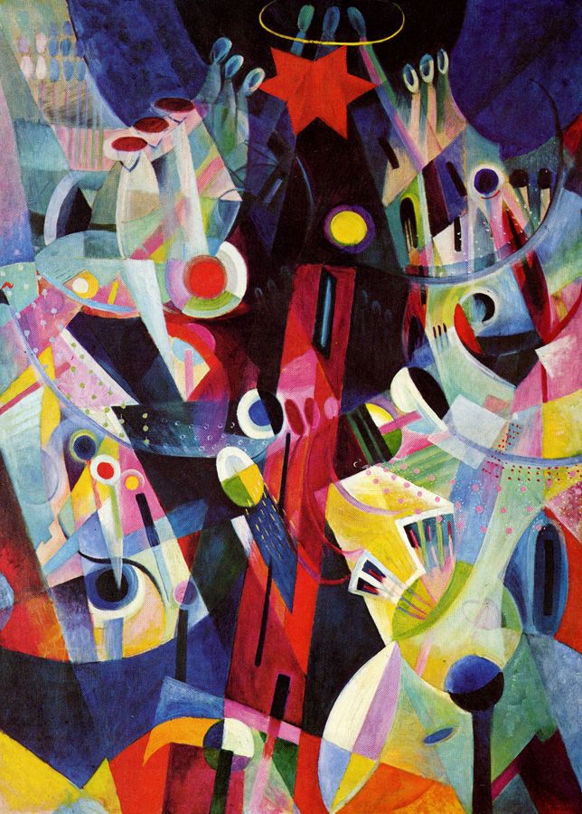
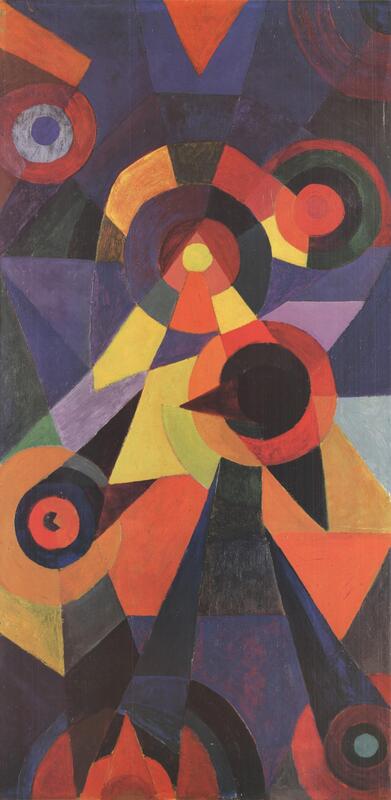
Johannes Itten
(1888 -1957)
(1888 -1957)
Johannes Itten was born on the 11th of November, 1888 in Südern-Liden in Switzerland. He was the son of a teacher which influenced him to study a teaching course at a teaching-institue in Hofwil near Berlin. Then he went on to work as a primary school teacher from 1908 to 1909 after this brief time he went on to spend a semester at Geneva Ecole des Beaux-Arts in Genf until 1910. Following this he took a diploma in natural science and mathematics at the University of Bern, so that he could start to teach at a secondary school. During his teacher training he started to learn about the concepts of psychoanalysis, which in turn allowed him to learn about colour and painting theories.
In the time he spent as an art teacher he attempted to encourage his student’s individuality instead of correcting their mistakes. He took multiple trips to different countries which helped Itten to discover a love of artwork, as well as forming his own colour and painting theories. This in turn convinced him that he would be much happier as a painter. He was trained by Adolf Holzel in Stuttgart in 1913. After which Johnannes Itten moved to Vienna in 1916 while there, he was greatly inspired by the music that he heard around him. As well as his new circle of friends who introduced him to Walter Gropius. Gropius then extended him an invitation to teach at the Bauhaus in 1919, this was one of the first invitations that was extended to anyone.
While he taught in Weimar from 1919 to 1923, he developed a universal doctrine in design, which he taught in the preliminary course at Bauhaus. Within this course he taught the students about the concepts of colour, composition and materials.
Itten had a great devotion to a cult following, which led to his dismissal from the Bauhaus group. After his dismissal he opened up a school for painting, printmaking, photography and architecture in Berlin in 1926 where he continued to teach the principles of colour. In 1932 Itten also taught at the Krefeld School of Textile Design until 1938. He moved to the Netherlands and became the director of the Museum of Arts and Crafts in Zurich in 1938. He worked extremely hard in the years that followed devoting himself purely to teaching. Johannes Itten retired in 1955 so that he was able to devote the majority of his time to working on his painting.
He wrote two books in the years that followed, “Art and Colour” (1961) and “My Preliminary Course at Bauhaus” on form and design. He received the “Netherlands Sikkens Art Prize” in 1966, and represented Switzerland at the 33rd Venice Biennale. Itten died in Zurich on the 25th of March 1967.
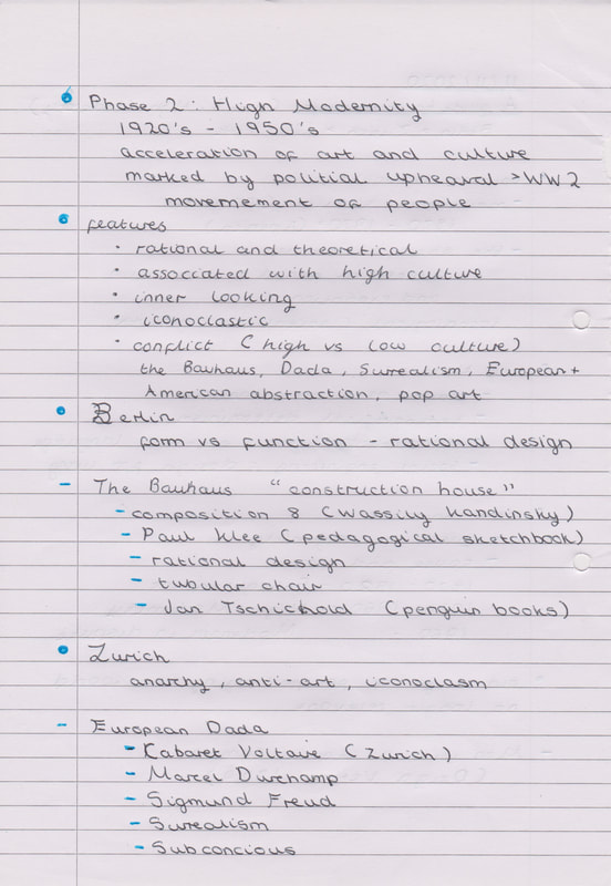
Notes (Week 5)
Session 6
Weekly Task:
- Take one of the artists or designers mentioned in the presentation and research their life and visual output.
- Collate a minimum of 10 pieces of their work and write a short biography (300-500 words).
Max Bill
(1908 -1994)
(1908 -1994)
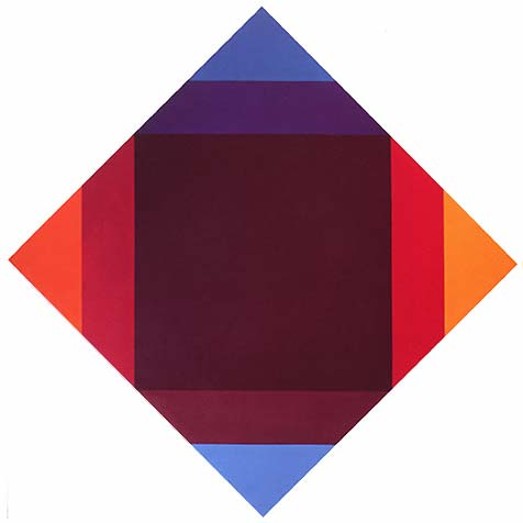
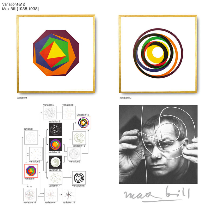
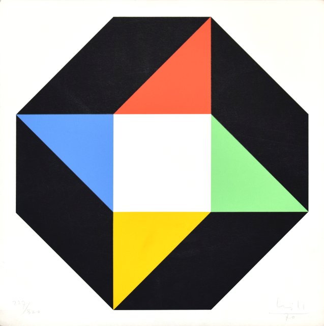
Max Bill was born on December the 22nd 1908 in Winterthur, Switzerland. His early dream was to become a silversmith, and trained at the Zurich. However the work of architect “Le Cobusier” inspired him to go and study architecture at the Bauhaus school of design in Dessau, Germany. While studying at the Bauhaus he additionally studied painting, metalwork and stage design. He continued to be very influenced by the Bauhaus, even after the conclusion of his education at the school. Max Bill set up his studio in Zurich, in this studio he focused upon architecture, sculpture and painting. While he was running his own studio he made a living by creating advertisements. Following this he entered the Allianz group in 1937; this was a group made up of Swiss abstract modern artists.
After 1944 Max Bill began to focus more heavily on industrial design, in this same year he was the founder of the “abstrakt konkret” journal. Additionally he took a teaching position at the Zurich, to teach the theory of form. With his emphasis on industrial design he started to create more diverse products like wall sprockets and chairs – he approached these new projects in a very logical and mathematical way to accentuate the simplicity of the objects. These all had an elegant form that exploited the characters of line. This same style was present in the marble sculpture that he created in 1942 called “Construction from a Circle” his use of geometric forms continued to reflect his Bauhaus training.
Max Bill co-founded the Ulm School of Arts and Crafts in Germany; he was the rector of Ulm from 1951 to 1955. Whilst there he was the director of both the product design and architecture departments, as well as planning the curriculum and designing the school buildings at Ulm, he attempted to continue the traditional design style of the Dessau Bauhaus. In both 1959 and 1964 he participated in the Kassel documenta, which is an exhibition of contemporary art that happens every five years in Kassel, Germany. Max Bill became the head architect of the “Bilden and Gestalten" in 1964 at the Swiss national exhibition in Lausanne. He went on to teach environmental design from 1967 to 1974 as a professor at the “Staatliche Hochschule fur Bildende Kunste” in Hamburg. In 1971 he set up a new art gallery called “Denise Rene und Hans Mayer” in Dusseldorf.
During the 80s Bill created multiple well know monumental sculptures, whilst also visiting various cities to organize some retrospectives of his own work. His work helped to develop the modern style of art we know today, this is shown by the many prizes that he received. In 1987 he was presented with a "Frank.J Malina Leonardo Award" for his lifetime achievements, this was presented by “The International Society for the Arts, Sciences and Technology”.
Notes (Week 6)
Session 7
Weekly Task:
- Create a 2020 version of Richard Hamilton's 'What makes todays homes so different so appealing?’.
- Create as a hand-crafted collage or digital work (using Photoshop etc).
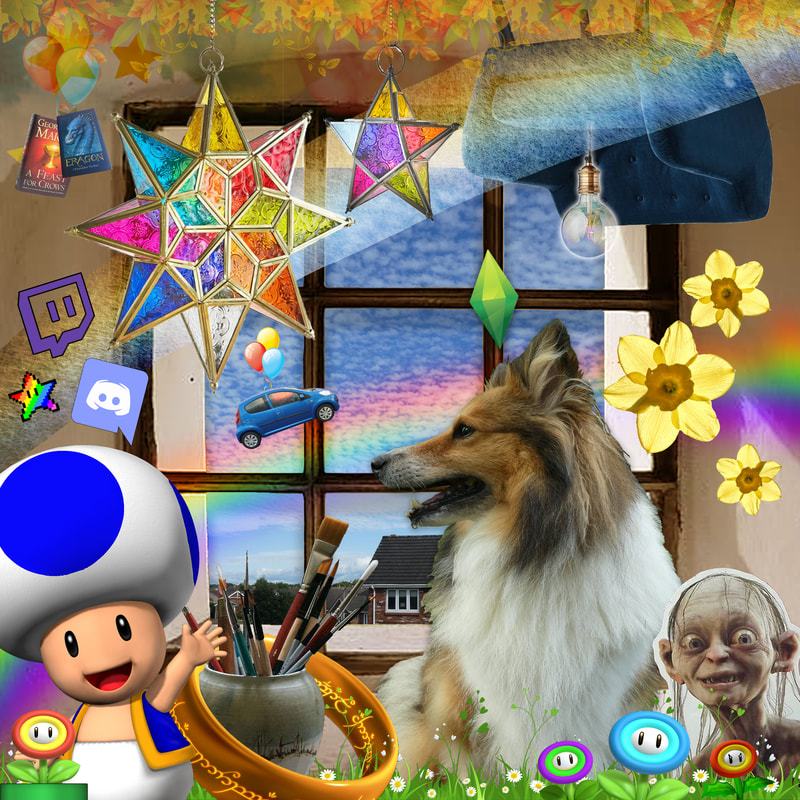
I created my own version of Richard Hamilton’s “What makes todays homes so different so appealing” based on my 2020 experience.
I included the things that have made 2020 fun even throughout the craziness of the year. My dog Fae takes pride of place within this image. But I also included some paintbrushes, as well as some of the games, books and films that I have enjoyed throughout the year. Flying across the window you can see my first car that I got in December of 2019, I had a lot of plans to travel across the country this summer, but even though that didn’t happen, I have really valued having a way to travel without seeing other people, so I class my car to be an outside extension of home.
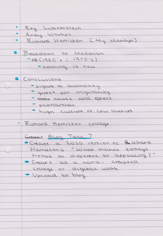
Notes (Week 7)
Session 8
Weekly Task:
Session 8
Weekly Task:
- Scan and critique two fashion "stories" from a publication (or 2) of your choice. Discuss the narrative intention, the audience, location, photographic techniques, tone and mood, composition, typographic elements, model choice etc.
- Display your choice and comments in your blog.
Story 1 (ELLE)
"Great British Bake Off's Prue Leith is the 80-Year-Old Style Icon I Never Knew I Needed"
"Great British Bake Off's Prue Leith is the 80-Year-Old Style Icon I Never Knew I Needed"
I believe that the narrative intention of this article is to draw in a different age demographic to the magazine, as well as expanding the audience of the “Elle” magazine by targeting the viewers of “The Great British Bake Off”. I am not someone who is very interested in fashion, however this article appealed to me because it was based on someone I have watched on television, so I had more interest in reading a “fashion story” than I normally would. I don’t think there is much to say about the composition of this article, it is quite simple and clean. The photographs are what stand out while any typographic elements fade into insignificance.
The location of these photographs is varied, from what looks like photographs taken from interviews, to stills from “The Great British Bake Off”. Most of the locations have things that are visually interesting within them, creating a friendlier looking environment. I believe that these photos have been collated by “Elle” magazine instead of taking the photographs themselves, so some of the backgrounds do clash against each other. All of these are very open and natural, even though some of them are posed, I think it is because Prue is smiling in most of the pictures. This isn’t necessarily a photography technique however by appearing to be natural it makes the story seem more relatable.
As far as colour tone goes this “fashion stories” tone is really bright, there are so many colours and patterns you can’t help but to pay attention. Prue’s clothes remind me of a peacock; she always pops out of her environment, and these bright colours help to make the story more intriguing. The mood of the this story in a word would be “happy” this article is just showing a women who is comfortable in her own skin, wearing what makes her happy. I think this is a really powerful message to get across to the readers. Showing that at any age you can have fun with fashion and embrace your natural beauty.
Story 2 (VOGUE)
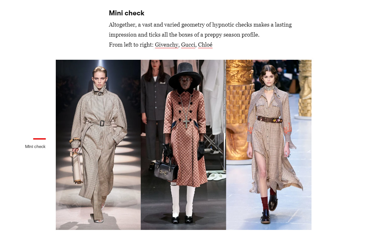
"These are the key fashion trends for fall/winter 2020-2021"
"These are the key fashion trends for fall/winter 2020-2021"
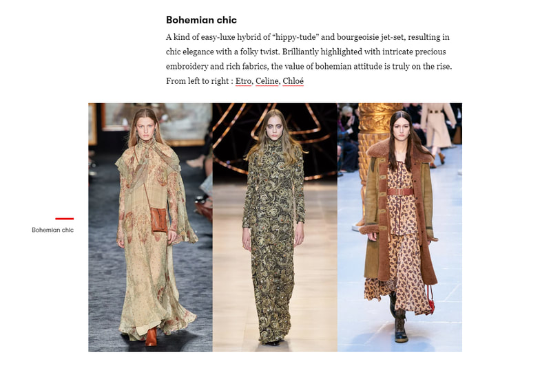
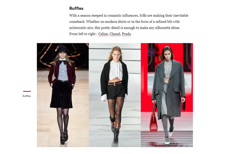
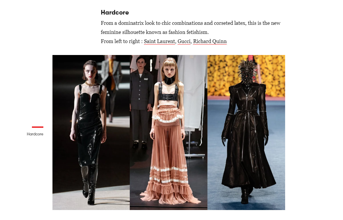
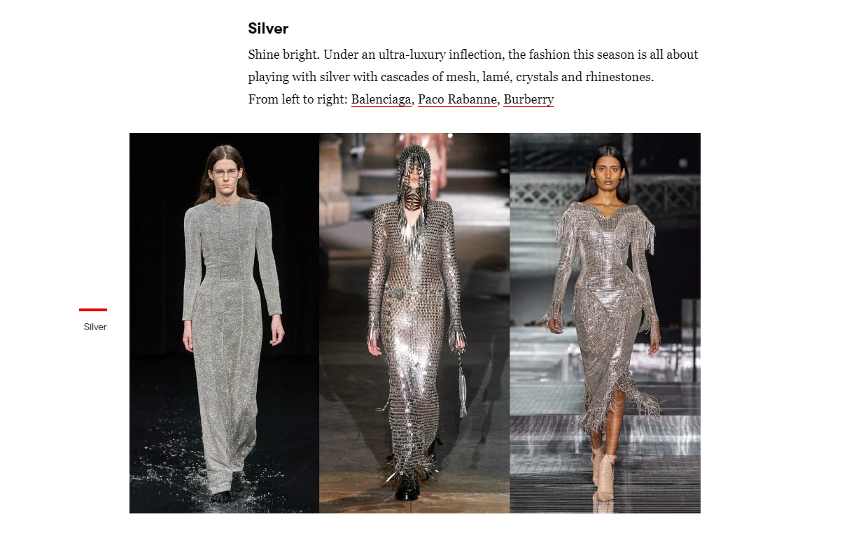
I believe the narrative intention of this “Vogue” article is to inform people of the current trends, and to inspire peoples seasonal wardrobes. As with most designer brands that go onto the runway - the designs are very extravagant, and unlike most clothing you would see when walking around the local area. However this is most likely what makes it so appealing to people. I would say that the desired audience of the article would be people who are interested in the trends and fashion in general. Smaller designers’ may also be looking into stories like this to see what people will be wanting to wear this autumn/winter.
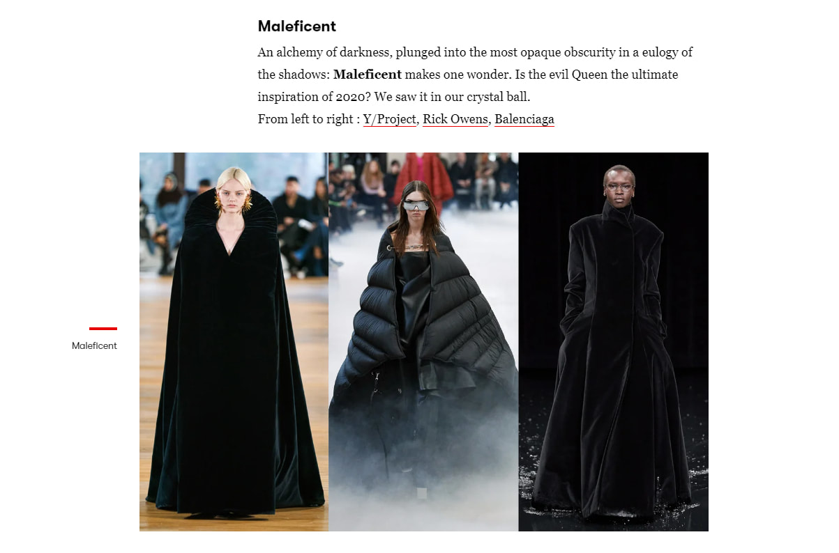
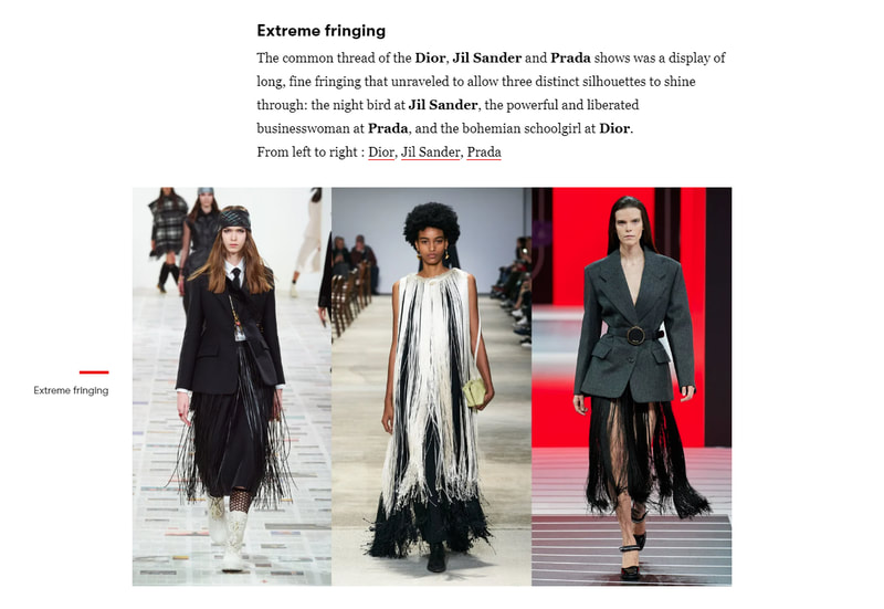
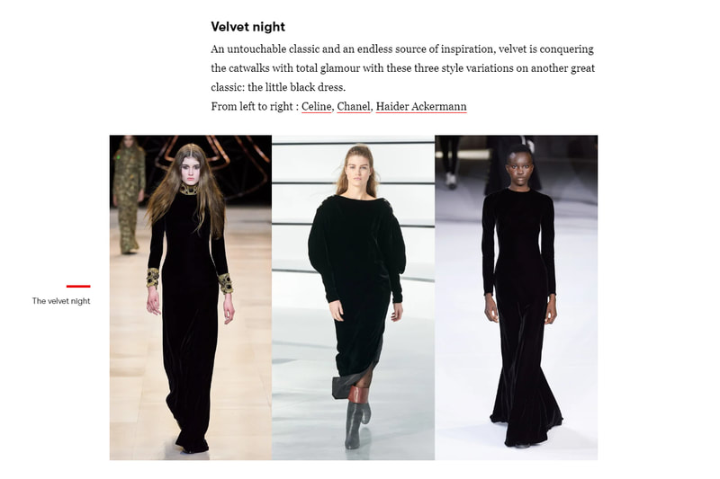
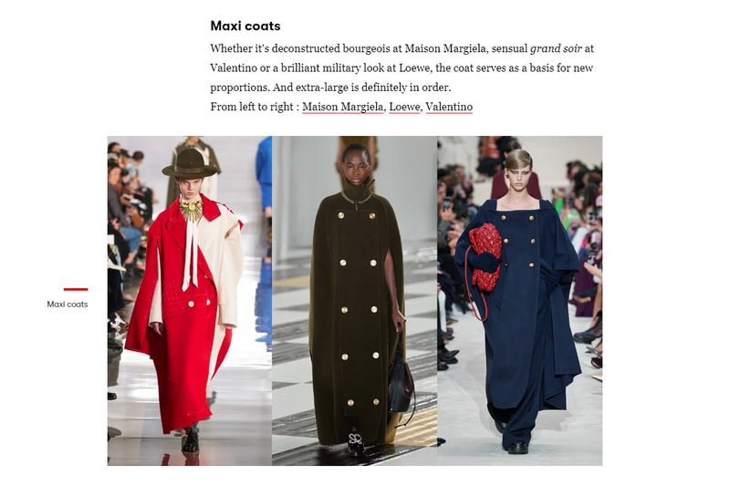
The location of all of the photographs is on the runway, the more blank backgrounds work really well to show off the extravagant fashion. The different locations mostly lets the clothing speak for itself, which in turn helps to show off the tiny unique details that are present on these garments. These photographs have been taken on the runway so they all seem to be in motion, highlighting the movement that the garment can create. Showing off the shapes and colours in a way that a flat motionless image could not. I especially liked the last independent image that has been taken from a side profile. This is the most unique image that is in this article, you can see the focus in the model’s eyes as she is walking down the runway. This image is also very atmospheric because of the blurred lights in the background, as well as the contusive colour tone that is in this image.
The tone of these images is very sterile; from the white lights to the neutral expressions on all of the models faces, these images seem almost unattainable and strange to me. Like the focus that all the models have, has turned them into robots somehow, they show no emotion and walk to the end of the runway and back again, never making a mistake, never showing fear. This makes the tone seem unattainable to me. Additionally the mood of the images is almost a polar opposite to how the other story appeared, this mood of this article is very stiff. This has also been highly curated to only show strength and composure – in my opinion these images dehumanise the models by making them seem so perfect.
The way that this article has been composed is very simple and clean, each category has three images within it to highlight the theme. While the text is just there to give a brief overview of what this style is all about. I personally think that the images would have benefited from some white space between them so they didn’t all blend into one.
There is a wide variety of models in this article; as far as I can tell each model that has been photographed is different from each other, however as with most models they have been dressed and made to look like the perfect example of what a human should look like. Which isn’t a very healthy thing for the consumers of fashion magazines, in my opinion. Everyone is made to look so effortless however the amount of work that has been put into making the models look like this is unbelievable and should be discussed more frequently.
Notes (Week 8)
Session 9
Weekly Task:
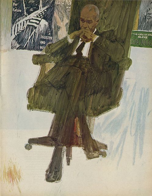
- Research the work of some of the artists covered - or any others from the era, who you find and engage with. Collate (and post) a collection of illustrations which depict normal/mundane and everyday moments (think Bernie Fuch’s obsession with people in chairs and how he was still able to create visual interest and energy). Be sure to name the artists responsible for each.
- Create an illustration / drawing which shows a normal/mundane and everyday moment but renders it visually interesting and exciting - look to the tricks used by the artists you research (composition, mark-making, foreground & narrative elements) which were used to create a midcentury feel and bring visual flare where it wasn’t obvious or expected. (Setting up, composing and taking photos of scenes of normal/mundane and everyday moments would be an acceptable substitute to drawing / illustration).
Bernie Fuchs
(1932 - 2009)
(1932 - 2009)
Bernie Fuchs was born on the 29th October 1932, he studied art at the Washington University and graduated in 1954. His illustration career started in the city of Detroit illustrating car advertisements at New Center Studios. Fuchs’ was known widely for his work within the advertisement sector and his illustrations for magazines. He used gouache to create highly detailed illustrations, as well as using oils to achieve a looser yet controlled style. This painting style was highly based upon photography, whilst also maintaining a simplification through the way that the paint has been applied as well and the colour and details within the artwork.
Some of his most well-known work was created for sports magazines, of which he created over fifty covers for 'Sports Illustrated' throughout his career. Which led to him receiving the Sports Artist of the Year in 1991 from the American Sport Art Museum and Archives. Bernie Fuchs died on the 17th of September 2009.
I found “A Note From The Editor by Bernie Fuchs from Illustrators ‘64” very interesting, within the article Fuchs talked about keeping the attention of the viewer through sensation. He believed that every illustration captures a moment a tiny instant that is recorded forever, which has to make people want to look at it. To give them time to use their imagination to explore the movement and feel the sensation of the sound, the feeling, the memory and the anticipation of the next second which can only been seen within the viewers mind.
I thought that this was a really interesting and beautiful way to view the impact of an illustration, and has really made me the consider the impact of what I can illustrate.
Bob Peak
(1927 - 1992)
(1927 - 1992)
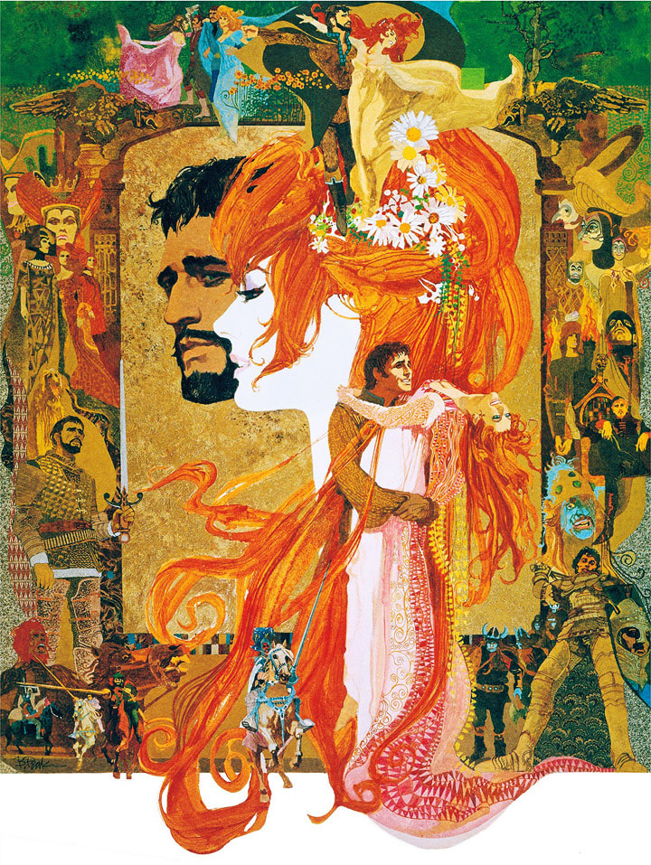
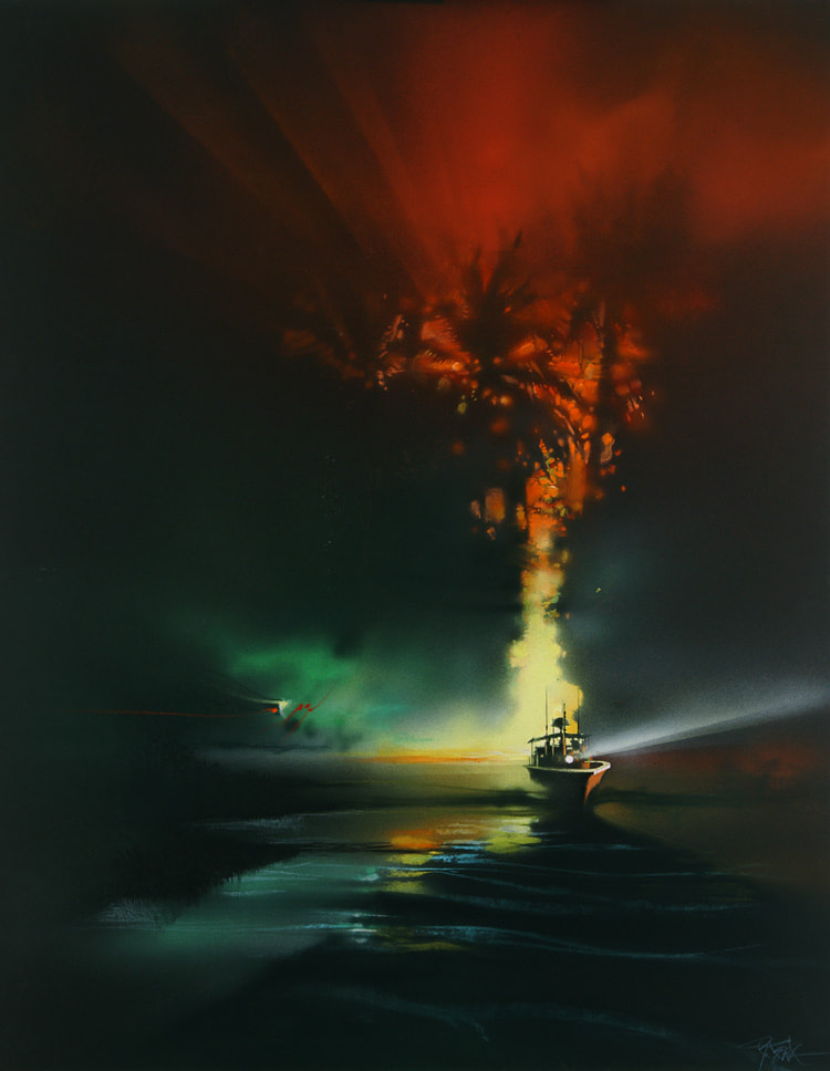
Bob Peak was an influential American artist, whose work helped to define the format and design of the modern movie posters that we recognise today. Within his lifetime Peak illustrated over one hundred movie posters, including posters that were created for the original “Star Trek: Motion Picture” and "Apocalypse Now".
He also worked for a number of commercial clients and created some editorial illustrations for a variety of magazines such as the “Time Magazine” and the “TV Guide”. In addition to this he also created some artwork for galleries. He was elected to the hall of fame by “The Society of Illustrators” in 1977. Bob Peak also taught at his own art school “The Art Students League”.
Bob Peak used varied methods to create his illustrations, he used acrylics, oils and charcoals as well as mixing the materials. His subject influenced this materials he used as well as the colours, design and textures that he chose to work with.
Norman Rockwell
(1894 - 1978)
(1894 - 1978)
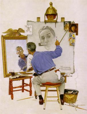
Norman Rockwell was born on the 3rd of February 1894, he studied at the National Academy of Design as well as the Art Students League. He is most well-known for the illustrations that he created for “The Saturday Evening Post”. His favourite subjects to illustrate included families, children and the ins and outs of small town life. Through the wide distribution of “The Saturday Evening Post”, Rockwell’s illustrations became iconic throughout America. His painting of a Thanksgiving Diner “Freedom from Want” became very popular and has been reproduced many times since.
Rockwell has had a lasting impact on the entirety of America, and his work has even inspired directors such as Steven Spielberg, George Lucas and most notably Robert Zemeckis who recreated several of Rockwell’s painting as scenes throughout the 1994 film “Forrest Gump”. Rockwell’s earlier artwork was not widely embraced by art critics because it was seen to have an idyllic outlook on American society, however his later work was praised for tackling controversial subjects. Norman Rockwell died on November the 8th 1978.
Rockwell has had a lasting impact on the entirety of America, and his work has even inspired directors such as Steven Spielberg, George Lucas and most notably Robert Zemeckis who recreated several of Rockwell’s painting as scenes throughout the 1994 film “Forrest Gump”. Rockwell’s earlier artwork was not widely embraced by art critics because it was seen to have an idyllic outlook on American society, however his later work was praised for tackling controversial subjects. Norman Rockwell died on November the 8th 1978.
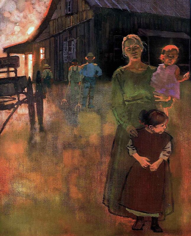
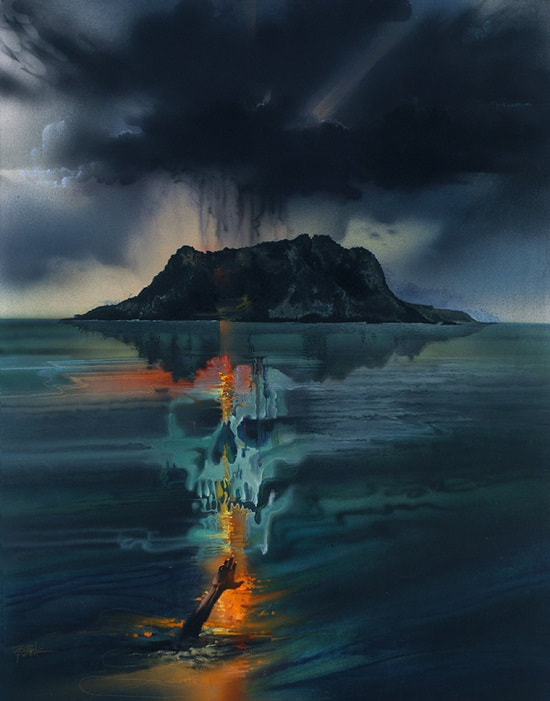
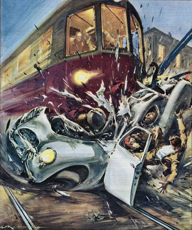
Illustrations which depict mundane and everyday moments.
These were hard to find and some are more abstract than others, but they have all taken things that happen in everyday life and turned them into interesting illustrations.
These were hard to find and some are more abstract than others, but they have all taken things that happen in everyday life and turned them into interesting illustrations.
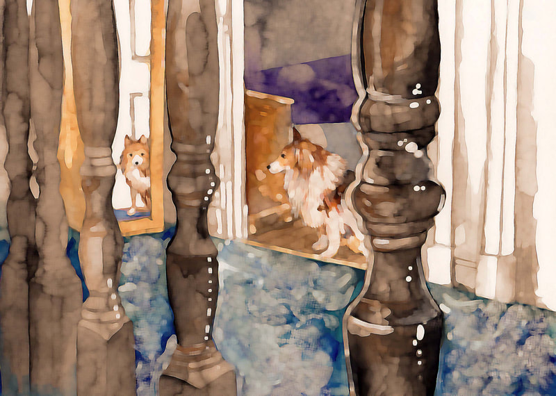
My Illustration
The Editing Process:
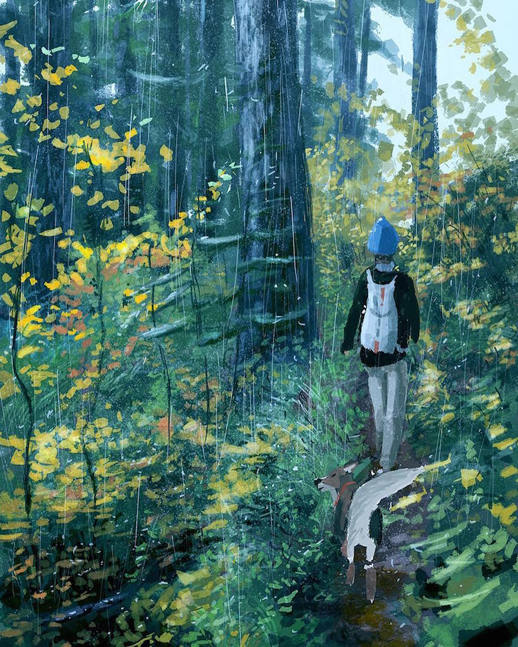
I edited my painting to make it closer to the work of the artists that I had researched.
I edited my painting to make it closer to the work of the artists that I had researched.
Notes (Week 9)
Session 10
Weekly Task:
- Choose one these artists ( • Wes Wilson • Victor Moscoso • Rick Griffin • Bonnie MacLean • • Martin Sharp • Mouse & Kelley • Robert Crumb • Alan Aldridge • )
- Collate and post a collection of representative work (i.e. work that is that artist is renowned for) on your blog.
- Identify and research your chosen artists’ own artistic influences (for example, Victor Moscoso cites Joseph Albers). Find examples of their work to post alongside those of your chosen artist, highlighting through brief annotation, where that influence can be recognised (if at all). Please make sure all images are credited to the artist and image source.
Artistic Influence (Alphonse Mucha)
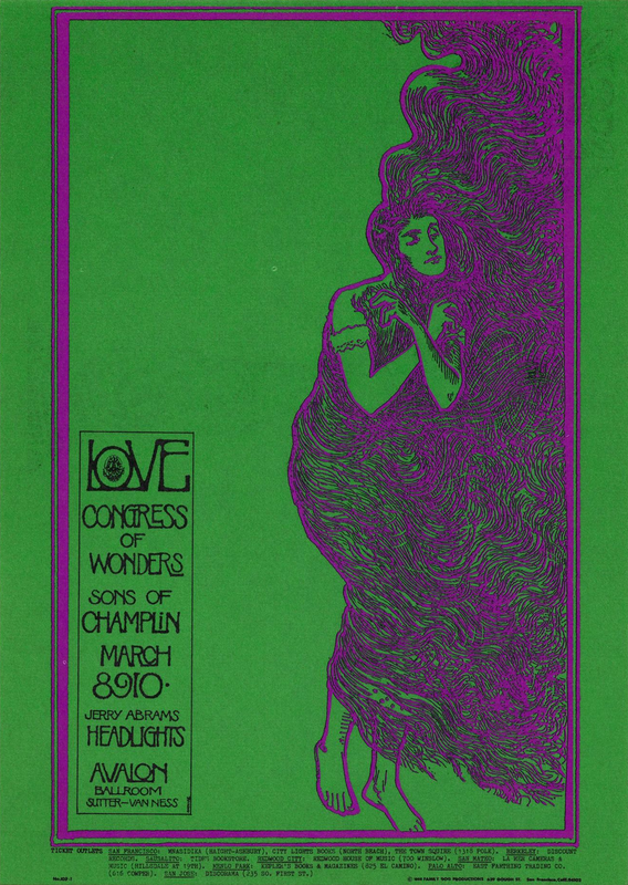
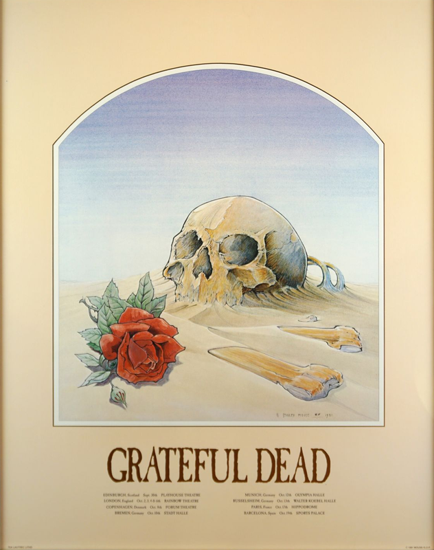
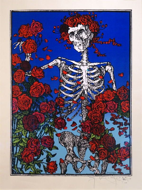
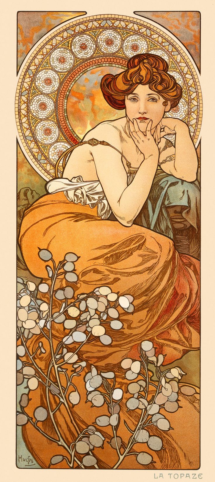
I have compiled a collection of both Mouse and Kelly’s work as well as some of their influence Alphonse Mucha’s artwork. Now looking at the artwork side by side I can see clear differences but also striking similarities between them.
There is a clear recreation of Alphonse Mucha’s artwork in their “Big brother and the holding company poster” here Mouse and Kelly have completely copied the original composition of the “Job cigarette paper poster”. However they have drastically changed the colours to give it a more modern appearance.
If I look at the other pieces of Mouse and Kelly's artwork that I have found you can see the influence of Alphonse Mucha coming through within the composition, they have used curved frames within some of their images just like Mucha did, as well as placing figures within the frame and using the space around them to tell a story.
Although the colour palette that Mucha used was a lot lighter and more subtle there are similarities between the colours that have been used by Mouse and Kelly. It sometimes looks like the same colour palette only with more saturation and vibrancy. However I have noticed that Mouse and Kelly have used a lot more blue than Alphonse Mucha did within his work, additionally their work is colder in tone as opposed to Mucha’s which generally stuck to a warm and inviting colour scheme. The influence of the Art Nouveau style can also be seen in their work through the soft, curved and natural lines. Even the text in one of their posters is calligraphic in nature which is very reminiscent of the fonts that Alphonse Mucha would have used alongside his artwork.
There is one thing that Mouse and Kelly have not added to their work that Mucha did and that is the use of pattern, instead they have kept their backgrounds more empty which gives their posters a more graphic quality. This has also been achieved through the addition of photography to the posters.
Notes (Week 10)
Session 11
Weekly Task:
- No weekly task.
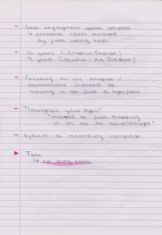
Notes (Week 11)
Session 12
Weekly Task
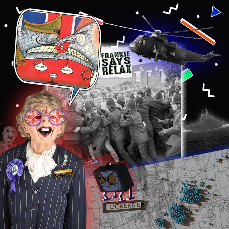
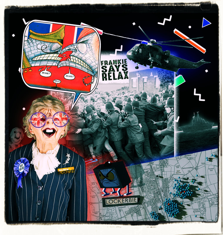
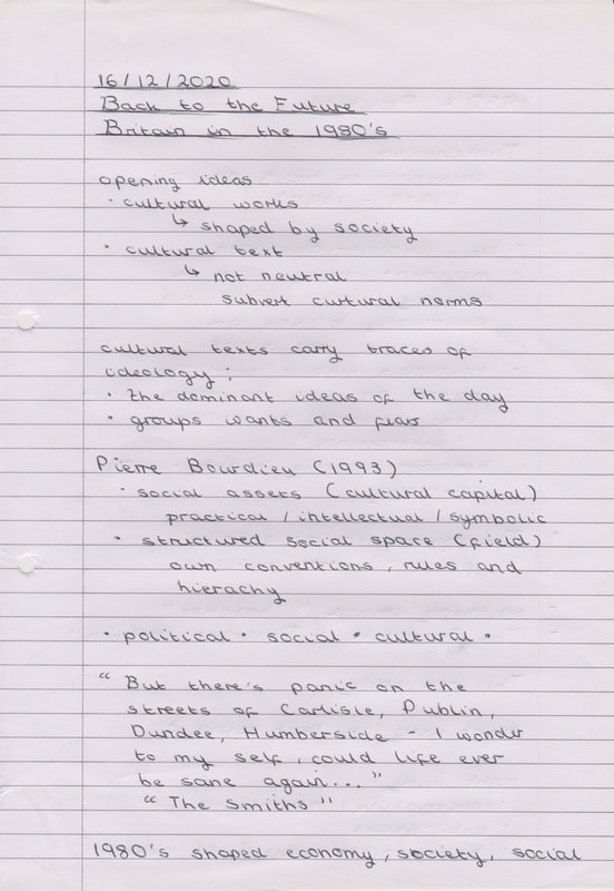
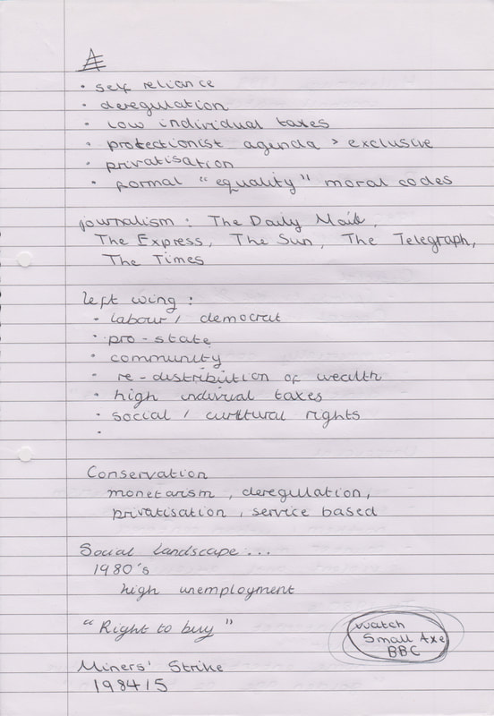
- Create a visual moodboard of 1980’s culture - showing examples of ‘official’ and ‘unofficial’ culture.
|
Official Culture
Pac-Man - Care Bears - Rubix Cubes - Walkman - Space Invaders - Rainbow - Star Wars - Atari - BonBons - Flying Saucers - VHS - Mr Ben - Ghostbusters - Dungeons & Dragons - Love Hearts - The Last Unicorn - Pac Man Background - Background Image - |
VS
|
For these visual moodboards comparing 1980’s official culture and unofficial culture I called in my resident 80’s expert, my Mum. She really enjoyed telling me what she remembered from her childhood and I enjoyed putting these moodboards together. I may have went a bit overboard and made the moodboards more like miniature collages, but I enjoyed making everything fit together. I especially liked seeing the contrast between the two sides of British culture in the 80s.
Notes (Week 12)


