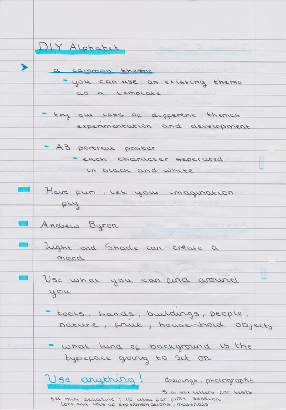
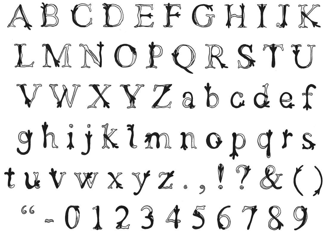
- DIY ALPHABET -
Week 1: Module Intro and Brief Delivery
|
|
|
|
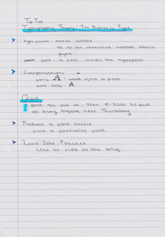
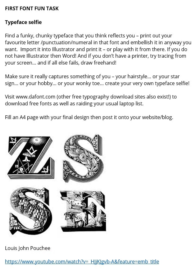
The First Task
|
|
Typeface Selfie Edits
|
|
|
|
|
|
|
|
|
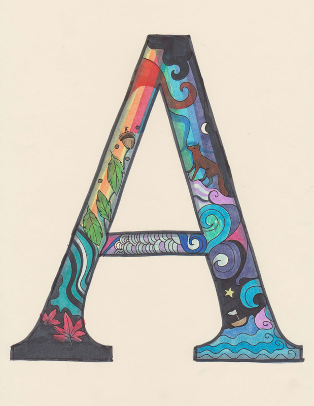
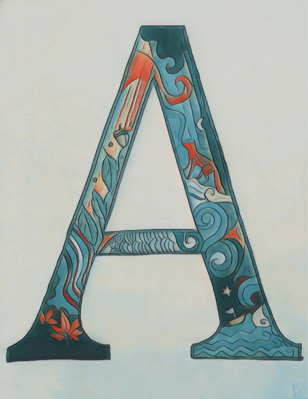
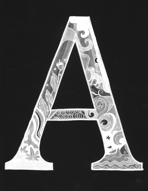
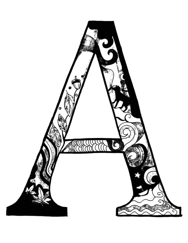
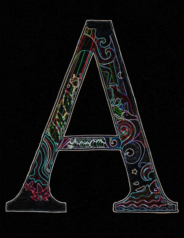
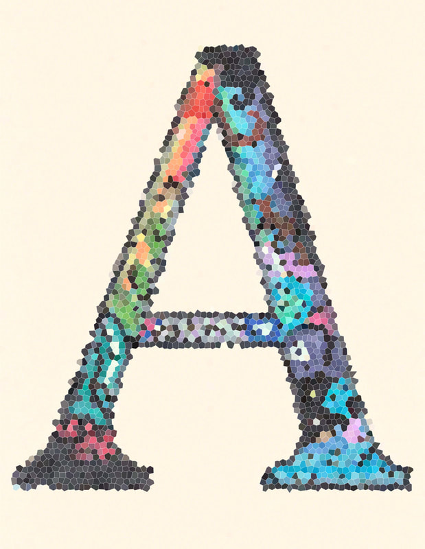
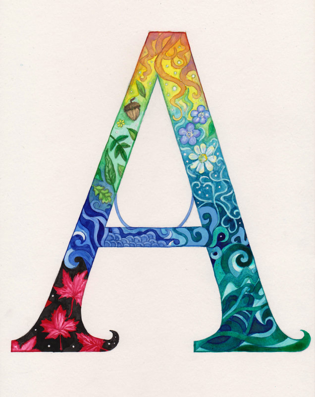
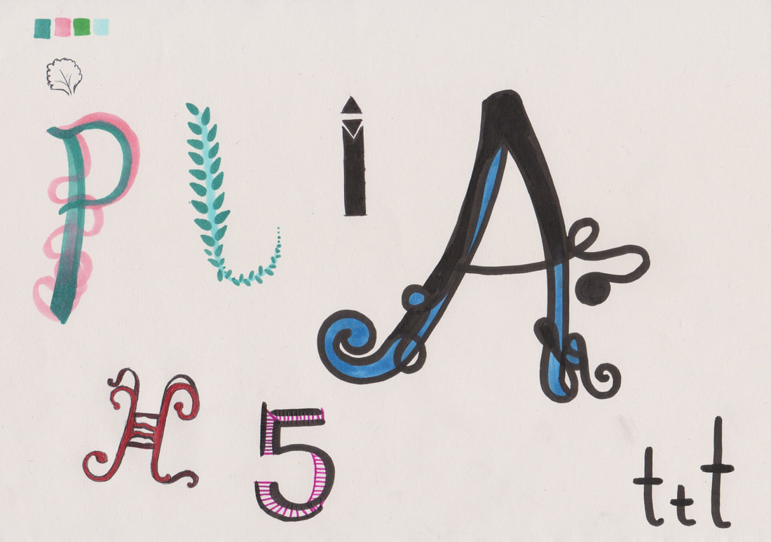
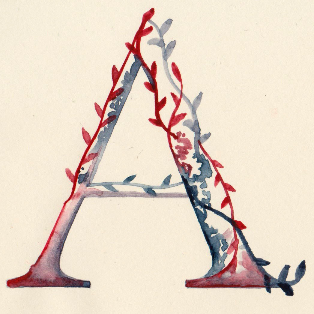
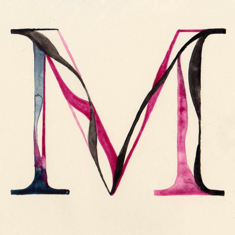
After completing the quick "Typeface Selfie" that was created within the online workshop, I decided to give this mini brief another go. But this time I allowed myself more time so I could create a letter that represented me accurately. I am really happy with how this turned out, I didn't plan the colours that I painted this letter with at all, so that they could be completely determined by my subconscious. I think that this made the letter a more accurate reflection of my personality. Within the letter I included the pattern of the dress I was wearing during the first session (the red and black maple leaf pattern), a lot of leaves (to show my love of nature), the sea (to represent my love of water, and my star sign Aquarius), forget-me-nots (one of my favourite flowers) and swirls of orange ( to represent my ginger curly hair). |
Type Quiz
|
|
|
|
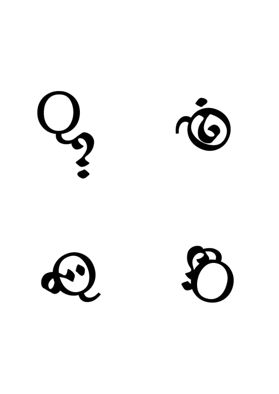
Antonym Typefaces
|
|
|
|
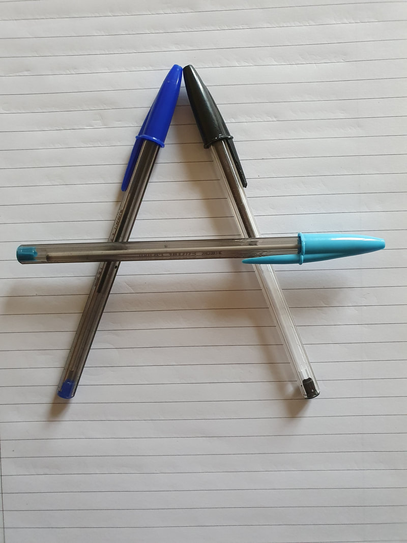
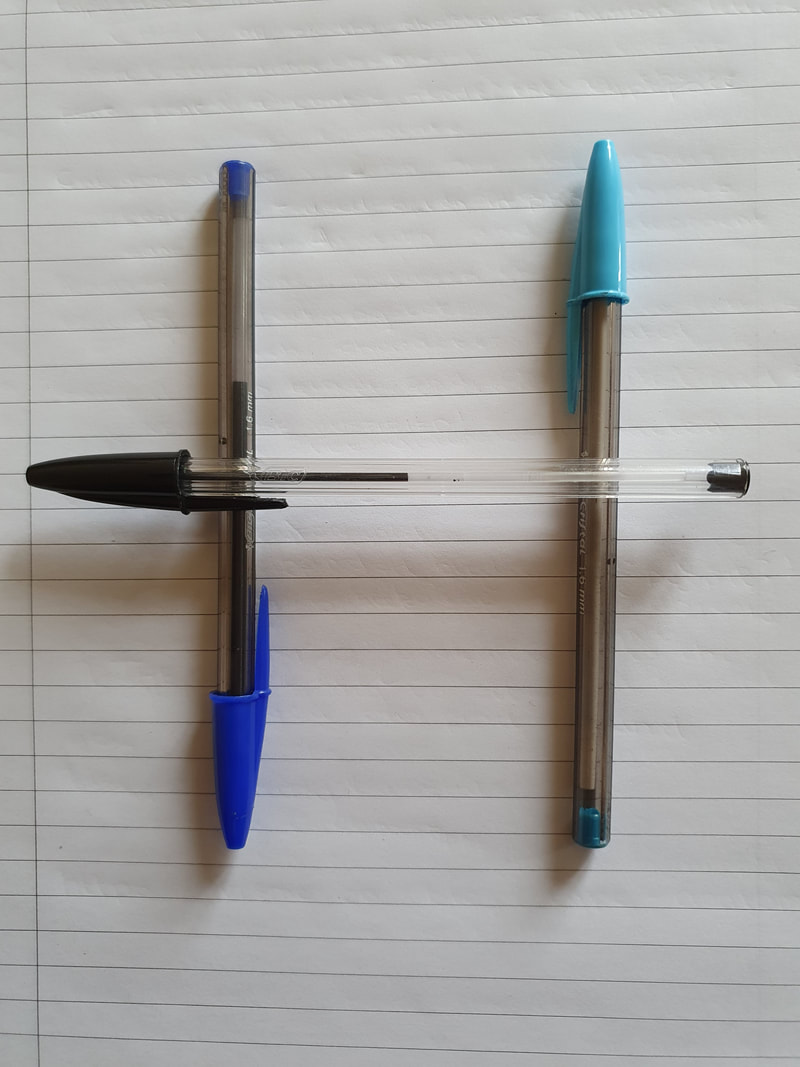
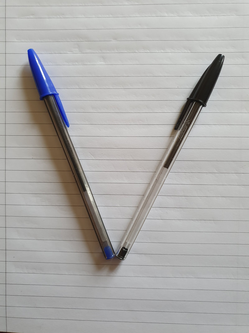
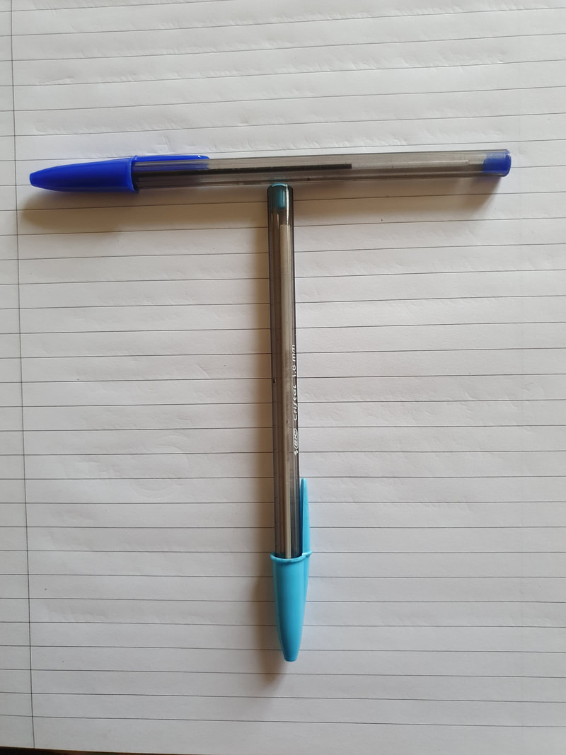
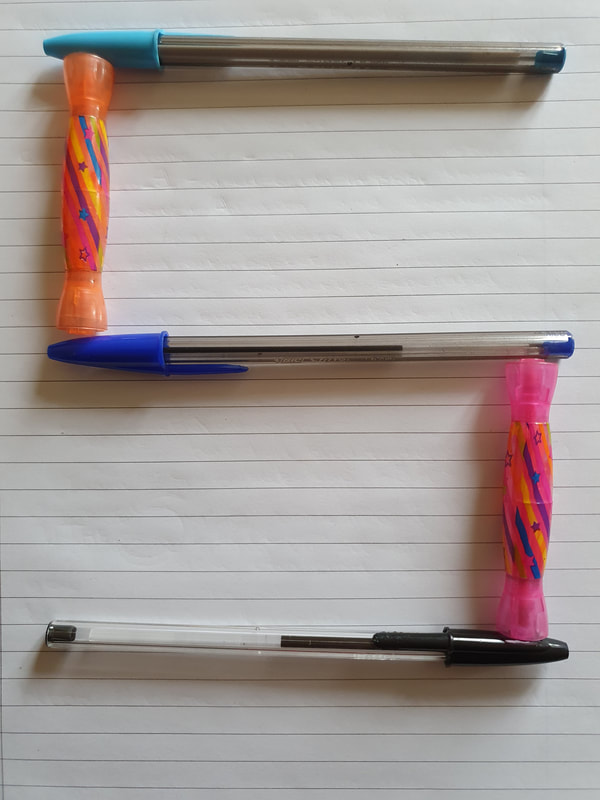
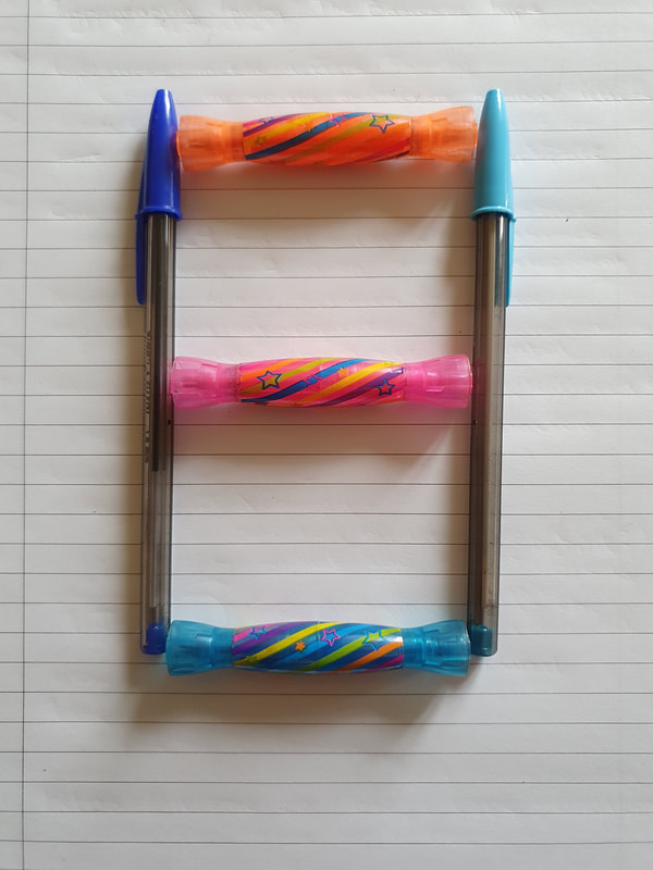
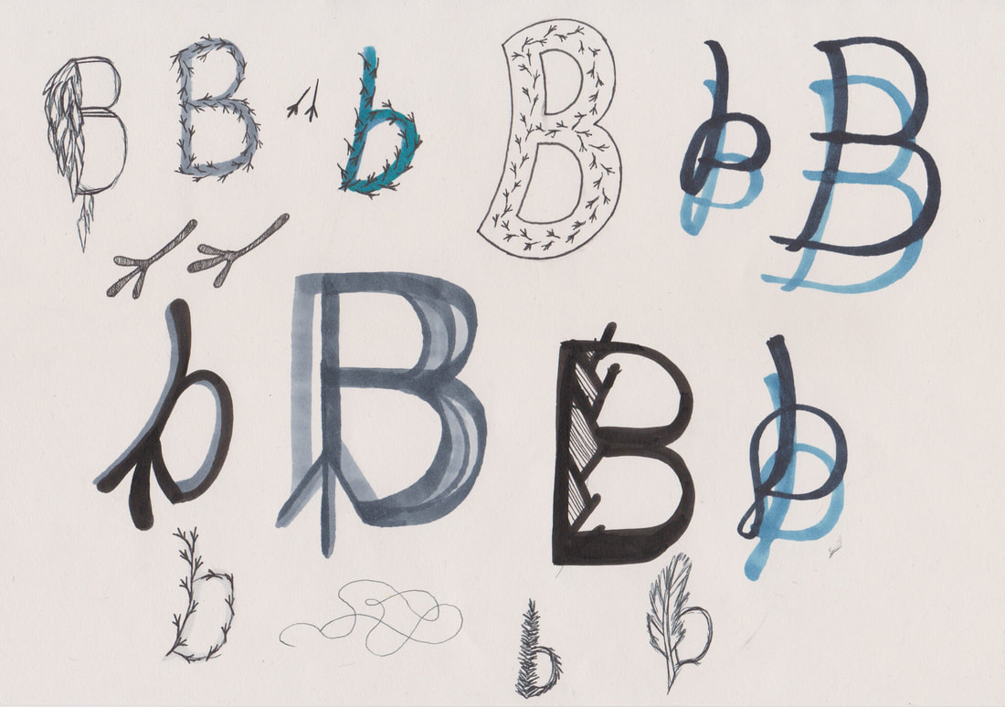
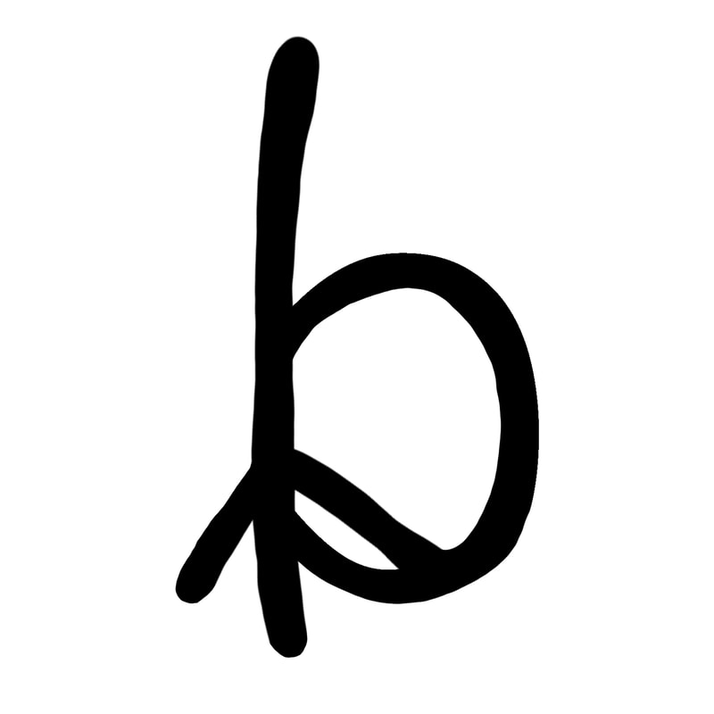
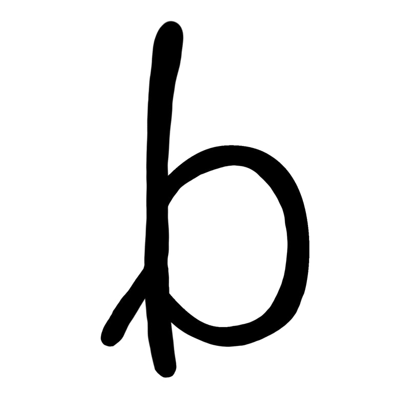
Pen Alphabet
This is my first attempt at creating letters from what I have around me.
The pens worked well to create some of the letters, however the B did not work at all so i don't think I will take this idea any further.
This is my first attempt at creating letters from what I have around me.
The pens worked well to create some of the letters, however the B did not work at all so i don't think I will take this idea any further.
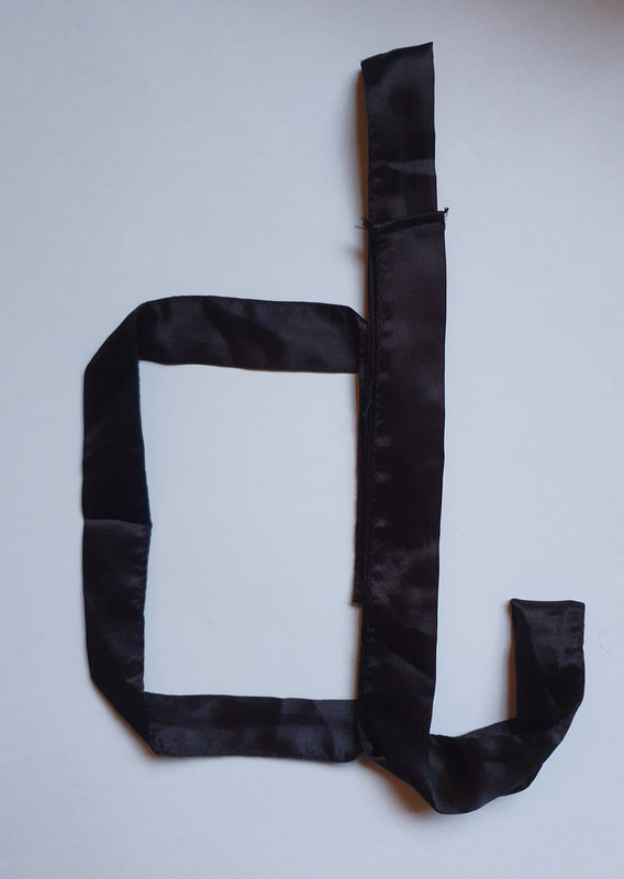
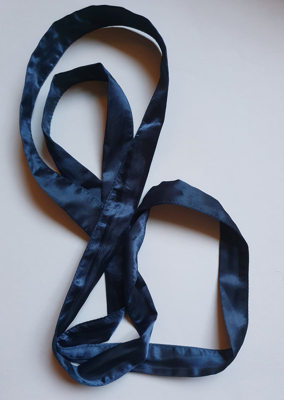
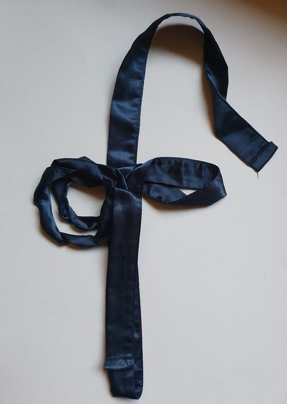
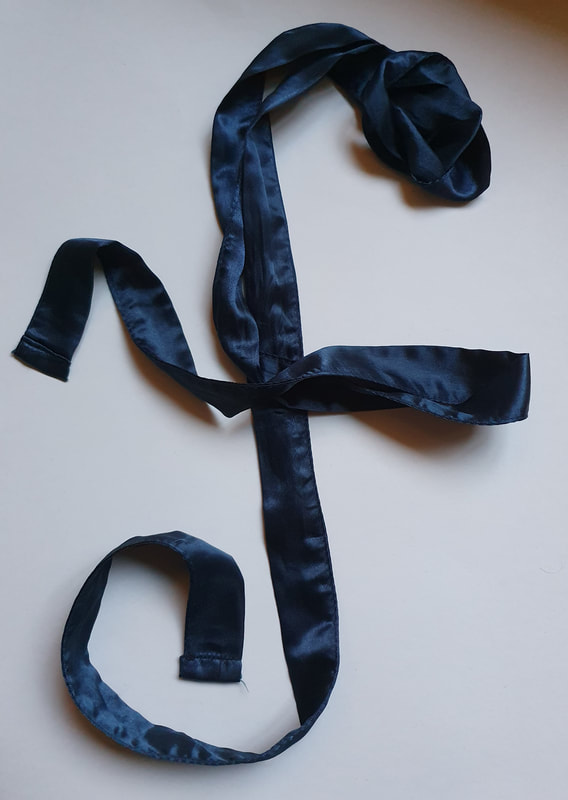
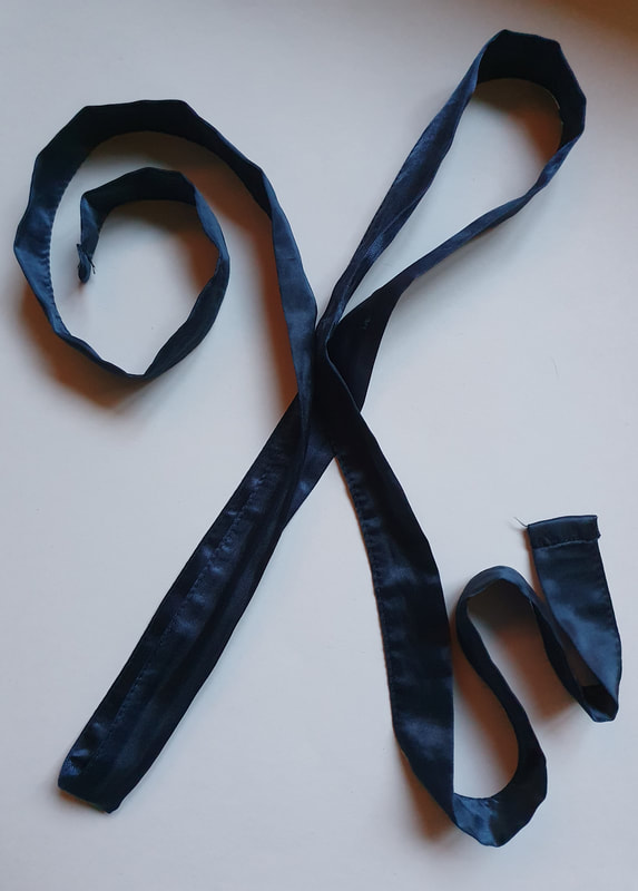
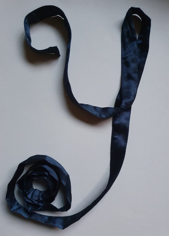
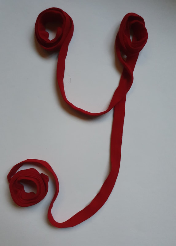
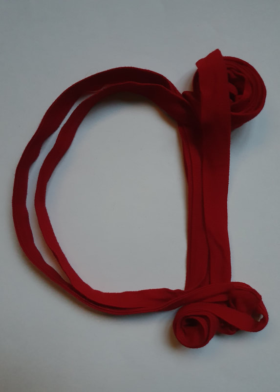
Ribbon Alphabet
I tested how my collection of ribbons could be used to create some letters, I really like how they turned out.
But I think for them to be more effective I would need to construct them on a large piece of paper.
Additionally I think this could be illustrated into an ink design really well.
I tested how my collection of ribbons could be used to create some letters, I really like how they turned out.
But I think for them to be more effective I would need to construct them on a large piece of paper.
Additionally I think this could be illustrated into an ink design really well.
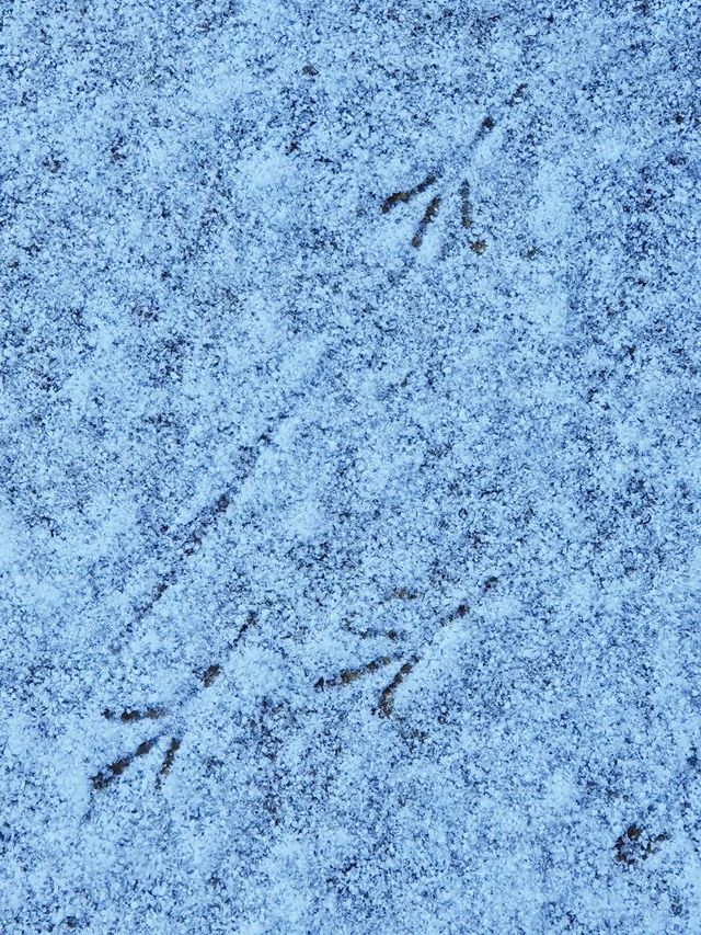
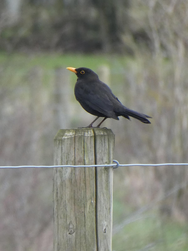
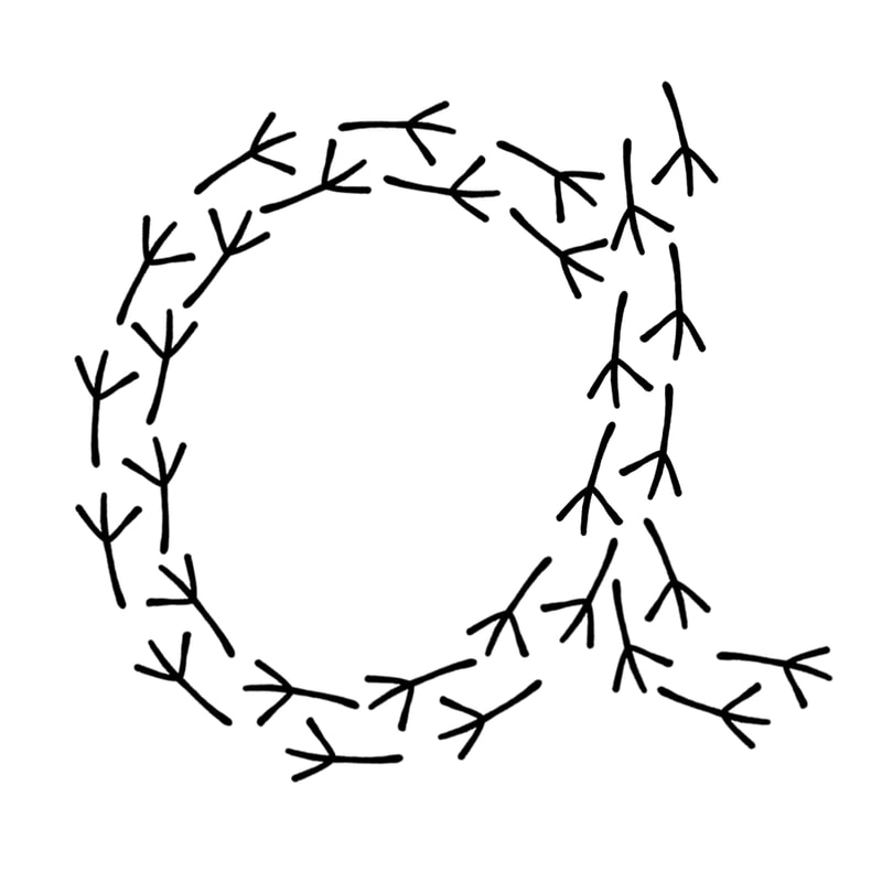
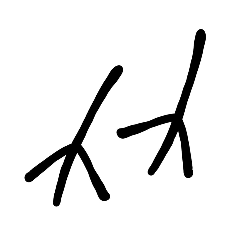
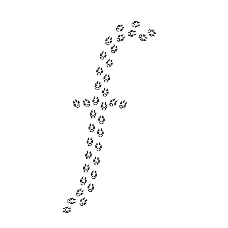
Blackbird Footprints
When I walked out of my door I saw some blackbird footprints in the snow, and I thought “I wonder if I could make this into a typeface”.
I have created some initial testing of this idea but I think that this needs some more experimentation to see if it would be a viable idea to take forward.
When I walked out of my door I saw some blackbird footprints in the snow, and I thought “I wonder if I could make this into a typeface”.
I have created some initial testing of this idea but I think that this needs some more experimentation to see if it would be a viable idea to take forward.
|
|
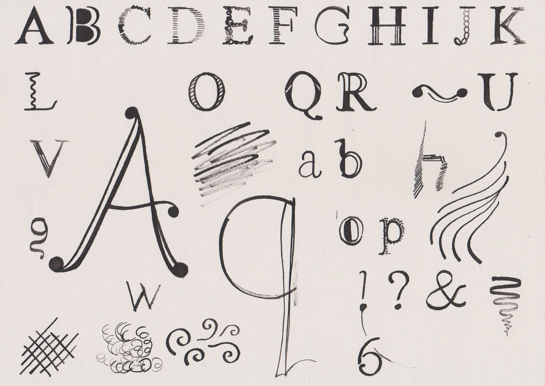
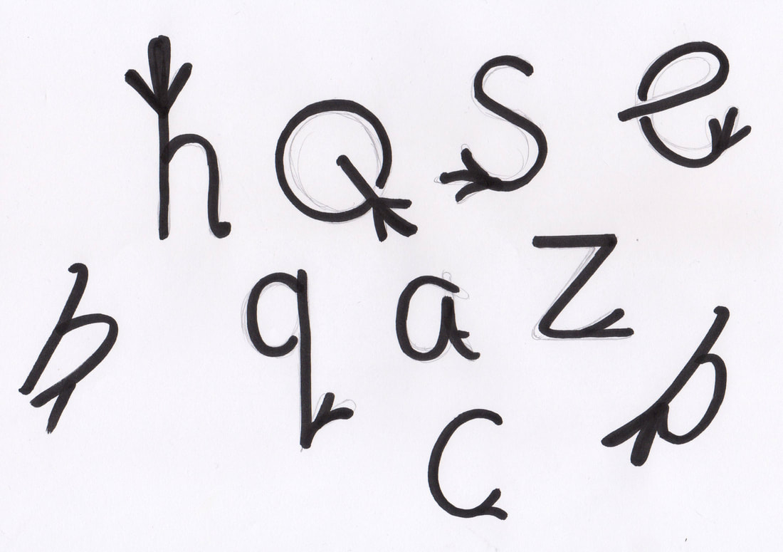
Style Testing
On this I tested different styles of letters to see which I liked best.
On this I tested different styles of letters to see which I liked best.
|
|
Week 2: Ampersand
Task 1:
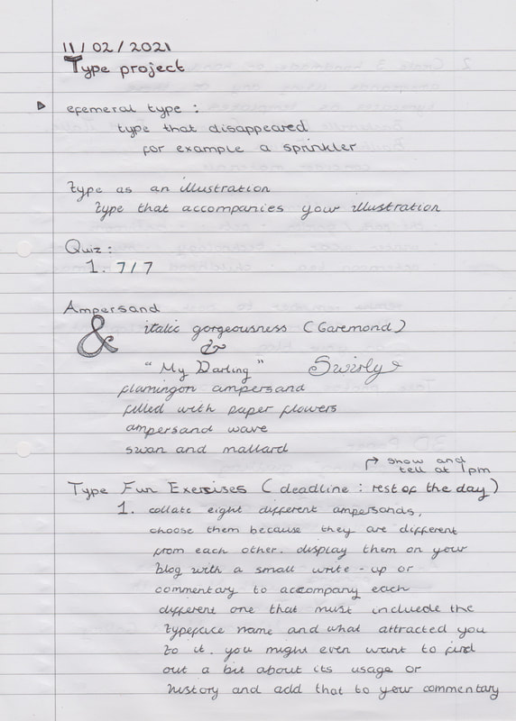
Collate eight different ampersands. Choose them because they are different from each other. Display them on your blog/website with a small write-up or commentary to accompany each different one that must include the typeface name and what attracted you to it
Collate eight different ampersands. Choose them because they are different from each other. Display them on your blog/website with a small write-up or commentary to accompany each different one that must include the typeface name and what attracted you to it
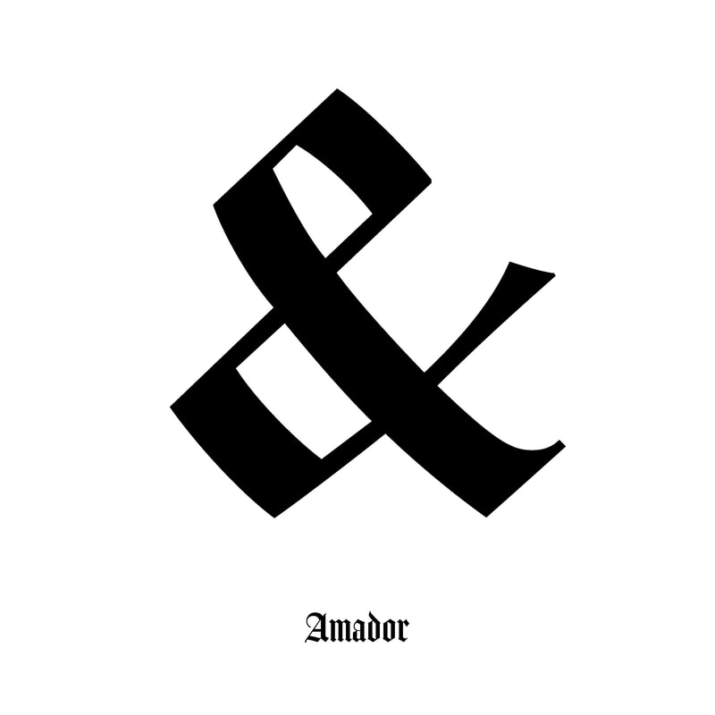
Amador
I picked the Amador ampersand because I liked how angular it is, it has a calligraphic quality that reminded me of traditional illuminated texts. However the blocky opaque letter makes it have a more modern appearance. 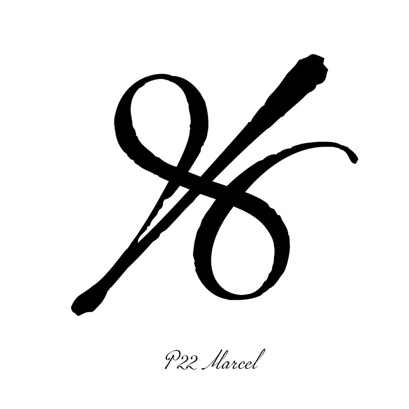
P22 Marcel
What attracted me to this ampersand is the fact that it doesn’t look at lot like a traditional ampersand, it leans more towards the appearance of a percentage sign. However I really like its appearance. |
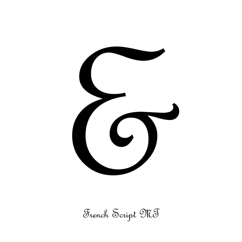
French Script MS
I like the appearance of this ampersand because of the way that the curl of the lower half of the E points out of the ampersand perpendicular to the top line. This creates an interesting appearance where the ampersand looks like it is pointing right. 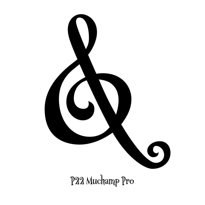
P22 Muchamp Pro
I liked this ampersand because it looks like a musical note, I additionally was drawn to the swirly pattern that has been used on this ampersand, I usually swirl my wetting when I am trying to write nicely so this reminded me of the type of ampersand that I would draw. |
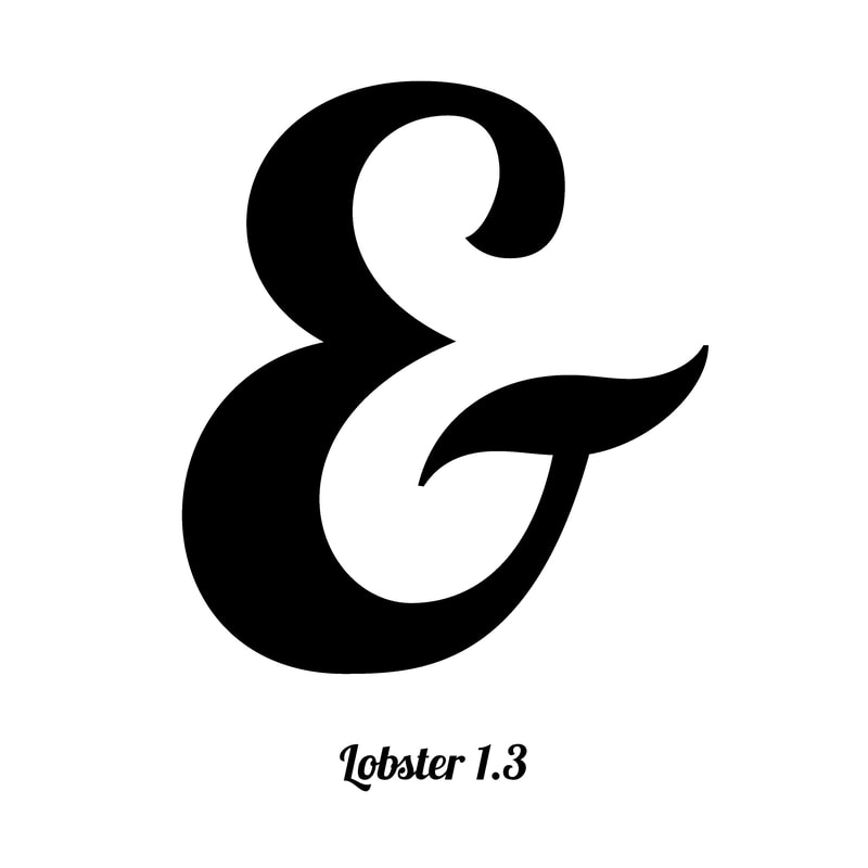
Lobster 1.3
I feel like this ampersand has its own character, it is fun and bold. It evokes feelings of confidence. I was also drawn to this ampersand because the bar reminded me of a moustache which made me smile. 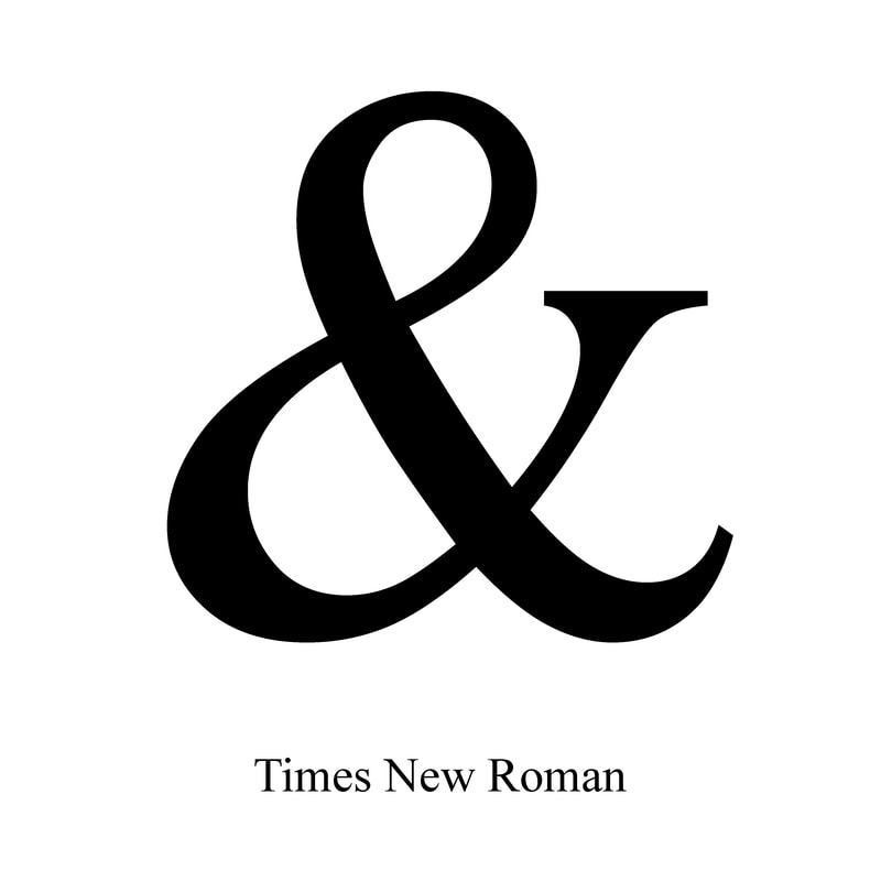
Times New Roman
This is a classic ampersand that I recognised so I was draw to it my memory, I like the mix of curved and angular lines in Times New Roman, it creates a nice balance that gives this ampersand a timeless quality. |
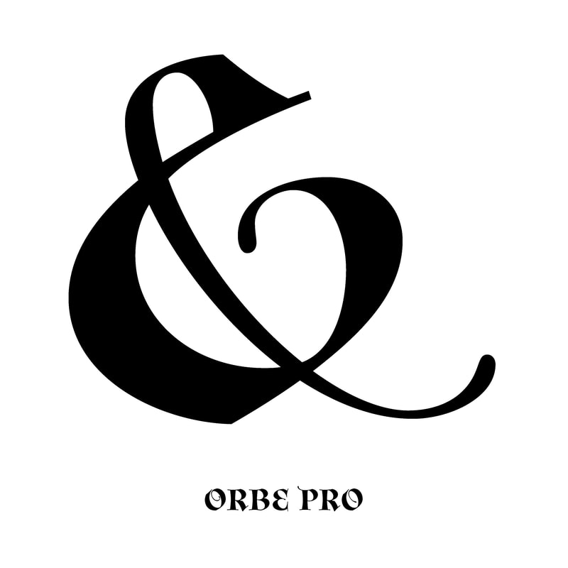
Orbe Pro
I think this ampersand is very elegant, it embodies an air of sophistication whilst also being expressive. I love the lyrical movement within this ampersand, it feels like it is moving which is what attracted me to this ampersand. 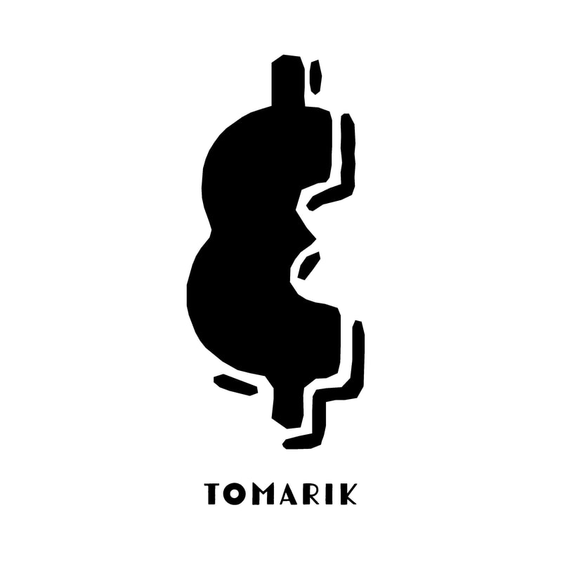
Tomarik
I really liked the ampersand of Tomarik because it has an appearance that is reminiscent of Aztec designs, the way that the shape is assented by a broken border also appealed to me. It is the most different ampersand in this collection, which makes in stand out. |
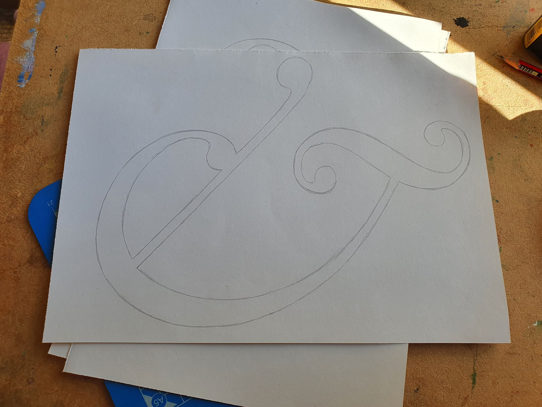
Task 2:
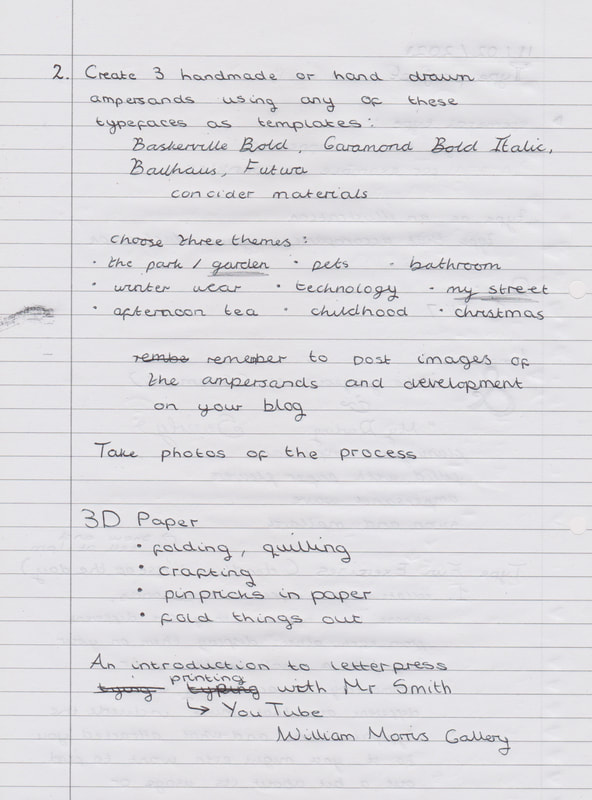
Create three handmade or hand drawn ampersands using any of these typefaces as templates: Baskerville Bold, Garamond Bold Italic, Bauhaus, Futura
Consider your materials, approach and techniques carefully and appropriately e.g. papercutting, watercolour, potato print, pen and ink, scalpel, ruler and cutting board, shadow/light projection, thread... etc. Choose three themes from the following list: THE PARK/GARDEN, PETS, BATHROOM, WINTER WEAR, TECHNOLOGY, MY STREET, AFTERNOON TEA, CHILDHOOD, CHRISTMAS.
|
|
|
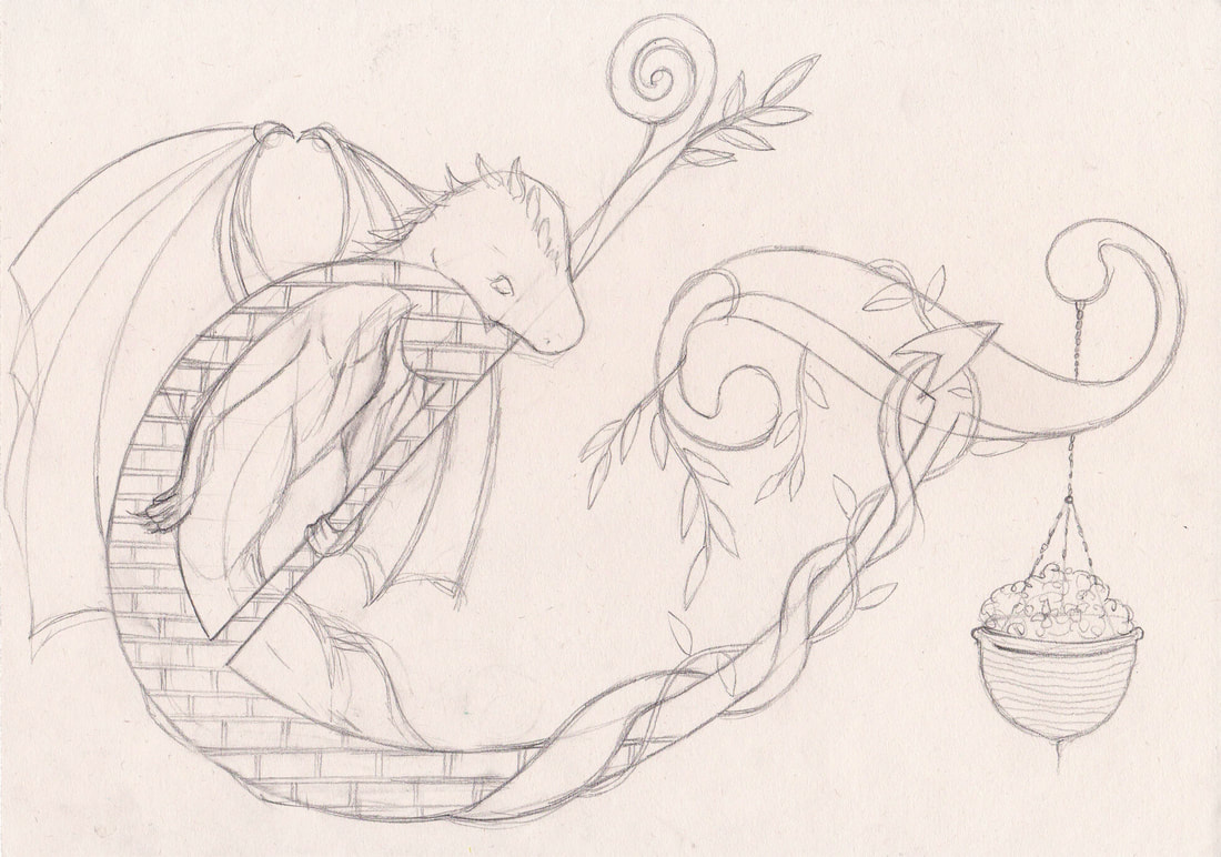
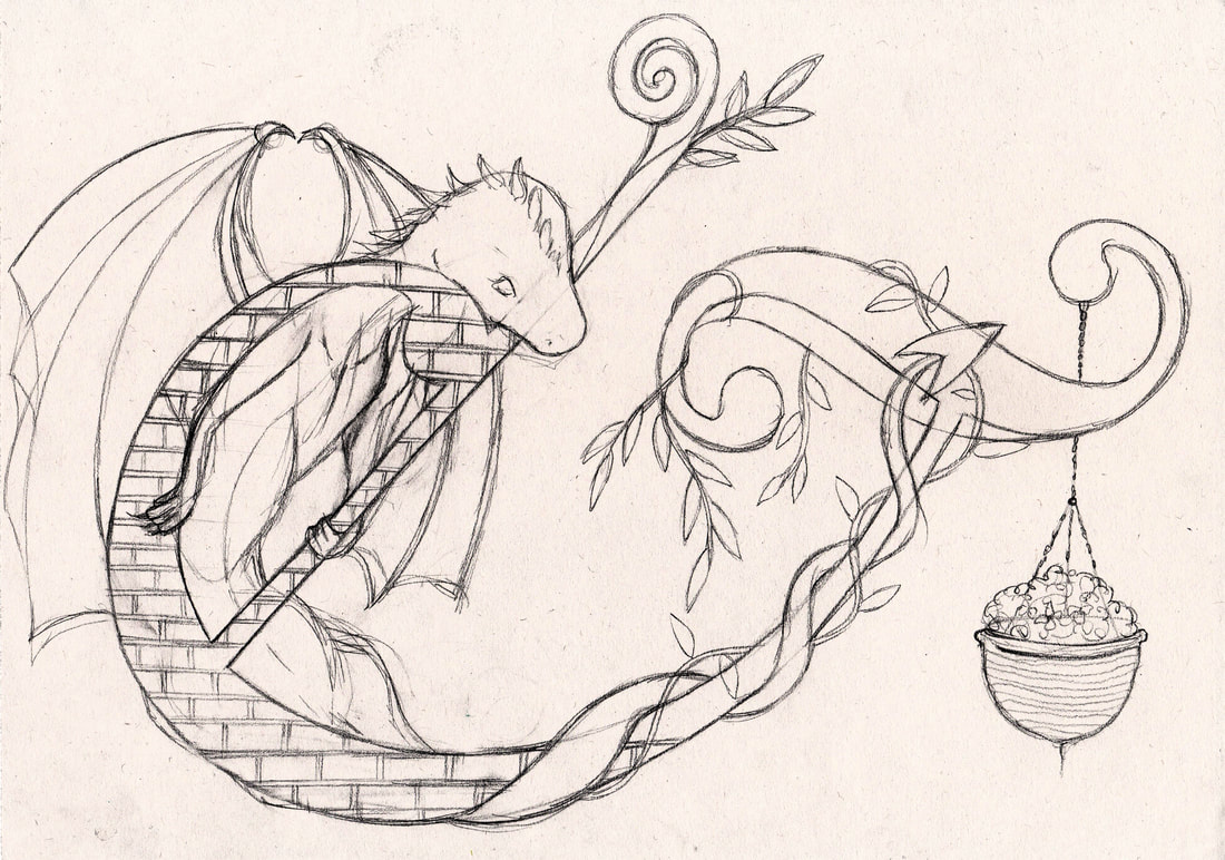
My Street
This ampersand is based on "my street" I have included what I could see from my window which includes a
willow dragon that my mum made, the brick pattern of my house, a hanging basket and the leaves of a nearby bush.
|
|
|
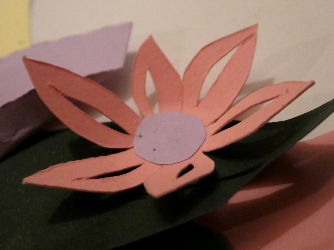
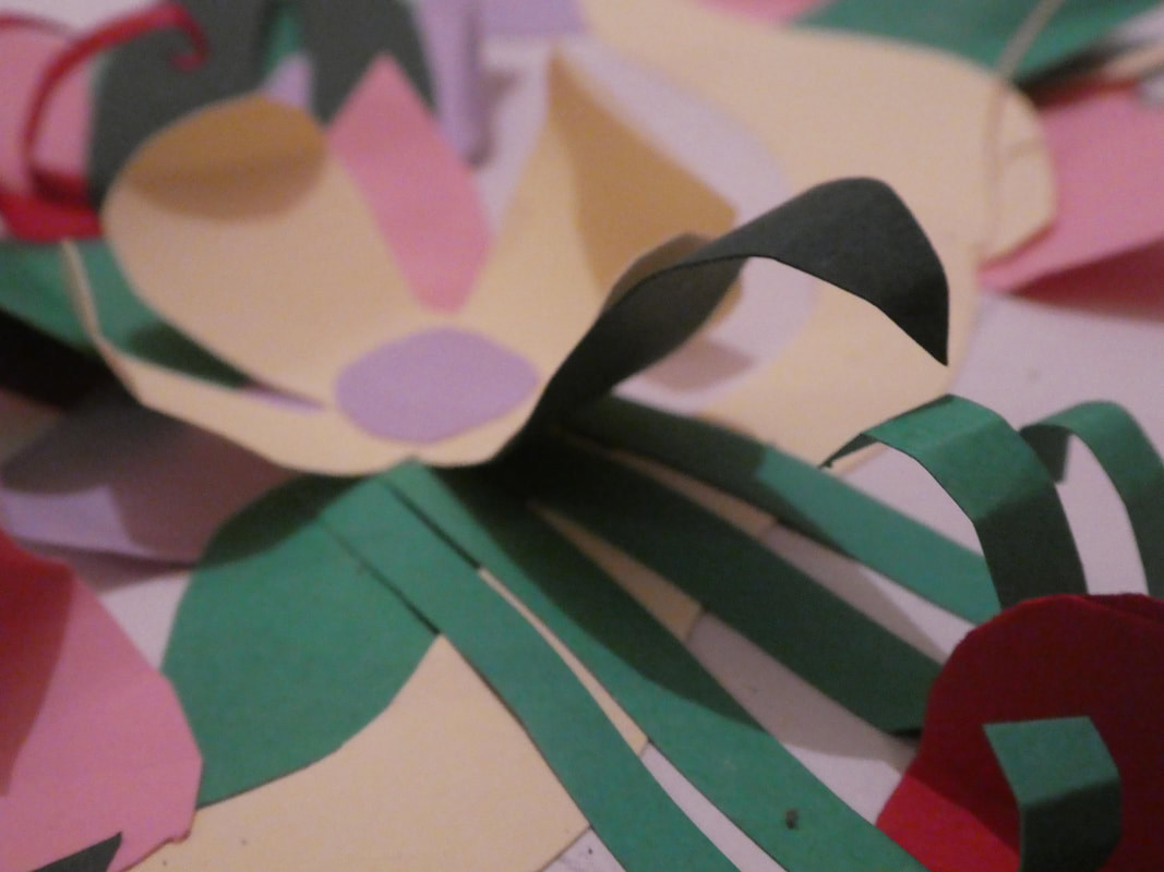
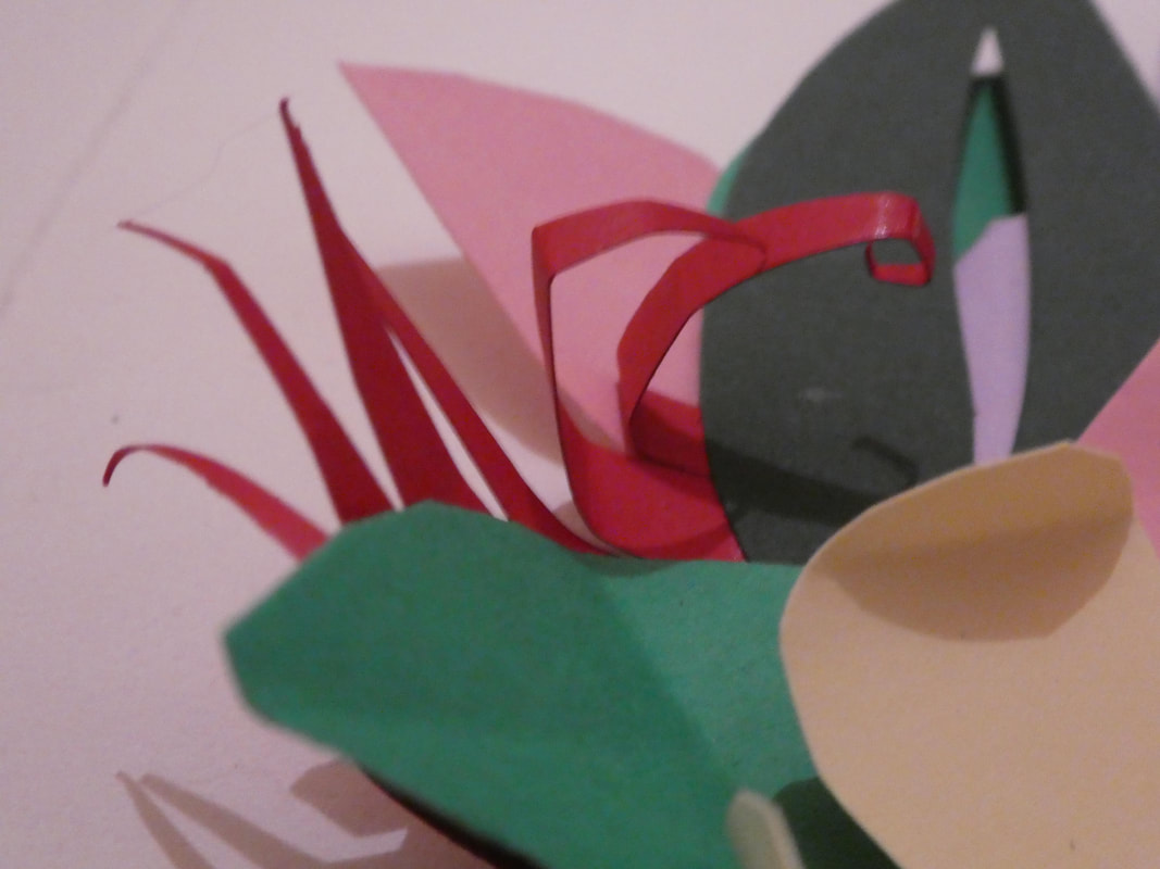
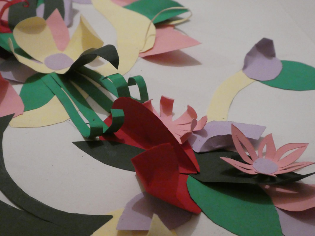
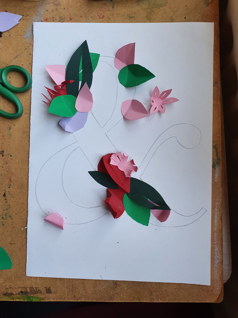
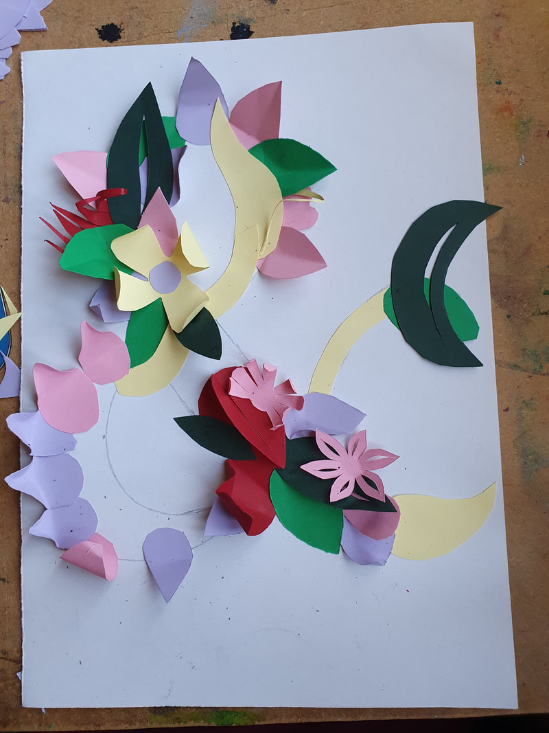
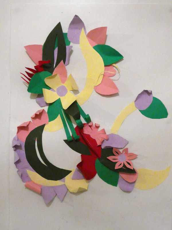
Garden
I created this ampersand based on the "garden" I used a collection of paper flowers and leaves to construct this letter, this gave me the opportunity to
experiment with the medium of paper. Which I think is something I could explore further as part of the "DIY Alphabet" project.
|
|
|
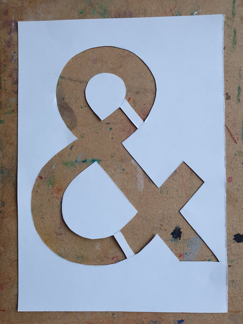
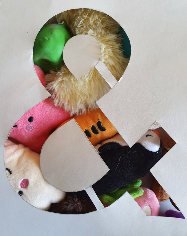
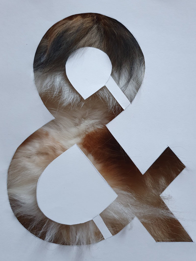
Pets
For this task I cut out the ampersand and used it to put on top of my dogs toys, and her fur. I really liked the way that this worked.
My Lecture Notes and a video shown during the lecture.
|
|
|
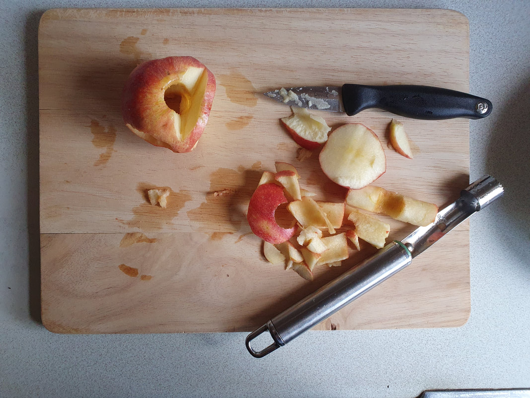
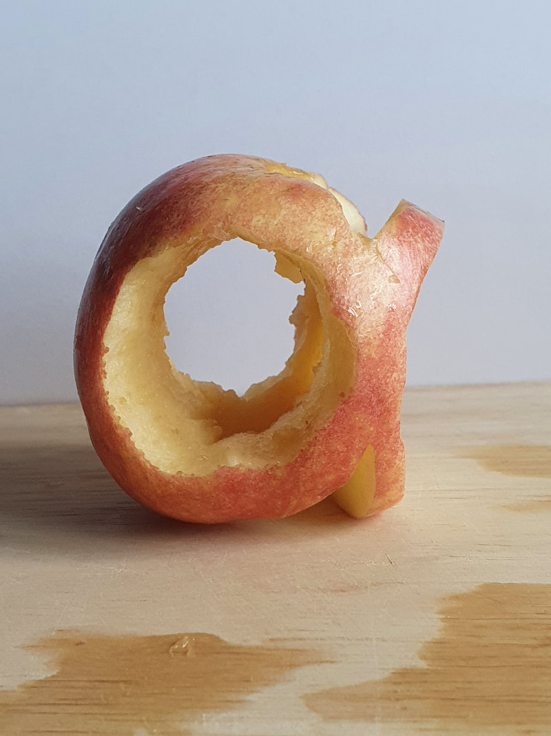
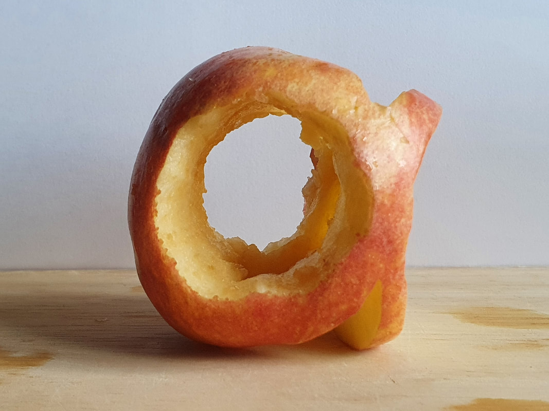
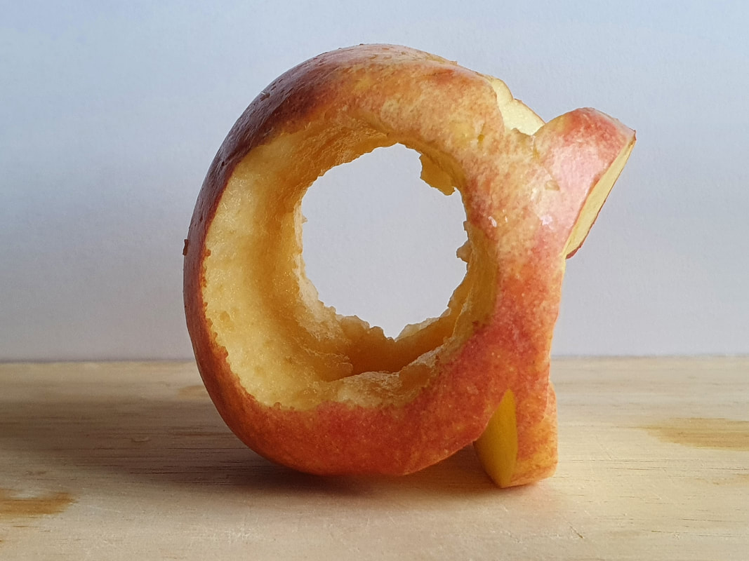
An Apple A
I had the idea of making a letter out of an apple, the idea worked well in theory but it was harder to do in real life.
I think it worked really well for the letter a; however other letters that have a leg, arm or tail wouldn't work as well.
I had the idea of making a letter out of an apple, the idea worked well in theory but it was harder to do in real life.
I think it worked really well for the letter a; however other letters that have a leg, arm or tail wouldn't work as well.
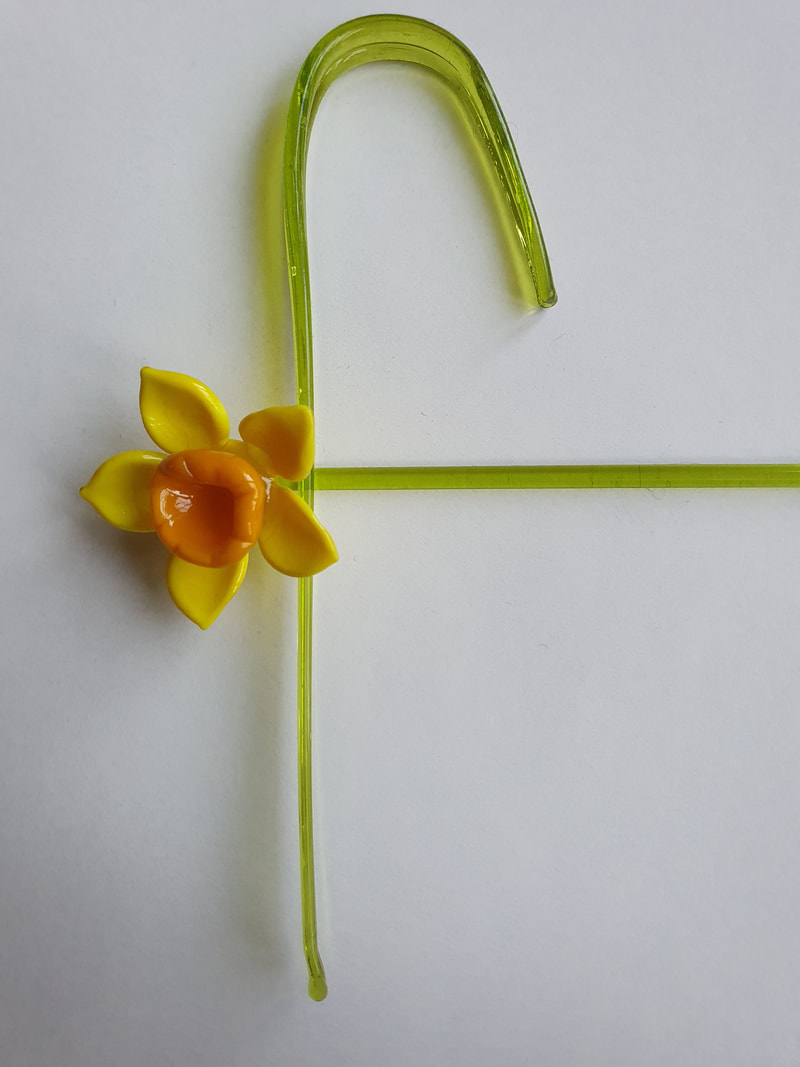
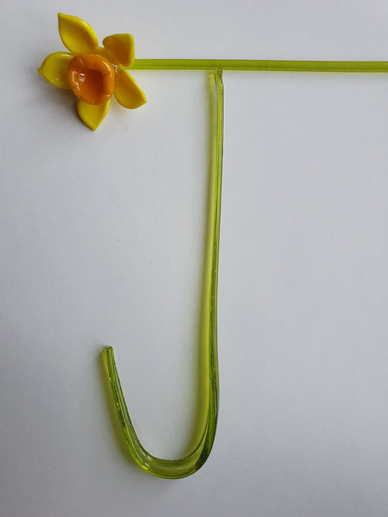
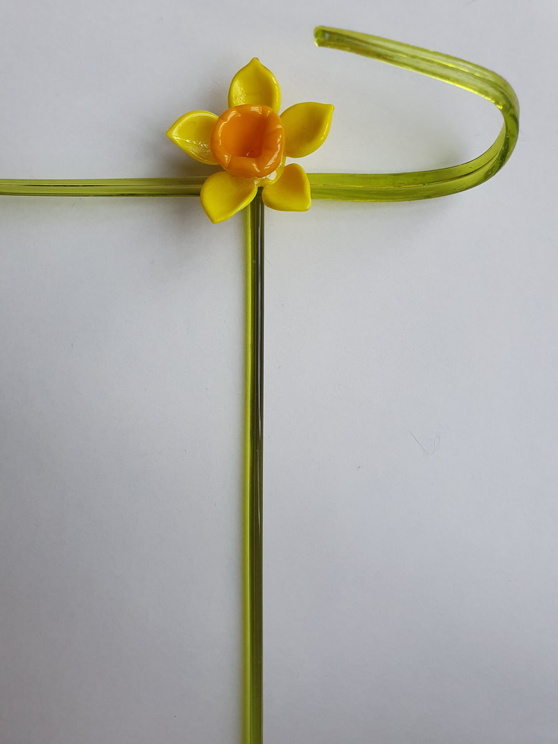
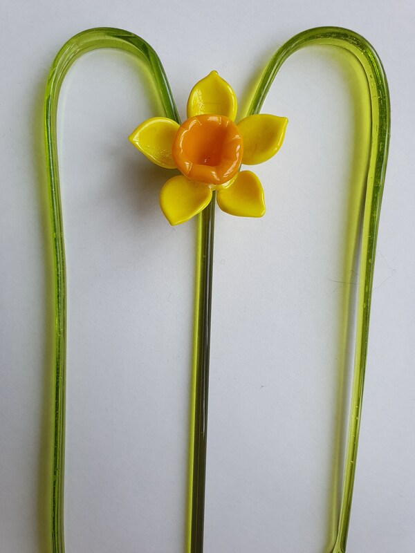
Glass Daffodil Alphabet
Being limited by the shapes of my glass daffodils was a challenge, I found it quite difficult to make the letters that I wanted to make.
However I do think that if this concept was taken further into an illustration it would be more effective.
Overall I really liked how the glass shone, it created a very pleasing effect.


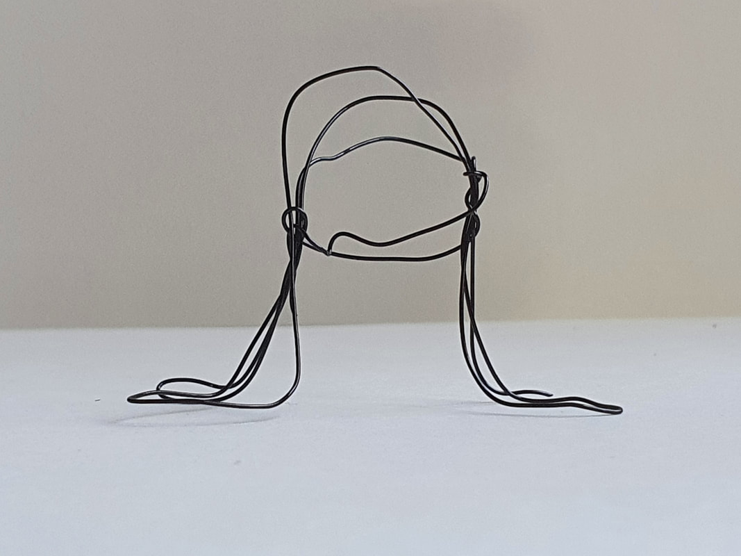
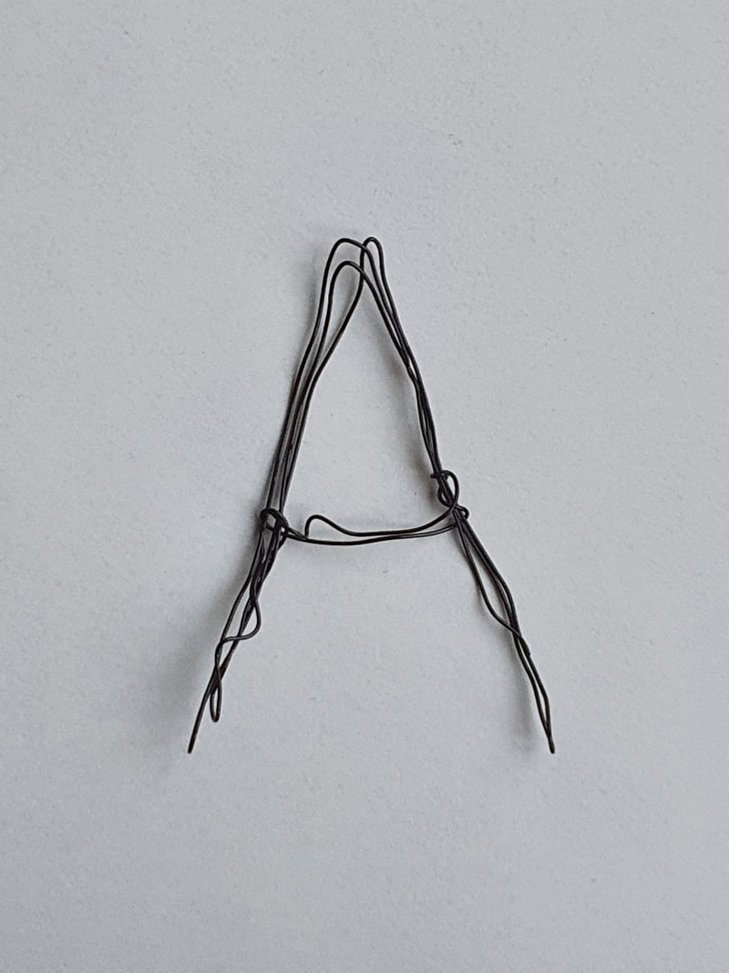
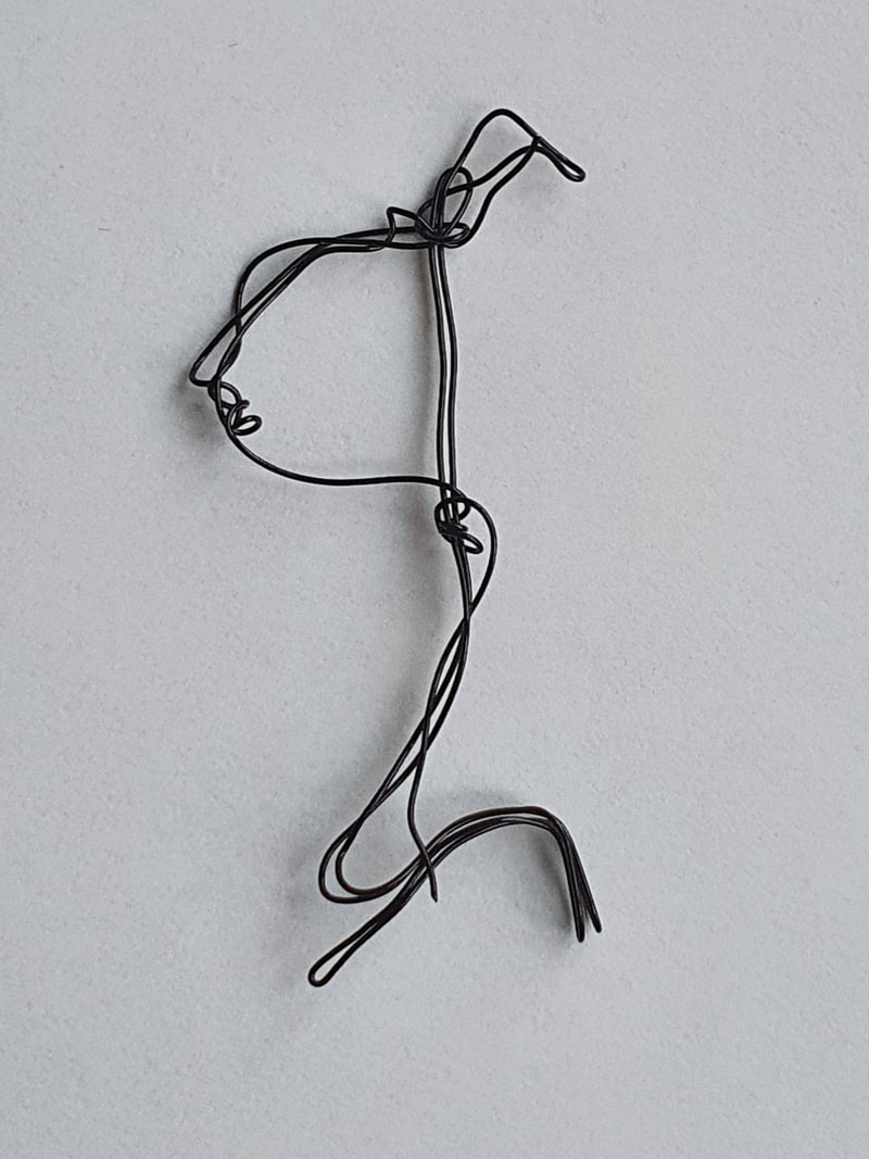
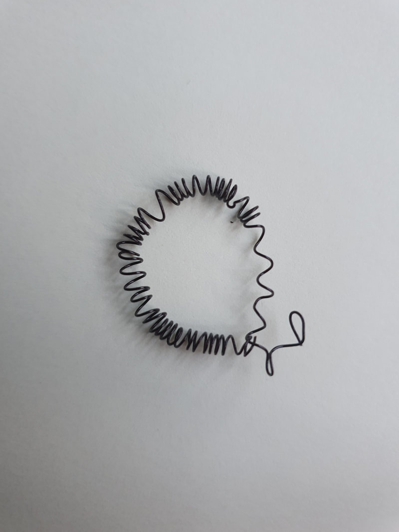
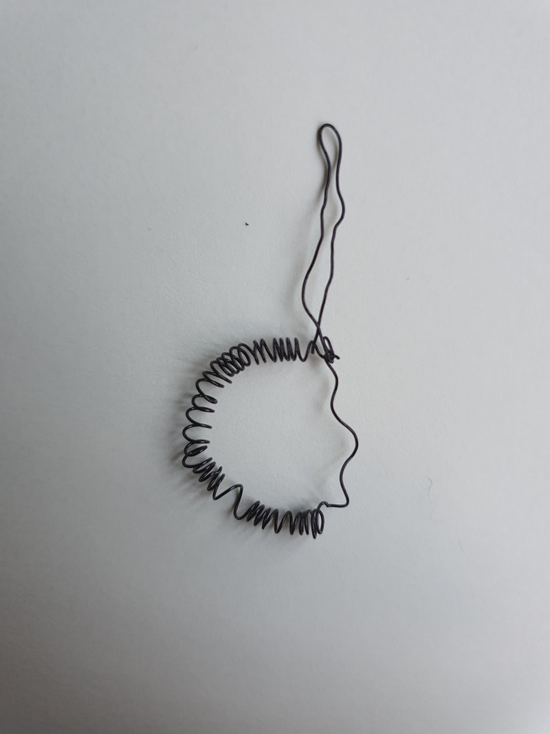
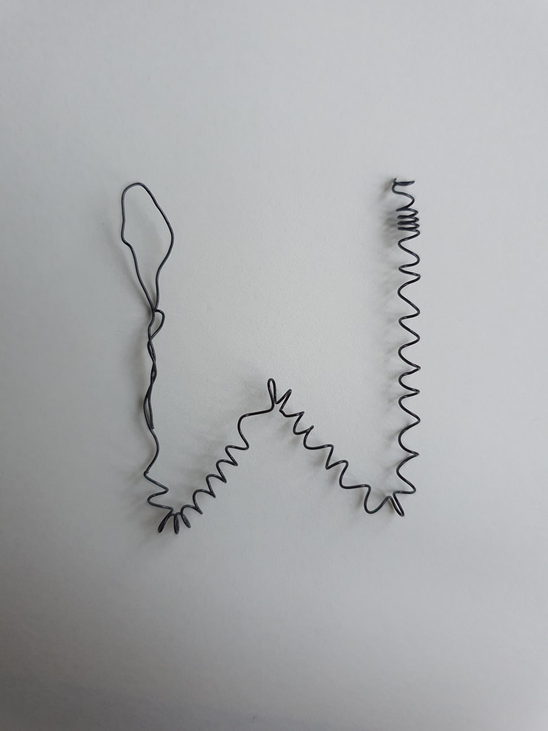
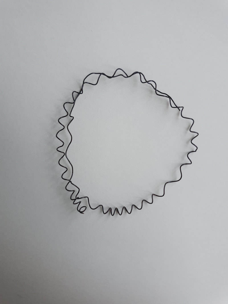
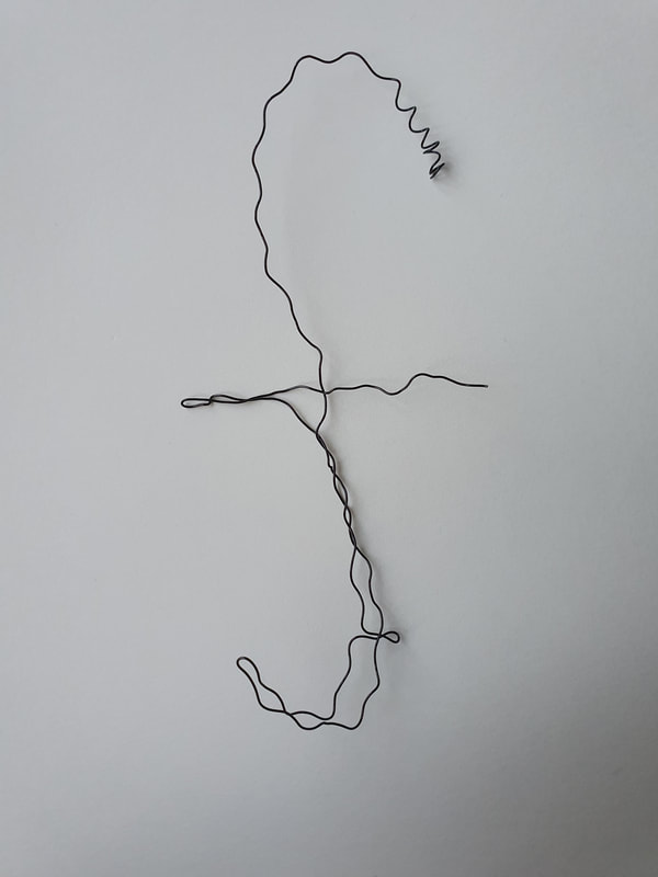
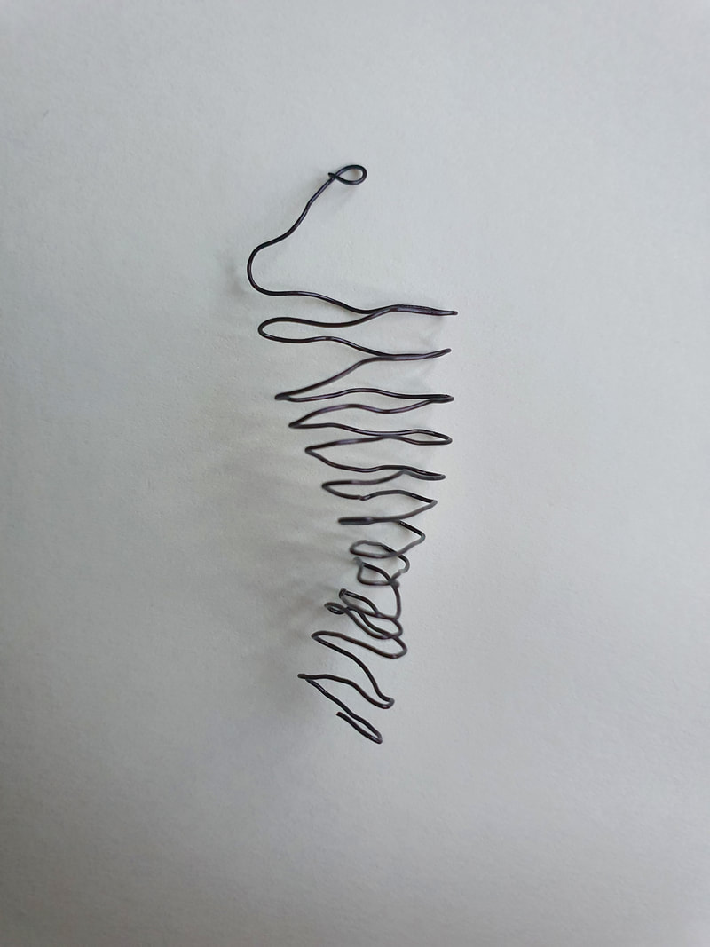
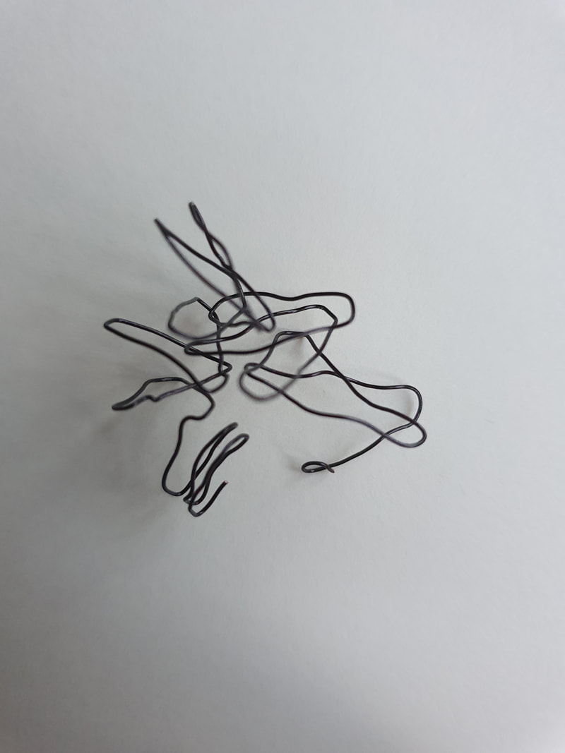
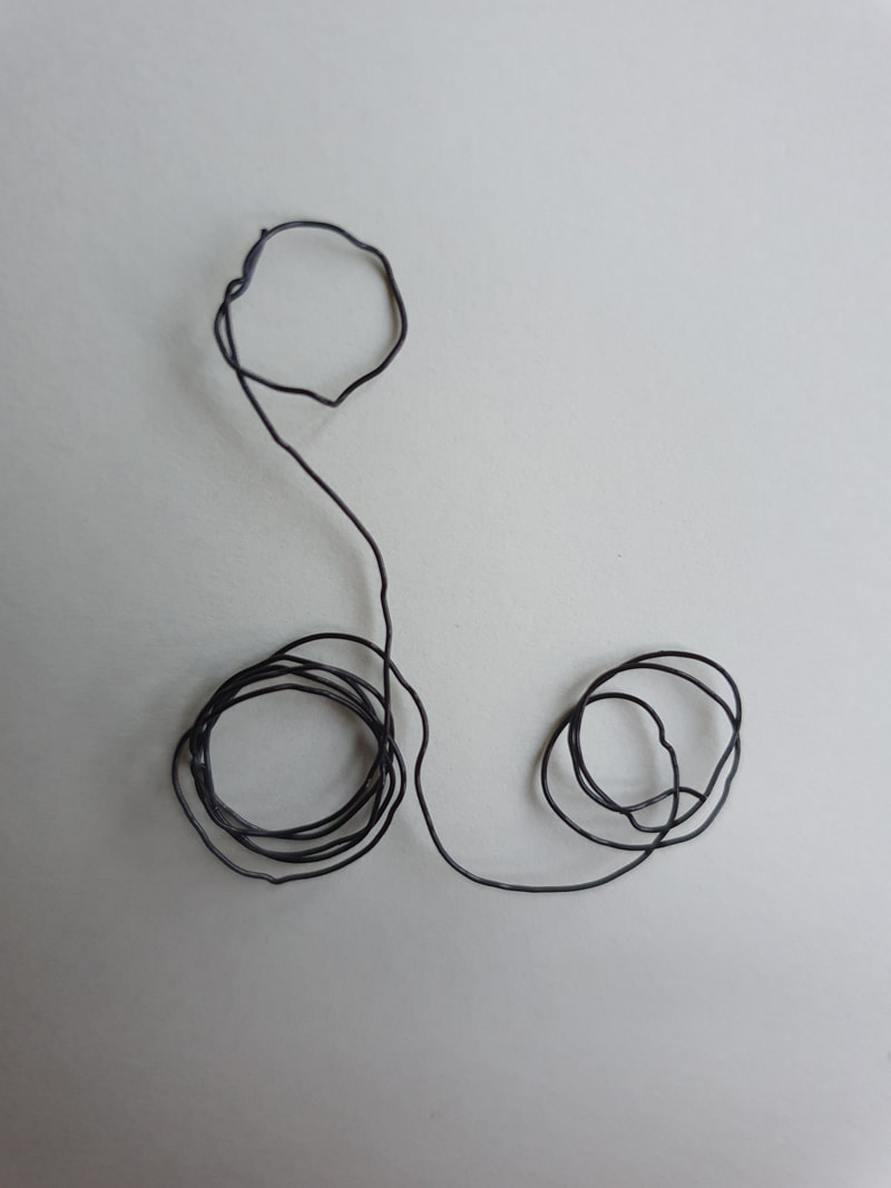
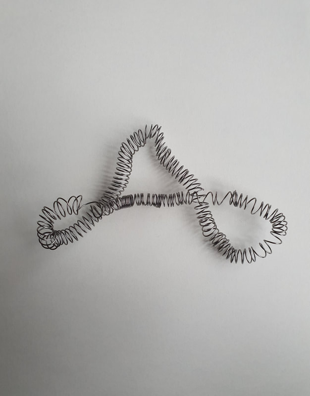
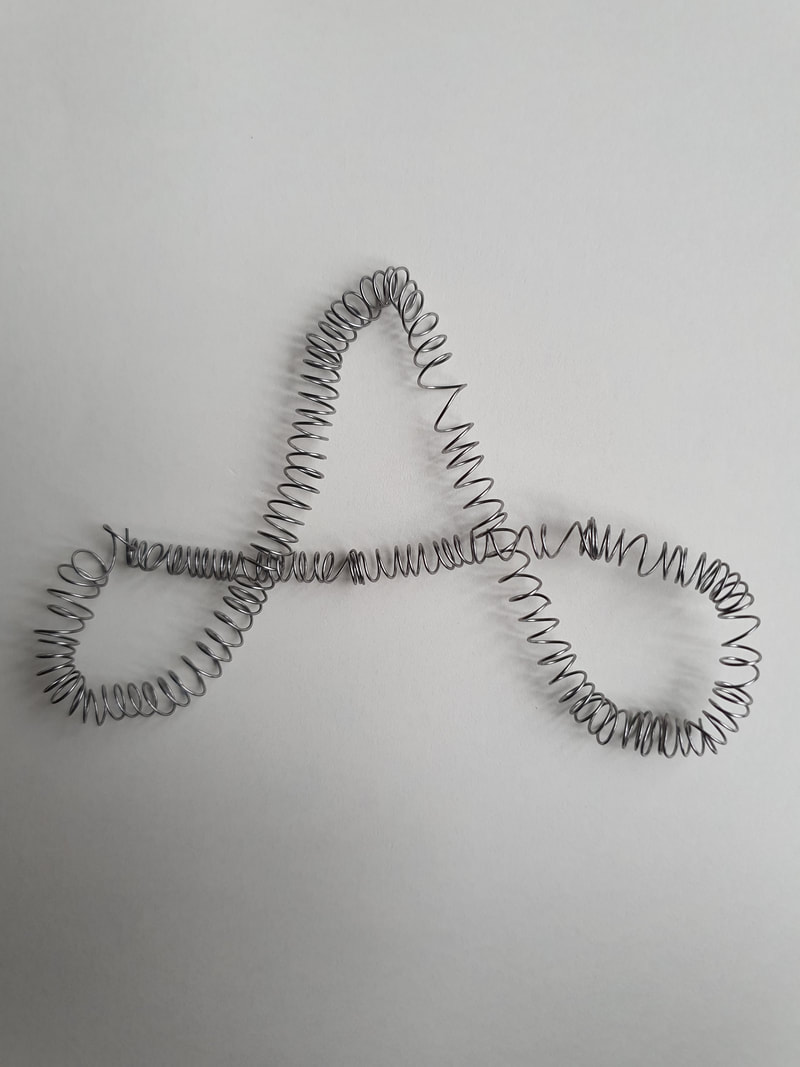
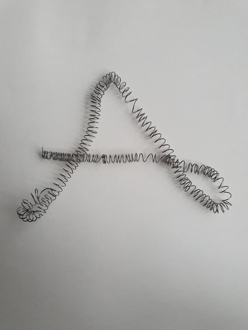
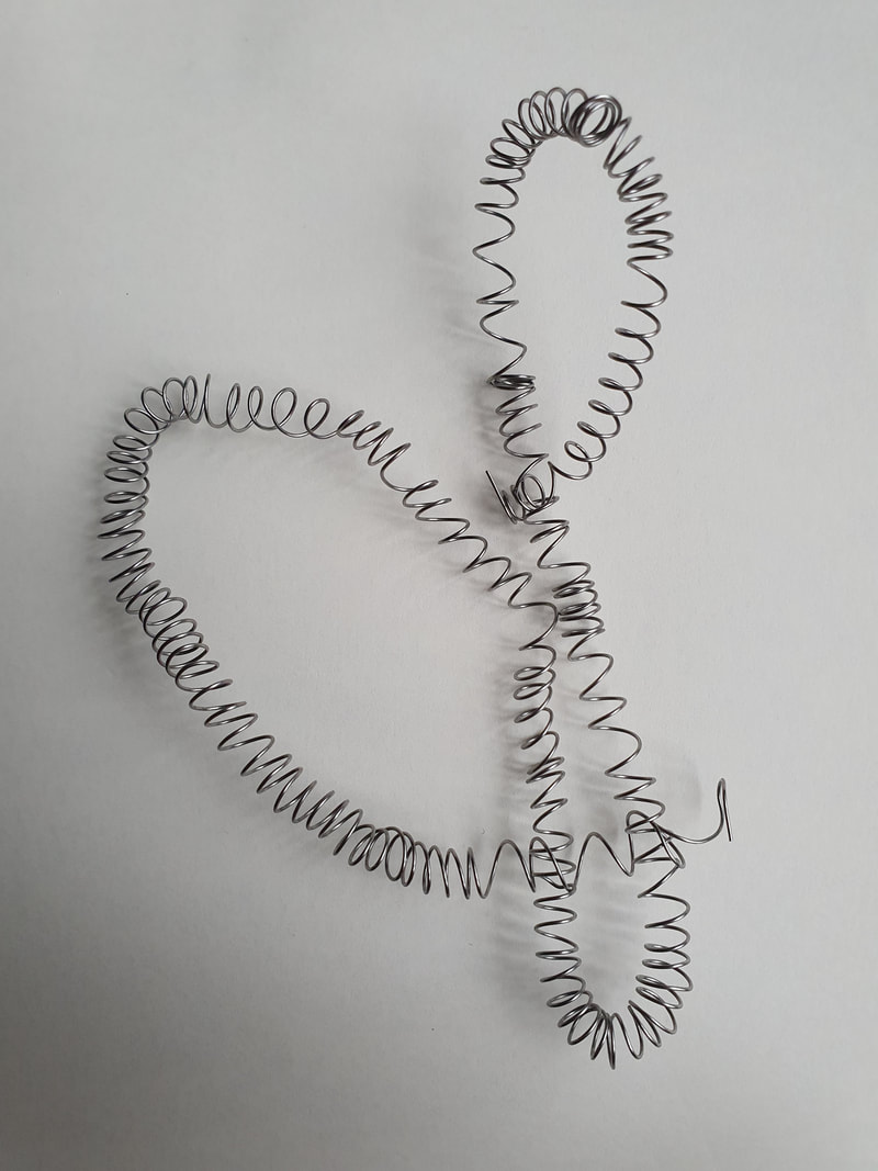
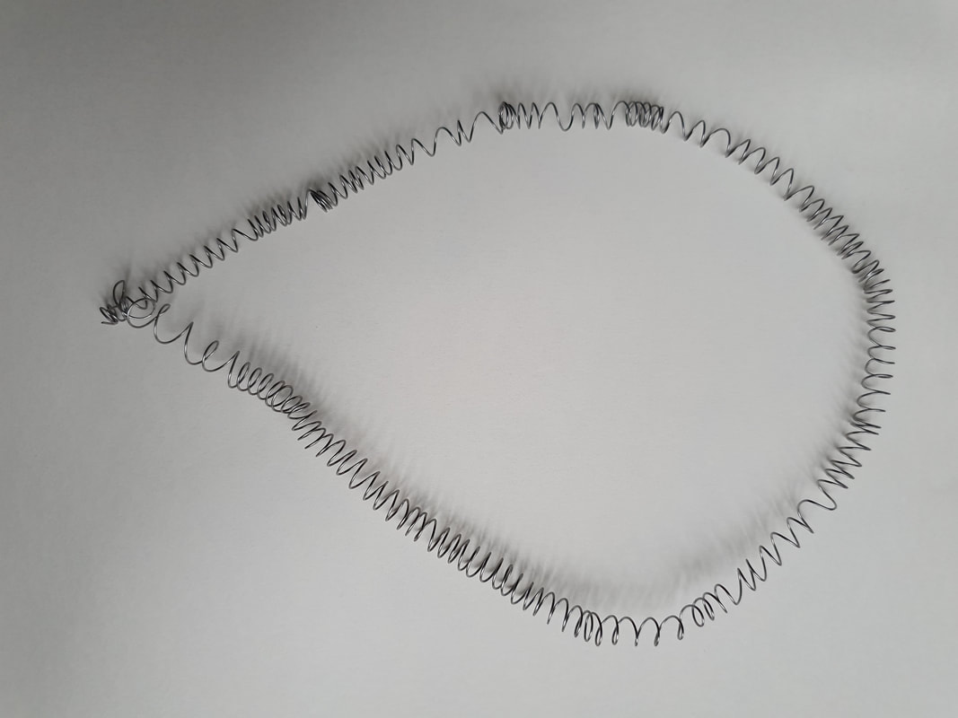
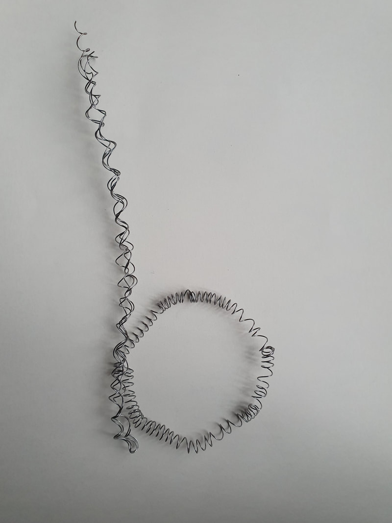
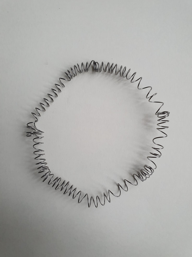
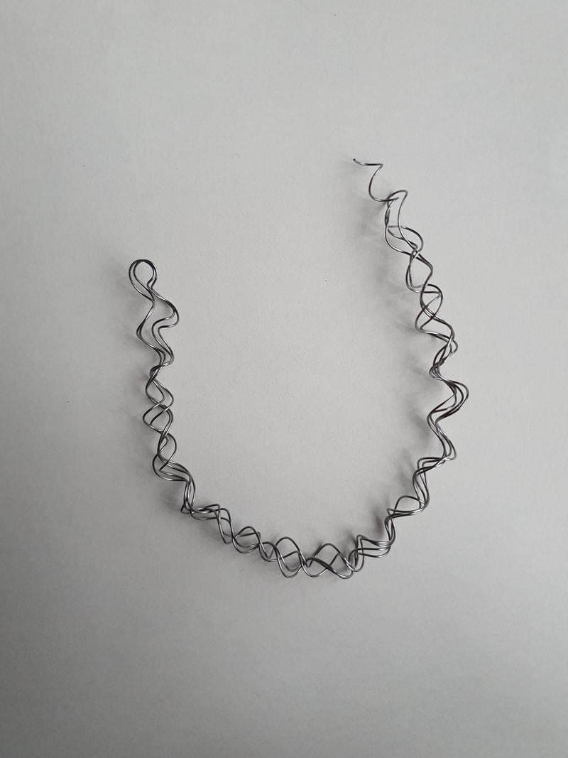
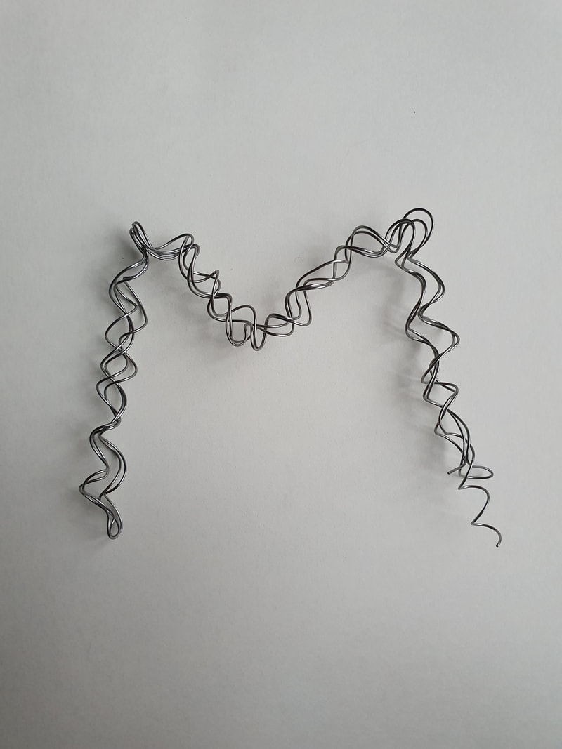
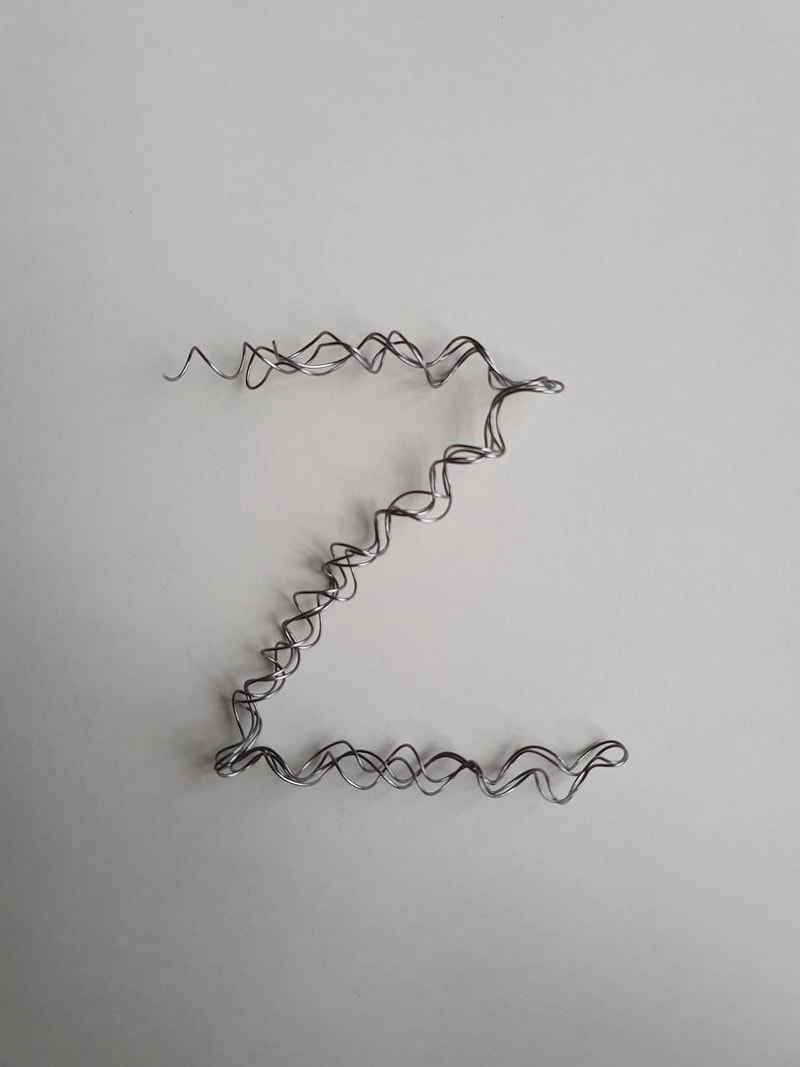
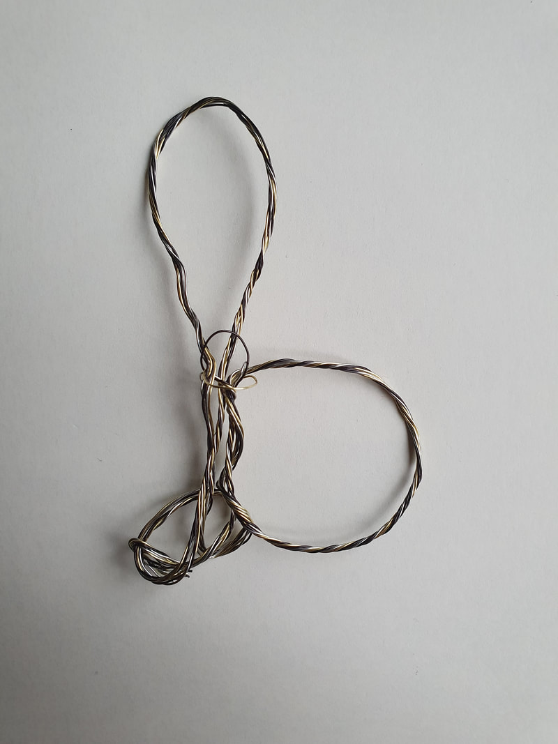
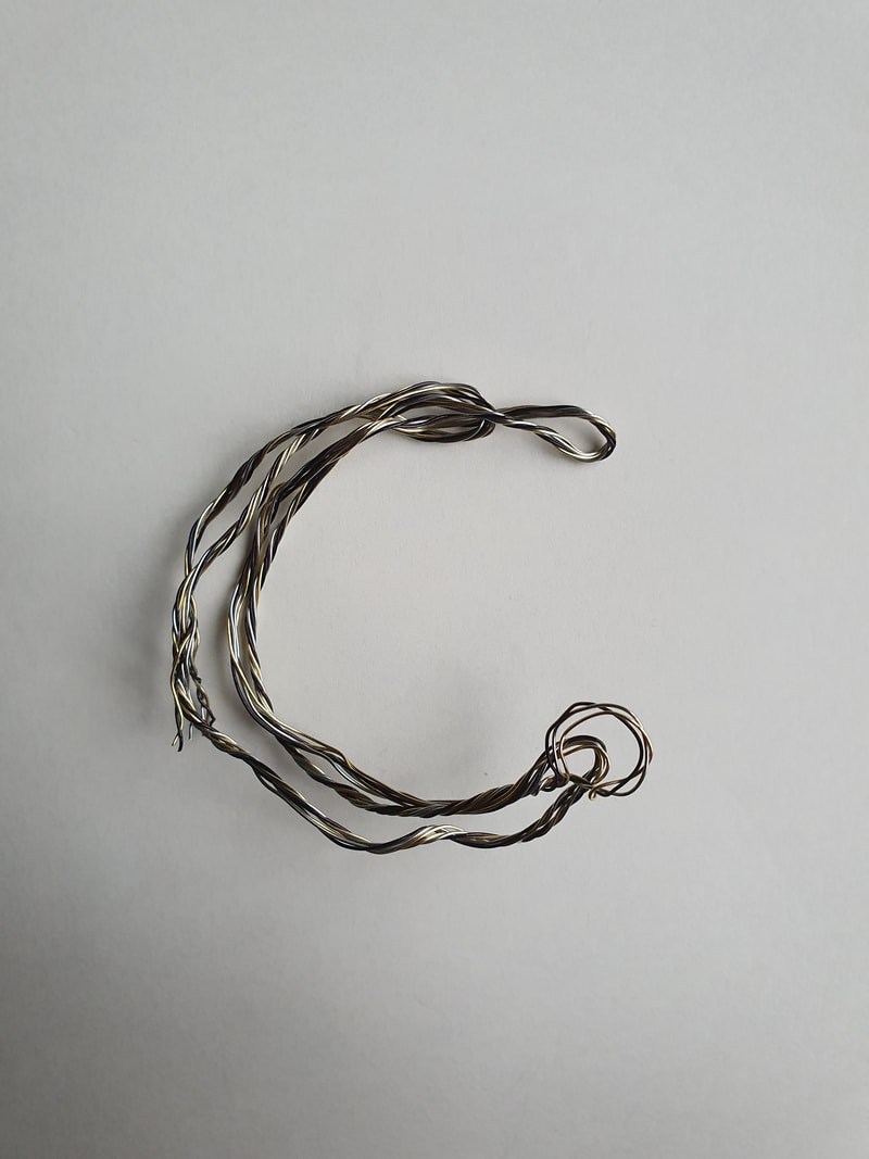
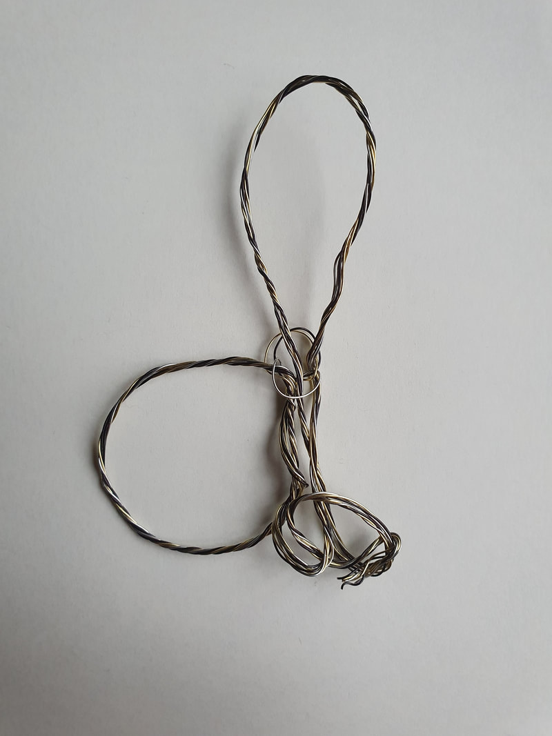
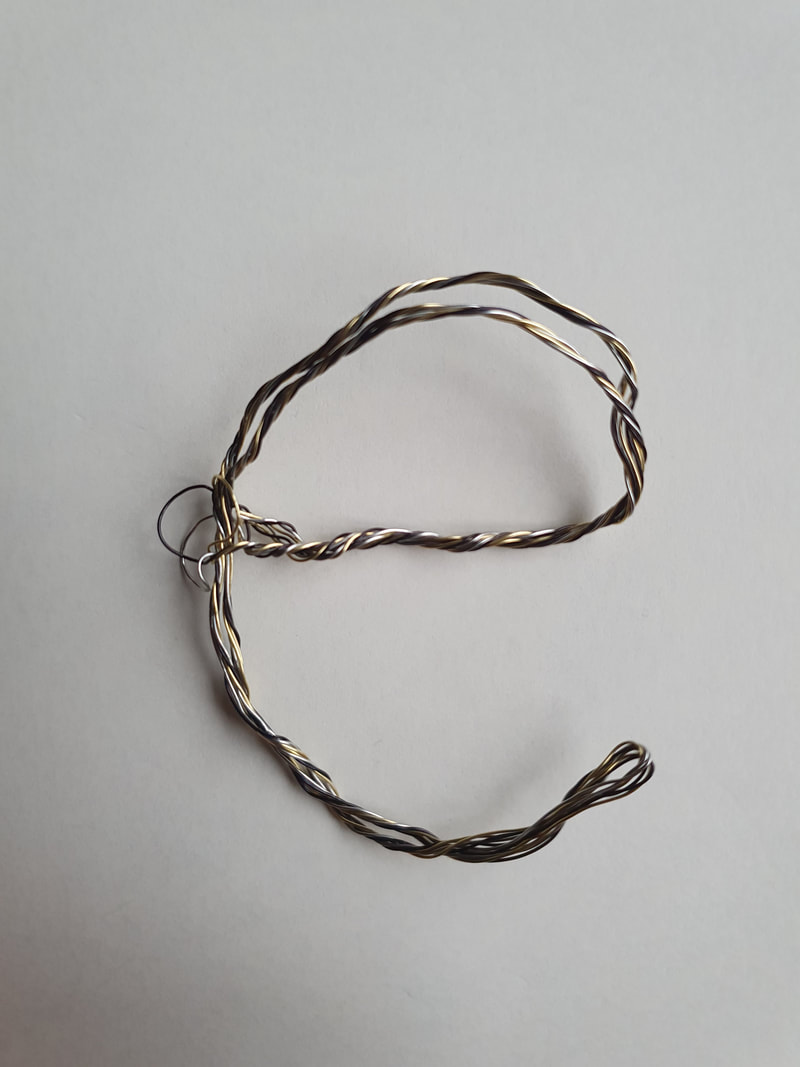
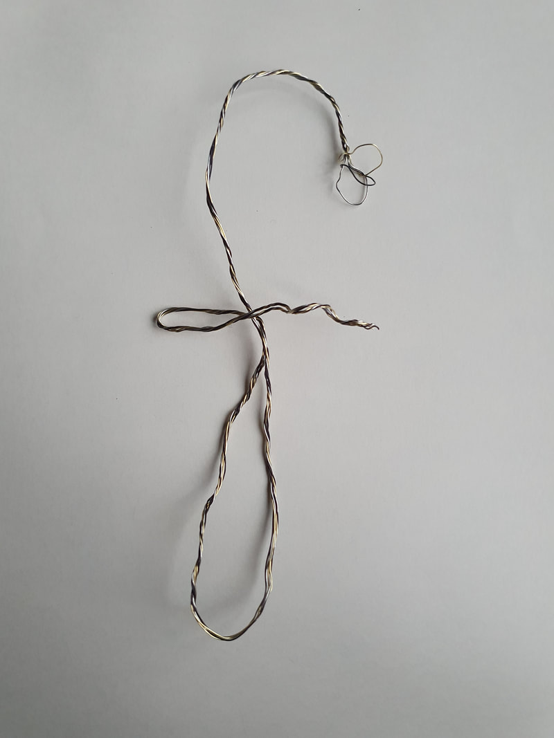
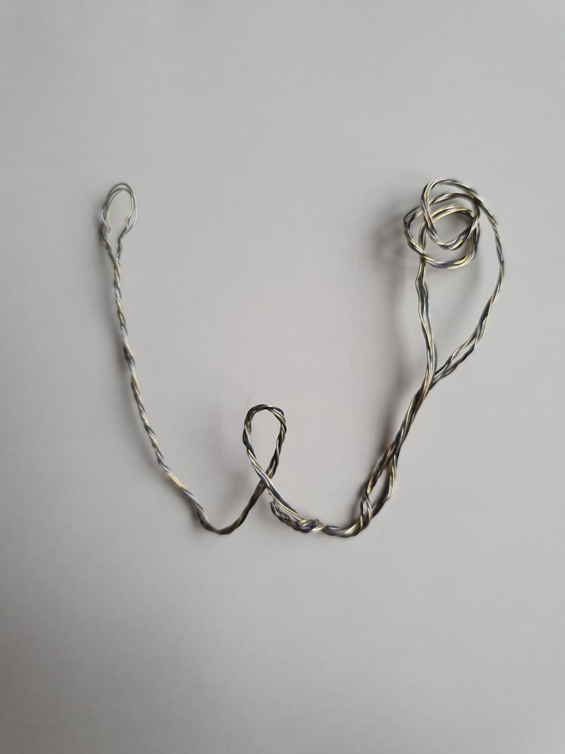
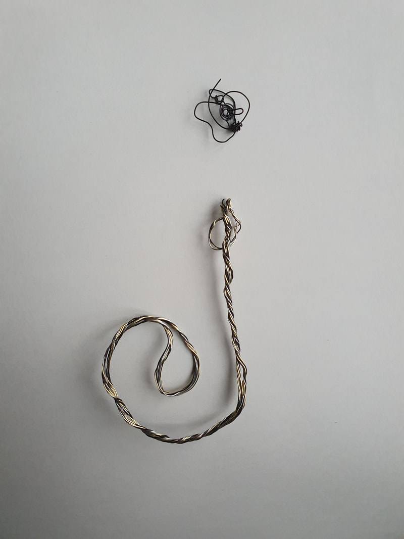
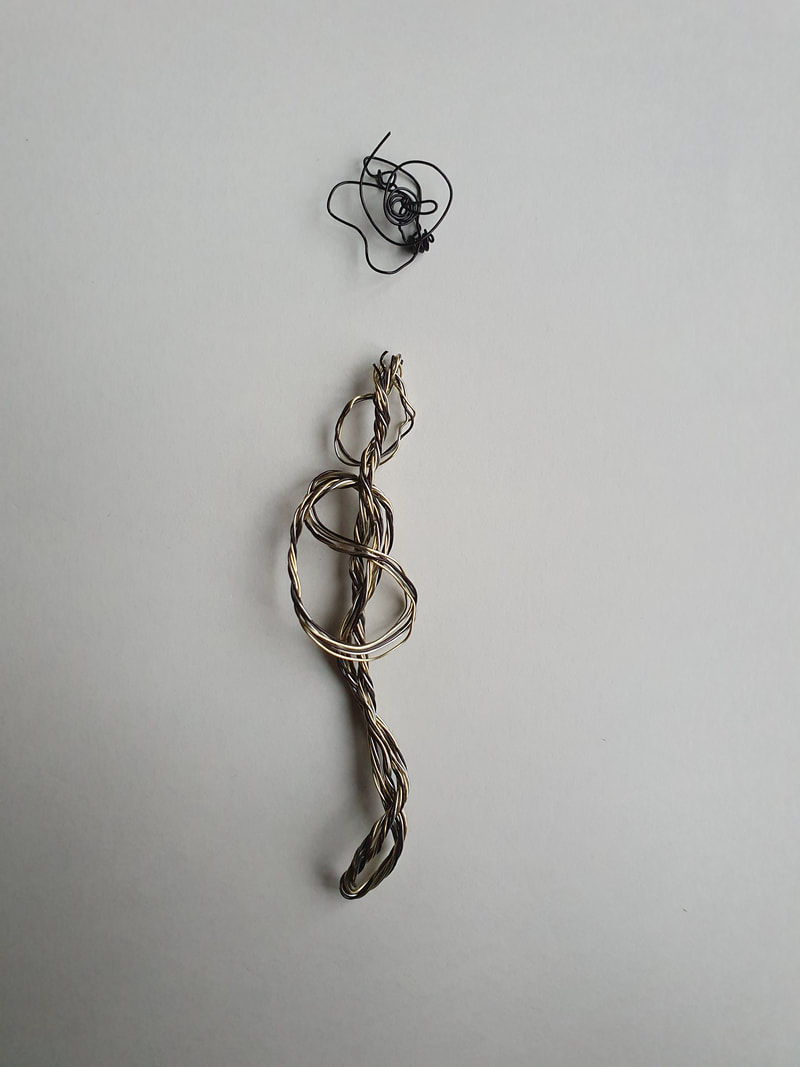
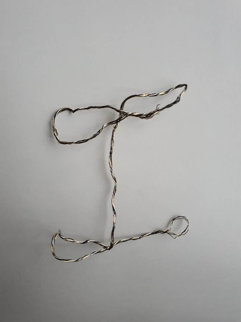
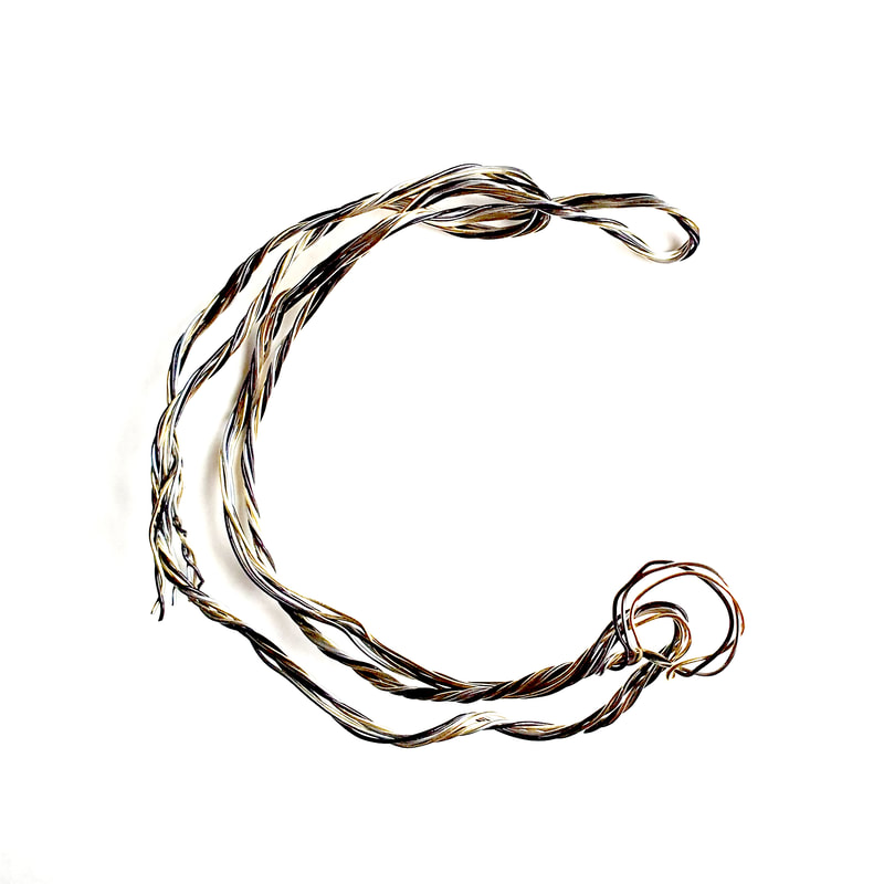
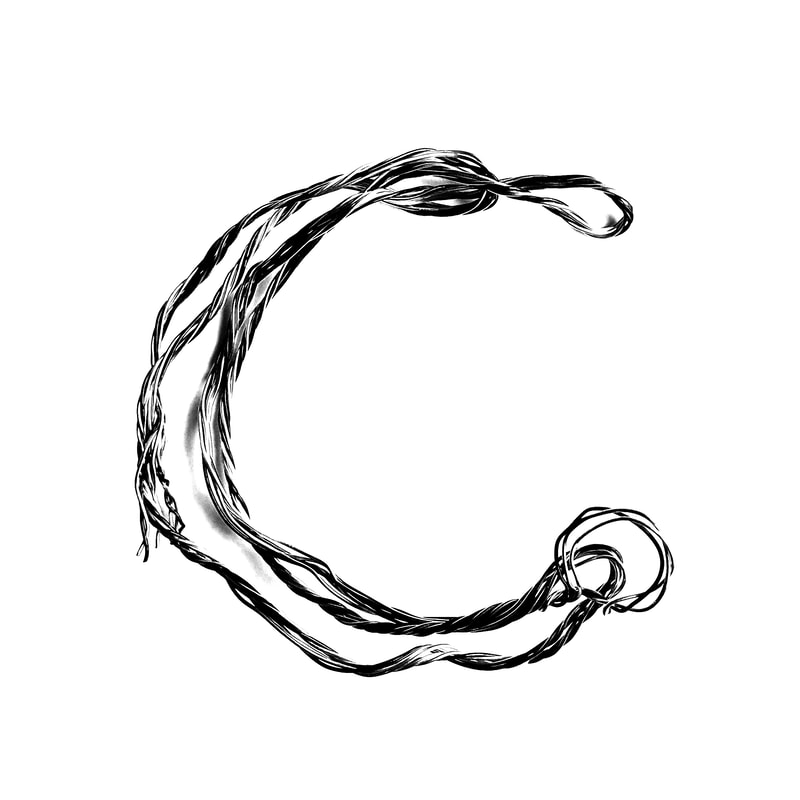
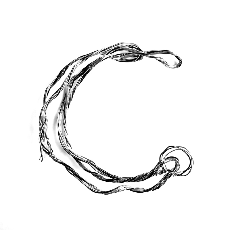
Wire Alphabet
I really enjoyed playing with wire to make these letters, so are more clear that others but overall this is a very malleable material to work with.
I especially like how the W looks, I found that wrapping the wire around a cocktail stick gave me an interesting coiled texture which made the letters more interesting.
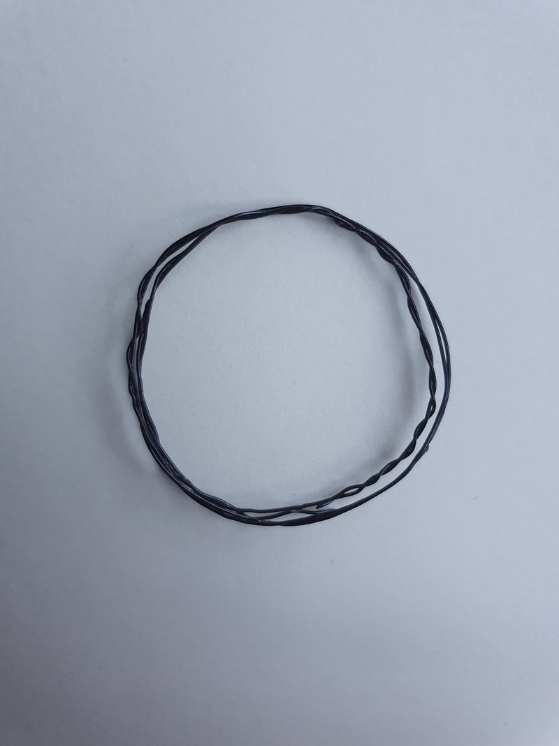
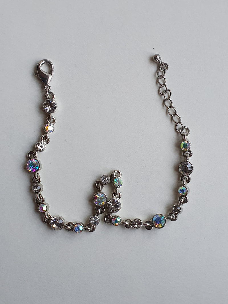
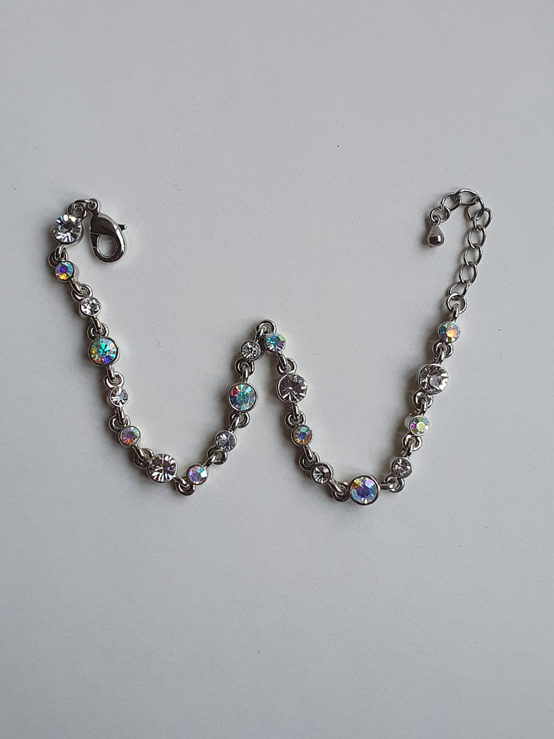
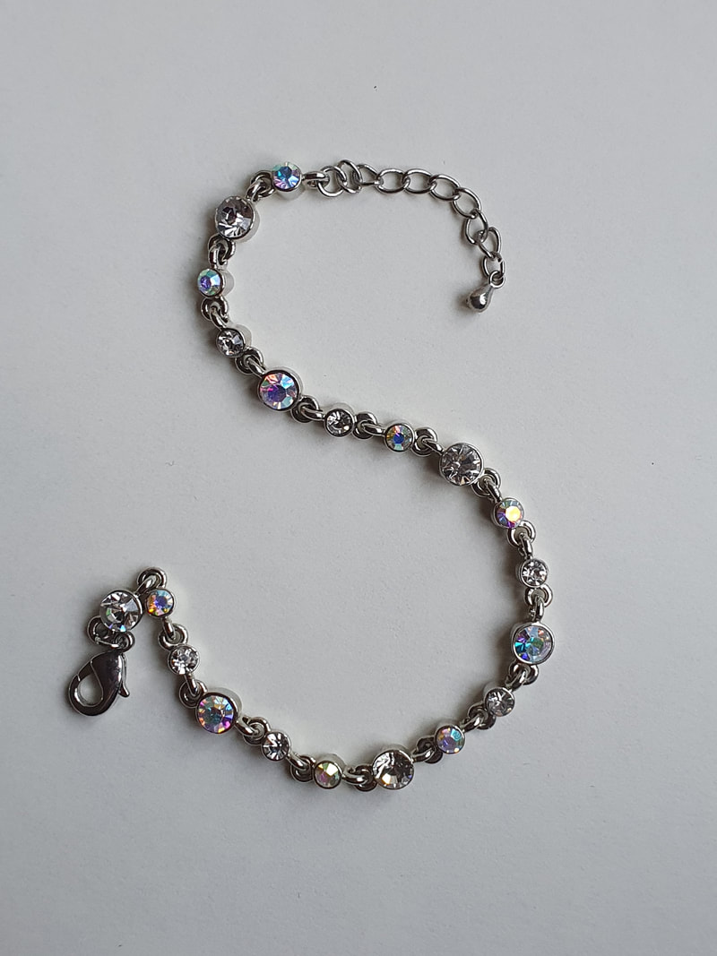
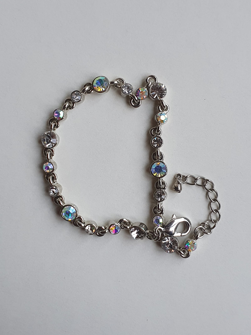
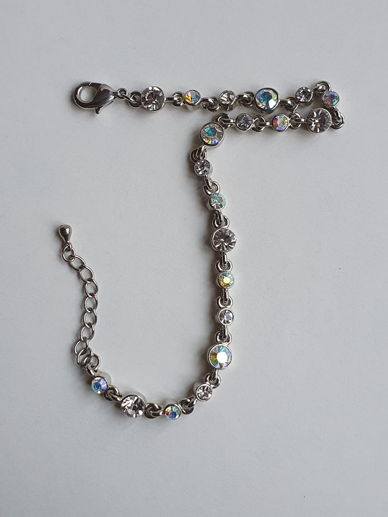
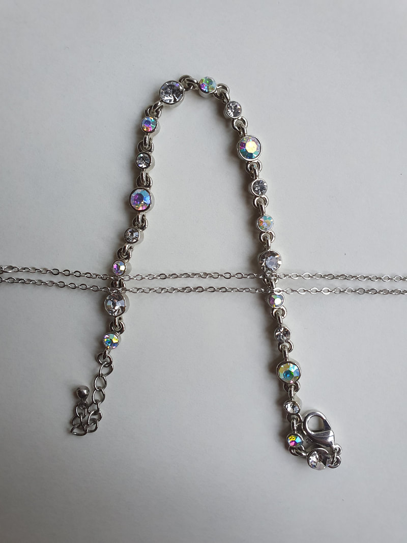
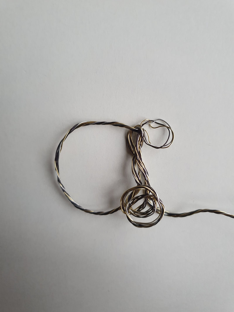
Bracelet Alphabet
I didn't like this test very much, although the bracelet is pretty I don't think it made very visually pleasing letterforms.
I didn't like this test very much, although the bracelet is pretty I don't think it made very visually pleasing letterforms.
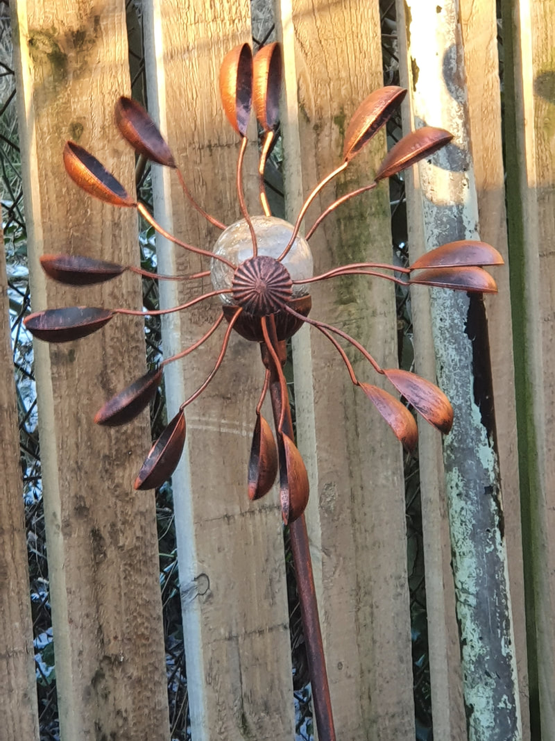
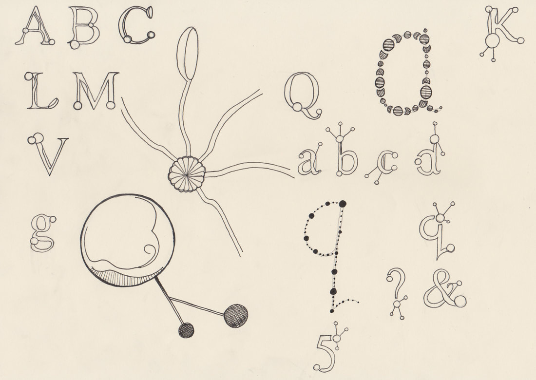
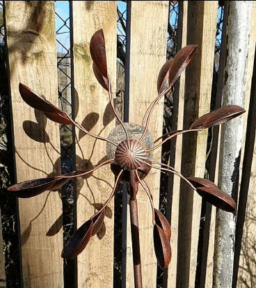
Wind Spinner Alphabet
I was inspired by the wind spinner that I have in my garden for this alphabet idea, I like how it spins creating interesting shadows.
I think that the letters have turned out a little bit steampunk which wasn't what I was going for.
However I do think there is room to improve upon this idea and take it further.
|
|
|
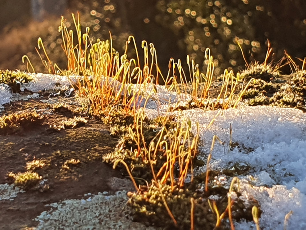
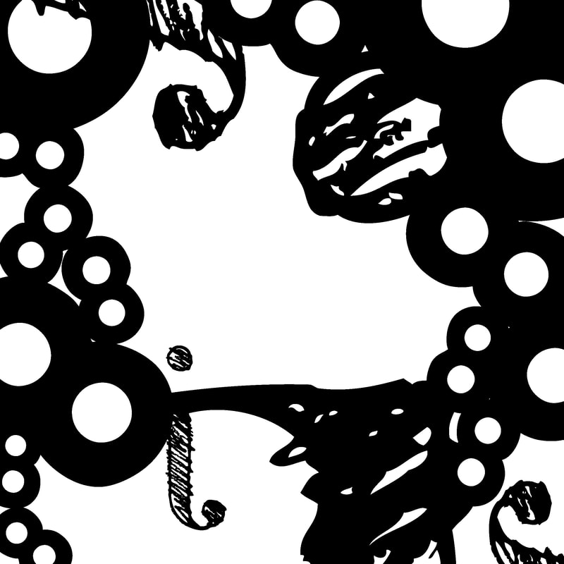
Moss Alphabet
I find moss fascinating, there is a lot of it on a railway bridge nearby my house. When the light highlights the moss it creates beautiful colours.
I love the way that the end of the moss curls, it reminded me of curly calligraphy.
I find moss fascinating, there is a lot of it on a railway bridge nearby my house. When the light highlights the moss it creates beautiful colours.
I love the way that the end of the moss curls, it reminded me of curly calligraphy.
|
|
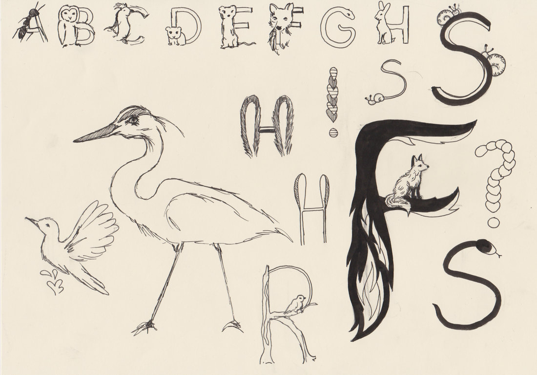
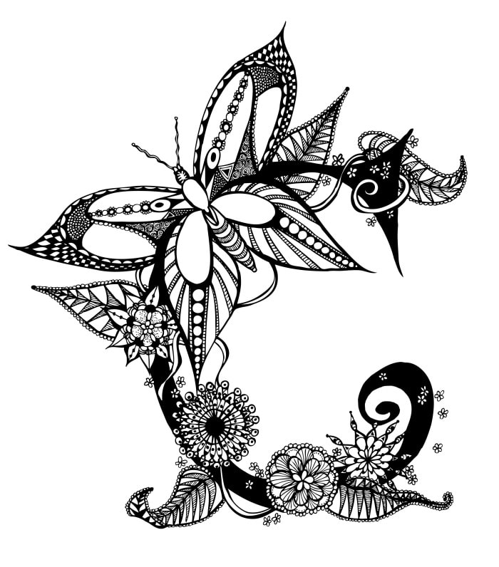
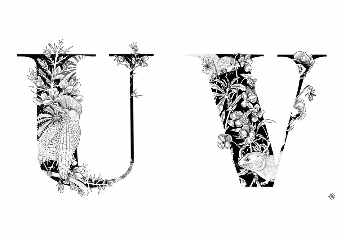
Animal Alphabet
Animals are my favourite thing to illustrate, so of course I had to include them. However I found that getting animals to become the shape of the letter is very difficult.
If I were to take this idea further I would probably have normally shaped letters with a scene including the animal painted inside the letters.
|
|
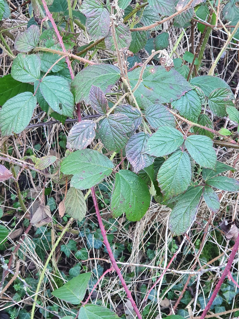
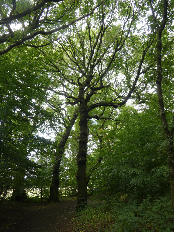
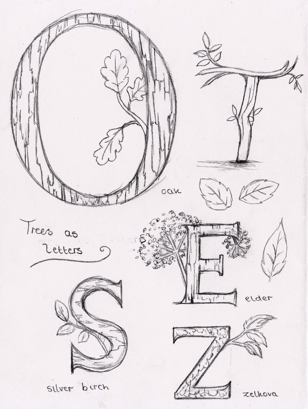
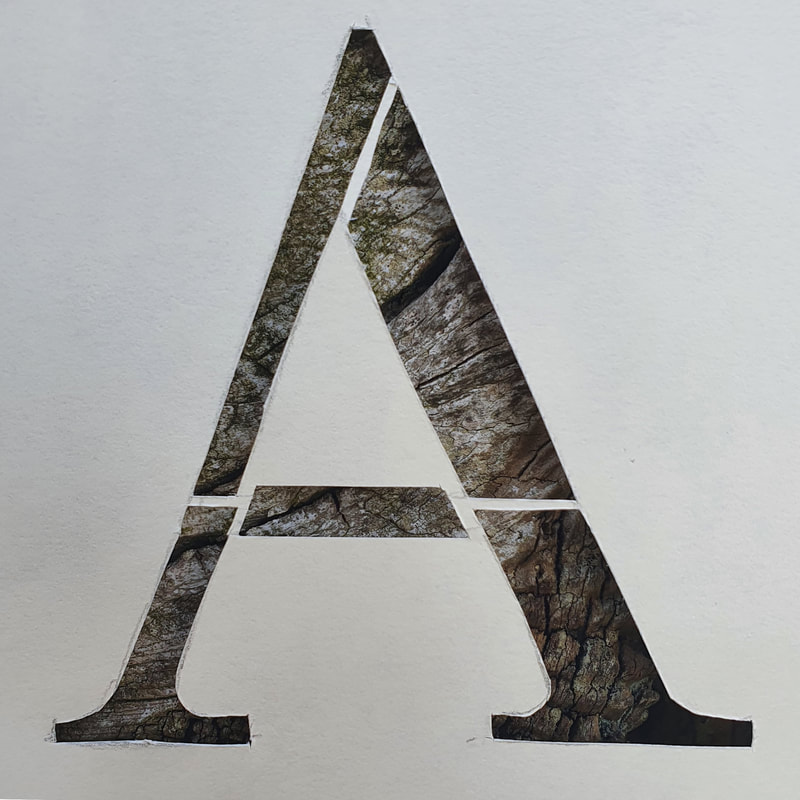
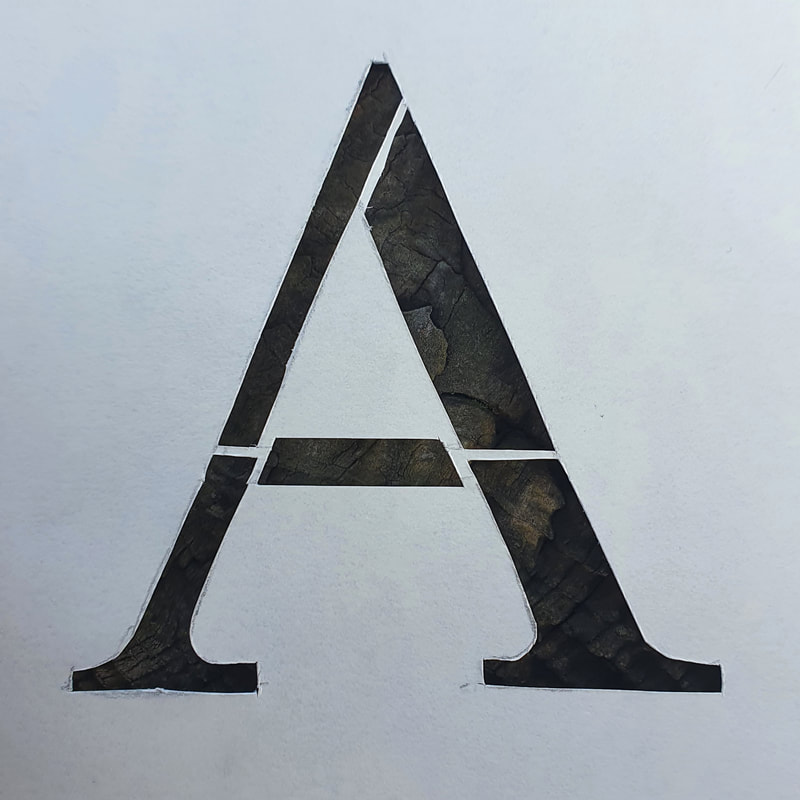
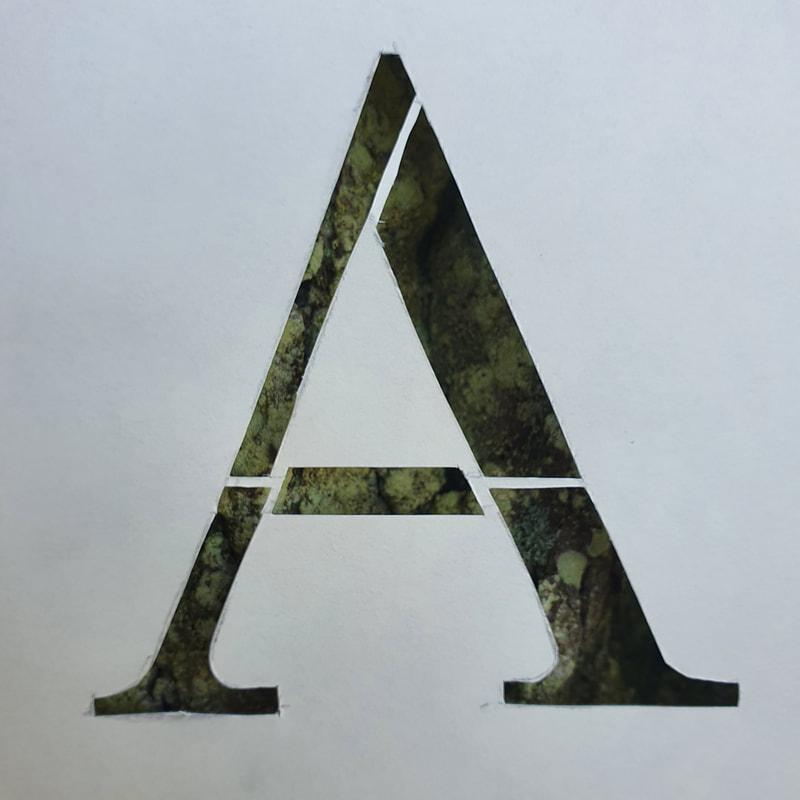
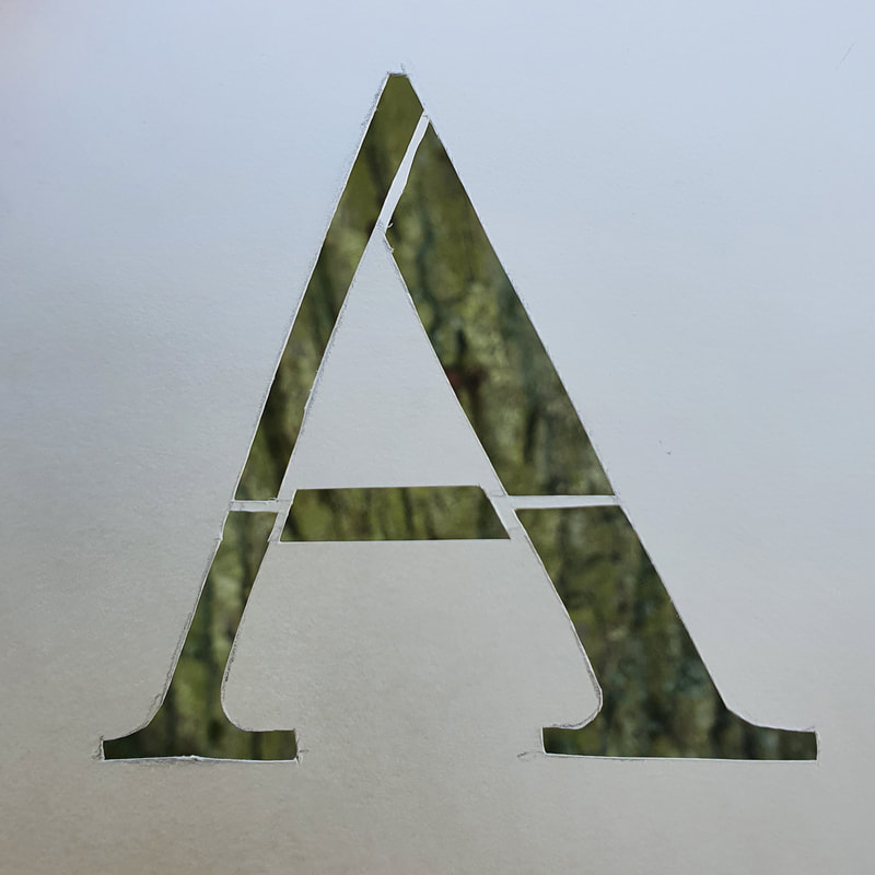
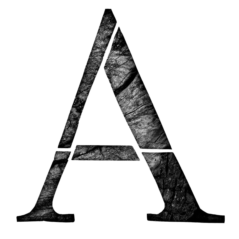
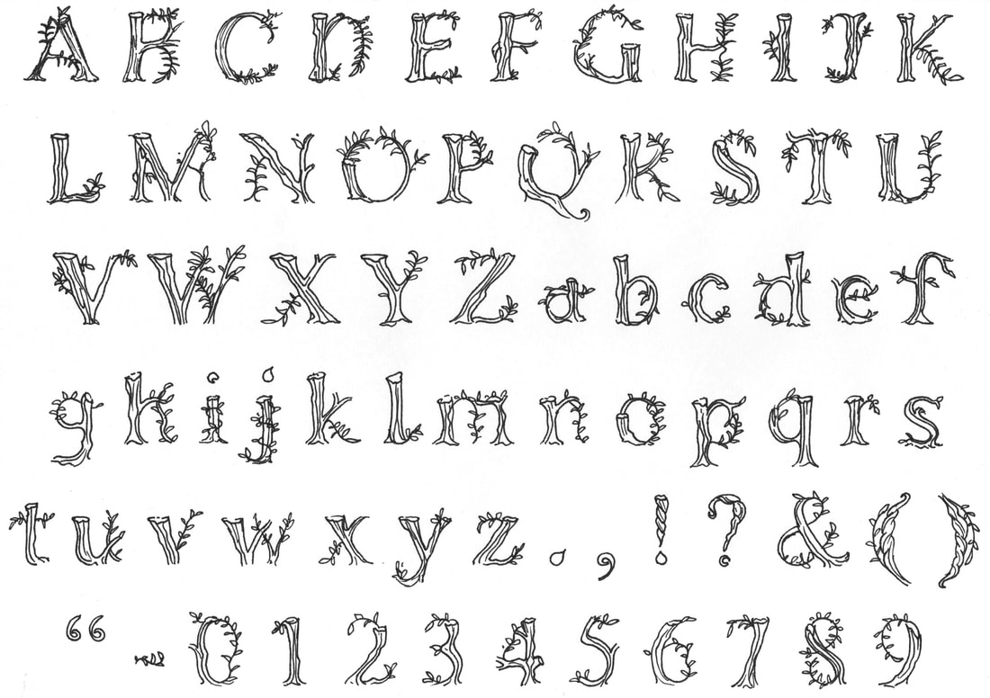
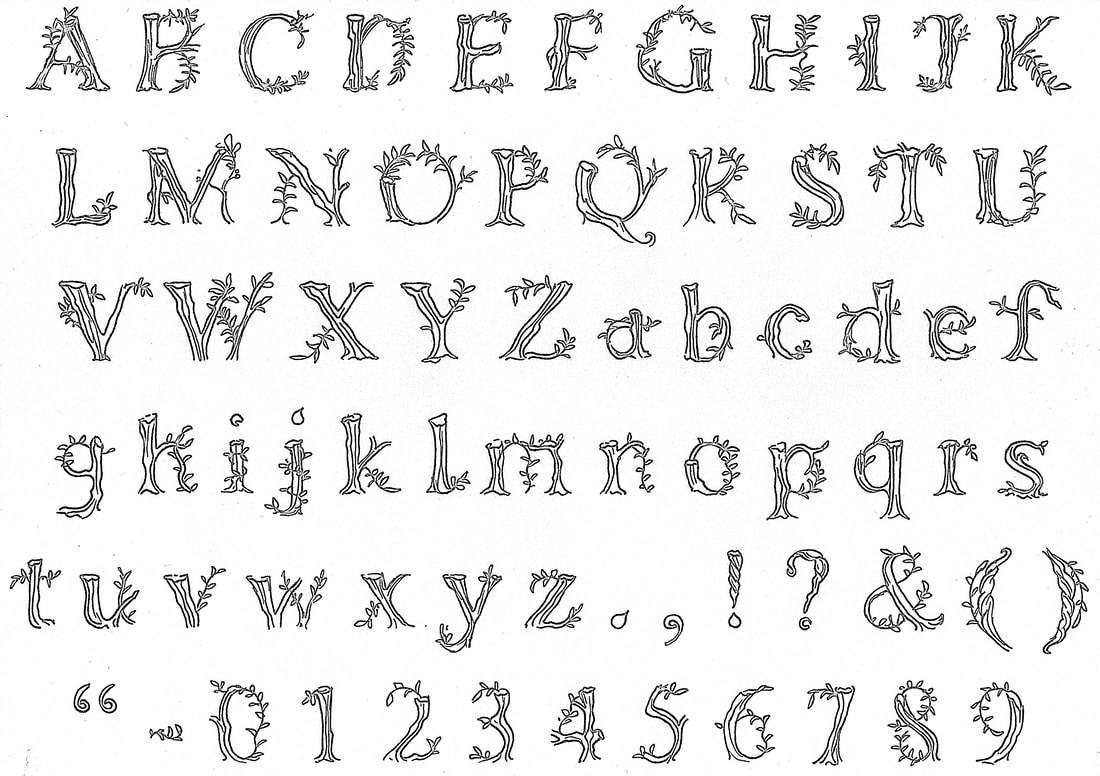
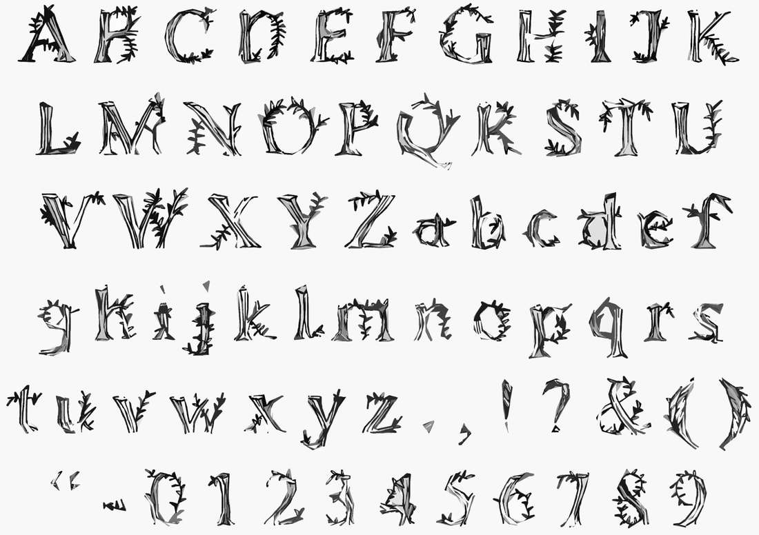
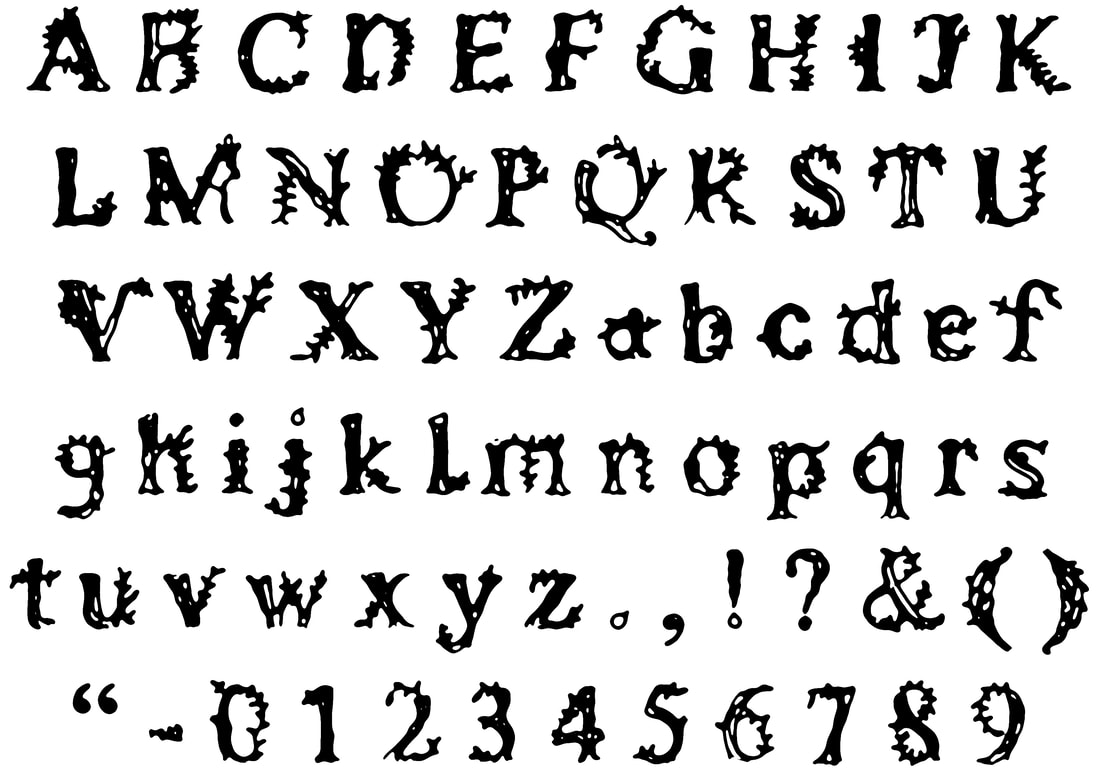
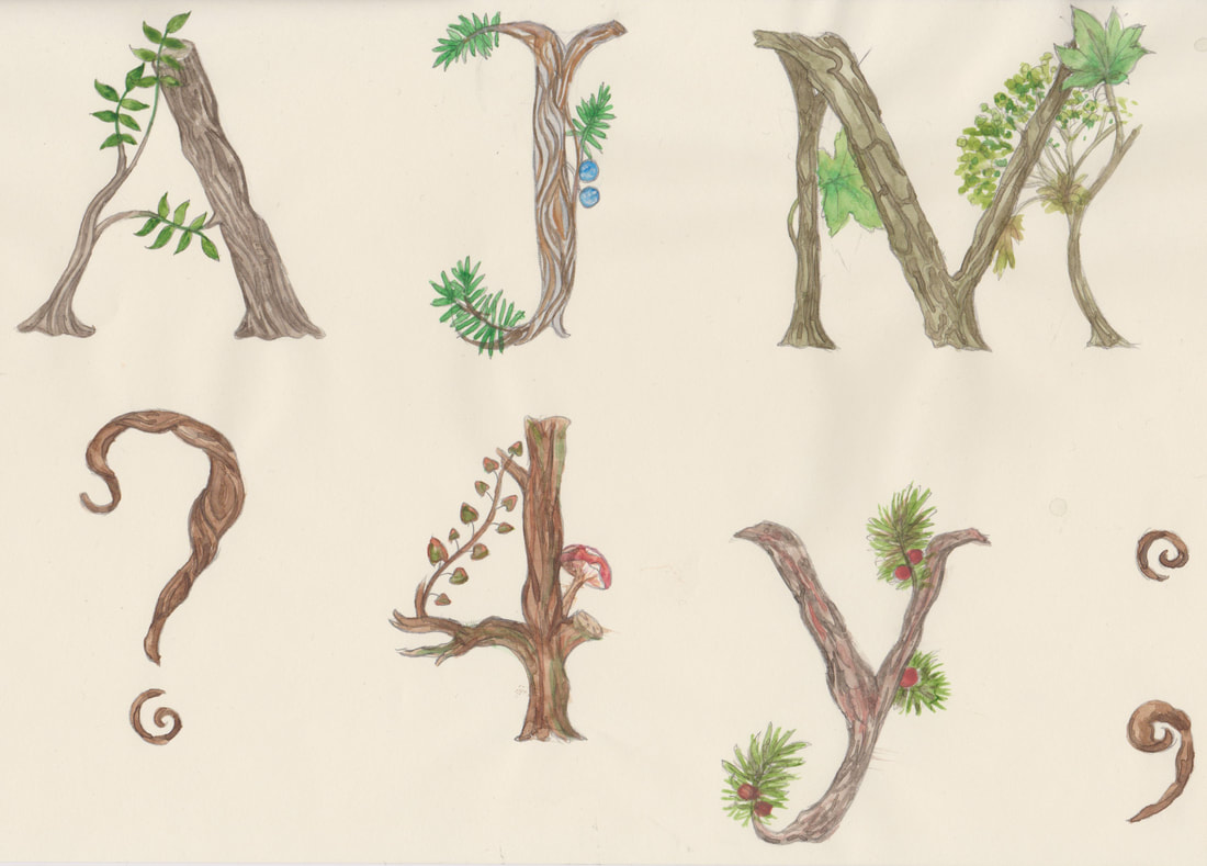
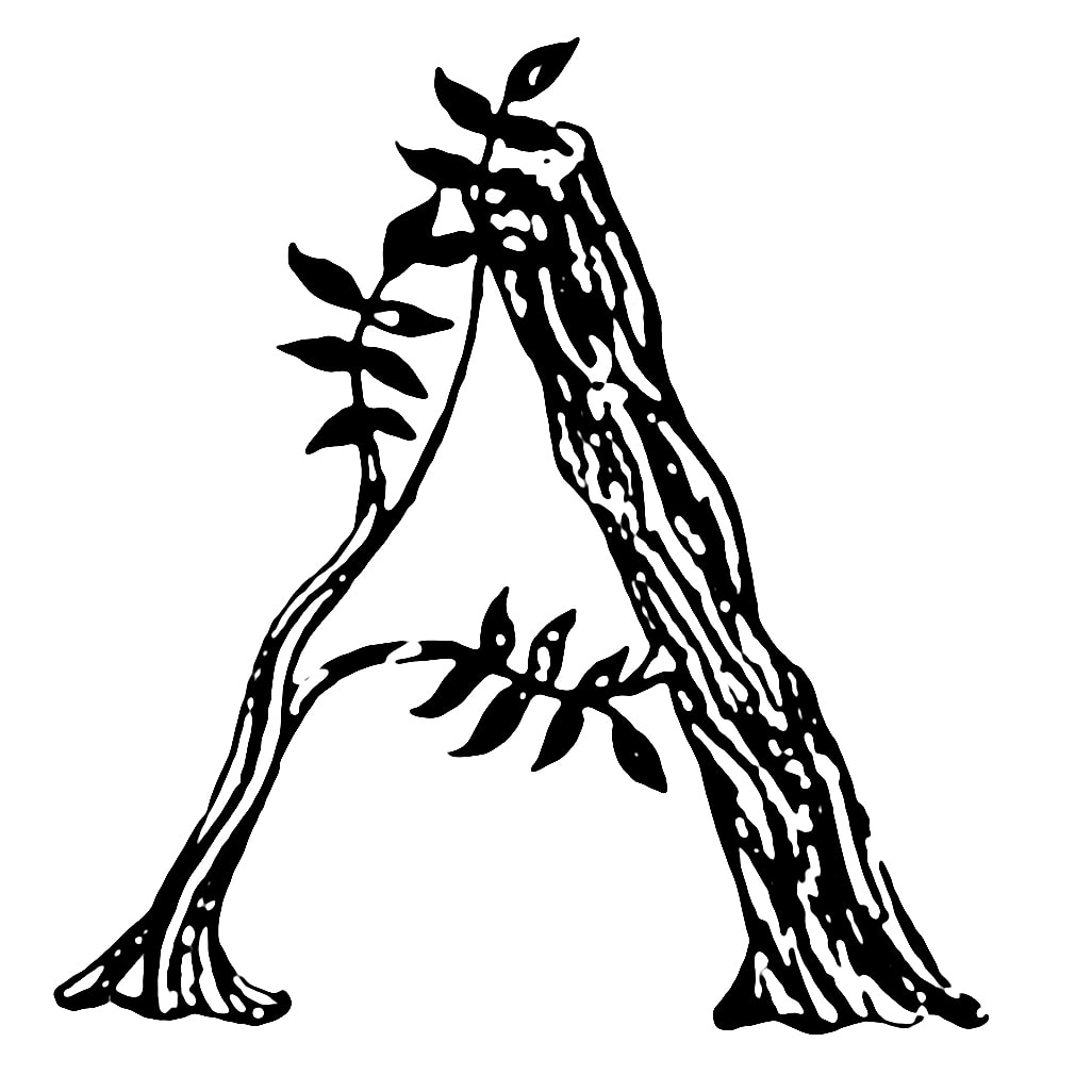
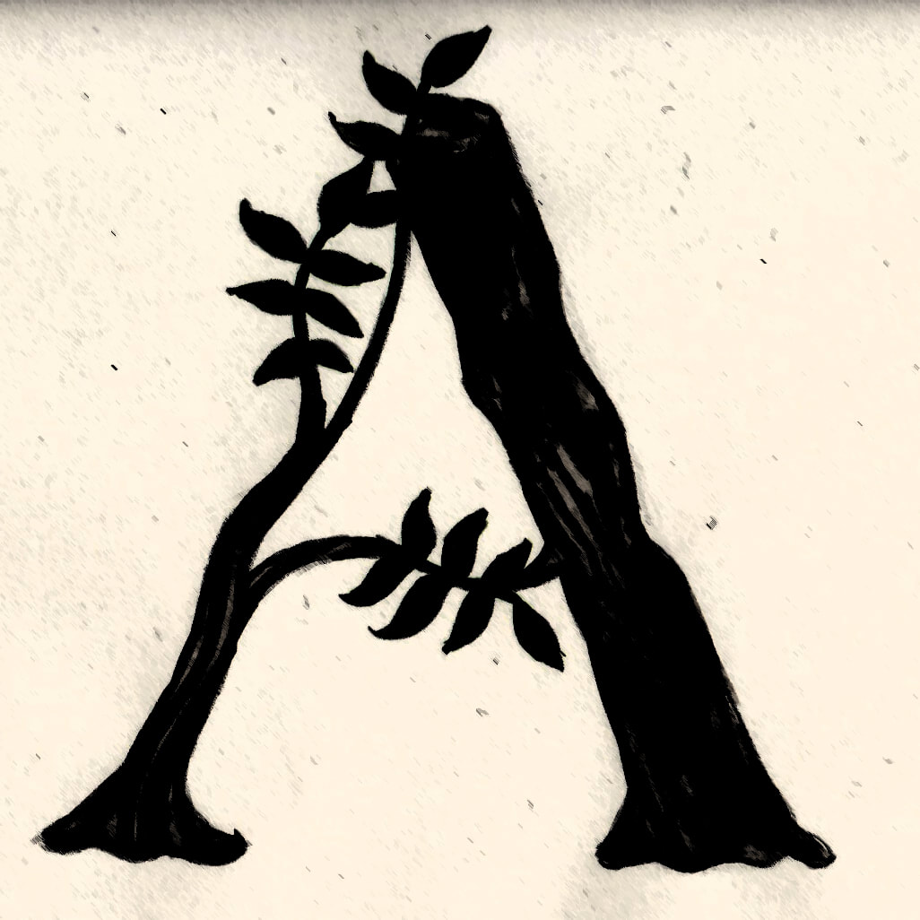
Tree Alphabet
I think there is a lot of scope in this idea, I like the idea of each of the letters reflecting the bark and leaves of a tree that starts with the same letter.
The movement within the branches and bark of a tree would allow me to play around with the shapes of my letters to make them more organic.
I think there is a lot of scope in this idea, I like the idea of each of the letters reflecting the bark and leaves of a tree that starts with the same letter.
The movement within the branches and bark of a tree would allow me to play around with the shapes of my letters to make them more organic.
|
|
Material Research
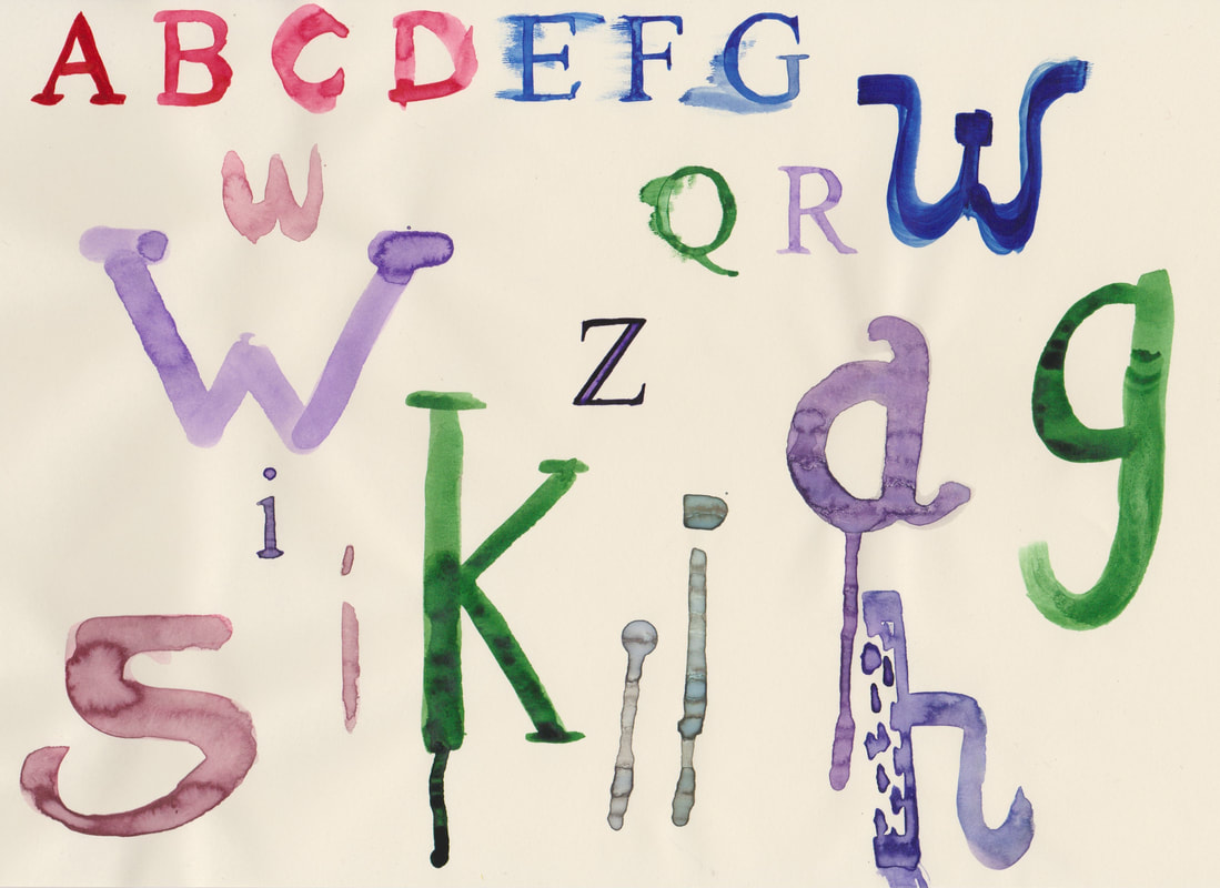
Watercolour
|
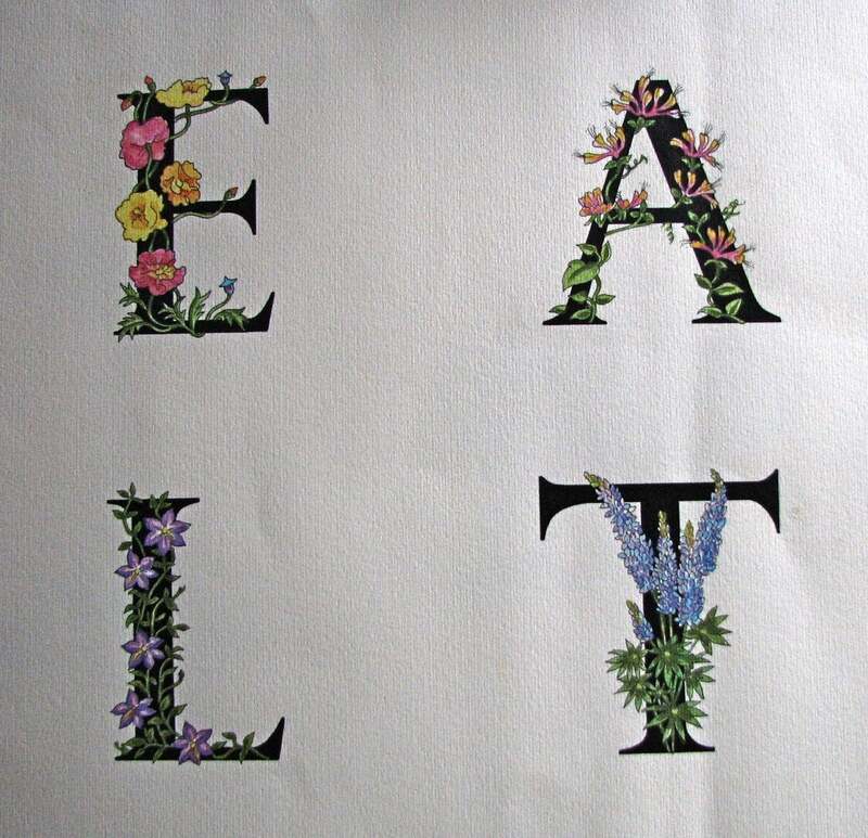
ETSY Inspiration
I started my medium research with looking into watercolour letters, I think these letters are very pretty. Additionally I think this style would work well for developing my different ideas into functional letterforms. |
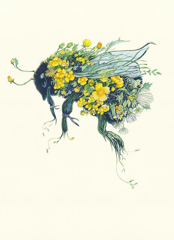
Daniel Mackie Daniel Mackie hasn't made any alphabet designs, however I think his style would translate well into a letter or character design. I especially like how the bee design looks, I think this style would work really well with the tree alphabet style that I sketched. |
Watercolour Material Testing
Ink
I love the style of ink letters, I think this material would probably work best for a functional alphabet. This is a material that I definitely want to explore during my development process.
The way that ink can both be expressive and delicate and detailed interests me, I think this style would work well for a nature inspired design.

Ink Material Testing
|
|
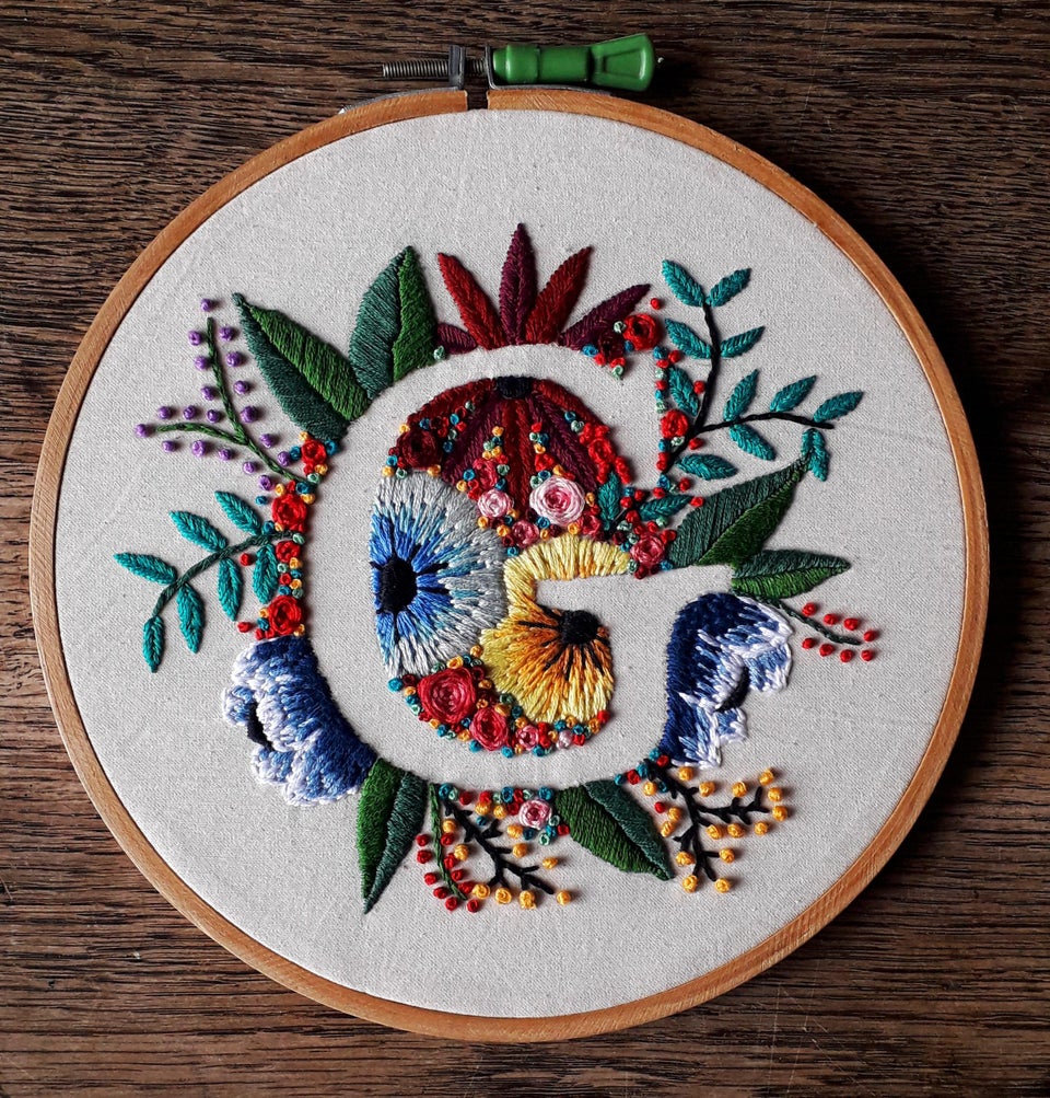
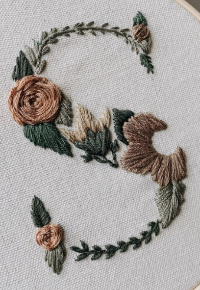
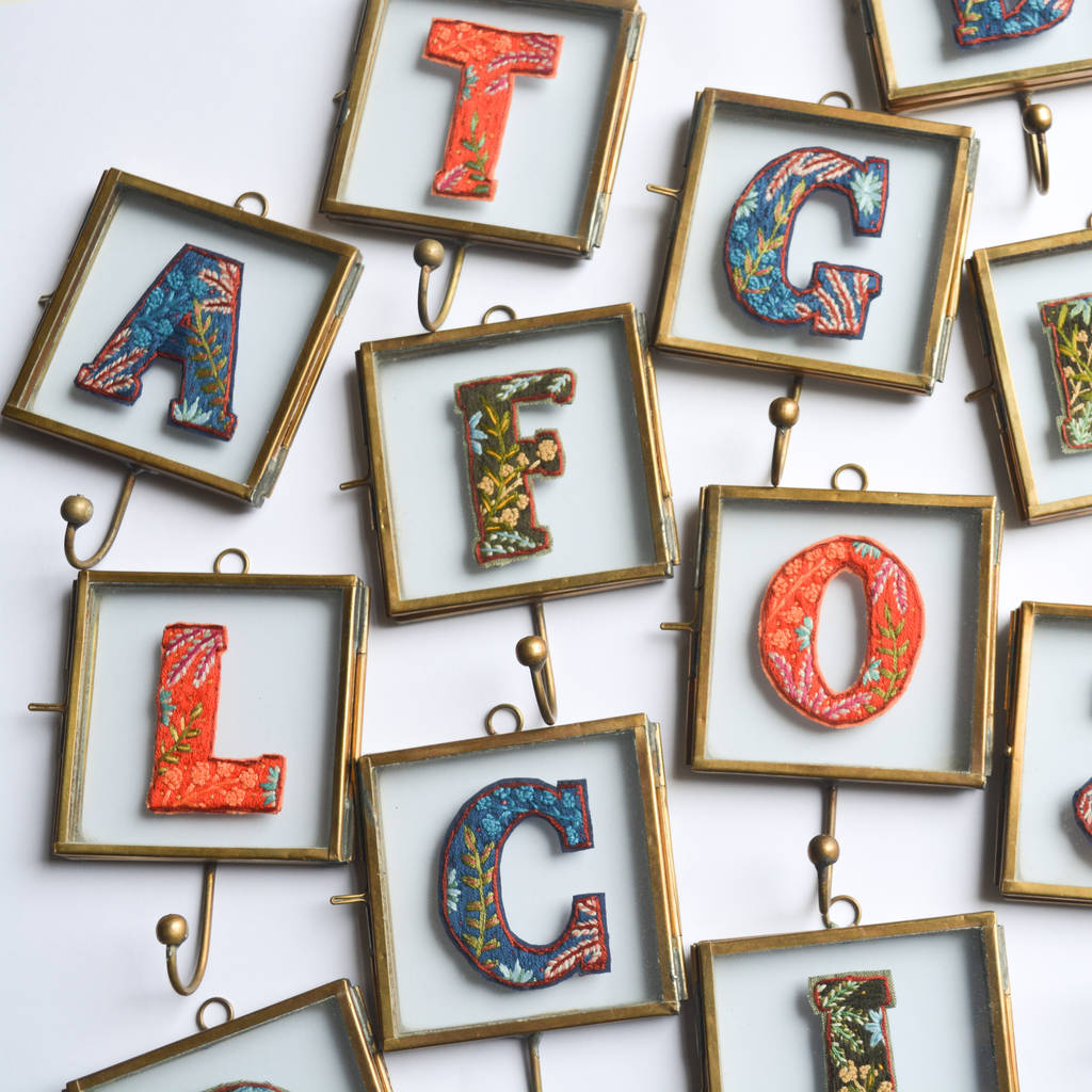
Embroidery
I really like embroidered letters, I think they are very beautiful. However I don't think I will be creating letters with this material myself as I don't have an embroidery hoop.
I really like embroidered letters, I think they are very beautiful. However I don't think I will be creating letters with this material myself as I don't have an embroidery hoop.
|
|
|
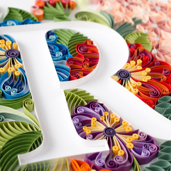
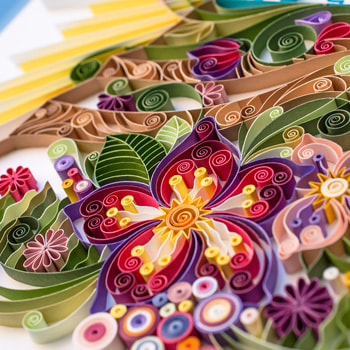
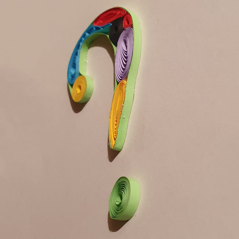
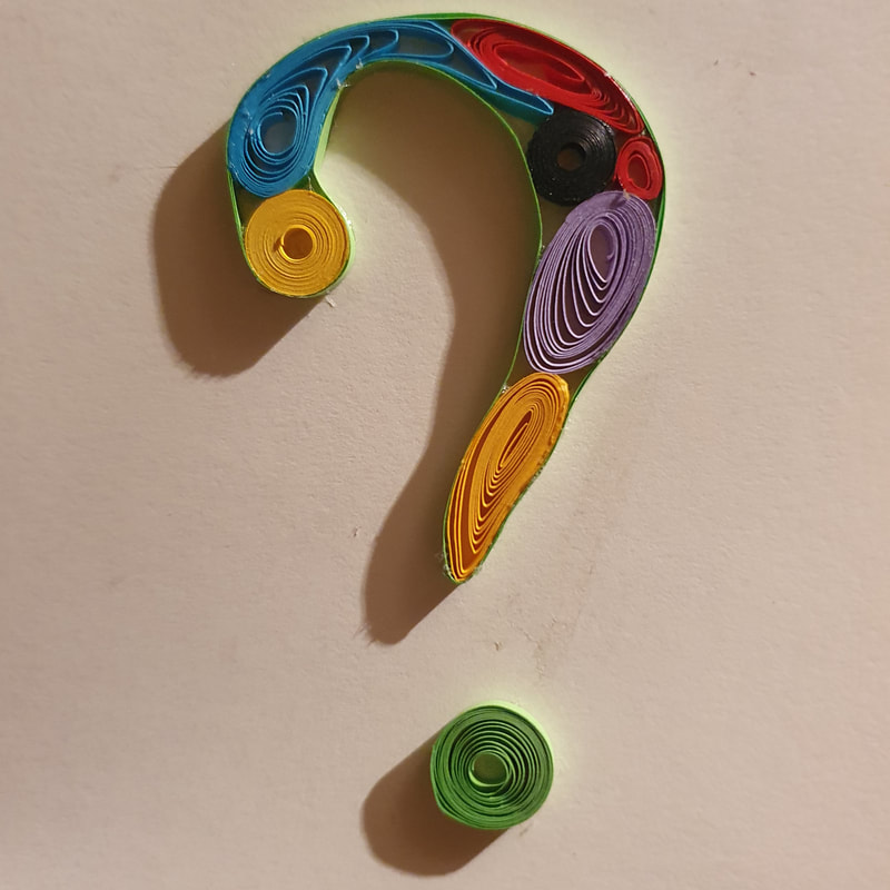
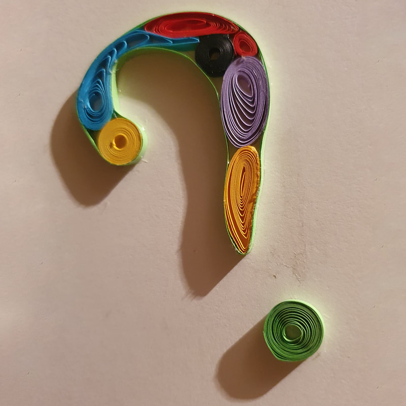
Paper
I love paper quilling, I have done it a few times when I was younger but never for anything as intricate as the artists below have.
I think that this would be a fantastic material to experiment with as it makes exquisite letters.
I love paper quilling, I have done it a few times when I was younger but never for anything as intricate as the artists below have.
I think that this would be a fantastic material to experiment with as it makes exquisite letters.
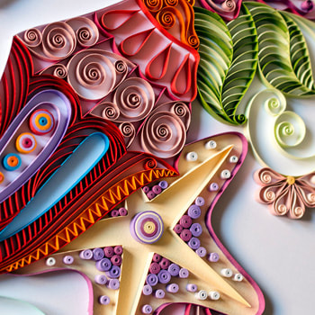
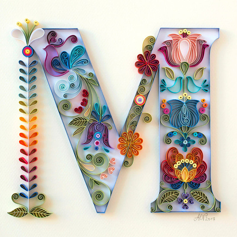
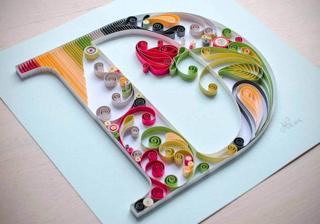
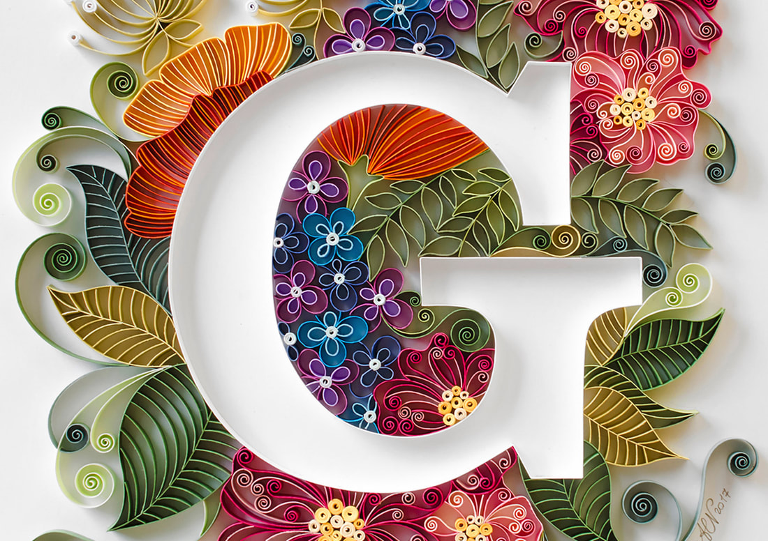
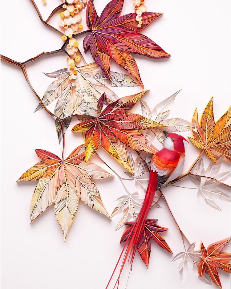

Quilling Material Testing
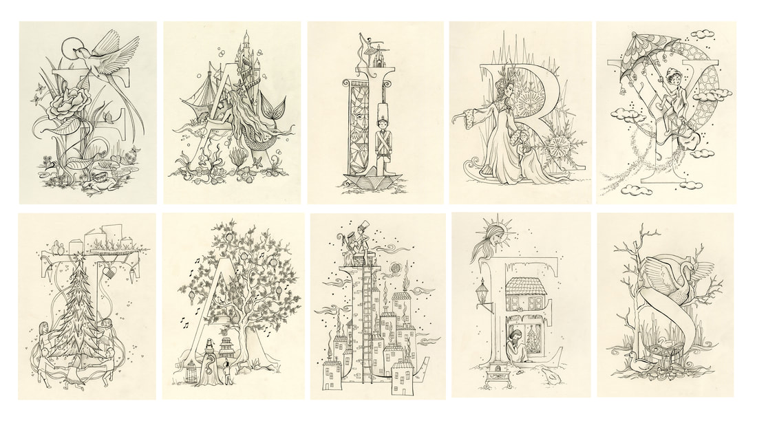
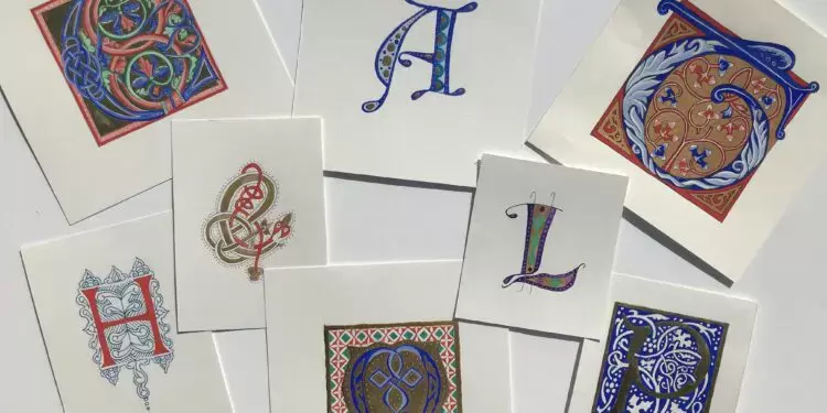
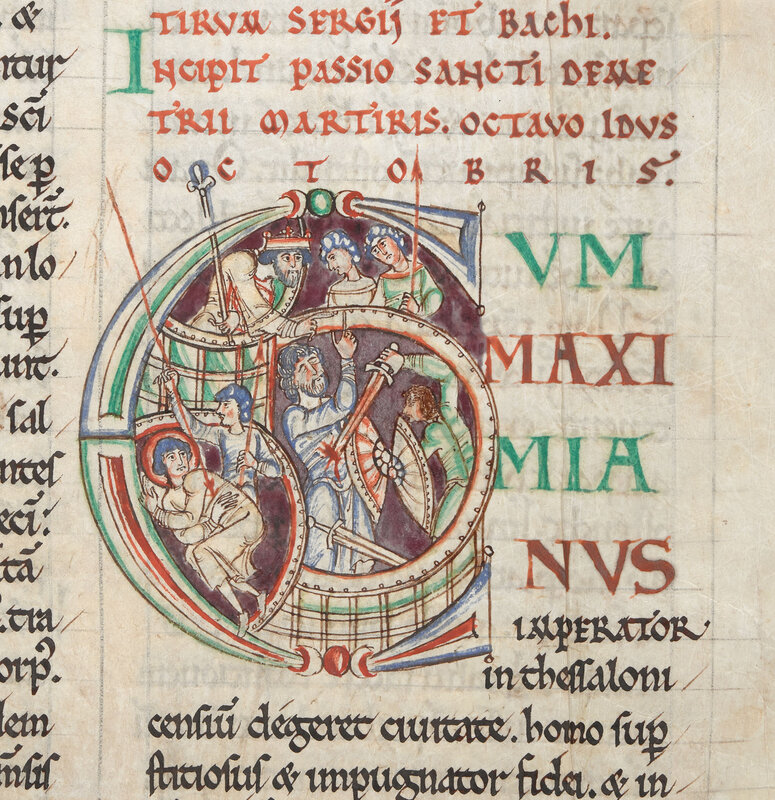
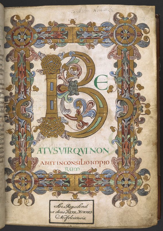
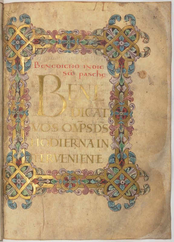
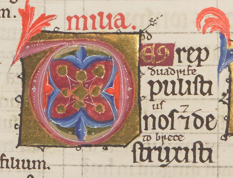
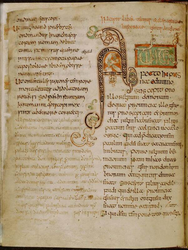
Illuminated Letters
Description from "The English Heritage"
"During the Middle Ages all books were handmade works of art. These manuscripts were often beautifully illustrated, with gold or silver leaf used to reflect light on the page.
The word illumination, meaning 'to light up', is used to describe this decoration on the pages of a book.
An illuminated letter was usually the first letter of a page. These were large and colourful, with areas in gold, while the rest of the text was black.
The images used to illustrate the letters included animals, plants and mythical creatures."
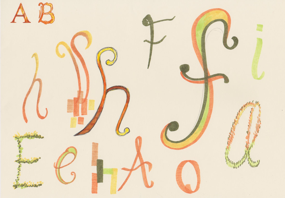
Type Fun Exercises No. 3
Hand-lettering Cheesy lines
Hand-lettering Cheesy lines
|
|
|
Development
|
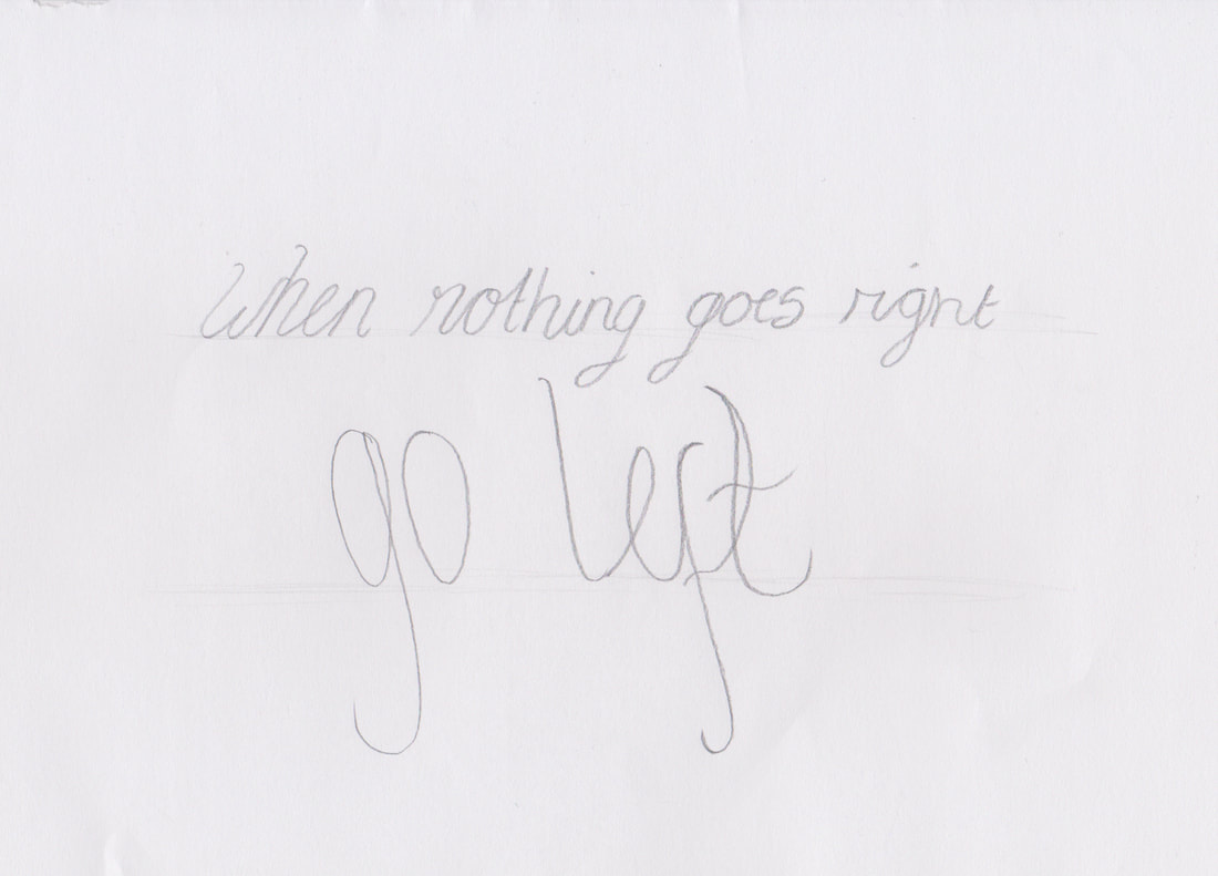
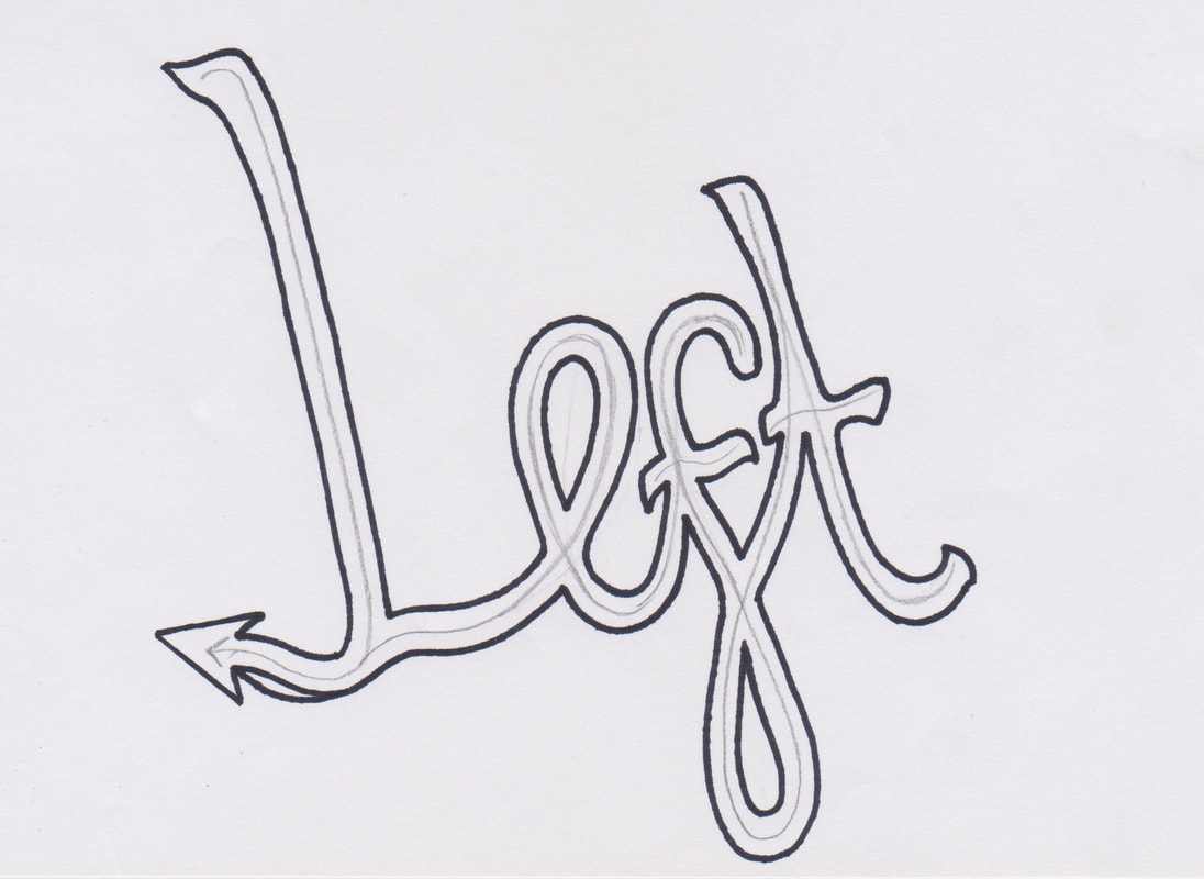
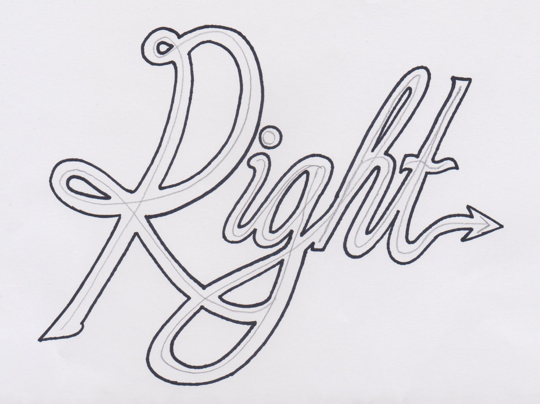
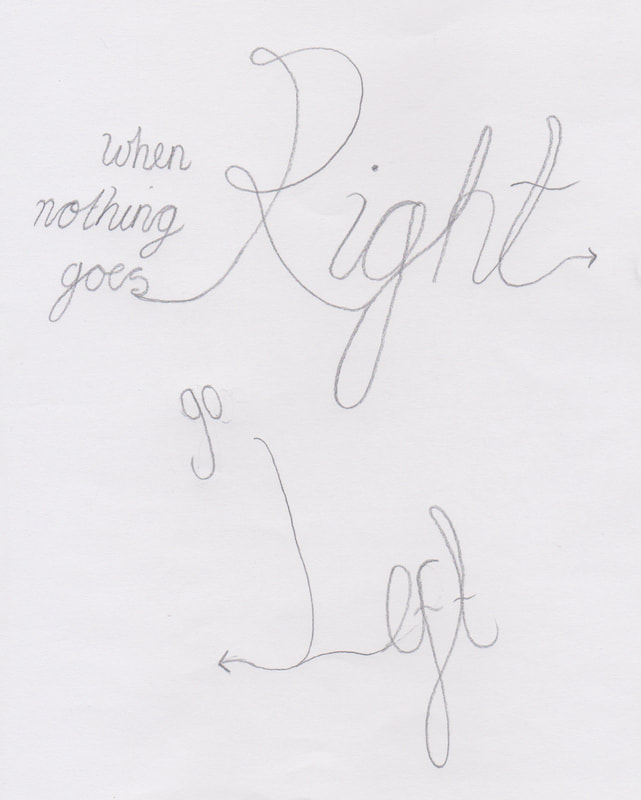
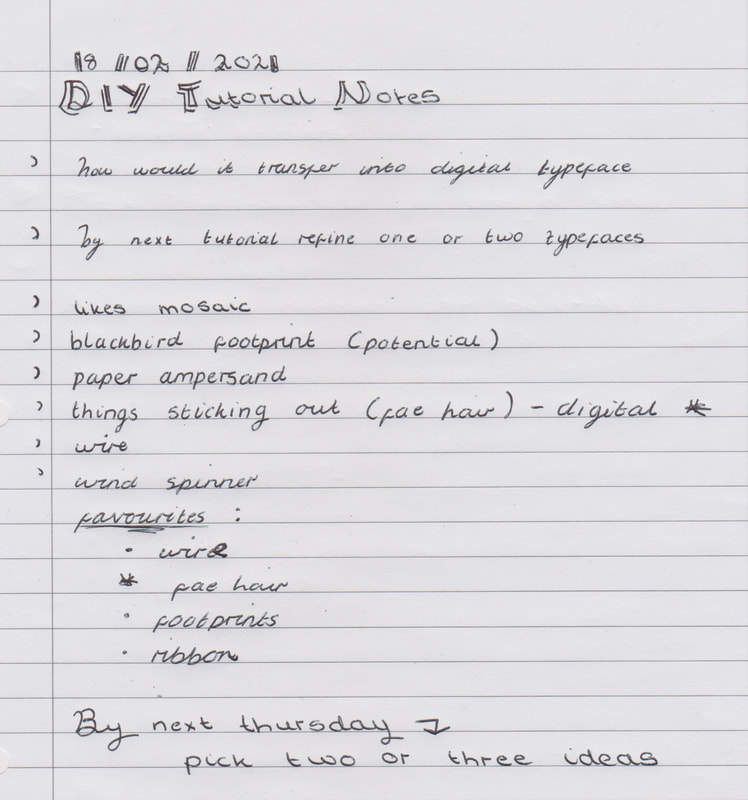
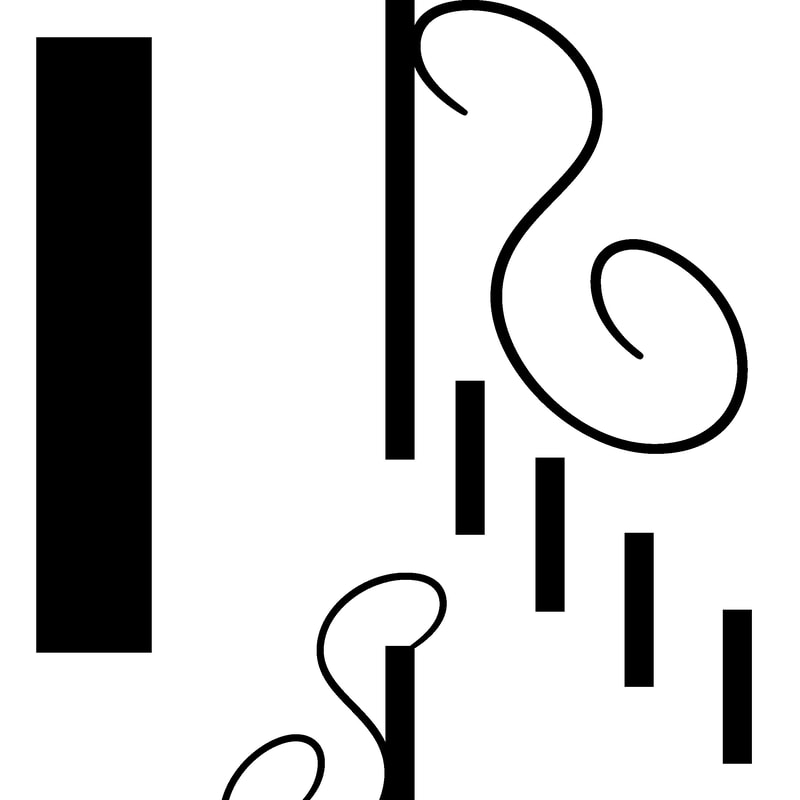
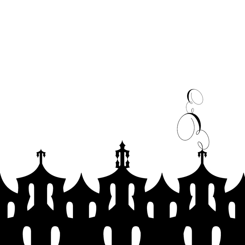
In the group tutorial I learned that we should chose two or three ideas to develop by next Thursday. I have chosen to develop the Blackbird Footprints, Wire and the Trees. |
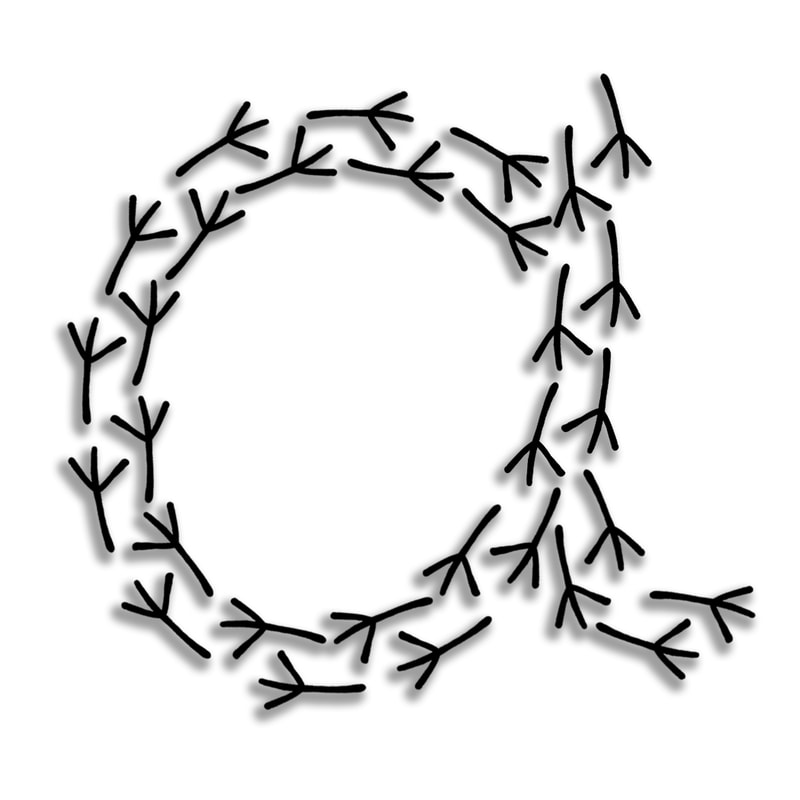
Footprints in the Snow
I like the development I have done for this idea so far, but I think there is something missing with this idea. So I need to work on this more.
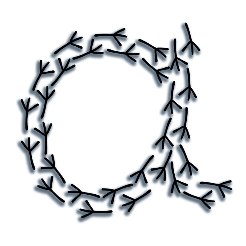
- Initial Development -
Overall I preferred the characters that were made from one blackbird footprint shape as opposed to the
characters with footprint borders, as I think that would become quite complicated when it was scaled down.
Overall I preferred the characters that were made from one blackbird footprint shape as opposed to the
characters with footprint borders, as I think that would become quite complicated when it was scaled down.
|
|
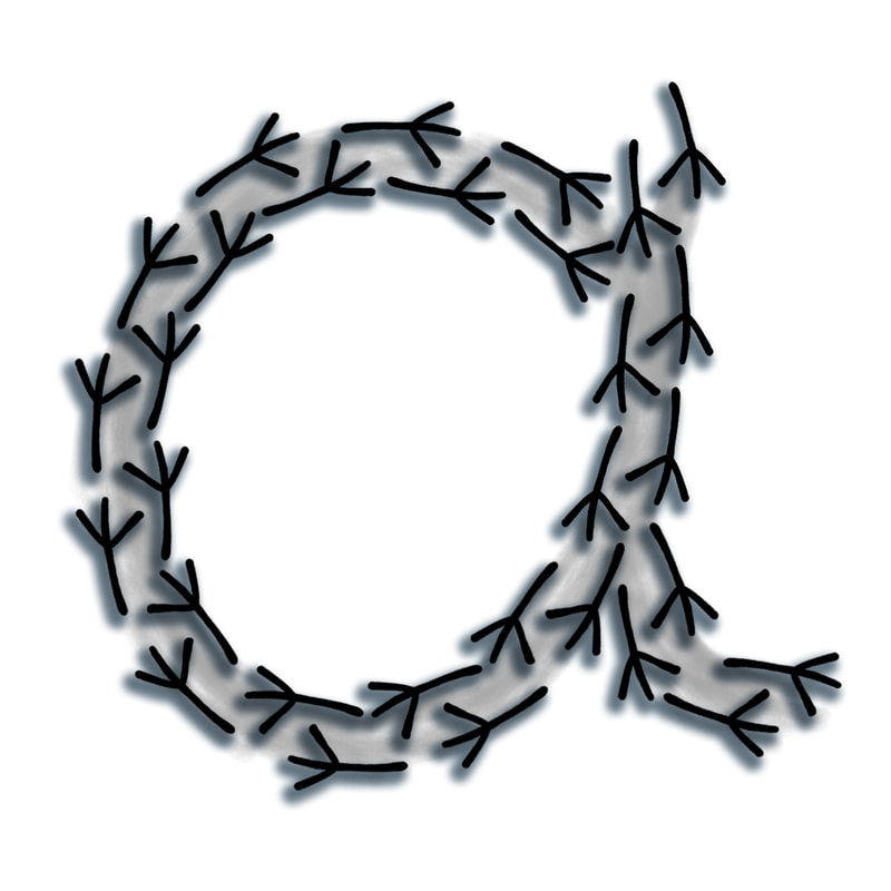
- Digital Development -
I think that I prefer the ink painted versions much better than the digital as it seems more impersonal and it wasn't as fun to make.

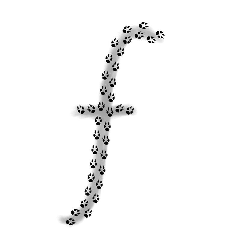
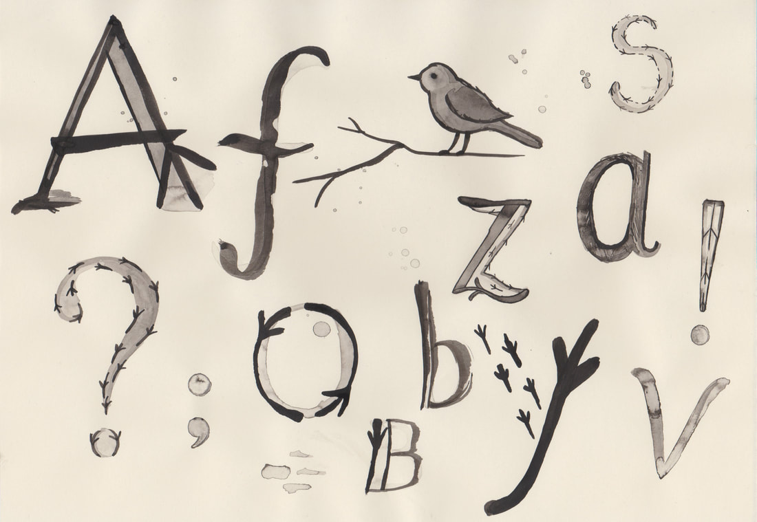
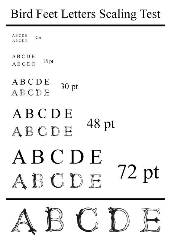
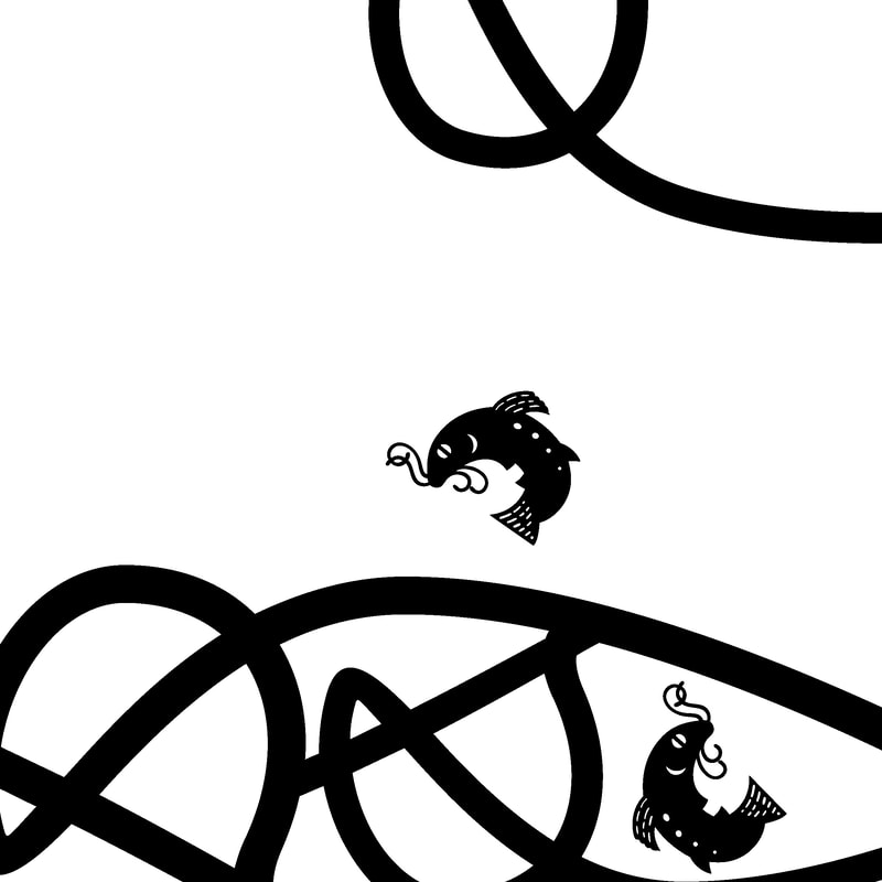
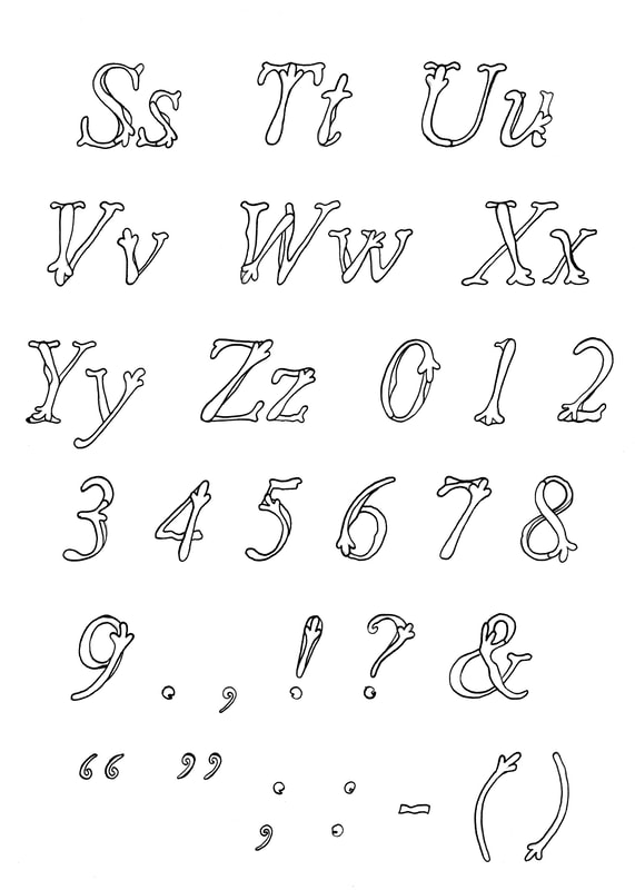
- Blackbird Footprint Ink Alphabet Test -
I created a small mock up of a blackbird footprint font to see if I liked the way it looked, I really like this idea because the style is a mix of formal with a bit of fun.
I think this font is something I would like to use myself, especially used in conjunction with an illustration of a blackbird.
|
|
|
|
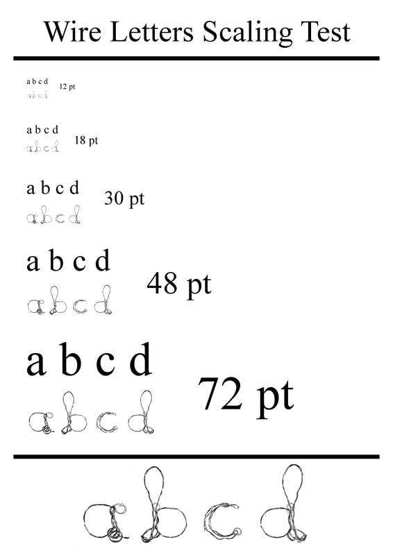
Wire
I tested different styles of wire letters, my favourite is the third and fourth rows. Twisting three pieces of wire together gives a really nice effect.
I tested different styles of wire letters, my favourite is the third and fourth rows. Twisting three pieces of wire together gives a really nice effect.
- Wire Alphabet Digital Editing -
This is the style of wire letter that I like the most, however I'm not sure how it would work as a whole typeface at a smaller scale.
I think this is something I should test before making my final decision about which font to create for my final piece.

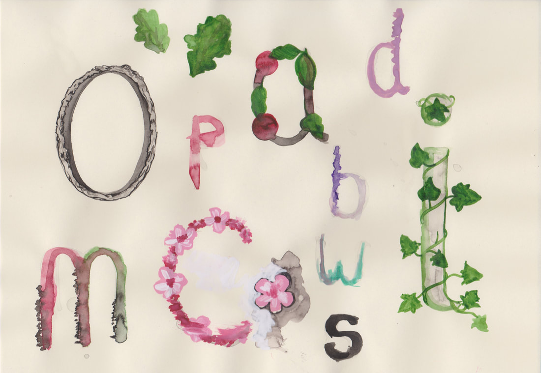
Trees
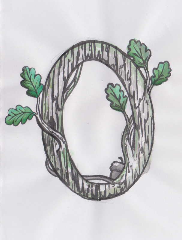
I like the oak themed "O" the best out of this development so far. But I think I should make this alphabet idea more illustrative.
I like the oak themed "O" the best out of this development so far. But I think I should make this alphabet idea more illustrative.
- Initial Concept -
|
|
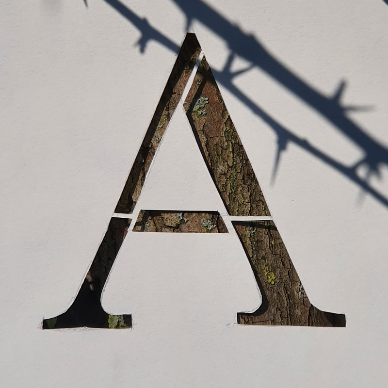
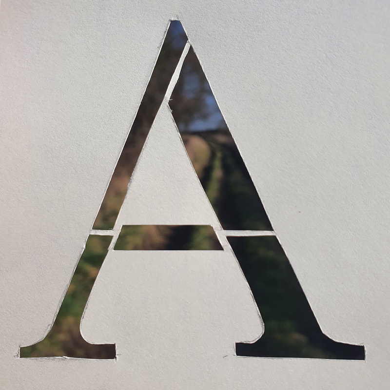
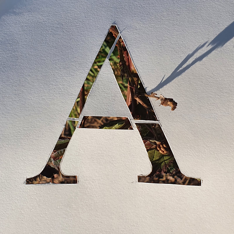
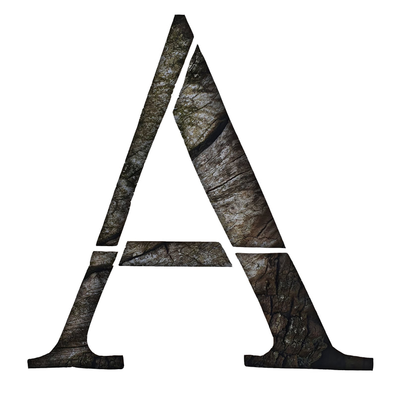
- Photographed Tree Letters -
I decided to mix this idea up a little by using a letter cut out to create some photographed tree letters, I like how these have turned out.
However I don't know how well these would work as a whole typeface.
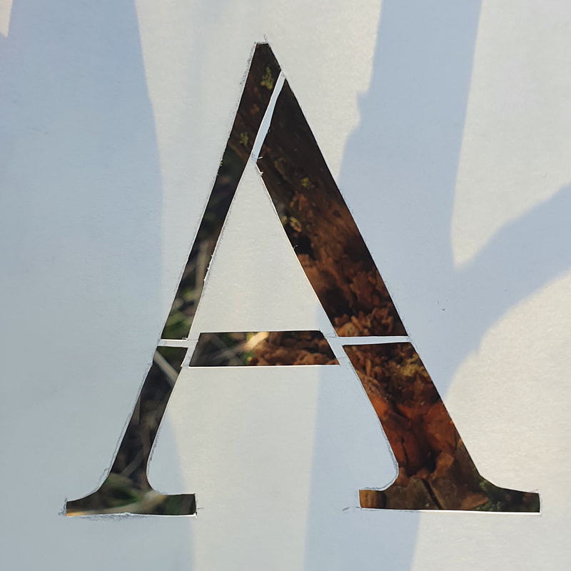
- Edited Photographed Tree Letter -
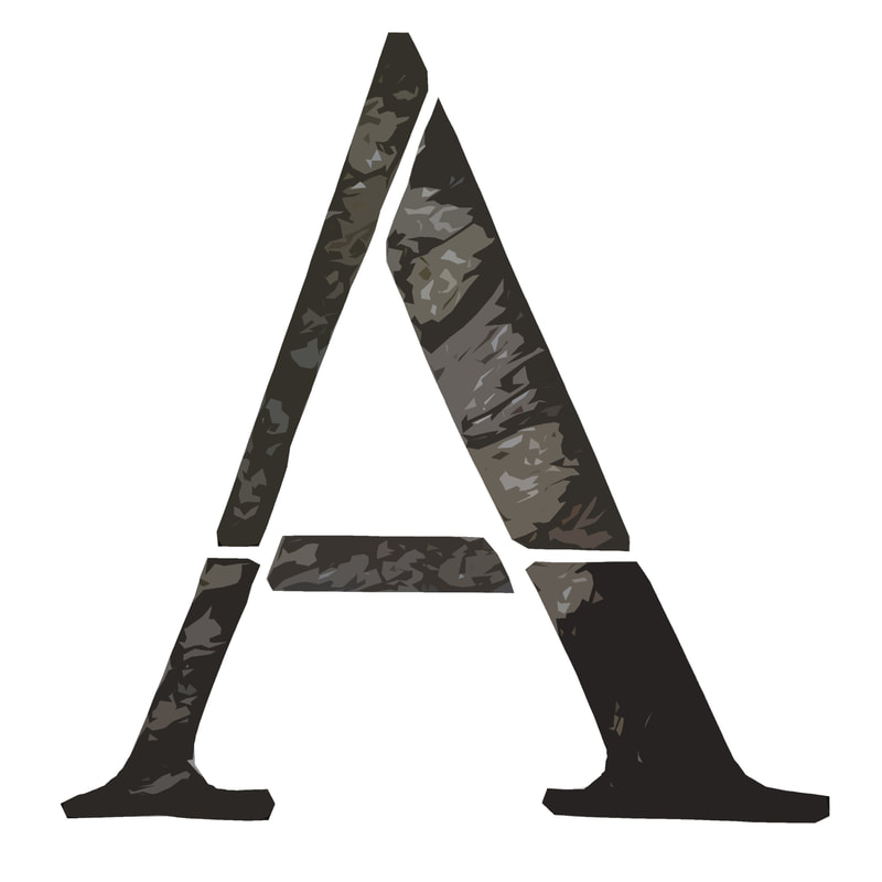


- Tree Alphabet Test -
I really like how this typeface looks, however I do think it is a little bit simple. I think it I were to take this concept forward I would have to make it more intricate.
|
|
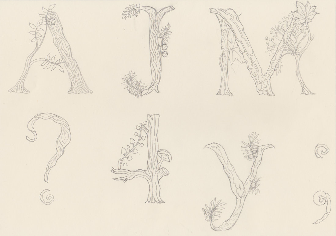
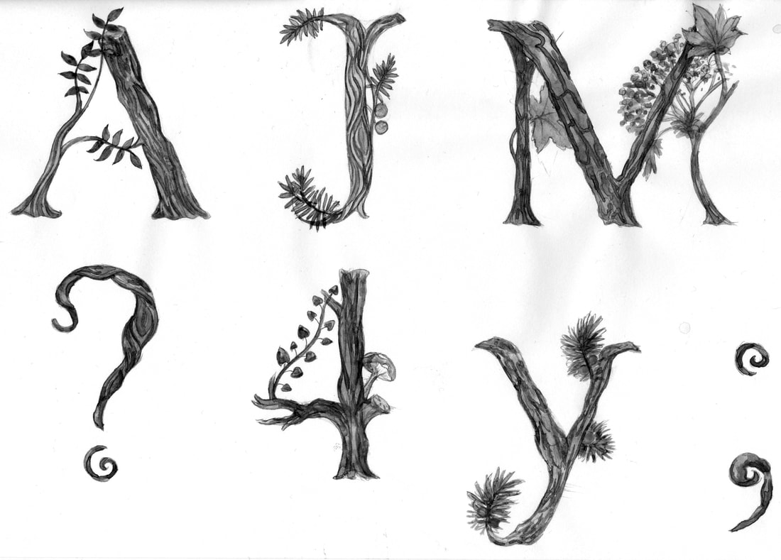
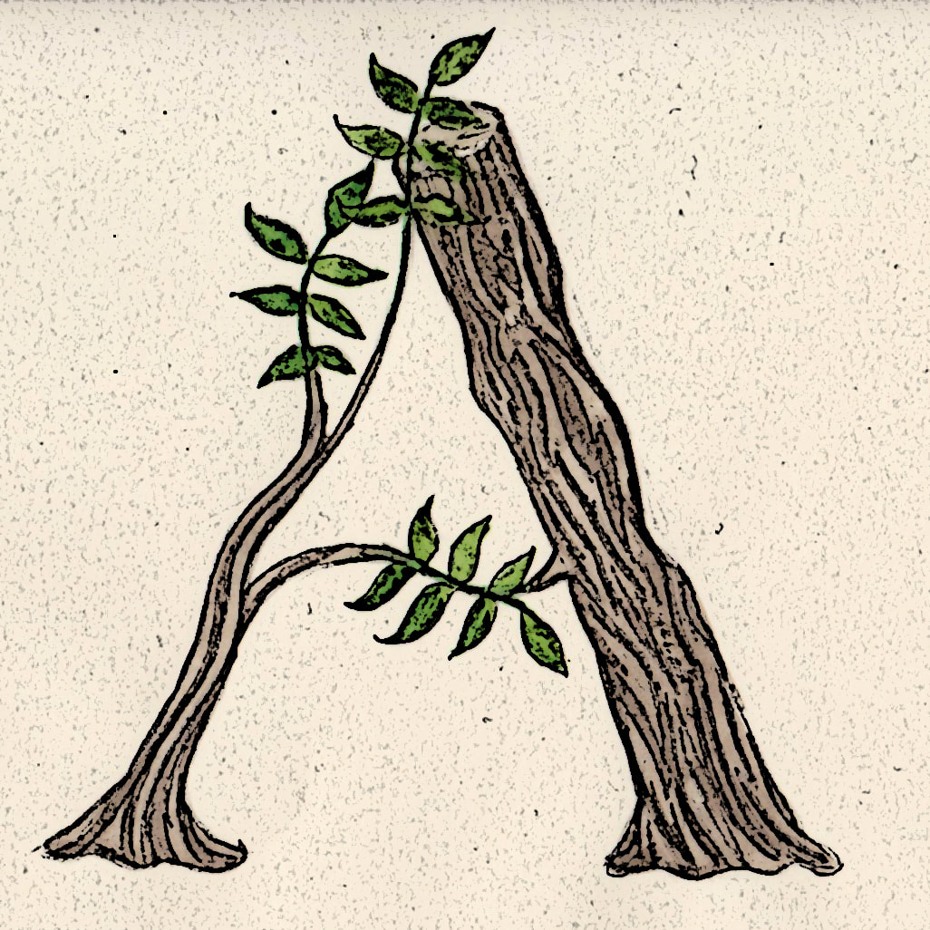
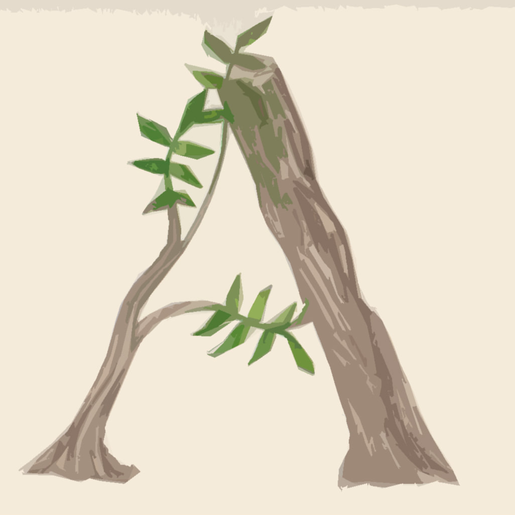
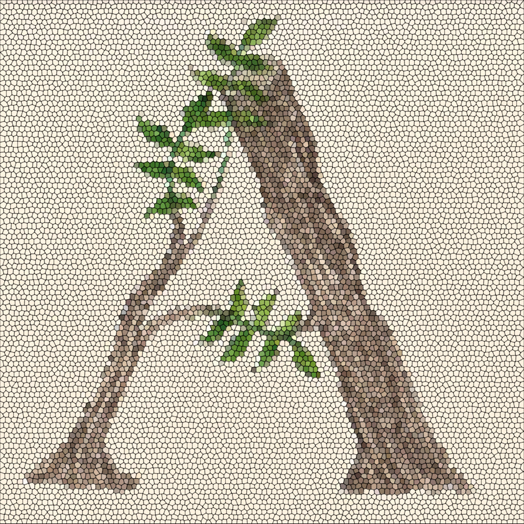
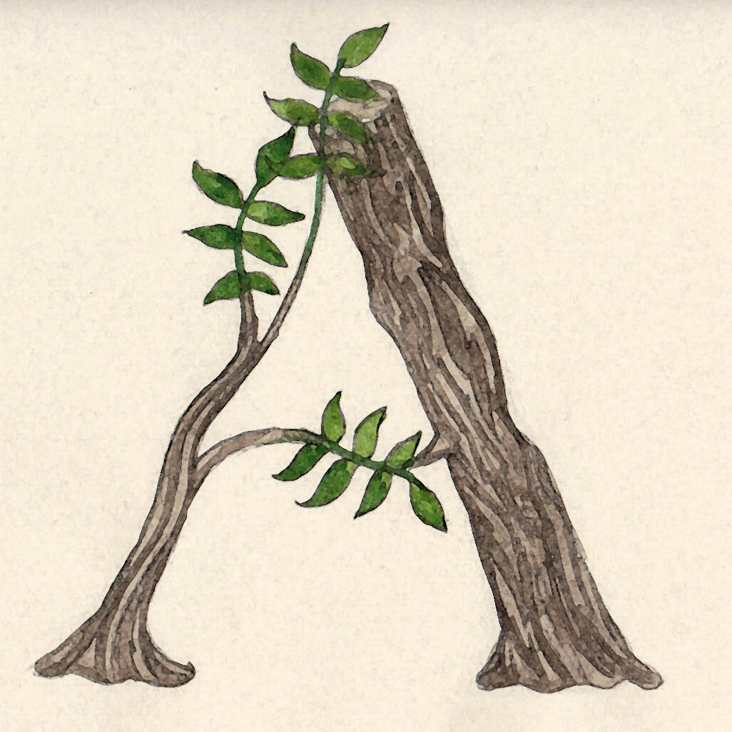
- Watercolour Tree Letter Development -
To develop the tree font idea I decided to draw them more detailed and paint them with watercolour.
I really like these at a large scale however I want my final font to work at every scale, so this is something I will test before making my final decision.
|
|
- Tree Letter Edited -
The Choice
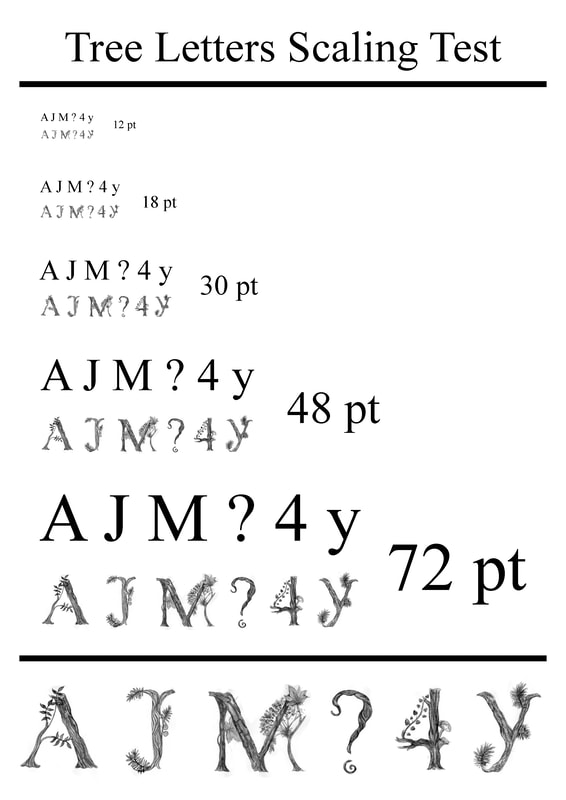
I was a bit stuck on which idea to choose as my final piece so I decided to test the three development ideas in different scales on an A4 page.
This really helped me, because it showed me that the trees and the wire letters were not as effective when they were smaller.
So I have chosen to create the blackbird foot letters.
|
|
|
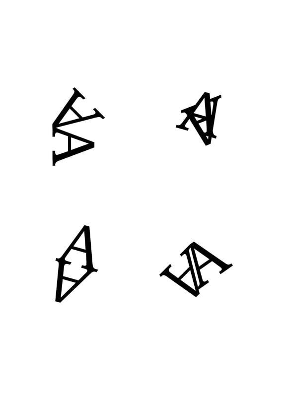
Type Fun Exercise:
2 become 1
Task 1
Select 4 exercises to create from this list of opposites: Regular/Italic Letter/Number Serif/Sans Serif Uppercase/Lowercase Black/White Letter/Punctuation
Choose a few typefaces to work through the task with. Start with an A4 page and fill it with your opposites combinations.
The aim is to bring your two opposites characters together to create interesting shapes. Try at least 4 four different shapes per opposite pair. Arrange them neatly on the page.
Rules: The two characters must touch. They can be rotated but not stretched. Stick to a point size of approximately 120pt-130pt.
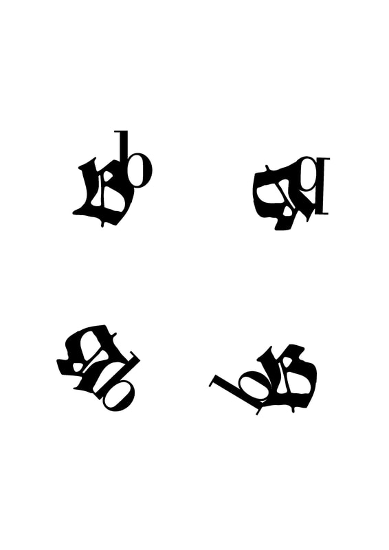
Task 2
Pick two letters or numbers or a mix. Create nine 7cm-7cm compositions where you can combine the two characters in a dynamic way within the square.
Explore scale, repetition and rotation within the composition but do not stretch/squish or distort the original type form. Each design should employ two unique typefaces and be made of single vector form. If you know how to use the pathfinder tool to cut the overlapping shapes out, then please do this, otherwise just overlap in black and white.

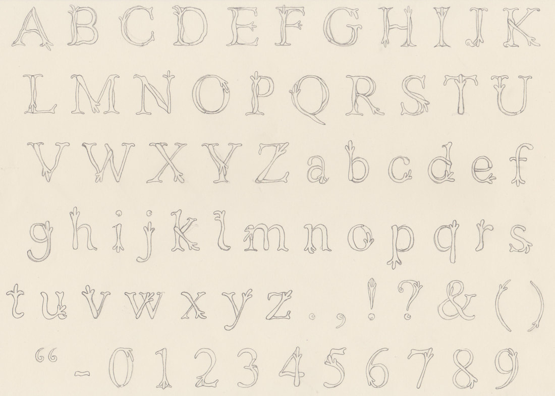
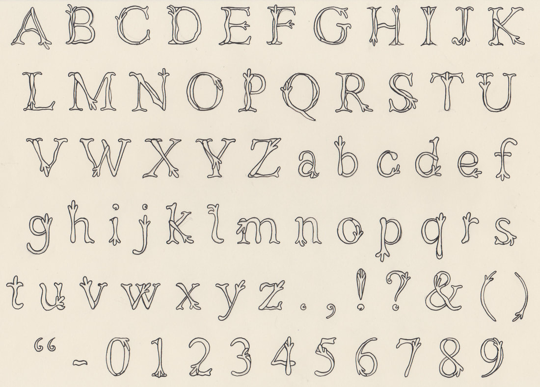
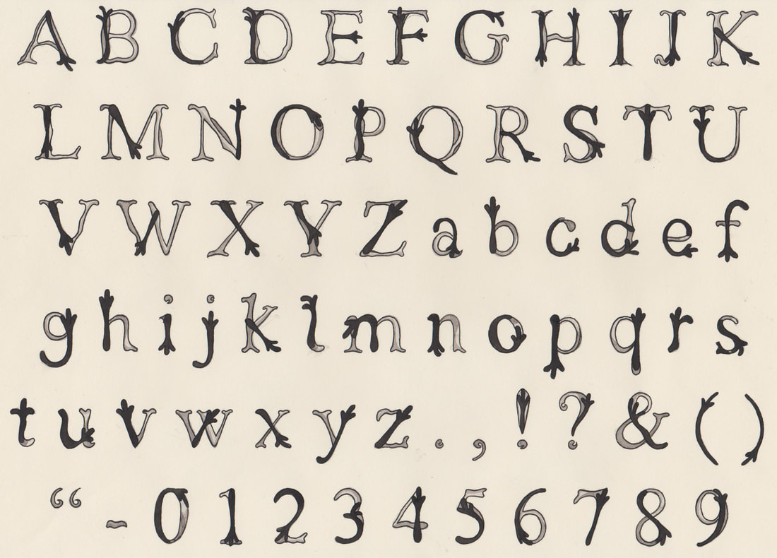
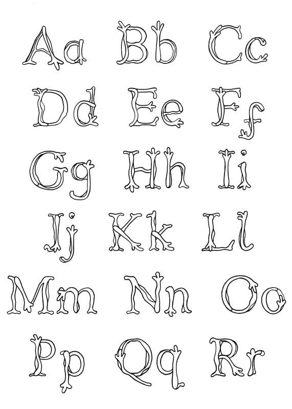
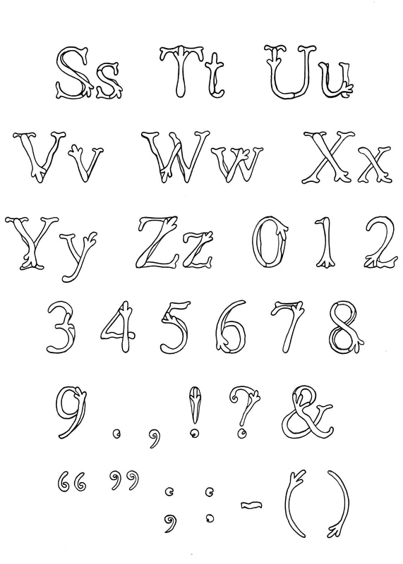
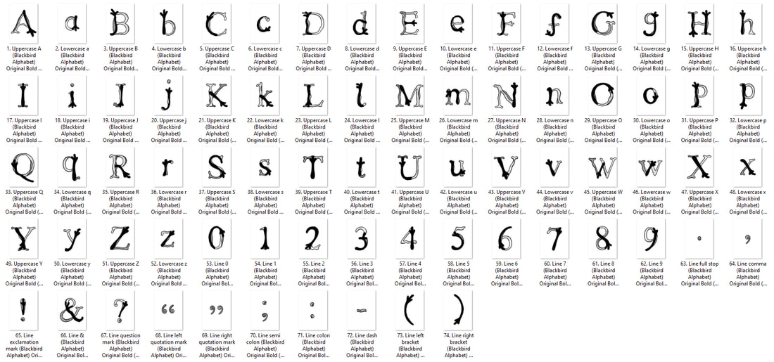
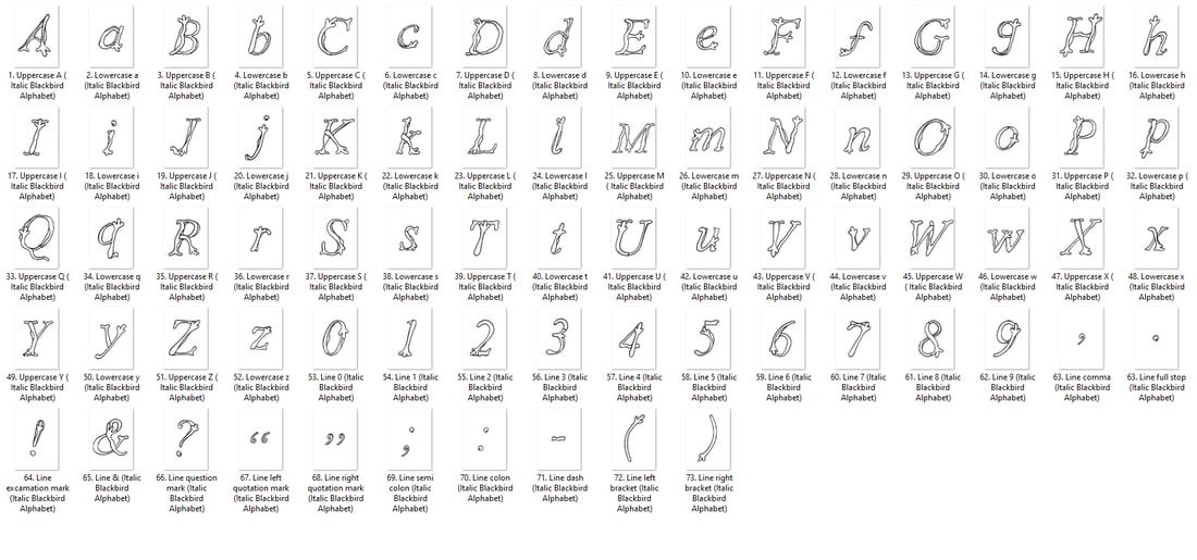
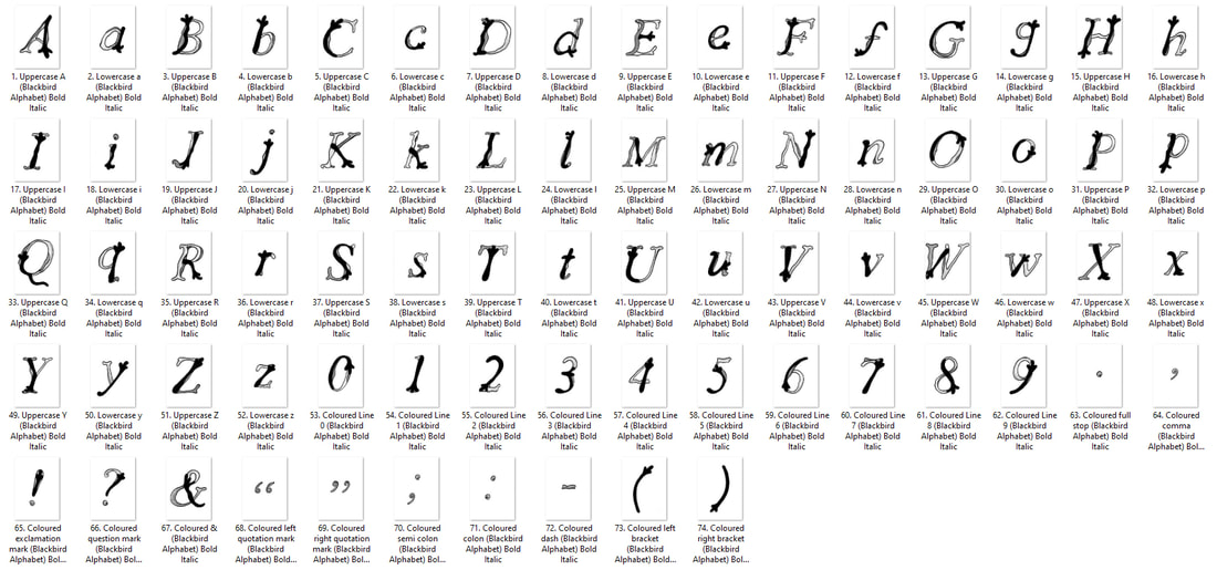
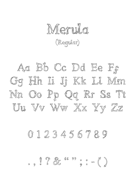
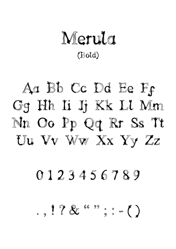
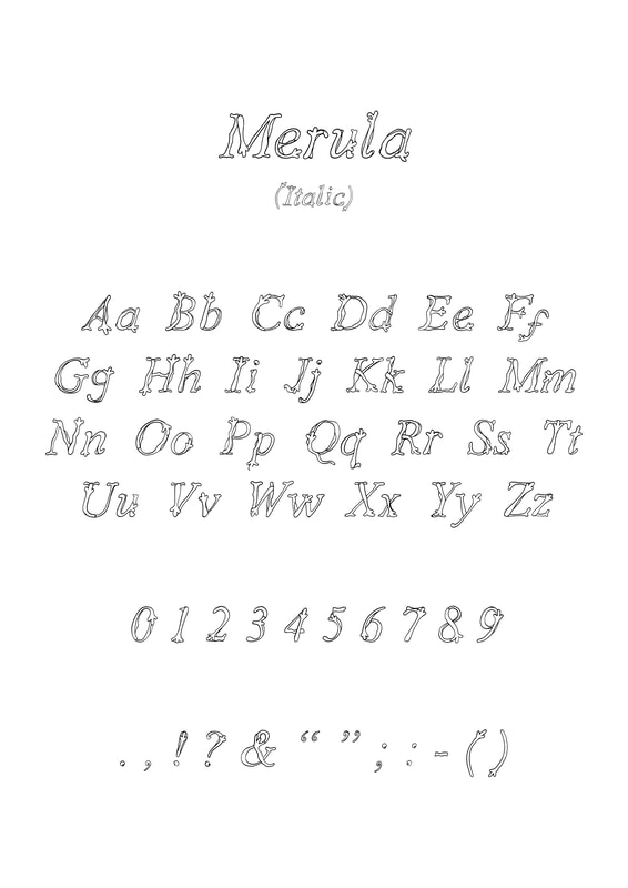
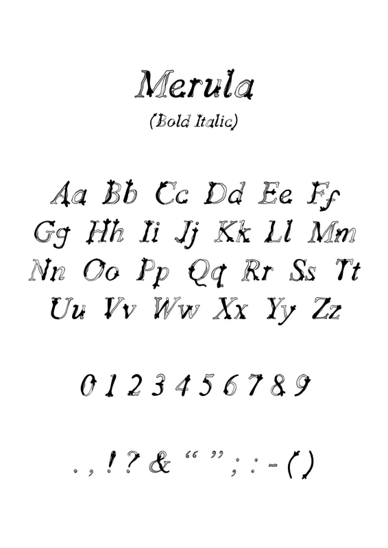
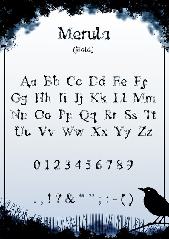
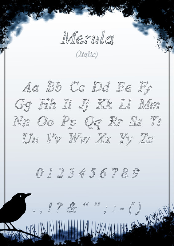
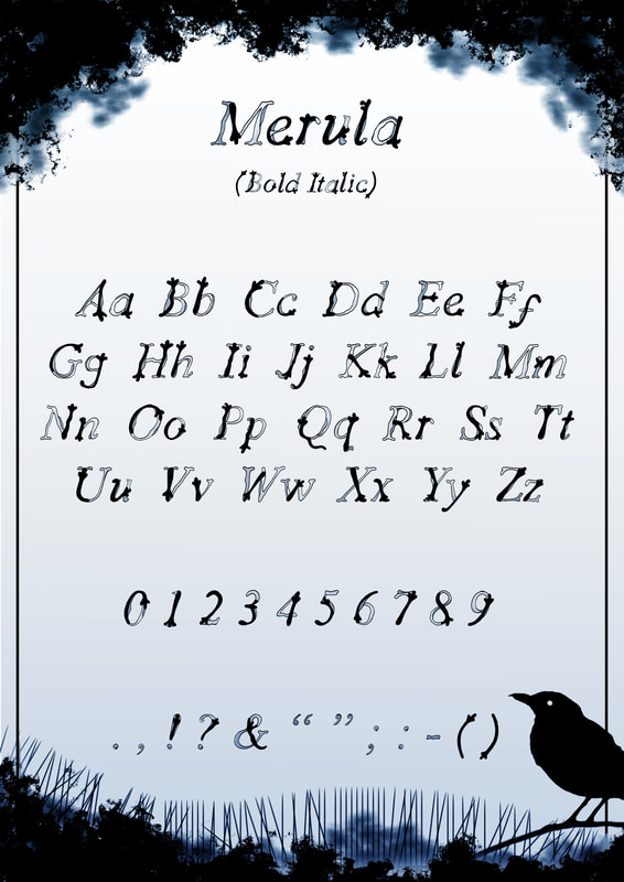
I decided on the name "Merula" for my Blackbird footprint inspired typeface. Previously I had considered "Feathers and Frost" which was inspired
by my original photograph of blackbird footprints in the snow. However I decided to name this typeface after the Latin name for Blackbird "Merula".
Original Sheets
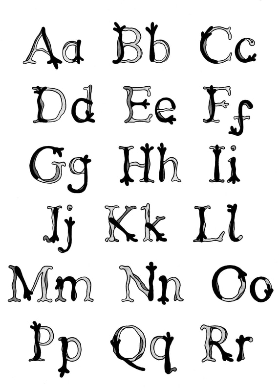
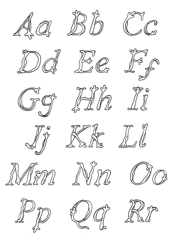
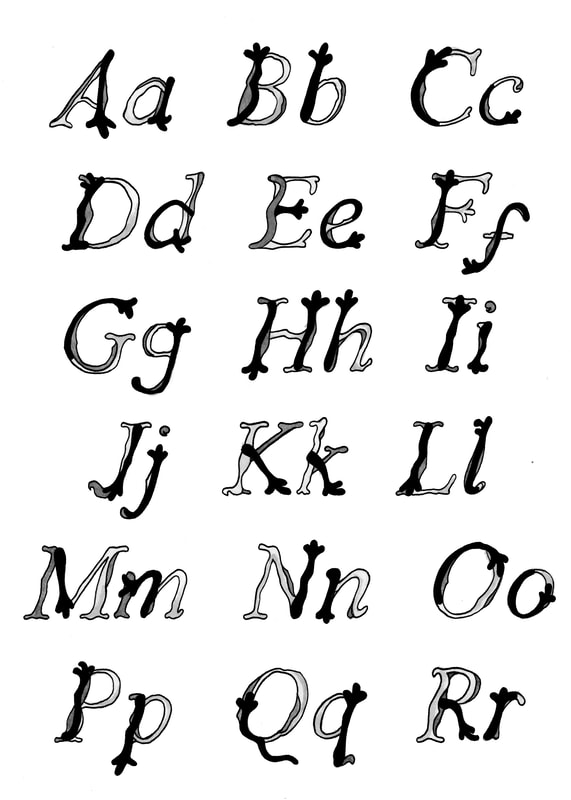
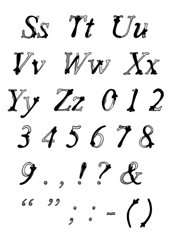
I scanned my font during the process of creating it, so that I could have both a line art and bold version of the font. Additionally I
created an italic version of "Merula", I am pleased with how these turned out, I would really like to use this as a functional font.
I scanned my font during the process of creating it, so that I could have both a line art and bold version of the font. Additionally I
created an italic version of "Merula", I am pleased with how these turned out, I would really like to use this as a functional font.
|
|
|

|
|
|
|
|
Separated A3 Characters
I separated each of the characters into its own A3 sheet, I have screenshotted the files to show the separated letters.
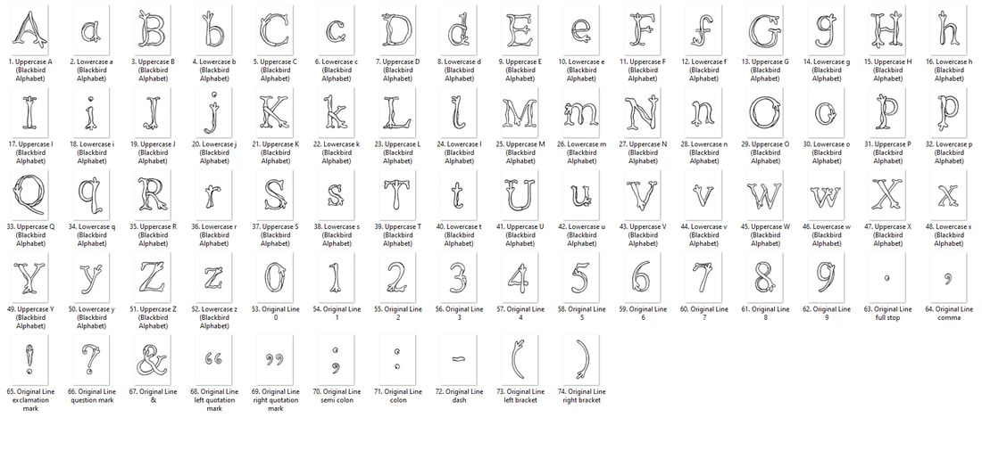
A3 Alphabet Posters
I then displayed the fonts on individual A3 pages, this was a long process but it is worth it to see them displayed properly.
|
|
|
|
Decorated Display Pages
After I placed all of the characters on an A3 page, I decided to create a background that reflected the frosty blackbird footprints that originally inspired this typeface.

|
|
|
|