- THUMBNAIL VISUALS -

Following the online session that we had on Friday I learned that thumbnail visuals
work best when they have some form of colour in the background, and are not all too similar.
work best when they have some form of colour in the background, and are not all too similar.
Initial Thumbnails
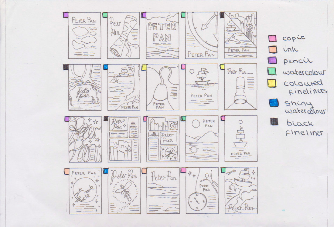

To make sure that my visuals didn't end up too similar I created a small visual map to work out which thumbnails should be created in each material.


The First Selection


These are the images that I selected to take into the development process. I picked more than five because some of the designs were similar so I decided to try to combine them.

|
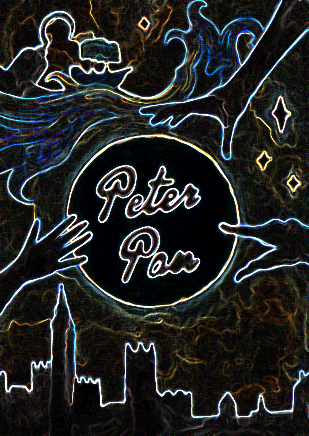
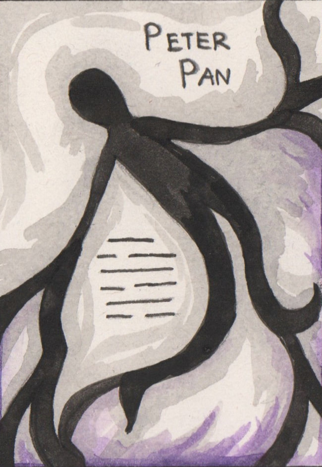
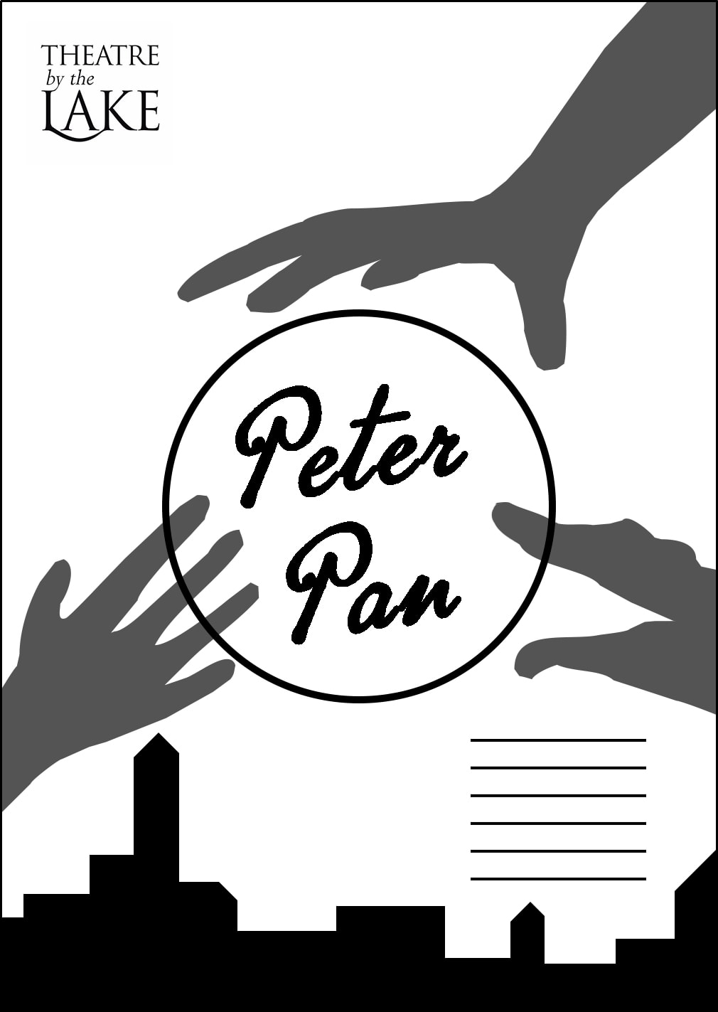
This was the first happy accident that occurred during this process. My brush slipped while I was using ink this created what looked to me like a hand shape on the right hand side of my thumbnail. This made me think of Peter Pan's shadow in more detail, could the shadows be reaching towards Peter Pan. After this I went on to research shadow puppetry and shadow hands. I found that shadow hands would work best for a theatre poster because they are more simplistic, however I had never researched Chinese shadow puppetry before so it was fascinating to learn about. The style reminded me of Jan Pienkowski's artwork. |
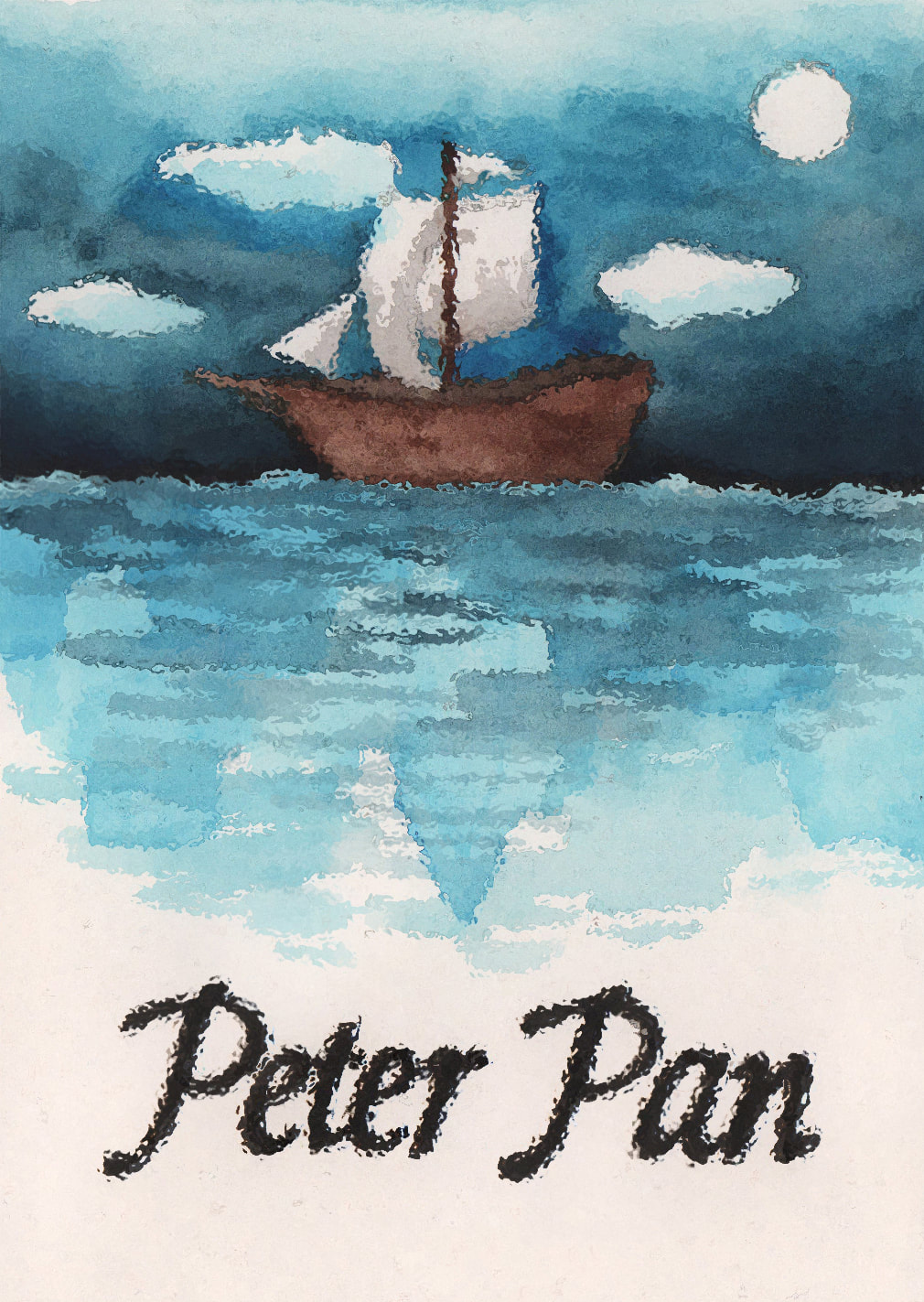
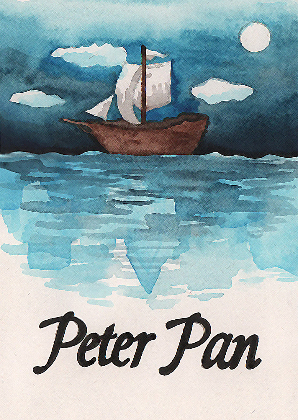
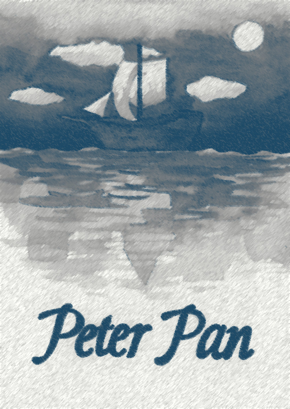
Development

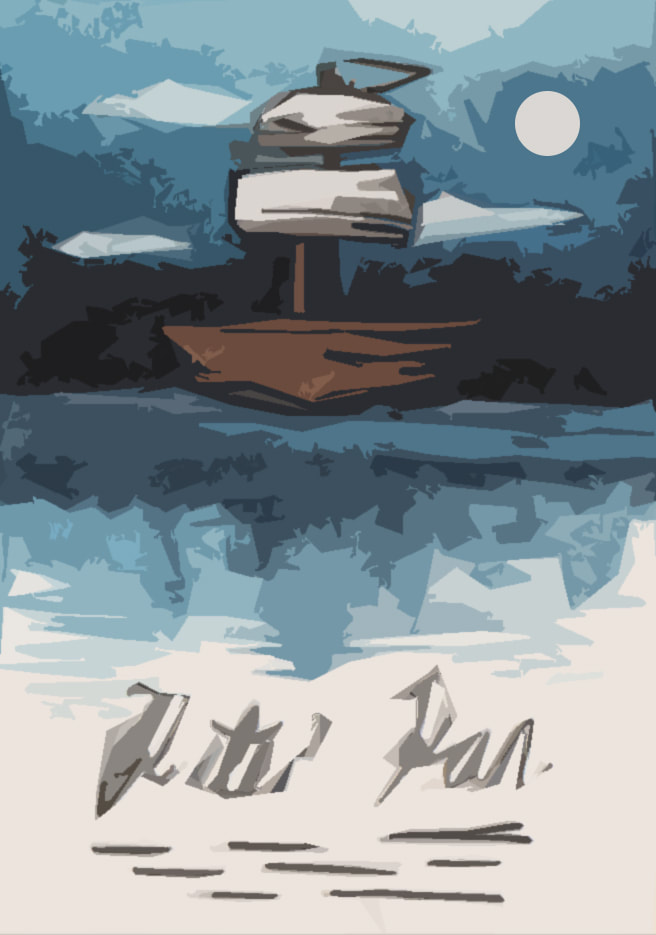
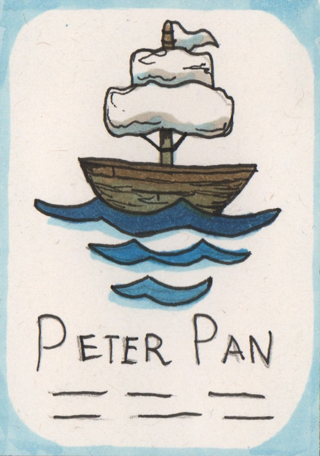
For the "Jolly Roger" development I tried to simplify the London skyline that is present in the water. I did really like the original boat that I had made using copic markers, however it looked more like a book cover than a theatre poster to me. Hence the reason why I decided to combine the two images. After testing how the marker and watercolour worked to create the appearance of water, I decided that I preferred the way that the watercolour looked. It was more fluidic which gave the piece more movement. However after these tests I decided that I didn't like the line art on the boat as it made the boat feel as though it was removed from it's environment.
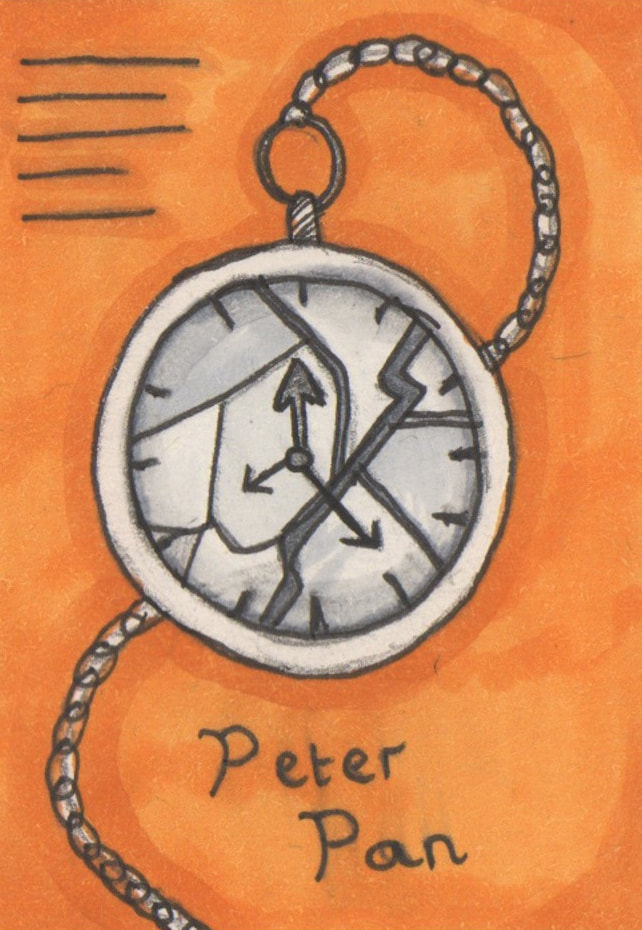
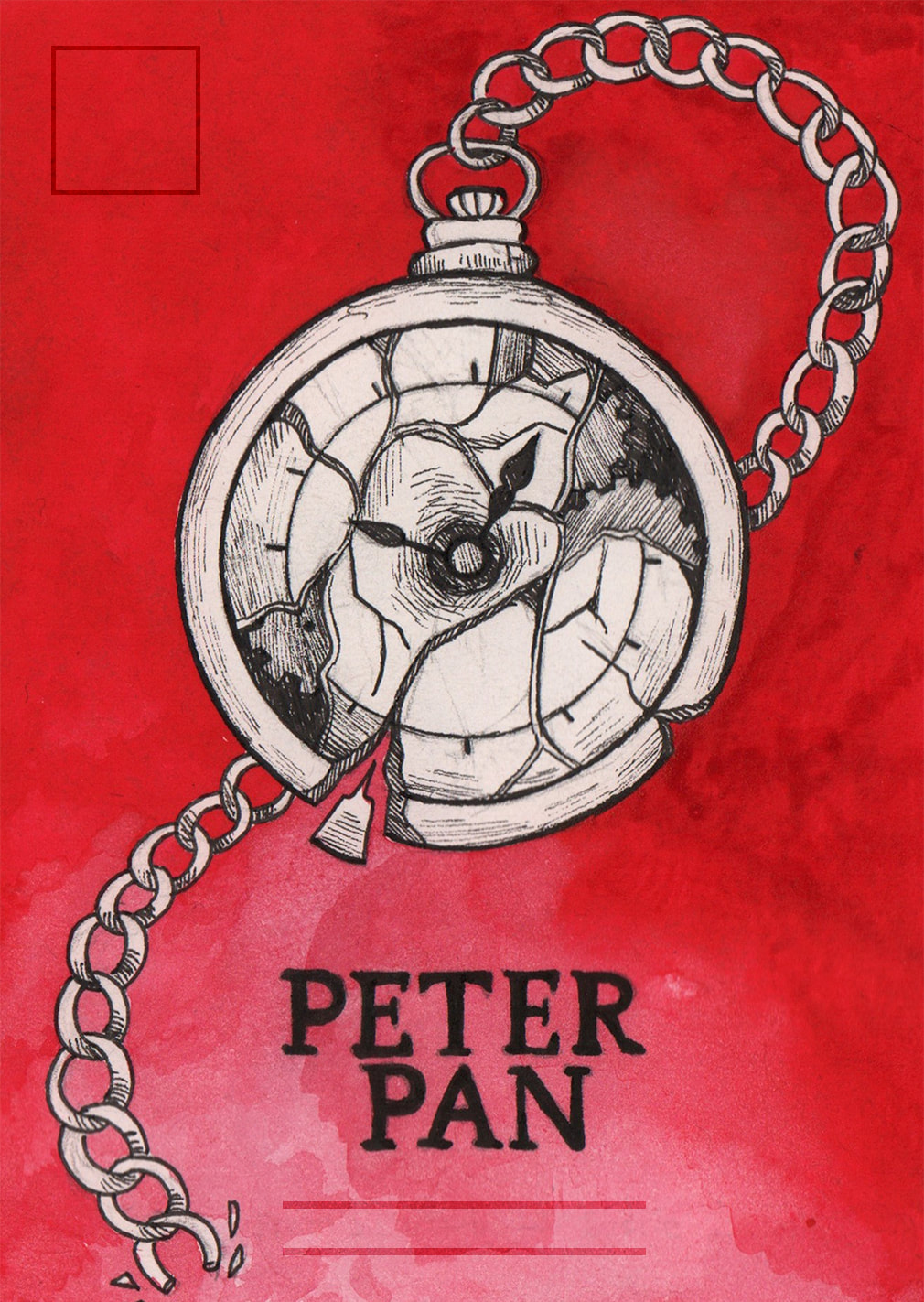
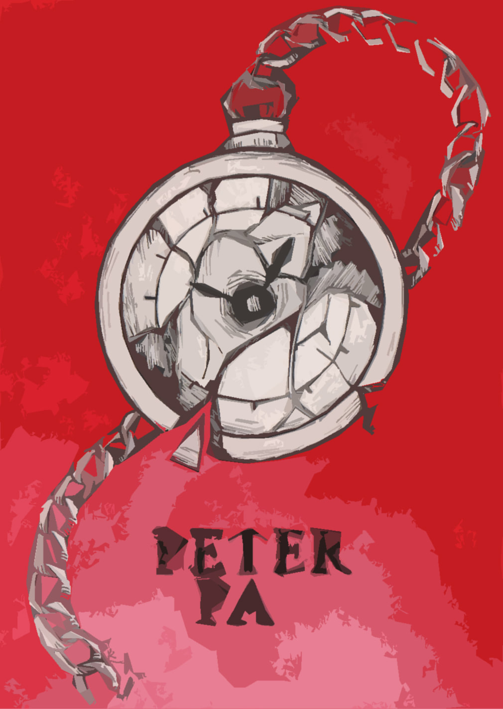
For the pocket watch design I tested different layouts and colours, all with copic markers which I later regretted as they looked very streaky, but from this I learned that I liked the original layout best. However I preferred red as a background colour because it gave the watch more presence on the page.
For the pocket watch design I tested different layouts and colours, all with copic markers which I later regretted as they looked very streaky, but from this I learned that I liked the original layout best. However I preferred red as a background colour because it gave the watch more presence on the page.

I liked the concept of the Crocodile design, however when I attempted to develop the design I felt like it was getting worse instead of improving.
Moving onto the development of the "Shadow" design; firstly I got a feel for the shadow hands by creating a different thumbnails. I ended up liking the blue shadow design best because it created a moody design. This design gave me the space to add in multiple shadow hands that were all converging on the title.
Moving onto the development of the "Shadow" design; firstly I got a feel for the shadow hands by creating a different thumbnails. I ended up liking the blue shadow design best because it created a moody design. This design gave me the space to add in multiple shadow hands that were all converging on the title.

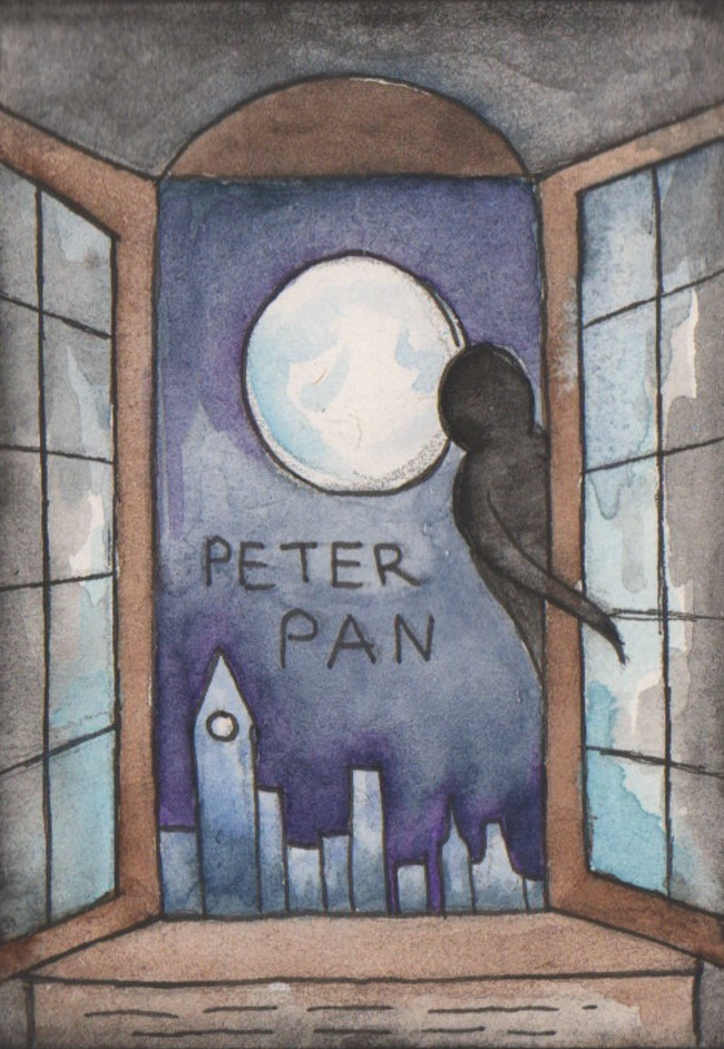
I did like the concept of a shadow looking round the side of the window but after developing the idea I thought it was too similar in appearance to some of the other designs that I created. My favourite was the hand reaching up towards the moon, however it didn't really have a direct link to the story.
Photoshop Edit Tests


I decided to try and edit some of my developments in Photoshop.
I didn't like them very much - however it was worth trying, and it gave my brain a break from making a decision on which three final designs to pick.
I didn't like them very much - however it was worth trying, and it gave my brain a break from making a decision on which three final designs to pick.
The Second Selection


Before I selected the final three designs, I selected the designs that I liked the most throughout the whole process.
The Final Selection


I selected these three designs to create into bigger client visuals, I decided that they were all different enough from each other.
Layouts

Before I moved onto creating the larger client visuals; I created layouts and found fonts that I liked on Adobe fonts, I chose three different fonts that looked slightly older. I am not sure if they all go with the designs because typography is a little confusing.

Client Visuals
|

|

|
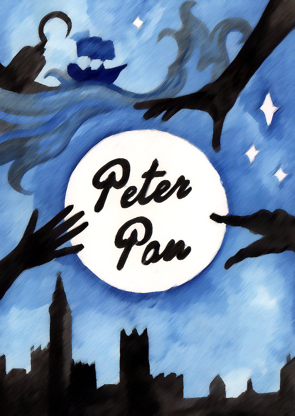
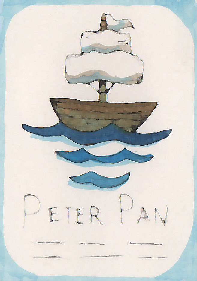
These are the final client visuals, I ended up not liking how the pocket watch turned out. I much prefer the boat and the shadow design.
My favourite of the three designs is the shadow design, which I think is because of how much thought went into it.
I have learned the importance of thumbnails through this project, as well as how to make my thumbnails stand out instead of looking quite boring like the chair thumbnails did on Friday.
The development and research helped me to create something that I wouldn't have created at the start of this week. Getting my ideas down on paper in a visual way instead of with word helped too. I liked how I could look at each of the little designs and get an idea of what they would look like as full scale designs without taking the time to make each one as a full scale illustration.
Overall I liked working on this process, however my brain did not like coming up with forty ideas to start with.
But after the initial brain ache the development part of this project was the bit that I enjoyed the most.
Mounted Client Visuals

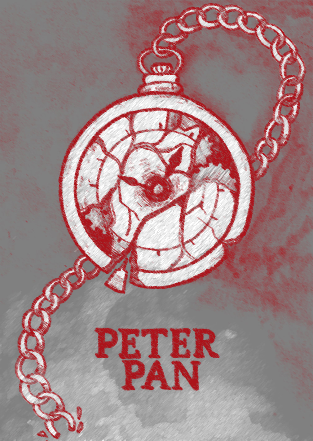

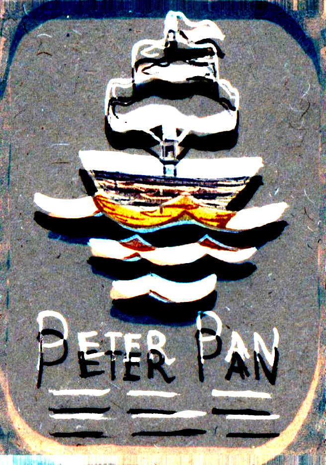
Seeing as though I wasn't very happy with how the pocket watch turned out, I took it back into Photoshop to see how I could edit it.
This was just for fun and it didn't make it to the final design, but I thought I would add it in anyway.
I also edited the other two just to see what I could do with them, I liked looking at the effects.
This was just for fun and it didn't make it to the final design, but I thought I would add it in anyway.
I also edited the other two just to see what I could do with them, I liked looking at the effects.