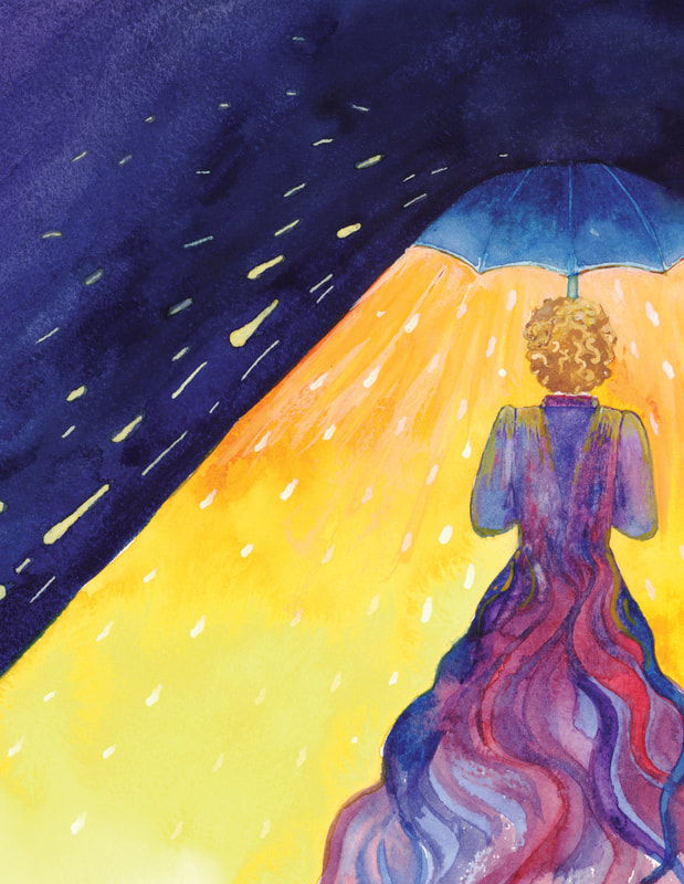
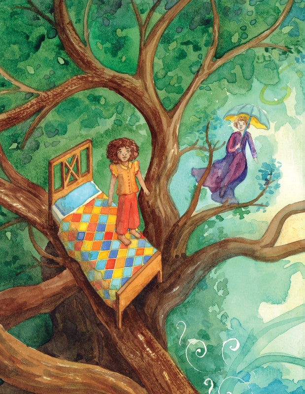
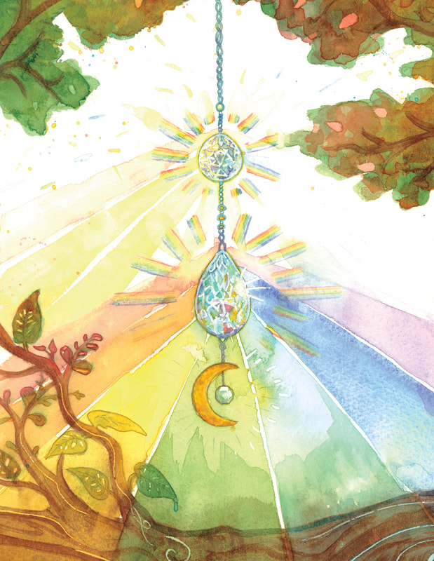
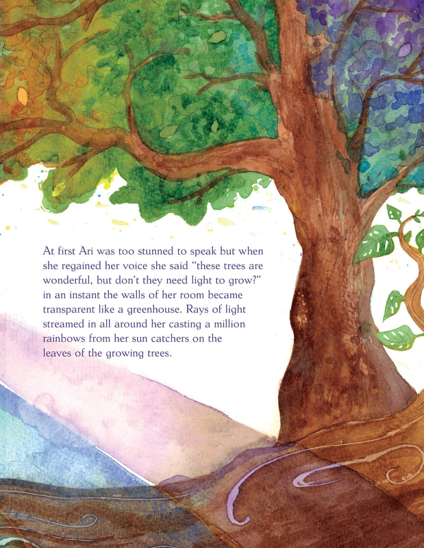
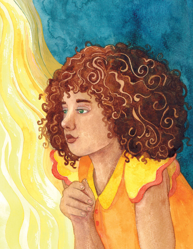
- THE DREAM WEAVER -
An adaptation of Ole Lukøje otherwise known as The Sandman, Dream God and Ollie Shuteye.
The Brief: To create a fully illustrated forty eight page children's book.
|
Ole Lukøje Synopsis ""Ole Lukøje" (Danish: Ole Lukøje) is a literary fairy tale by Hans Christian Andersen based upon a folk tale telling of a mysterious mythic creature of the Sandman who gently takes children to sleep and, depending on how good or bad they were, shows them various dreams. Under each arm he carries an umbrella; one of them, with pictures on the inside, he spreads over the good children, and then they dream the most beautiful stories the whole night. But the other umbrella has no pictures, and this he holds over the naughty children so that they sleep heavily, and wake in the morning without having dreamed at all. Ole Lukøje's name is actually composed of two parts: Ole is a common Danish masculine name, and Lukøje a compound of the Danish words for 'close' and 'eye'. In the tale, he visits a boy called Hjalmar every night for a whole week and tells him stories. Ole Lukøje is later revealed to be a dream god, and in his final tale on Sunday he tells of his brother, likewise called Ole Lukøje but also Death, who closes the eyes of those he visits and takes them away with him." |
- Neil Gaiman -
“People think dreams aren't real just because they aren't made of matter, of particles. Dreams are real.
But they are made of viewpoints, of images, of memories and puns and lost hopes.”
“People think dreams aren't real just because they aren't made of matter, of particles. Dreams are real.
But they are made of viewpoints, of images, of memories and puns and lost hopes.”
|
"The Norse took dreams quite seriously. While they acknowledged that some dreams were random and meaningless (and called them draumskrok,[1] “dream-nonsense”), other dreams were held to possess enormous significance.
Dreams could sometimes foretell the future. Their ability to do so went hand in hand with the Norse view that all events were directed by fate; as the Eddic poem The Song of Skirnir (Skírnismál) puts it, “My destiny was fashioned down to the last half-day, and all my life was determined.”[2] Since the future was preordained, it could be known in advance." "Niorun herself can be seen as a veiled figure walking through the misty halls, her face almost never seen. If approached, she will speak in riddles and poetry, or say things that one later cannot remember. Offerings to her include colored glass balls and prisms that she can hang up in her hall to rotate and add to the ambience. Niorun can bring the gift of lucid dreaming, and if you have any aptitude for it, prophetic dreams. That doesn’t mean that your dreams will necessarily be clear and decipherable, just that they will have information in them. A good prayer to Niorun is to say before you fall asleep, “Let me wake up knowing one thing that I do not know now.”
|
"From the late 18th century, the Industrial Revolution triggered significant social and environmental changes. Society shifted from a mainly pastoral way of living, towards life and work in more industrial and urbanised settings. The hive of industrial activity at Coalbrookdale, nestled in the picturesque Shropshire valleys, drew the attention of artists working from the late 18th to early 19th centuries. In Philippe-Jacques de Loutherbourg’s Coalbrookdale by Night, the human impact on the landscape is immediately apparent. Indeed, the valley landscape is hardly visible, cottages and figures in the foreground are dwarfed by the central subject—a magnificent blaze of fierce flame and light from the blast furnaces beyond. Many artists were excited and inspired by the progress and invention during the period. Like de Loutherbourg, JMW Turner also sought to capture the thrill and spectacle of the changes happening. Rain, Steam and Speed shows a train hurtling through the countryside—outpacing a nearby boat sitting placidly in the lake. Through impactful light and powerful movement, both artists capture a sense of dynamism, drama, and even positivity around the profound changes that were happening in Britain.
Famous now for his rich floral textile designs, William Morris (1834–1896) was not only a designer with an aesthetic interest in nature, but also a social campaigner passionate about humanity’s relationship with the environment. He distained the environmental pollution and societal injustices that rose from the Industrial Revolution, and drew a connection between the poor quality of life endured by working people and alienation from the natural world.
At this time, art was also being used to inform and share images of nature with urban populations. A striking example is a pair of paintings of ash trees, one set in winter and another in summer, by James Hey Davies (1844–1930). These were displayed in Ancoats, Manchester, to introduce an idea of the countryside and seasons to residents used to a densely crowded and polluted city, with very little opportunity to experience nature."
At this time, art was also being used to inform and share images of nature with urban populations. A striking example is a pair of paintings of ash trees, one set in winter and another in summer, by James Hey Davies (1844–1930). These were displayed in Ancoats, Manchester, to introduce an idea of the countryside and seasons to residents used to a densely crowded and polluted city, with very little opportunity to experience nature."
William Morris: The first eco-warrior of design
"You’d be forgiven for thinking that the designs of William Morris – his trellises and willows and honeysuckles – are a little out-of-date and irrelevant. Popular designs like Strawberry Thief adorn cushions and mugs, but do they really fit the modern interior? Surprisingly, not only have these botanical themes made a massive comeback, but Morris himself has been enjoying a new wave of popularity – as an environmental prophet and anarchist. The British textile designer, writer, activist and leading member of the Arts-and-Crafts Movement has also recently been extolled as a precursor of green theory, according to biographer Ruth Kinna. If he were alive today, it is very likely he would be standing shoulder to shoulder with environmental protestors. He was 170 years too early, but he foresaw the ill effects of industrialisation: “When our green fields and clear waters, nay the very air we breathe, are turned... to dirt... let us eat and drink, for to-morrow we die – choked by filth.” The natural world in which he had grown up – cantering his pony through Epping forest – was being destroyed before his eyes, and the ‘common man’ enslaved to carry out this destruction. Observing the ill effects of factory work on people, Morris realised that a healthy environment was linked to psychological as well as physical health; that the landscape itself could lift spirits and contribute to psychological equilibrium. Obsessed with the pollution, congestion, and squalid industrial waste produced by the Industrial Revolution, he retreated artistically into a medieval utopia. Fighting the evils of the ‘modern age’ became, in due course, linked to his entire design ethos, and underpinned his life’s work."
"Few art movements have been as influential and expansive as Surrealism. What began as a rebellion against the stifling rationality that permeated the beginning of the 20th century, grew into a vibrant, cross-disciplinary creative force which took root across the world, and continues to inspire to this day. Spearheaded by poet André Breton and formalised in his 1924 manifesto, the movement ignited a new form of artistic language that championed the power of unconscious thought, through a combination of free association and the uncanny imagery of dreams."
Visionary Art
1980s Fantasy Animation
|
|
|
|
|
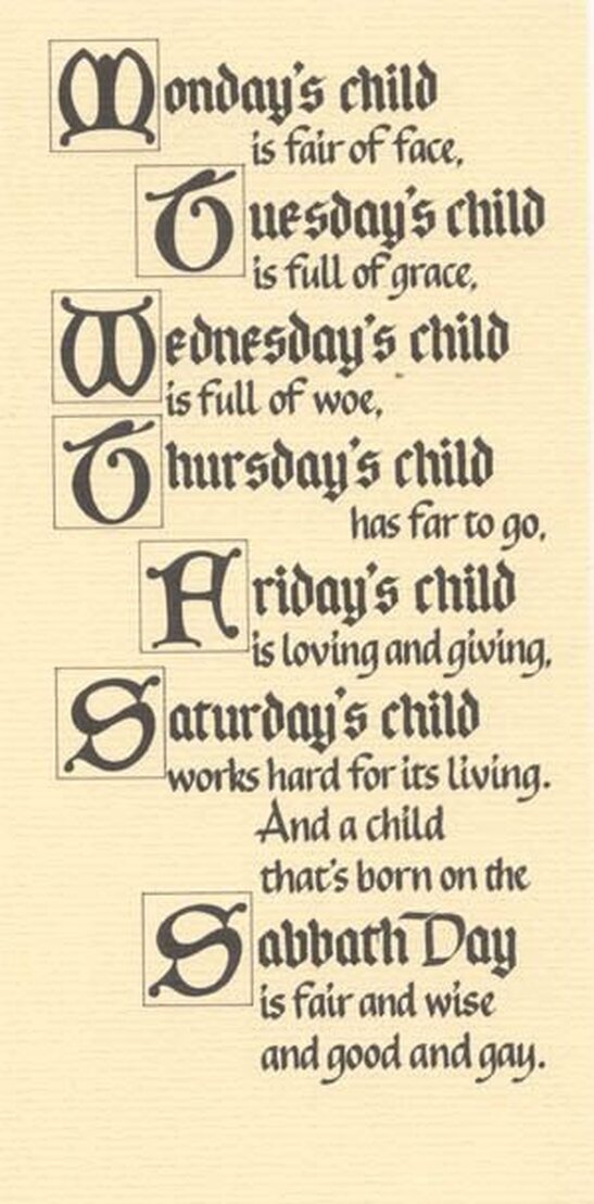
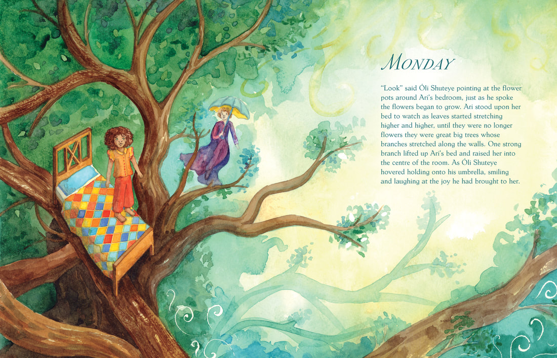
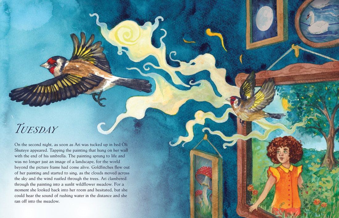
"Mánadagr – Monday
The name Monday is related to the moon. In the Nordic areas, the moon was called "Mani". Tysdagr - Tuesday Mars is a god of war, and so is the Nordic god 'Tyr' or 'Tír'. It is Týr who has given his name to Tuesday. In Norse mythology, Týr is one of the Aesir. He is primarily known as the god of justice and war, but is also described as wise and brave. The T-rune was associated with Tyr. Óðinsdagr – Wednesday Odin is the most prominent god in traditional Norse mythology. He is particularly associated with war luck, royal power, rune power and wisdom. Odin is the most powerful and eldest of the Æsir. Þórsdagr - Thursday Thor is reminiscent of Jupiter, as they both deal with lightning and thunder. So this day of the week became Thursday. Thor is in Nordic mythology the god of thunder. Thor controlled the weather. He is associated with strength, aggression and reliability. Frjádagr - Friday Frigg (Freya) is the goddess of love. Frigg is Odin's wife in Norse mythology. She was perceived as the goddess of marriage. She was also a protector and helper. Laugardagr (sunnunótt) – Saturday Most inexplicable among the Old Norse day-names is laugardagr. 'Laug' mean bath or hot water and 'dagr' means day. So you can translate the Nordic word for Saturday into 'the day of the hot water' or 'bathing dag' Sunnudagr – Sunday, the day of the Sun Sól is a goddess in Norse mythology. 'Sol' means Sun. Over time, the day of the sun became Sunday. In the runic alphabet, the rune-S name is Sun." |
Instagram Favourites
Instinctual Art Creation
Artists Whose Styles Inspire Me
|
|
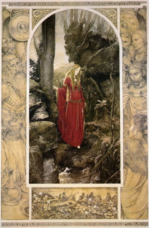
"Paint Me a Picture: PJ Lynch: Mastering the Classic Style Who are the artists who’ve most influenced your work? Arthur Rackham and Edmund Dulac are two of my favourite illustrators from the golden age of British book illustration. But I’m also really influenced by American artists like Norman Rockwell and NC Wyeth. Alan Lee, Gennady Spirin and Brian Selznick are some of my favourite book illustrators working today. Can you tell us a bit about your process? My process always starts with a story. Usually someone else’s story, but now I have started writing my own. By reading the story over and over I decide which parts need to be illustrated. Then there’s lots of drawing of very rough thumbnails. Next I select the thumbnails that are working best and I take them a little bit further and add more detail. On some of my books I work closely with models and take lots of reference photos, while on others I like to draw as much from the imagination as I possibly can. After I’ve done all that, then I finally start to do the finished paintings. In recent years I’ve been enhancing the images a bit digitally as well. Anything to make the finished book look as good as possible. What one piece of advice would you give to someone starting out on this career? I would advise aspiring illustrators to draw every day. Make it a real habit. It’s advice I need to follow myself. For any one who wants to make books as an illustrator, or as a writer, I would offer one very practical piece of advice. You should consciously limit your time on the internet! Social media and emails can eat up hours of your day if you let them. Take a break from the social media until you get that new project really going. Hopefully you will get so involved with your work that Twitter and Facebook will come to seem relatively unimportant." |
|
|
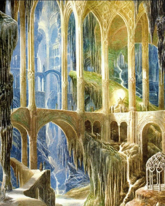
"Interview with Tolkien illustrator Alan Lee Q: I've read that some people do not consider book illustrations to be art, since they serve a purpose outside of pure creation. Do you consider yourself an artist? I think of myself as an… I think of what I do as illustration, because that is what it is. It is always connected with a text or with a story, and is going to be printed. The responsibility is to help to tell the story, without interfering with the readers’ imagination. In a way it is a bit more akin to a sets designer or to providing music for a film. You are serving the text and you are serving the story. Q: When looking at your art in the Children of Hurin the color plates are most of the time landscapes and the figures are drawn so very small? Was this done on purpose? There are two factors. One is that it is a personal preference for me to paint landscapes, because I am more moved and impressed by landscapes. A lot of my favorite painters, like Turner, are landscape artists. Q: One would always think that sketches are the unfinished product that will lead to a drawing, to me it seems in the Children of Hurin these are much more detailed then the color drawings. I love this very much it really ads something extra to the story. They are very detailed! They look detailed, but they were actually done quite large. They have been done on about A2 size. So the detail gets crisper as they get printed smaller. I can get back a little bit from the page and draw larger to get the same effect. Q: Your Tolkien related illustration has evolved incredibly over the years. For the Children of Hurin you now even used computer to improve your work. Is this moving up a level? I wouldn’t say that is moving up a level, it is just for convenience really. I started moving to the world of computers when I was working on the films. Coming back from New Zealand, I was able to use computers for designing as well. In doing that also, scanning my own artwork, I was able to do enhancements, sometimes to get it closer to the original artwork or add a little contrast. |
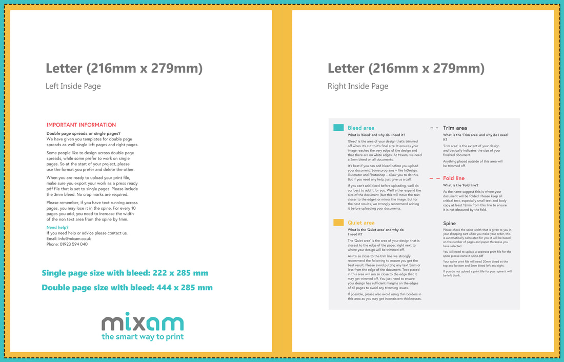
Mixam Book Sizes
Letter (216mm x 279mm) or Square (210mm x 210mm)
I chose to make my book letter ratio, as I will be using A3 watercolour paper to create the pages so letter size maximizes available space.
I chose to make my book letter ratio, as I will be using A3 watercolour paper to create the pages so letter size maximizes available space.
Dwayne suggested that for this project I should research into Kickstarter and how the process works. So here is some information about successful UoC projects.
|
|
Setting Of The Story: Location
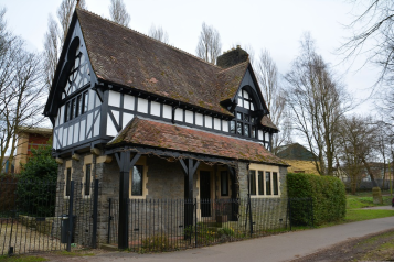
I believe that the setting of these illustrations should be inspired by a mix of victorian London, Odense (the birthplace of Hans Christian Andersen), and Danish architecture in general.
|
Man In The Moon: Inspiring The Dream God Design
|
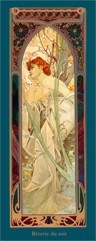
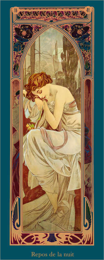
Fashion: 1930s Inspired
|
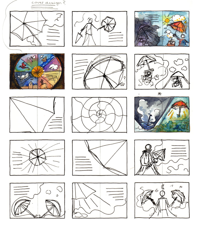
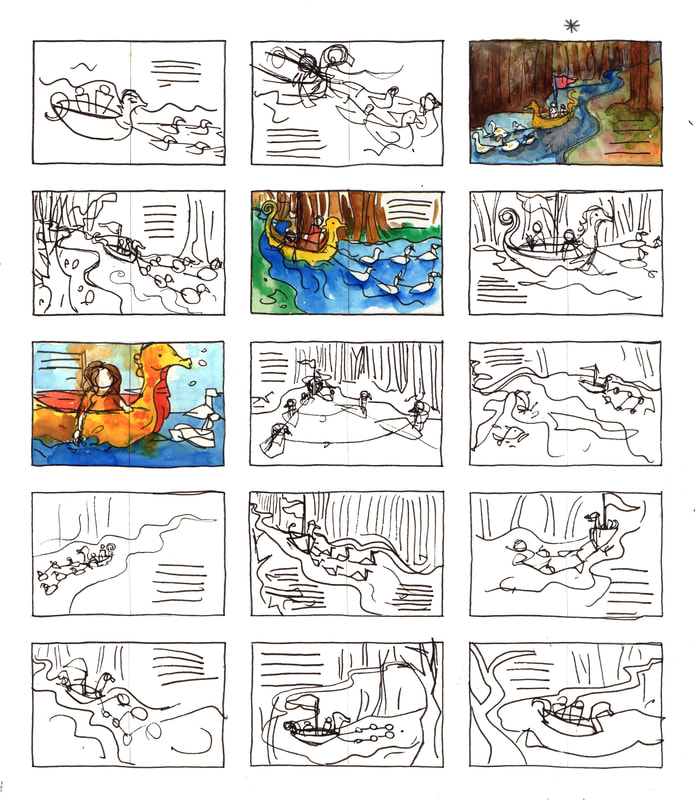
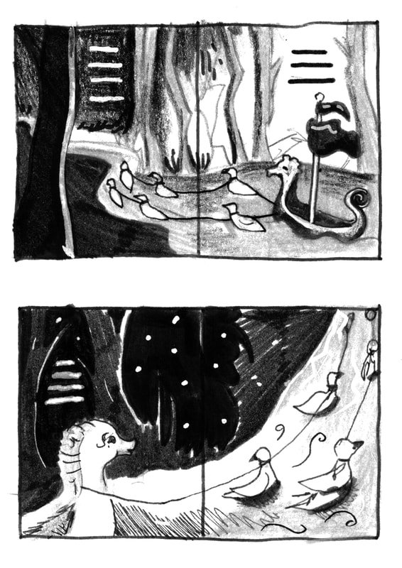
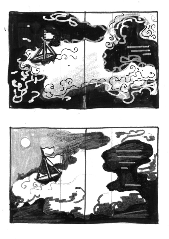
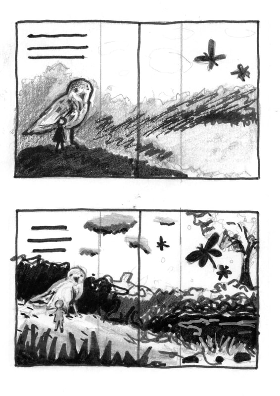
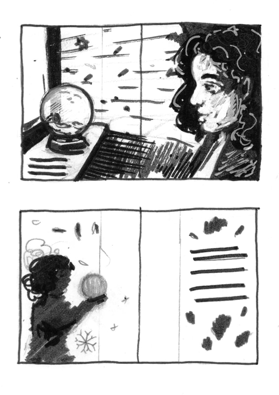
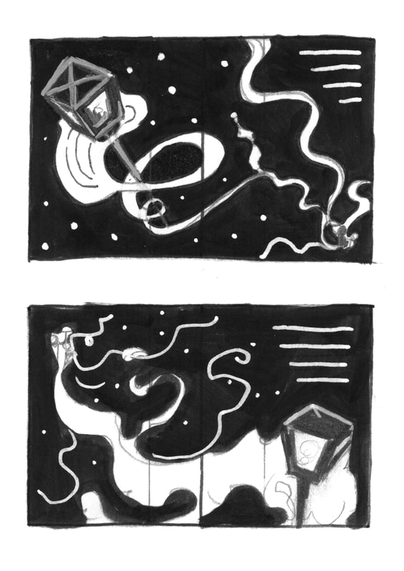
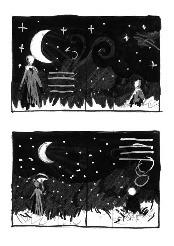
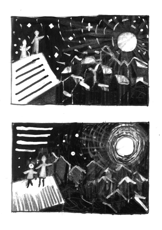
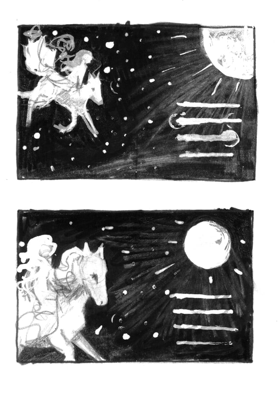
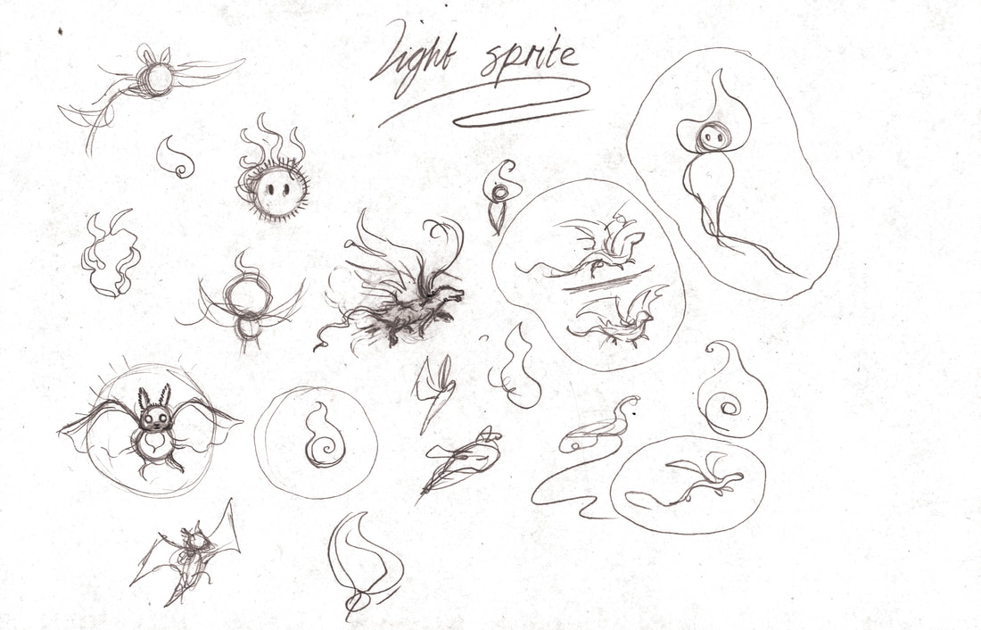
Thumbnails
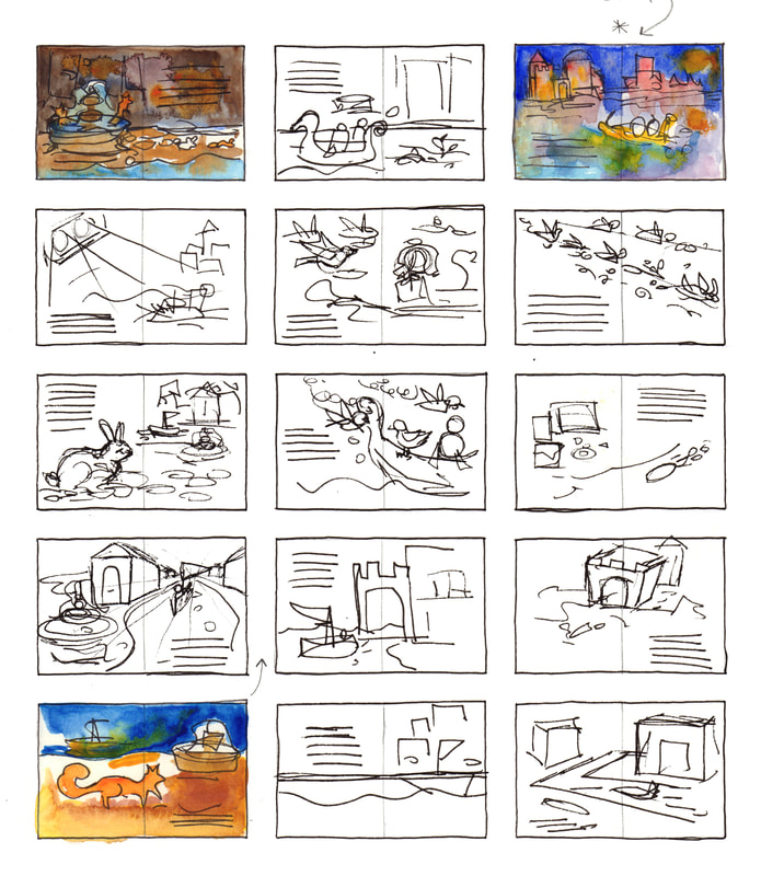
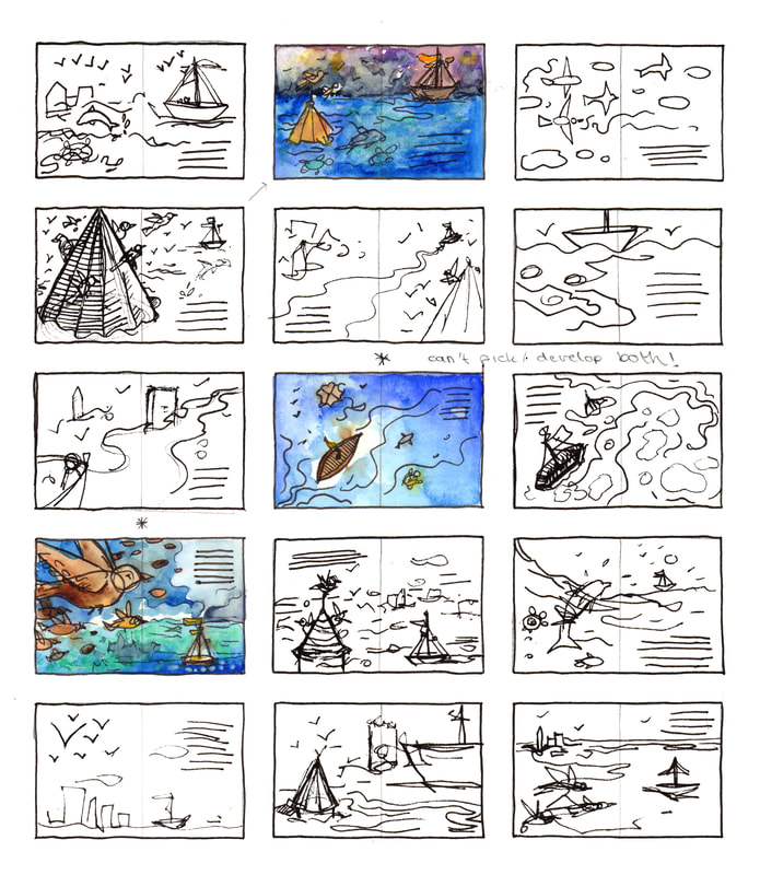
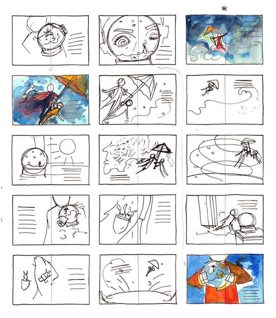
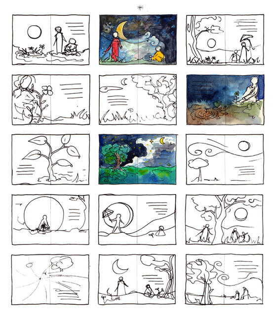
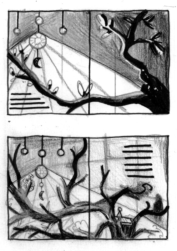
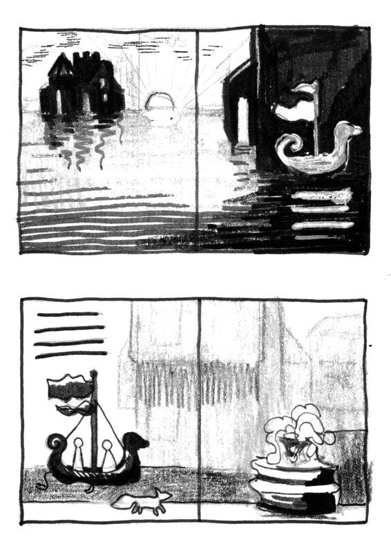
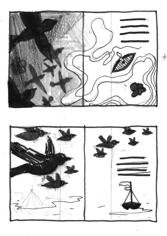
To start the 'Dream Weaver' of project I created multiple sheets of thumbnails using a pen, then I selected and painted the ones that I liked best. Afterwards I sought feedback from
both my tutors and peers about which thumbnails people preferred. This allowed me to gain access to opinions out with my own which is a good reflection of a client scenario.
Character Design
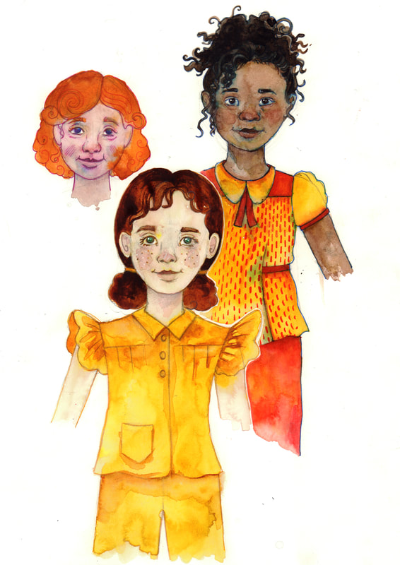
After I had completed my thumbnails I moved onto character design, drawing or painting people has never been my strong suiting. So, I took time planning out
characters and looking at facial features and energy of the character I wanted to create. I used watercolour mainly to do this in a light and expressive way.
I also played around with the idea of overlaying patterns onto my watercolour paintings, however I felt that it took it away the spontaneity of with watercolour painting.
I was advised by Tony to access a 3-D modelling software online so I found this software just sketch me. I did find it helpful in some ways however the children’s proportions were not exactly accurate, So moved on to use a mixture of that with Pexels, a free online website which has a load of free references.
Colour Scheme
I also thought it would be a good idea to pick a colour scheme for my book overall. This would be stuck to throughout the book, from the start I knew I wanted the book to be
bright and colourful as the intended day's range for the reader are children so I picked warm leaning colours predominantly as that is my personal preference as well as reflecting the story.
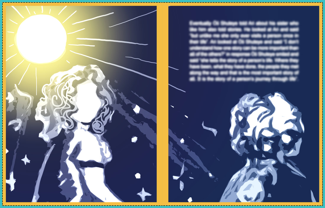
Tonal Contrast Development
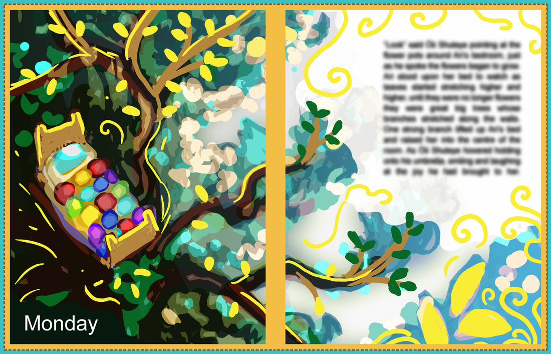
Dwayne mentioned to me about tunnel contrast the ability to have areas of light and dark to have the text sit on I found this was an important thing for me to explore as I do struggle within my article is adding darkness the way I did this was to digitally mock up coloured designs based on black-and-white thumbnails this isn't my unusual style and does not reflect the final outcome however it was an invaluable tool there out exactly where my text would be placed this was a very helpful thing to do and they ended up helping me a lot.
Dwayne mentioned to me about tunnel contrast the ability to have areas of light and dark to have the text sit on I found this was an important thing for me to explore as I do struggle within my article is adding darkness the way I did this was to digitally mock up coloured designs based on black-and-white thumbnails this isn't my unusual style and does not reflect the final outcome however it was an invaluable tool there out exactly where my text would be placed this was a very helpful thing to do and they ended up helping me a lot.
Working Out The Scale
Unfortunately Mixam didn't have a premade template for the size of book that I want (Letter 216 x 279 mm) so using the power of mathematics and
photoshop I worked out the scale for myself. Fingers crossed that my calculations are sound! (216 x 2 = 432 / 432 + 40 = 472 / 472 + 9 = 481 / 279 + 40 = 319)
Style Development
After this I moved on to further style development using watercolour and ink. At this time I created a collection of multiple pieces some more rendered than others, this was intentional to see what level of finish I wanted on these illustrations. However the dotty texture on paintings that were added onto with ink around the eyes and nose didn't work as well as I anticipated. This was a style that I used during the Pied Piper project however it doesn't work as well out of the stained glass style.
After this I moved on to further style development using watercolour and ink. At this time I created a collection of multiple pieces some more rendered than others, this was intentional to see what level of finish I wanted on these illustrations. However the dotty texture on paintings that were added onto with ink around the eyes and nose didn't work as well as I anticipated. This was a style that I used during the Pied Piper project however it doesn't work as well out of the stained glass style.
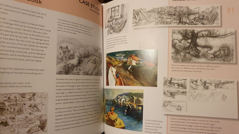
Book Research
I took a quick trip to the library to get some book research about text being used in children's books. Text is something I still find difficult, however for this project I really wanted it to sit well on a page and to be something that isn't noticeable for the wrong reasons, so inspiration and research was needed.
I took a quick trip to the library to get some book research about text being used in children's books. Text is something I still find difficult, however for this project I really wanted it to sit well on a page and to be something that isn't noticeable for the wrong reasons, so inspiration and research was needed.
Development
During this development stage I really was struggling to create any art for the project. So these pieces aren’t directly linked to the project in any way. However, I do very much like the painting that I created of my dog Fae sitting on a bridge, the expressive quality, movement and texture is something that I very much enjoy within this painting and I'm glad that I created it.
During this development stage I really was struggling to create any art for the project. So these pieces aren’t directly linked to the project in any way. However, I do very much like the painting that I created of my dog Fae sitting on a bridge, the expressive quality, movement and texture is something that I very much enjoy within this painting and I'm glad that I created it.
Layout Paper Pages
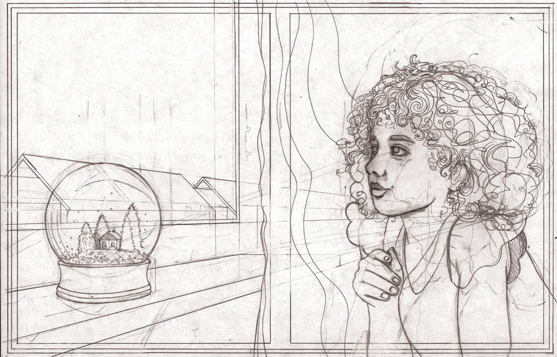
As two example sheets I created layout paper pages these were sketched with text overlaid. Initially I was going to have the text to follow the roofline, however I was
advised by multiple people that this was not good for legibility and legibility is the main thing. So, this was removed in later iterations of the design.
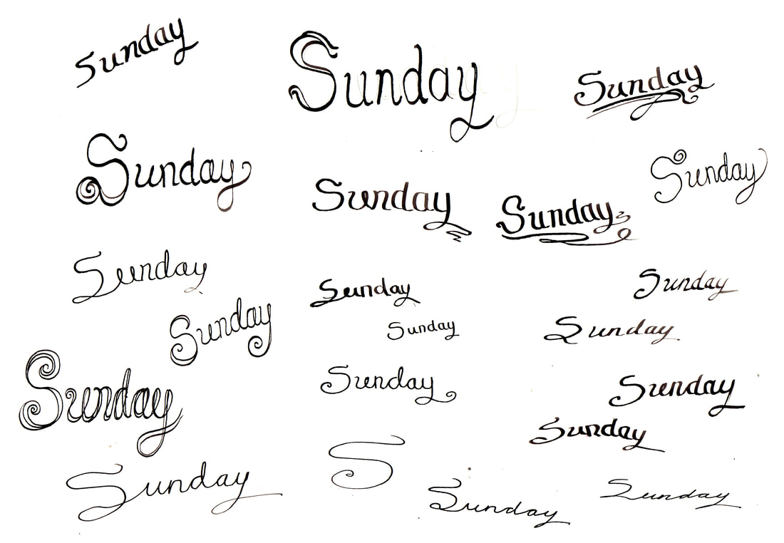
Title
Initially I have toyed with the idea of using calligraphy to create the title of the individual days of the week. However, after this experimentation
I scrapped that idea my handwriting although interesting is not good for legibility and is not regimented enough to be used in a book.
Initially I have toyed with the idea of using calligraphy to create the title of the individual days of the week. However, after this experimentation
I scrapped that idea my handwriting although interesting is not good for legibility and is not regimented enough to be used in a book.
Watercolour Paper Tests
I did some watercolour tests following a conversation with Tony, he suggested that the most important thing to do was to get good quality watercolour paper as the quality of paint didn't make as much difference. The watercolour paper either makes or breaks a design, so I invested the money that we were given for printing into buying myself three full books of nice quality watercolour paper.
I did some watercolour tests following a conversation with Tony, he suggested that the most important thing to do was to get good quality watercolour paper as the quality of paint didn't make as much difference. The watercolour paper either makes or breaks a design, so I invested the money that we were given for printing into buying myself three full books of nice quality watercolour paper.
Book Cover and Introduction Pages Planning
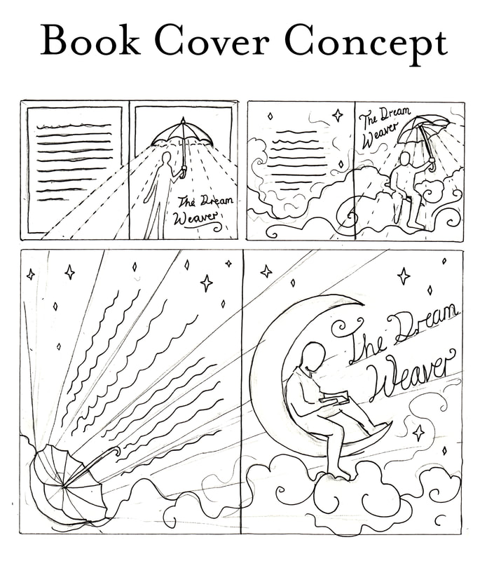
These are very quick doodles created on my phone to work out the book cover and introduction page planning.
These are very quick doodles created on my phone to work out the book cover and introduction page planning.
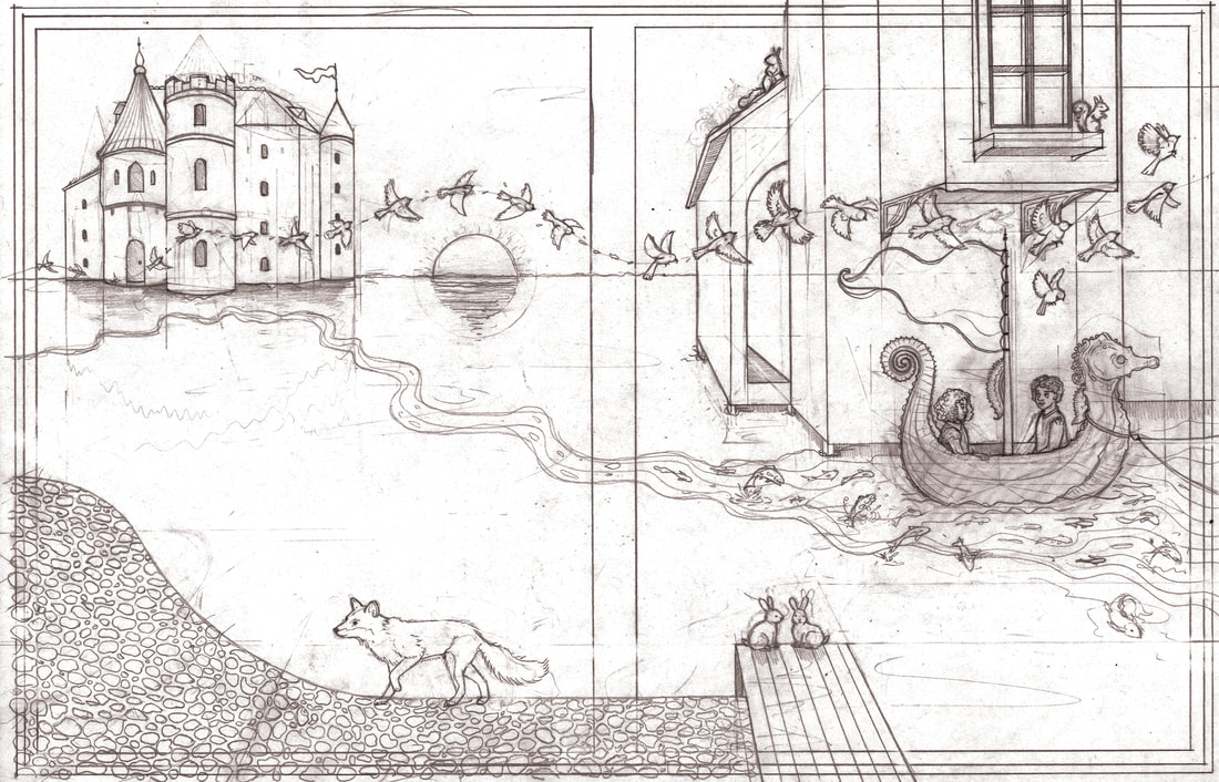
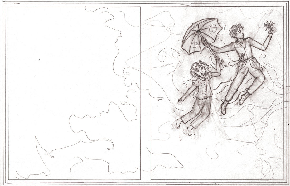
Layout Paper Pages
Below you can see all of my layout paper pages these are all sketched on A3 layout paper, these are a full finished designs developed from thumbnails.
I am overall very happy with it, I did however I find that when I rubbed out a lot on the layout paper it became very thin and warped in places.
Below you can see all of my layout paper pages these are all sketched on A3 layout paper, these are a full finished designs developed from thumbnails.
I am overall very happy with it, I did however I find that when I rubbed out a lot on the layout paper it became very thin and warped in places.
Painted Mini Mock Ups
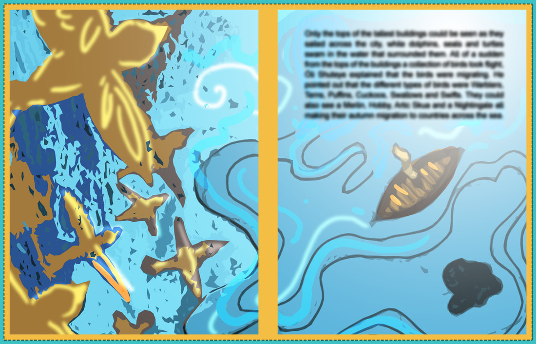
To work out the colours of the final designs I printed my layout pages as very small thumbnails and then coloured them quickly to gain an idea of tone before I before I began the final illustrations.
To work out the colours of the final designs I printed my layout pages as very small thumbnails and then coloured them quickly to gain an idea of tone before I before I began the final illustrations.
Outfit Colour Testing
I wanted to make doubly sure I was happy with the colours of Ari’s outfit before I put brush to paper, so I
digitally mocked three different options and sort outside opinions on which one people liked best.
I wanted to make doubly sure I was happy with the colours of Ari’s outfit before I put brush to paper, so I
digitally mocked three different options and sort outside opinions on which one people liked best.
Painted Pages
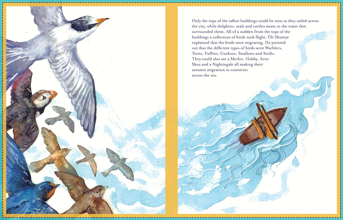
These are my first set of painted pages overlaid with the Mixam crop guides.
These are my first set of painted pages overlaid with the Mixam crop guides.
To ink or not to ink! That is the question?
I am debating adding dip pen and ink to add definition to the faces and points of focus within the illustrations.
I am debating adding dip pen and ink to add definition to the faces and points of focus within the illustrations.
How do titles work?
I am finding it hard to pick a font that works well as a title for the days of the week alongside my chosen copy font.
I am finding it hard to pick a font that works well as a title for the days of the week alongside my chosen copy font.
Developing The Spreads With Text
For formative assessment I painted a couple of the spreads fully and added text. I was still unhappy with
the title and the legibility of it, the scale was around right however move playing with type was needed.
For formative assessment I painted a couple of the spreads fully and added text. I was still unhappy with
the title and the legibility of it, the scale was around right however move playing with type was needed.
Painted Pages
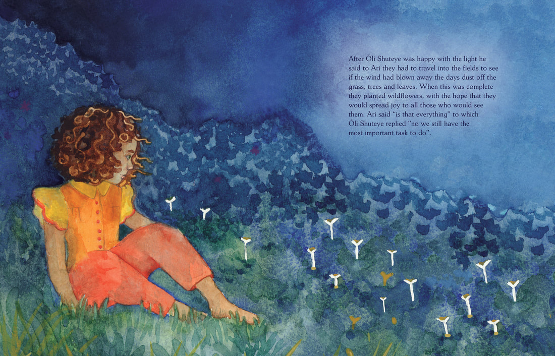
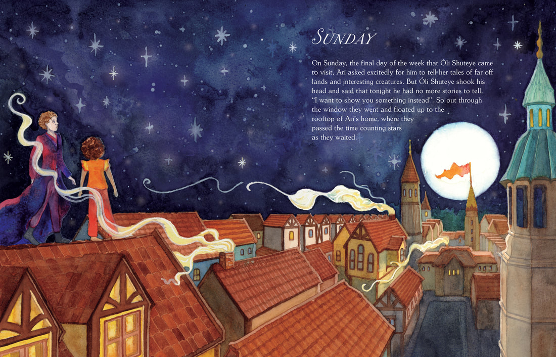
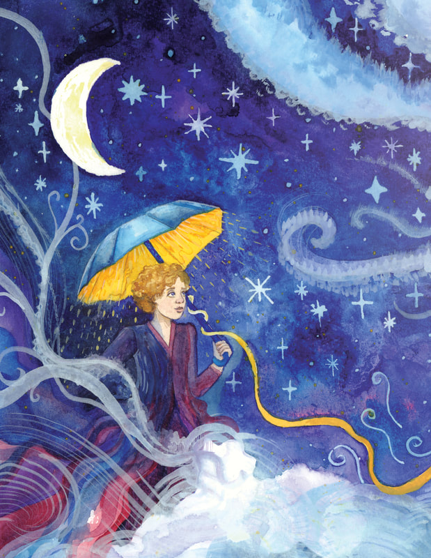
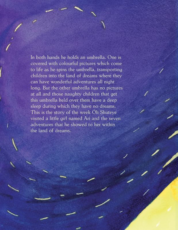
Here is the full collection of my painted pages that will go into the dream Weaver book. I found painting at a paste like this very difficult as usually one painting can take me
multiple days, however for this project I had to speed up and sometimes do three paintings in one day. This may be a good example of what it's like to work for a client, however I
do prefer having more time for my art. Bearing this time restraint in mind I am actually very happy with how most of them turned out.
Book Before Feedback
This is how my book looked for my final feedback and things have been changed since so I won't write too much about it.
However, Tony gave me feedback on my book which I found extremely useful and that helped me get the book ready to print.
This is how my book looked for my final feedback and things have been changed since so I won't write too much about it.
However, Tony gave me feedback on my book which I found extremely useful and that helped me get the book ready to print.
First and Last Page
Introduction
Monday
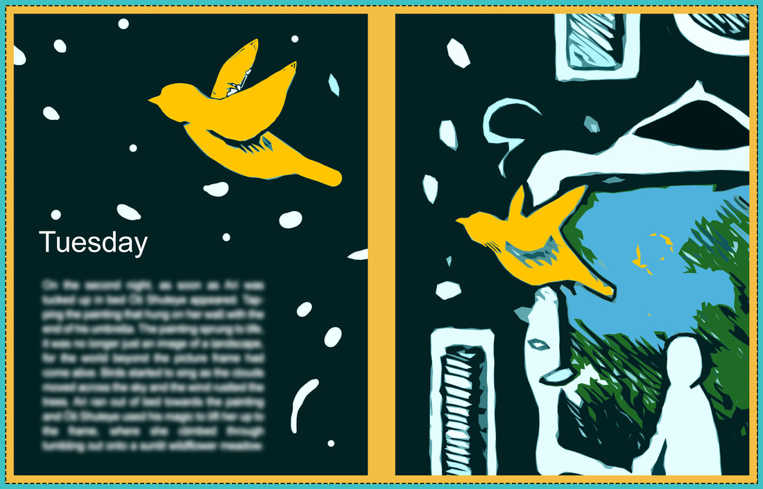
Tuesday
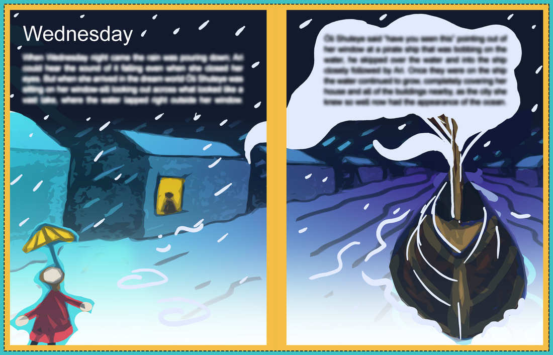
Wednesday
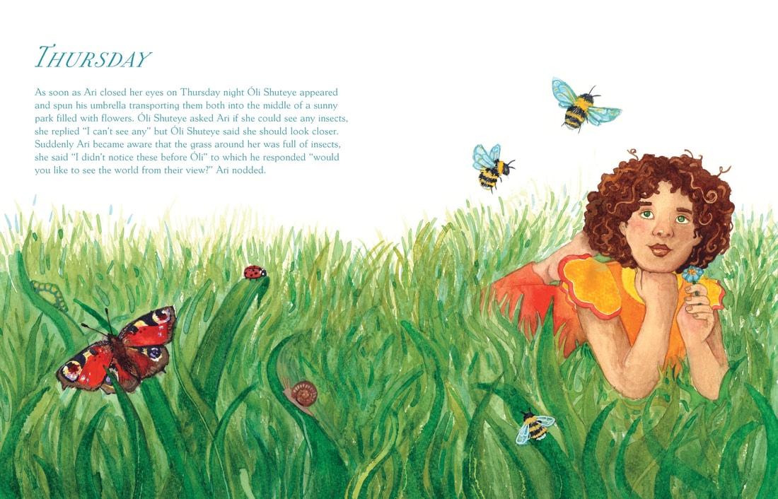
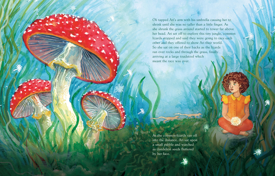
Thursday
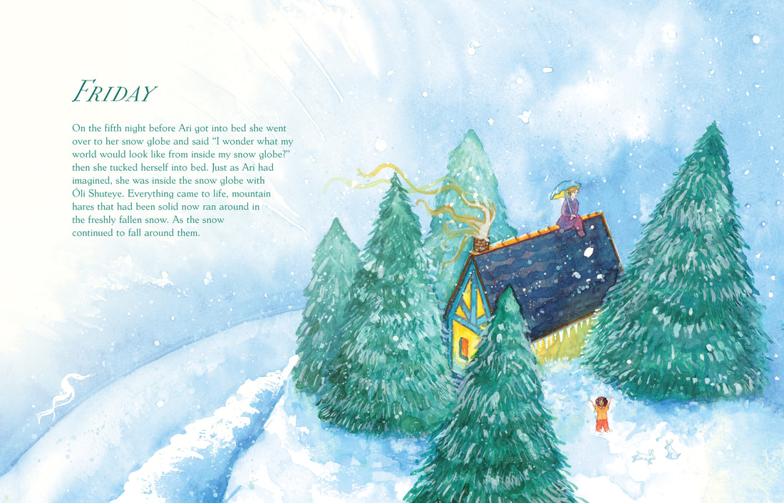
Friday
Saturday
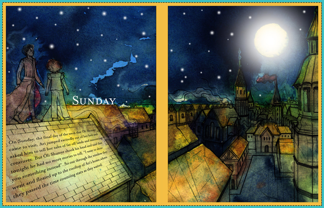
Sunday
The Finished Book
Dust Jacket
Here is the dust jacket I created for my book. Initially I was not going to make one as they have personally never appealed to me I always just
want to see the nice covers on hard back books. However, I was informed that Dwayne had advised adding barcodes to your books which I hadn't done
originally when I sent it to print. As I want to be able to sell ‘The Dream Weaver’ book and I felt a fake barcode would damage that saleability so to see what it
looked like as a more realistic book I created a dust jacket which has the bar code on the back as well as information on both of the inner flaps.
Mock Ups
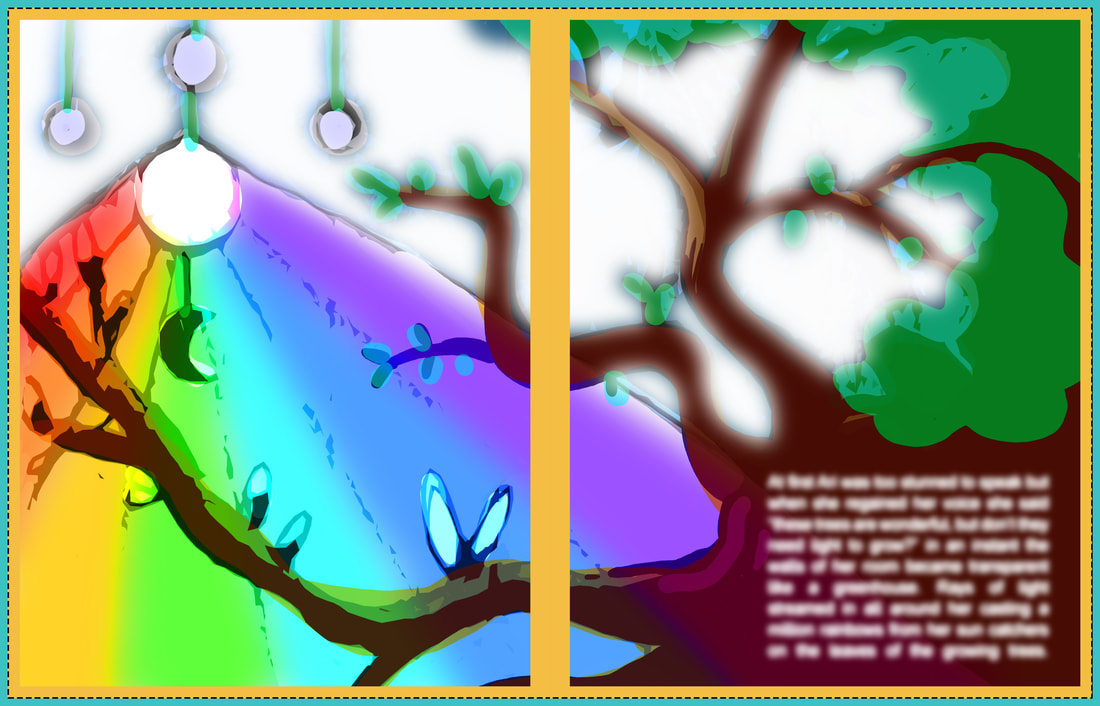
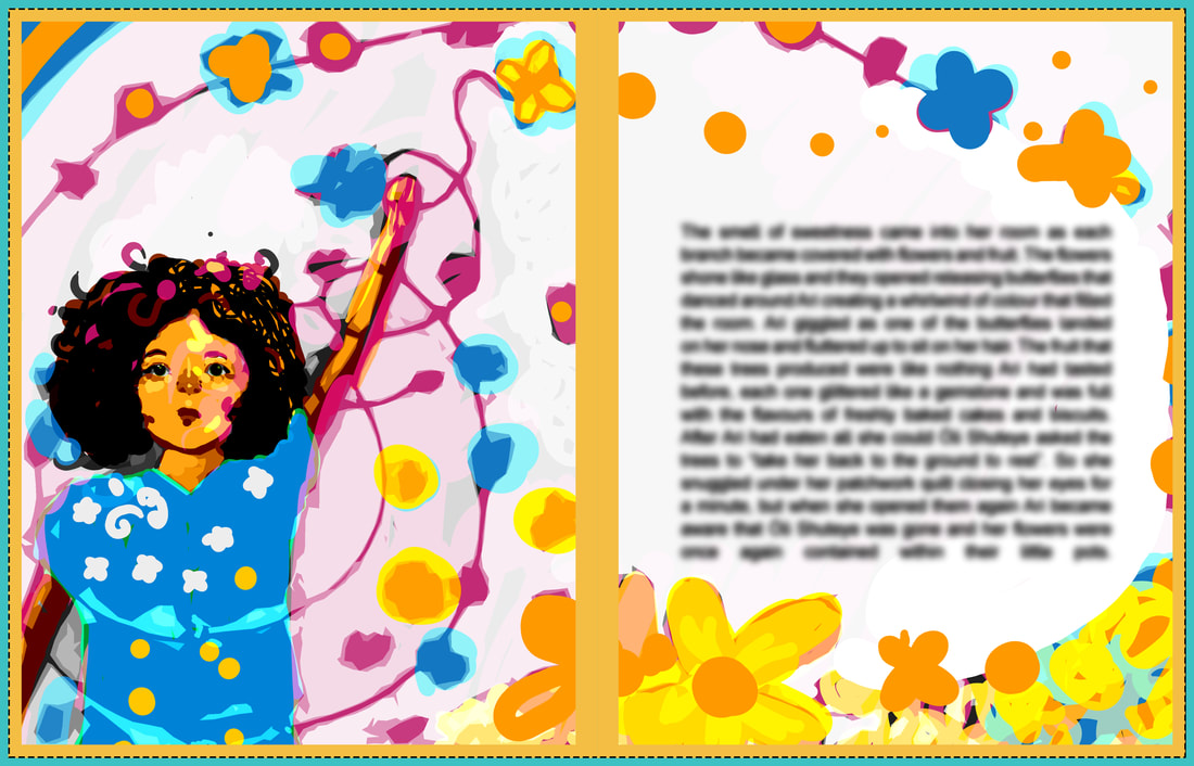
Here are two mock-ups that are created for ‘The Dream Weaver’ one is of the cover and one represents the interior spread.
Here are two mock-ups that are created for ‘The Dream Weaver’ one is of the cover and one represents the interior spread.
First and Last Page
This is my first and last page, so the title page and end page. I would have usually put the dedication at the front of the book as is the norm for most books. However, unfortunately
Mixam did not allow printing on the end papers of hardback books which made this difficult, however the dedications location at the back also narratively it makes more sense to be at the
end of this book. As the book does culminate in a discussion about life and death.
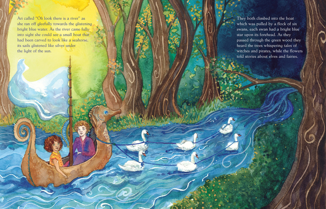
Double Page Spreads
I will admit I found dividing the full double page spreads into individuals very difficult. I also found that using the Mixam service online was difficult and caused me a lot of issues. I had
problems with bleed and alignment which I hadn't faced so far, as I've never printed anything before. However, after this experience I would feel more able to do something like this again in
the future. To create these spreads I initially painted them with watercolour as you know, however I took them into Photoshop and made any tweaks that I felt necessary towards the end. The
colour scheme varies within this book and is not as uniform as I initially anticipated, this is a by-product of the fact that I was creating seven miniature stories within one based upon the days
of the week, Each day is a bit different so it made sense to change the colour scheme to reflect that.
Mixam Mockup
Here you can see a flip through version of my book which was produced by Mixam.
Here you can see a flip through version of my book which was produced by Mixam.


