- TELLING STORIES -
The Moon is a Harsh Mistress
|
|
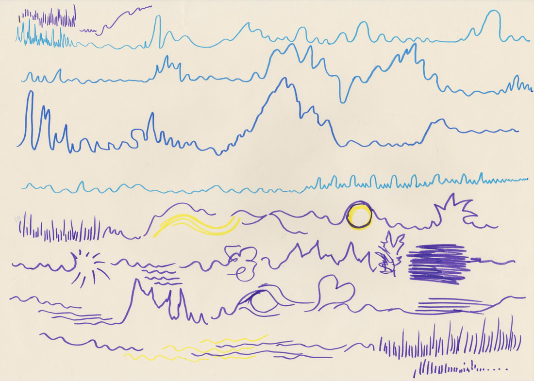
This is the version of "The Moon is a Harsh Mistress" that I took inspiration from for this project. To get a feel for the song I listened to it multiple times and tried to record the images and shapes that came into my mind. I used this to work out how the musical tone changed throughout the song. Additionally, I printed off the lyrics of the song and sketched any images that came into my mind onto the sheet. |
Scale
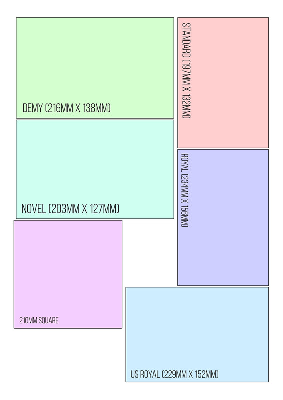
To find out what scale I wanted to create this book in I researched the book sizes that Mixam offers for book printing.
After which I sketched on top of them and worked out that I liked the 210mm square.
Thumbnail Visuals
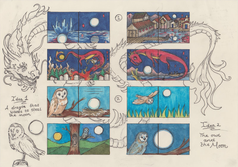
I created four full book ideas, I like the idea of the images continuing across both pages so I made sure to make the images flow together within my thumbnails.
Research
I started my research by looking into artwork that the song had reminded me of.
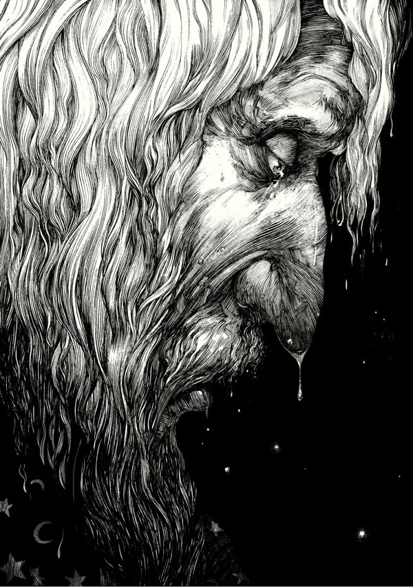
This led me to research dip pen illustration heavily; because the way that the collection of individual lines work together to creates musical imagery, of how when a collection of audibly pleasing notes are put together they create what we would consider to be music - so this made me wonder whether I could create visual music using a dip pen?
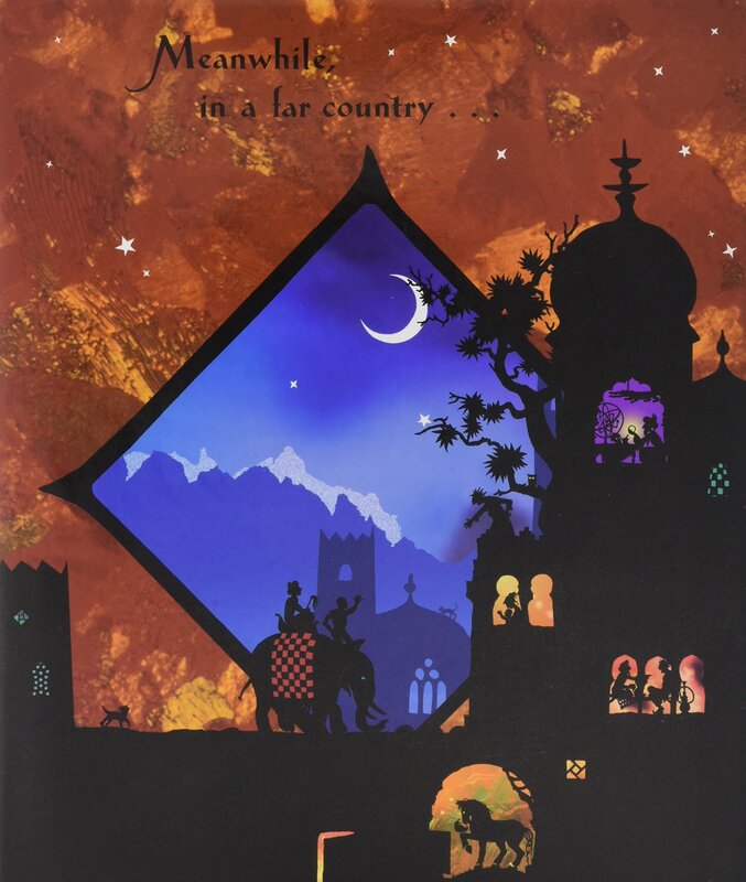
I also looked at the work of Jan Pienkowski, because I remembered that the moon featured heavily in the illustration of "The Thousand Nights and One".
Materials Tests
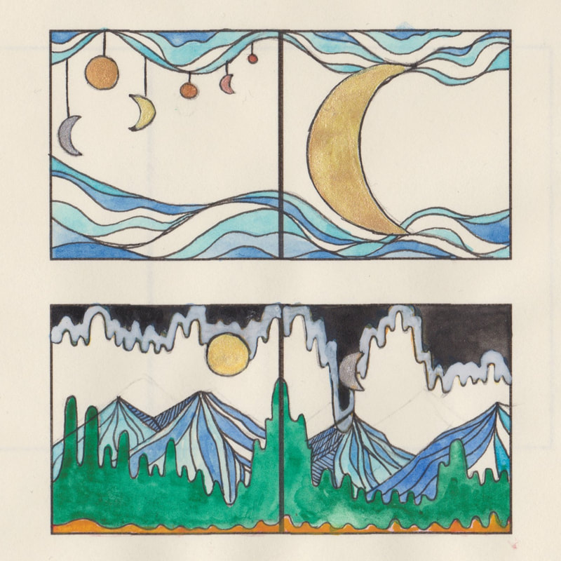
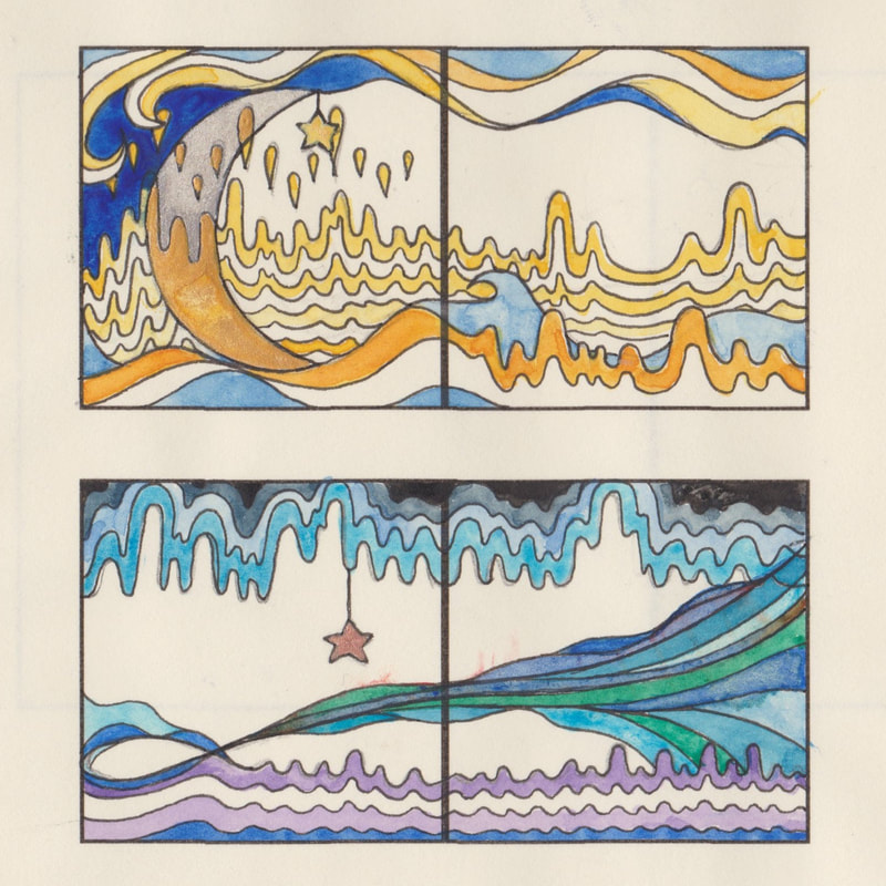
I work out how I wanted to create the illustrations, I decided to create some material test pages.
I really liked how these tests turned out; the contrast between black and white really helped the moon to stand out.
I also liked experimenting with my metallic paints, and working on improving my ink painting.
Mock Ups
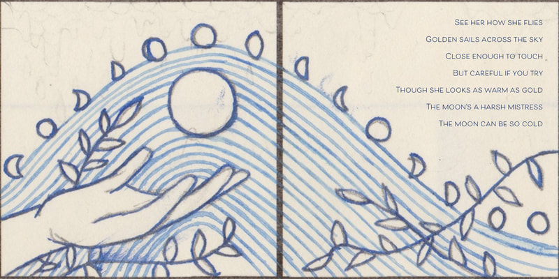
I created mock ups of two different book designs, which I then scanned and added text to so that I could see which design worked best with the song lyrics.
Lyric Placement
I really liked the more colourful lyrical illustrations that are at the bottom but they did not work very well with text at all.
So I decided to work on the the blue ink dip pen illustrations instead. Plus I also thought that the dip pen set had more visually recognisable imagery.
I really liked the more colourful lyrical illustrations that are at the bottom but they did not work very well with text at all.
So I decided to work on the the blue ink dip pen illustrations instead. Plus I also thought that the dip pen set had more visually recognisable imagery.
Final Book Illustrations
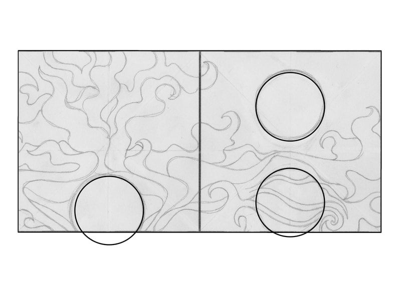
I changed the way that the lines moved throughout the pages to reflect the tone of the song verses that they were meant to represent.
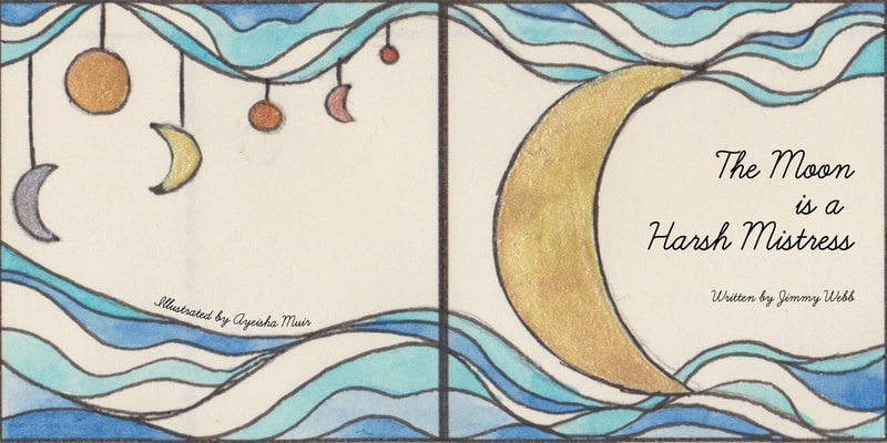
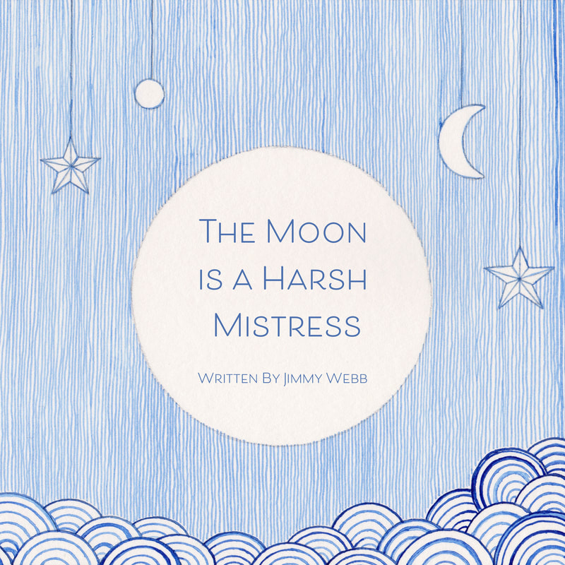
The cover has lines that are going upwards that are static to show that the song hasn't started yet.
The first double page spread has a soft curve to show how the song started.
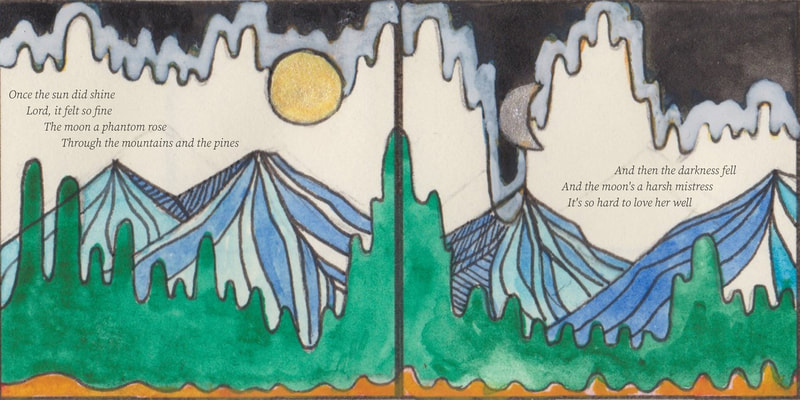
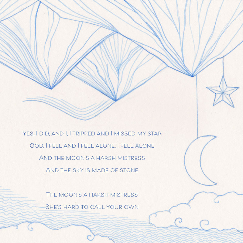
For the next page I used the mountains to show how the music fluctuated up and down in this section of the song.
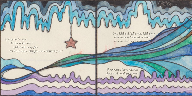
Finally I used wavy lines on the last double page spread to show how the music tapered off at the end of the song.
Final Illustrations with the Lyrics
I do like the final illustrations overall, but I don't particularly like the way that the last page with the eye turned out. I think it looked better as a thumbnail.
My favourite page to create was the front and back pages, the individual lines created a very interesting texture.
But I don't think that the illustrations capture the mood of the moon that well, I think I tried to capture the meaning of the song more than the mood that the moon reflects. This in the end made the illustrations quite simple and cold, even though I still like them, maybe this wasn't the best design that I could have created.
Holiday Improvements
I had started to work on another illustrated version of this song during the holiday,
however I became unwell so I haven't managed to finish the all of the final images.
This is the work that I have managed to create so far.
|
I started this process by taking some pictures of the moon, I have put my favourite on the left. I then moved into researching stories that fit alongside "The Moon is a Harsh Mistress". This is when I discovered the story of Bakunawa and the Seven Moons. The story of Bakunawa gave me the inspired me to think of a dragon wanting to steal and possess the moon, I believe this storyline also works well with the original lyrics of the song which say "The moons a harsh mistress, she's hard to call your own". This made me think that the dragon would end up losing the beauty of the moon during the pursuit of trying to keep the moon to itself. |
Lighting
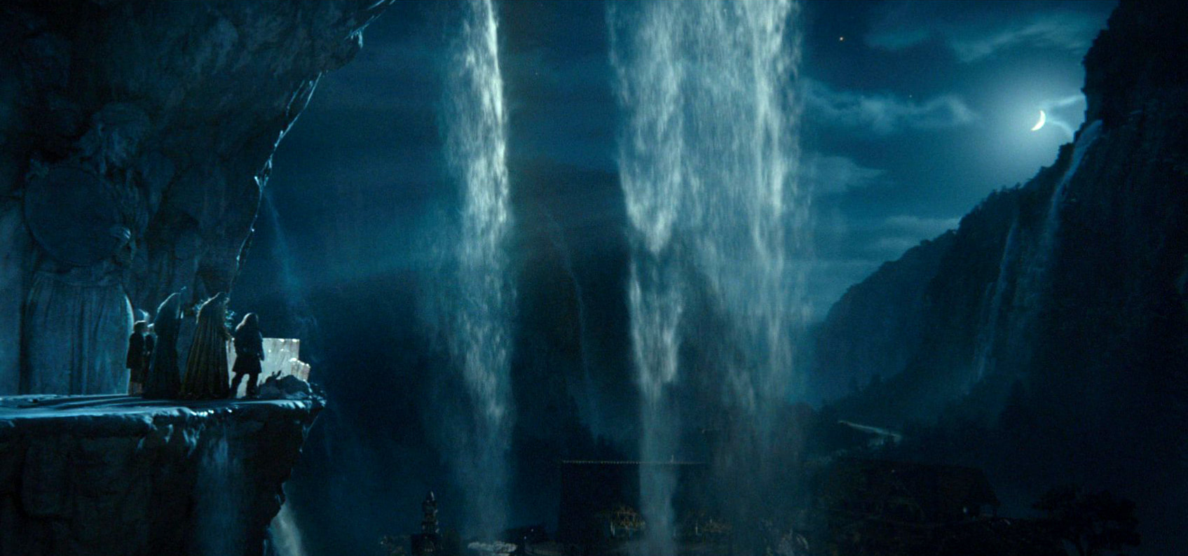
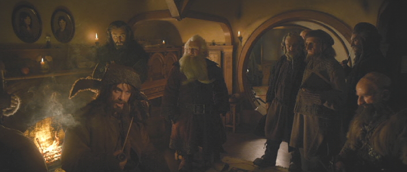
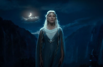
I have re-watched "The Hobbit" and "The Lord of the Rings" over the break, which inspired me to look at how the moon and other light sources where used to create beautiful lighting effects.
Illustration Inspiration
|
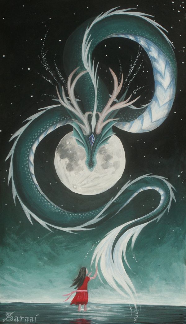
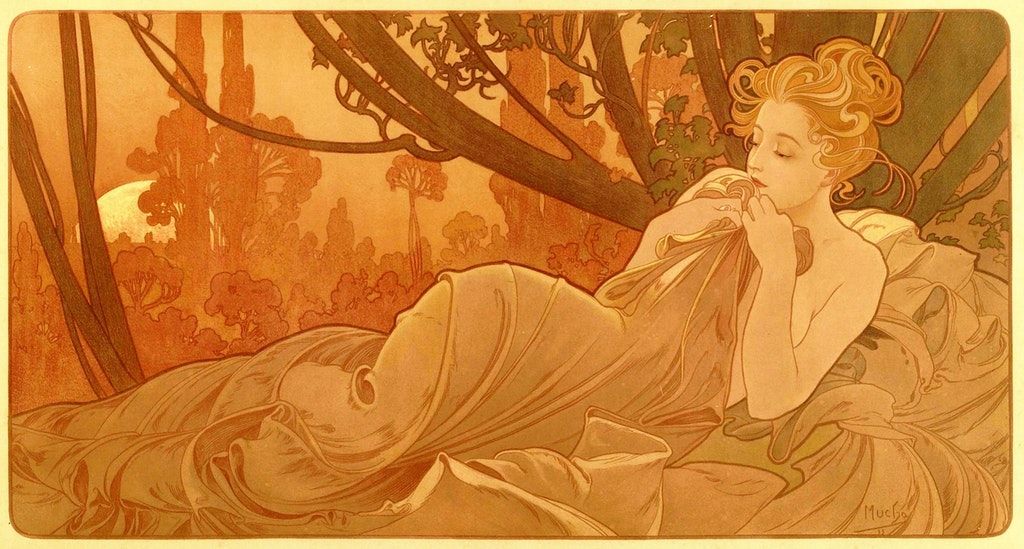
I found a selection of artwork that I thought reflected the story of the moon well. I especially like the woodblocks illustrations, so I wondered if there was a way to create the appearance of a woodblock illustration using inks. I also decided by looking at these illustrations that a more subtle colour scheme that used the light of the moon as an accent would work best for the song.
|
Thumbnails
After thumbnailing four different storylines to fit alongside the song I decided that I definitely liked the dragon idea best.
Drawing the Final Designs
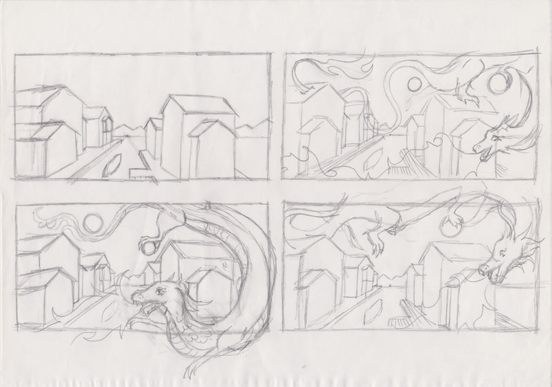
Alongside trying to improve this project I worked on furthering my understanding of perspective by planning out house from three different angles, these buildings are a part of my sketched designs.
The Final Illustrations
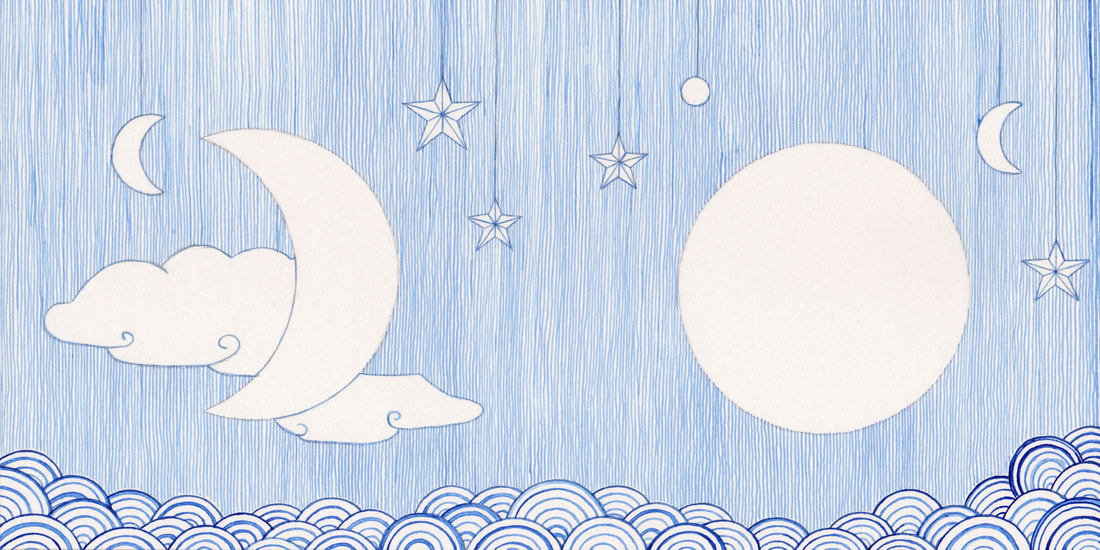
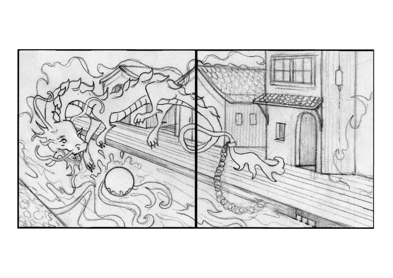
These are the final four illustrations that I created for this redo project.
The Finished Pages
