- BOOK JACKETS -
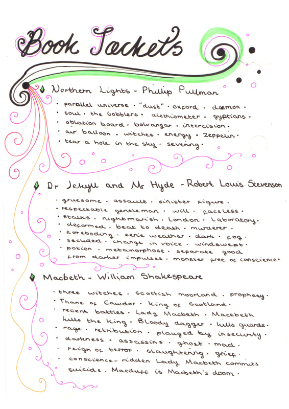
Mind Map And Lecture Notes
Finding Out About The Stories
|
|
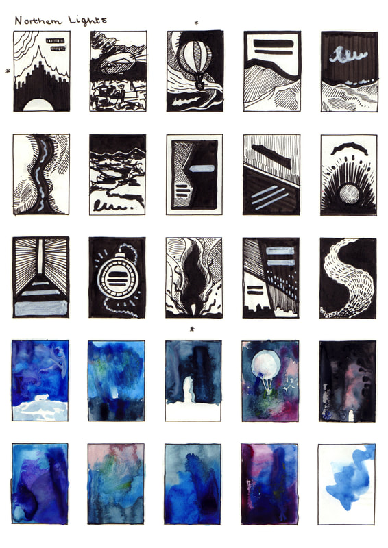
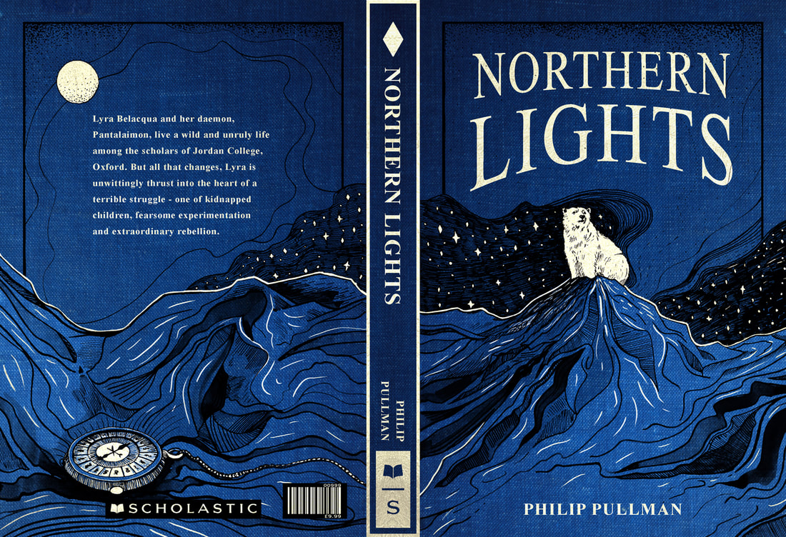
"When Lyra's friend Roger disappears, she and her dæmon, Pantalaimon, determine to find him.
The ensuing quest leads them to the bleak splendour of the North, where armoured bears rule the ice and witch-queens fly through the frozen skies - and where a team of scientists is conducting experiments too horrible to be spoken about. Lyra overcomes these strange terrors, only to find something yet more perilous waiting for her - something with consequences which may even reach beyond the Northern Lights." |
|
|
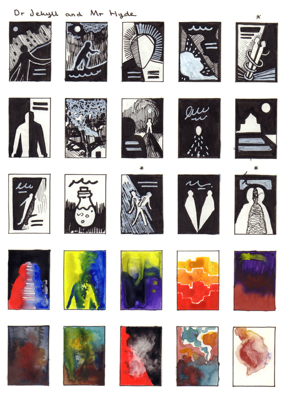
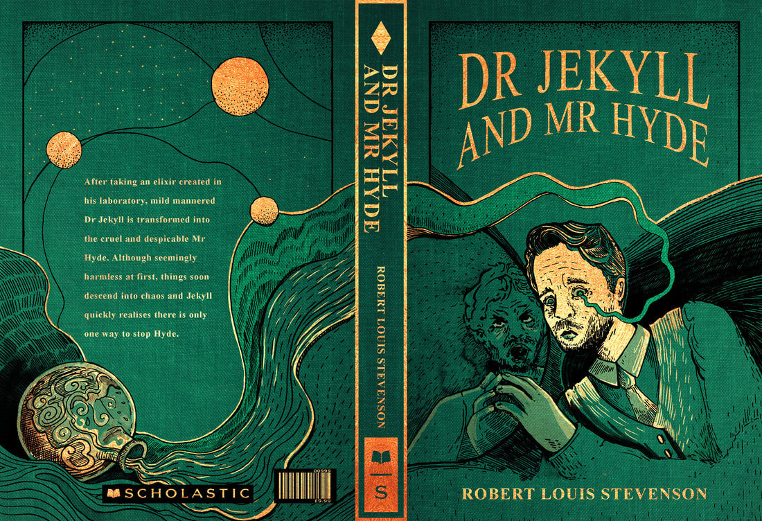
"Strange Case of Dr Jekyll and Mr Hyde by Robert Louis Stevenson is a narrative about the complexities of science and the duplicity of human nature. Dr Jekyll is a kind, well-respected and intelligent scientist who meddles with the darker side of science, as he wants to bring out his 'second' nature.
He does this through transforming himself into Mr Hyde - his evil alter ego who doesn't repent or accept responsibility for his evil crimes and ways. Jekyll tries to control his alter ego, Hyde, and for a while, Jekyll has the power. However, towards the end of the novel, Hyde takes over and this results in their deaths." |
|
|
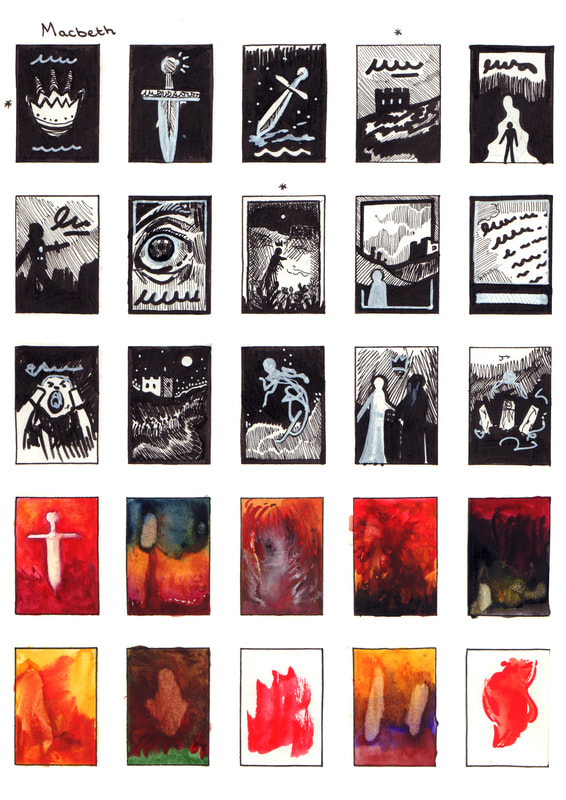
"Three witches tell the Scottish general Macbeth that he will be King of Scotland. Encouraged by his wife, Macbeth kills the king, becomes the new king, and kills more people out of paranoia. Civil war erupts to overthrow Macbeth, resulting in more death."
"On a bleak Scottish moorland, Macbeth and Banquo, two of King Duncan's generals, discover three strange women (witches). The witches prophesy that Macbeth will be promoted twice: to Thane of Cawdor (a rank of the aristocracy bestowed by grateful kings) and King of Scotland. Banquo's descendants will be kings, but Banquo isn't promised any kingdom himself. The generals want to hear more, but the "weird sisters" disappear...….." |
Playing Card Research
One of my initial thumbnail designs reminded me of a playing card, so I decided that cards would be a good point of research.
Playing cards each have a different power and value, much like the characters in the stories I have to create book jackets for, so this was a natural connection in my mind.
Playing card decks are also always quite legible and can use colours in clever and interesting ways, so they will be a good source of visual inspiration.
Moving onto Mucha, I researched this artist because I have always admired the way he composed his art. This is something that I am looking to incorporate into my final book jacket designs.
Book Jacket Ideas
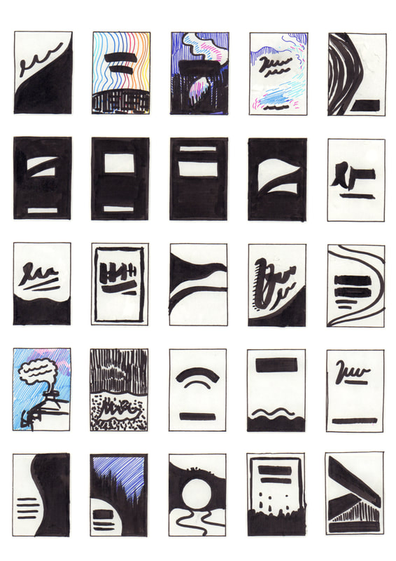
I started the project by thumbnailing some potential designs for the three book covers, after deciding on the cover I will them more onto adding a back cover and spine.
I started the project by thumbnailing some potential designs for the three book covers, after deciding on the cover I will them more onto adding a back cover and spine.
Additional Visual Inspiration From Instagram
These are some illustrations that stood out to me as I looked through Instagram, I especially like the way they are all using colour in unique and effective ways.
These are some illustrations that stood out to me as I looked through Instagram, I especially like the way they are all using colour in unique and effective ways.
Developing My Favourite Concepts
I reviewed my initial thumbnails and picked a three concepts of each book which inspired me the most, I then developed them and started to move them forward.
After the feedback with Tony I decided to try and go for a more graphic approach and also not to peruse the hand design because it wouldn't fit with the overall set.
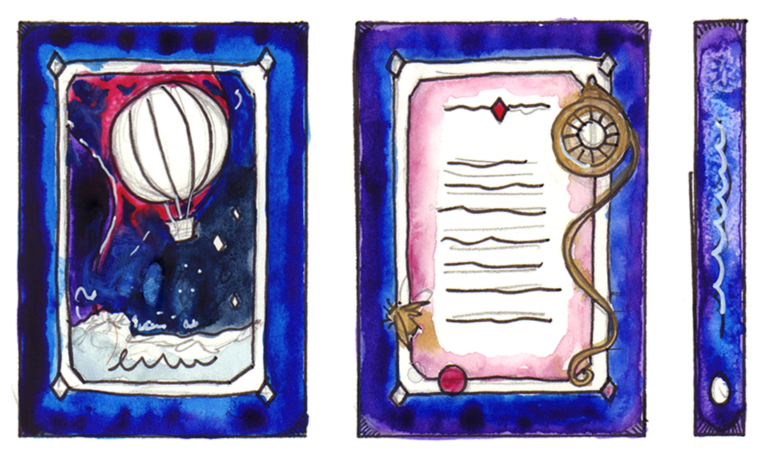
Development Of The Spine And Back Cover - Inspired By Playing Cards
I initially was going to go with a playing card design to unify the book covers, however after discussion and some thought I began to see this wasn't the right way to take this project forward.
I initially was going to go with a playing card design to unify the book covers, however after discussion and some thought I began to see this wasn't the right way to take this project forward.
Development Of My Book Cover Set
I decided to mock up a set of designs for the Inkymole feedback, so I could see where I was heading and be able to show that to Sarah during the feedback. I decided to take the Macbeth cover forward and allow it to be the basis for the other two covers, I really like this design and I am pleased that it doesn't feature the usual things a Macbeth cover would.
I decided to mock up a set of designs for the Inkymole feedback, so I could see where I was heading and be able to show that to Sarah during the feedback. I decided to take the Macbeth cover forward and allow it to be the basis for the other two covers, I really like this design and I am pleased that it doesn't feature the usual things a Macbeth cover would.
Here is some of Inkymole's work that I particularly likes when I had a look through her blog, I especially like the fire cover and it puts me in mind of Macbeth.
Contrast And Perspective Experiments
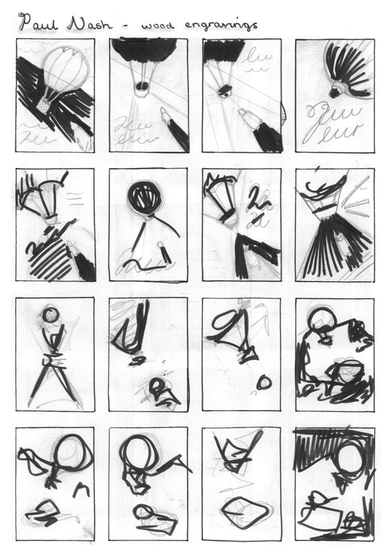
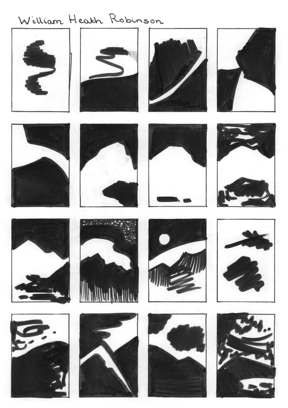
I decided to look at some artists that use black and white very well to see how tonal contrast elevates their work.
I decided to look at some artists that use black and white very well to see how tonal contrast elevates their work.
Ayeisha Outdoors (Visual Research and Inspiration)
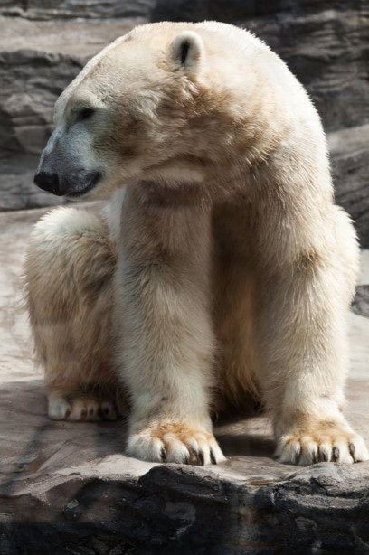
This is some inspiration I found during this project, the majority was from the Museum of Scotland during the trip to Edinburgh. But I also for a very pretty copy of an M.R.James Ghost Story book whilst meeting a friend. It was good to see a polar bear in person during this project and the crystals were very helpful to give me an idea of how to depict the mountains in Northern Lights.
This is some inspiration I found during this project, the majority was from the Museum of Scotland during the trip to Edinburgh. But I also for a very pretty copy of an M.R.James Ghost Story book whilst meeting a friend. It was good to see a polar bear in person during this project and the crystals were very helpful to give me an idea of how to depict the mountains in Northern Lights.
Quick Development Changes
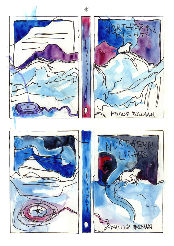
I was still not quite happy with the other two designs so I tried them in different ways, moving Iorek and the mountain further up which I think helped a lot so I was happy with that.
But Dr Jekyll and Mr Hyde is still a proving to be difficult for me, so I will continue to work on it until something feels right.
Dr Jekyll and Mr Hyde Development
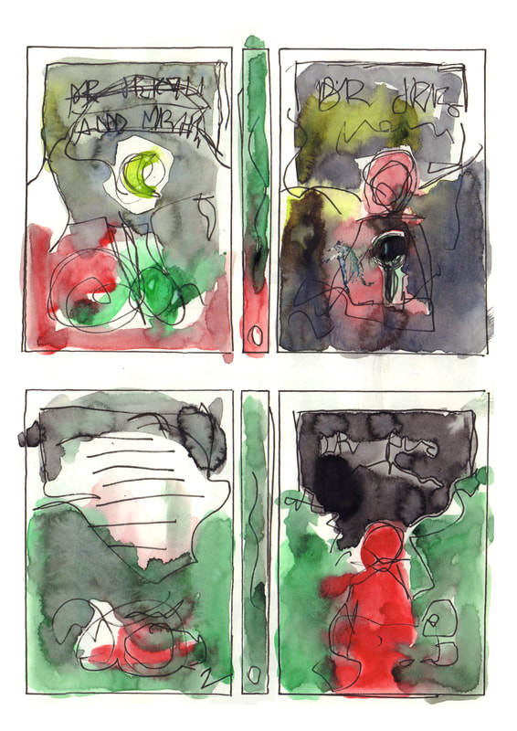
This is some further development for Dr Jekyll and Mr Hyde, I came up with using the idea of a key or door in the design which I think would be a good thing.
This is some further development for Dr Jekyll and Mr Hyde, I came up with using the idea of a key or door in the design which I think would be a good thing.
More Mock Ups
These are some more mock ups with the more developed ideas within them, I am happy with Northern Lights but I'm still not completely sure about Dr Jekyll and Mr Hyde.
These are some more mock ups with the more developed ideas within them, I am happy with Northern Lights but I'm still not completely sure about Dr Jekyll and Mr Hyde.
Planning Text Placement
Research For The Book Covers
Book descriptions / Visual references and inspiration
Book descriptions / Visual references and inspiration
|
|
|
|
Dip Pen Tests and Coloured Backgrounds
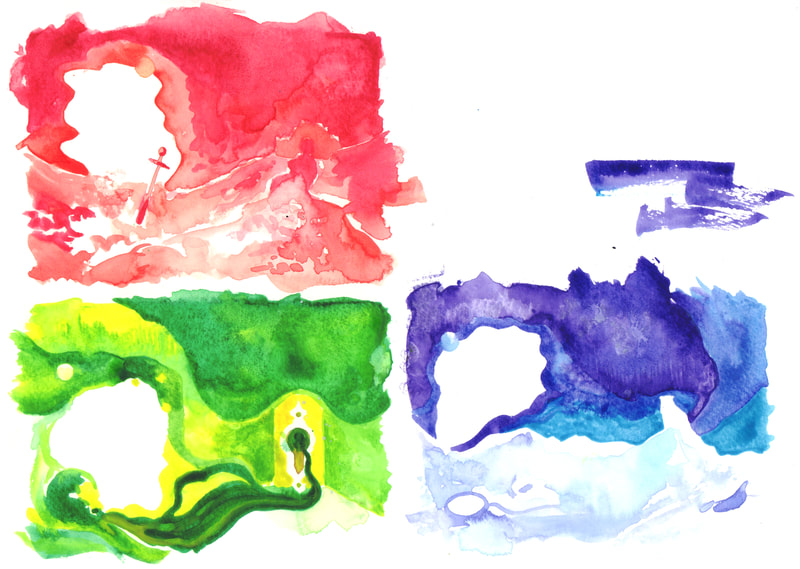
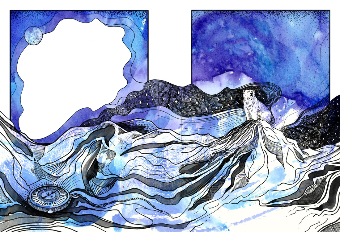
During some feedback with Dwayne he suggested it might be a good idea to explore a contrast of makes, as I am planning on using dip pen for the design it could provide a good contrast if I used more loose watercolour marks alongside it. This isn't something I have done before but I thought it sounded fun so I tried it out.
During some feedback with Dwayne he suggested it might be a good idea to explore a contrast of makes, as I am planning on using dip pen for the design it could provide a good contrast if I used more loose watercolour marks alongside it. This isn't something I have done before but I thought it sounded fun so I tried it out.
Layouts And Placement
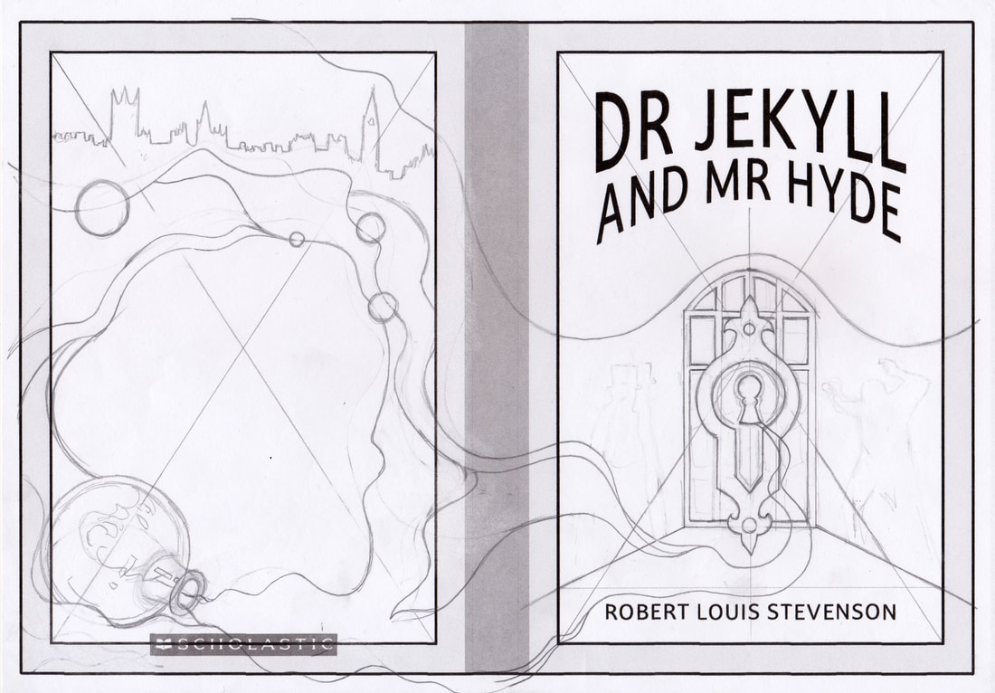
After inking in the designs I moved onto placing the text and making sure everything was positioned correctly.
After inking in the designs I moved onto placing the text and making sure everything was positioned correctly.
Book Cover Tests
This is the process of me putting together the Macbeth cover and also playing around with overlaying watercolour scans onto the dip pen drawings.
This is the process of me putting together the Macbeth cover and also playing around with overlaying watercolour scans onto the dip pen drawings.
Book Cover Finalisation
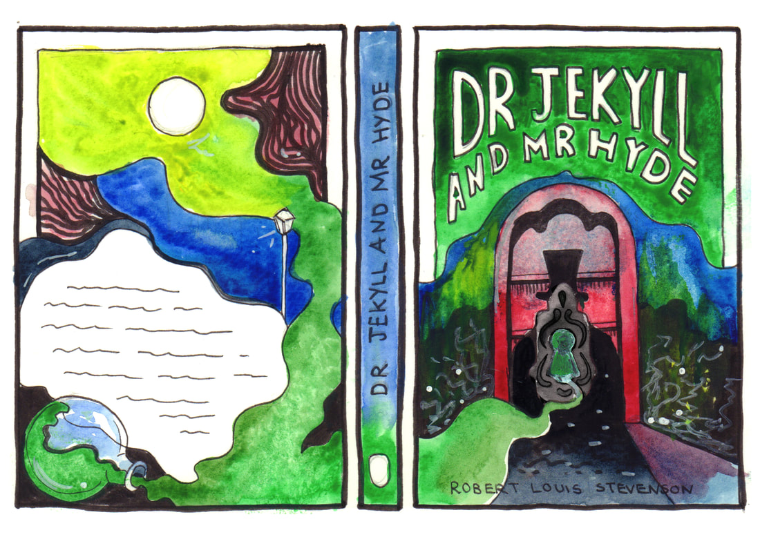
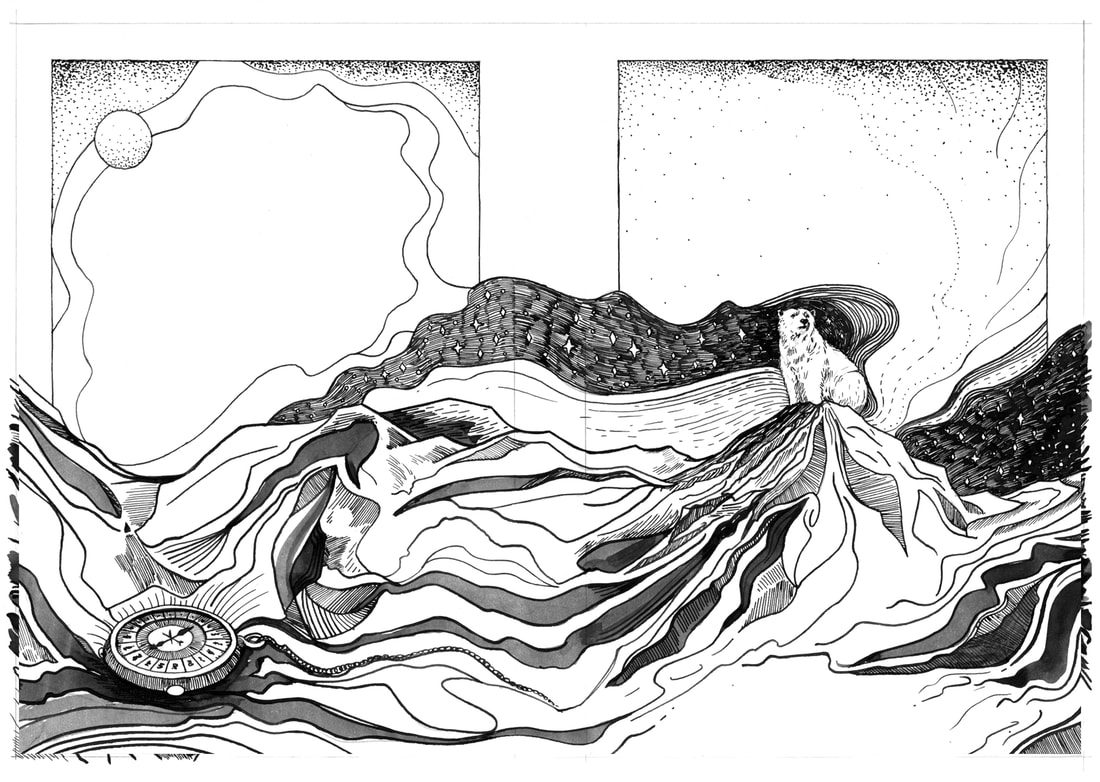
This is every stage of my putting together these book covers, I started with a pencil sketch, the onto dip pen and watercolour on a separate sheet. Finally the covers were completed in Photoshop.
This is every stage of my putting together these book covers, I started with a pencil sketch, the onto dip pen and watercolour on a separate sheet. Finally the covers were completed in Photoshop.
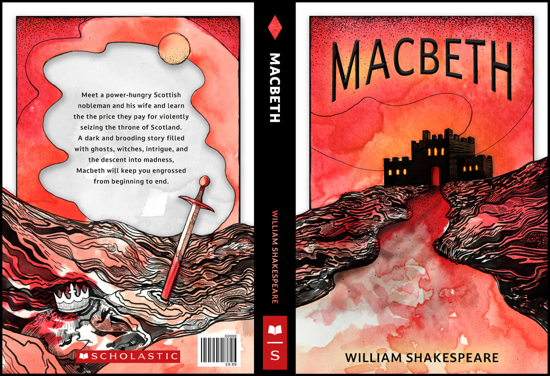
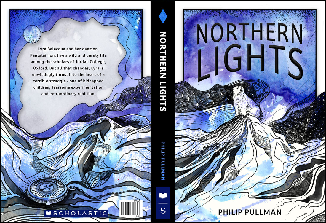
First Set Of Book Covers (Before Feedback)
These are the final cover designs that I have created, overall I quite like them. they aren't what I had in my head but I think that they work a set. I am interested to see what other people think of these in the formative feedback session. Personally I think I may need to redo the watercolour paintings because I just don't think that they are dark enough and they aren't quite what I was expecting. My favourite would either be Macbeth or Northern Lights, Dr Jekyll and Mr Hyde still isn't sitting right with me, so I am going to get some feedback from Tony and my peers then proceed accordingly.
These are the final cover designs that I have created, overall I quite like them. they aren't what I had in my head but I think that they work a set. I am interested to see what other people think of these in the formative feedback session. Personally I think I may need to redo the watercolour paintings because I just don't think that they are dark enough and they aren't quite what I was expecting. My favourite would either be Macbeth or Northern Lights, Dr Jekyll and Mr Hyde still isn't sitting right with me, so I am going to get some feedback from Tony and my peers then proceed accordingly.
Book Cover Individual Pages
Book Cover Mock Ups
Book Cover Redesign After Feedback
After the feedback with Tony, I took time to re-think my book cover designs. Tony suggested to make the font a serif design and also make it metallic (possibly gold). However I was just not happy with the whole book design, I really like the ink line art, however the watercolour wash did nothing for the design. The end product was something that I was just not happy with, so I decided to take these covers in a different direction, starting with looking at book covers in my own bookshelf that I think have effective covers. Also I took the time to reflect and research what makes a good cover.
After the feedback with Tony, I took time to re-think my book cover designs. Tony suggested to make the font a serif design and also make it metallic (possibly gold). However I was just not happy with the whole book design, I really like the ink line art, however the watercolour wash did nothing for the design. The end product was something that I was just not happy with, so I decided to take these covers in a different direction, starting with looking at book covers in my own bookshelf that I think have effective covers. Also I took the time to reflect and research what makes a good cover.
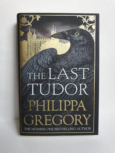
My Personal Book Collection - Metallic Text
What Makes a Good Book Cover?
|
1. Appropriateness: (You need a book cover example for this first point.) The legendary graphic designer Massimo Vignelli stated that design should be "semantically correct and syntactically consistent." Without getting too brainy, what this means is that it needs to be appropriate for the application. A book about fixing computers requires a different approach and solution for a cover than a book about a gangster who falls in love with a nun. That's why a good design brief is a very important stepping stone to a good cover. It spells out all the necessary components a designer must familiarize themselves with to understand what a book is truly about. A book needs to "fit in" with the genre, but also attempt to be visually distinct. The ability to fit in yet be distinct enough is subtle. Like dressing up for a cocktail party but selecting a special pair of cufflinks. It's usually something small that distinguishes you.
2. Clear visual hierarchy: As mentioned, books have a lot of work to do these days to remain visible and readable in small sizes. A good book cover makes sure that the font used for the title is helping in that regard and not making it more difficult. Making sure there is a proper order and logic to how you want your readers to see your cover message. Is the title competing with an image? Is the color not contrasting? Is it hard to make out the subtitle? What do you want your reader to see first? Do you want to draw them in with the image/art? Or the title? Often you cannot have both. Likewise, you cannot expect a cover to say everything. Think of a cover as a mini-poster or sign. It points you in the right direction and gives a hint, a general idea of the book's mood, vibe, tone, and content. It does not try, nor is it beneficial, to say everything. 3. Express the book's message, tone, and vibe: As mentioned above, a successful cover needs to traverse the shortest possible distance to the reader in conveying the general feeling of the content of the book. |
4. Connects with your target audience: Pick up a book you're reading right now. Look at the cover. Do you feel it's designed with you in mind as the target audience? As an author and a publisher, knowing who you hope to sell your book to is paramount to how you approach the design. The wrong font, colour scheme, illustration style or historical reference can make or break even a good-looking cover. Imagine a novel about WWII French fighter pilots. Using an American fighter jet on the cover will leave you with a mile-long string of negative reviews on Amazon letting you know just that. You can imagine any number of such scenarios. Your audience is savvy. They notice.
5. Create an "ah-ha" moment: This is a perk. A bonus. The hope with any good cover is that it leaves the reader intrigued and aching to find out more. In the old days, it would make them want to read the flap copy, crack the spine and get reading before they even pull out their wallet. Nowadays, we hope it makes them click on the image and press the checkout button.
5. Create an "ah-ha" moment: This is a perk. A bonus. The hope with any good cover is that it leaves the reader intrigued and aching to find out more. In the old days, it would make them want to read the flap copy, crack the spine and get reading before they even pull out their wallet. Nowadays, we hope it makes them click on the image and press the checkout button.
Jekyll and Hyde Resign
I knew that I needed to redesign the Jekyll and Hyde cover again so I created two sketch pages to work out a better concept.
I knew that I needed to redesign the Jekyll and Hyde cover again so I created two sketch pages to work out a better concept.
Two Potential Designs
After sketching my ideas, I chose two to draw out as a larger designs. Initially I was going to pick the characters with the streetlight, however when I started
inking it in I didn't like how it looked at all. The closer portrait view of Dr Jekyll and Mr Hyde worked lot better, and finally I was happy with the book design.
Design Process
I choice to create my final book covers with a fabric texture, inspired by "Drake's Comprehensive Compendium of Dragonology".
This choice was to allow the pen and ink illustration to stand out and be an important part of the book cover, I think this is a bit improvement from the previous version.
To create my final book covers I combined my ink drawing, with a fabric texture and finally a layer of metallic to be placed behind the other layers.
Final Book Covers
I am so much more happy with these covers in comparison to the ones I presented at the formative feedback session! This project has taught me that with book covers simplicity is best, I would rather own these in my own bookshelf as apposed to the other version. I can safely say that this project has been a difficult one, book covers have always been a part of book design that trips me up. However, I have gained confidence in designing book covers from this project and that is something that i am proud of.
I am so much more happy with these covers in comparison to the ones I presented at the formative feedback session! This project has taught me that with book covers simplicity is best, I would rather own these in my own bookshelf as apposed to the other version. I can safely say that this project has been a difficult one, book covers have always been a part of book design that trips me up. However, I have gained confidence in designing book covers from this project and that is something that i am proud of.
Photoshop Mock-ups
