- LITERAL ILLUSTRATION -
This is a dramatic reading of "A School Story" by M.R.James that I found on YouTube, as well as the overall text and the parts of the text that I found the most interesting.
|
|
|
Research
|
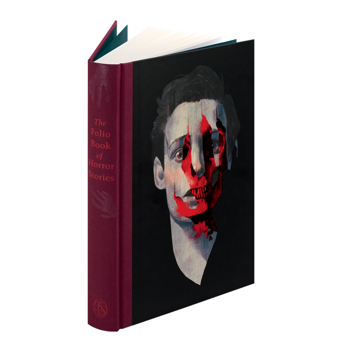
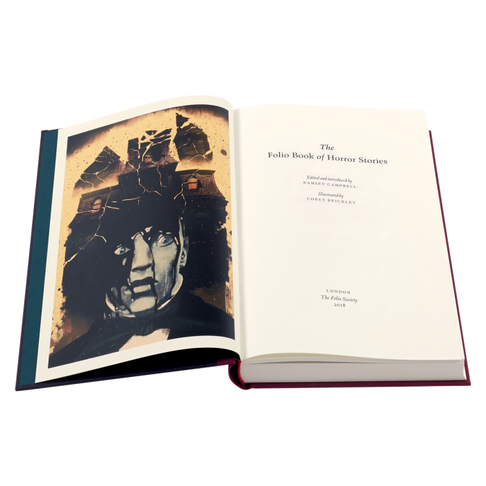
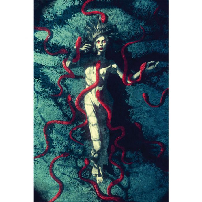
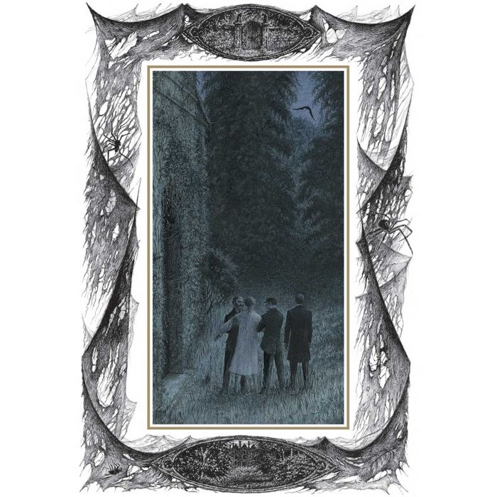
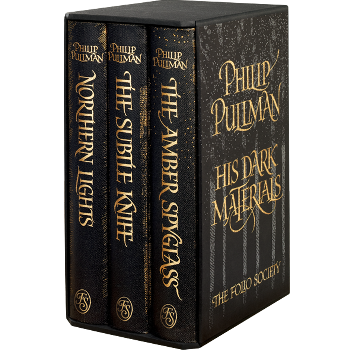
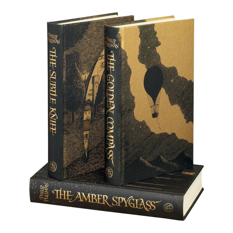
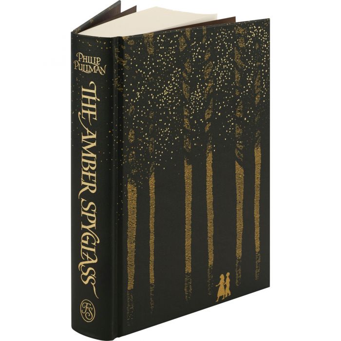
For this project I researched Folio Society books, I really like the illustrations within this book and the overall colour scheme. I think it works really well as a complete book.
|
I think the Folio Society's version of Dracula is very pretty, I love the way that the borders work around the illustrations. I also love the red, white and black cover.
|
I love the way that the covers of these books look, the way that the black is overlaid over the yellow colour is beautiful. I would like to take inspiration from this for my cover.
|
Pen and Ink Illustrators
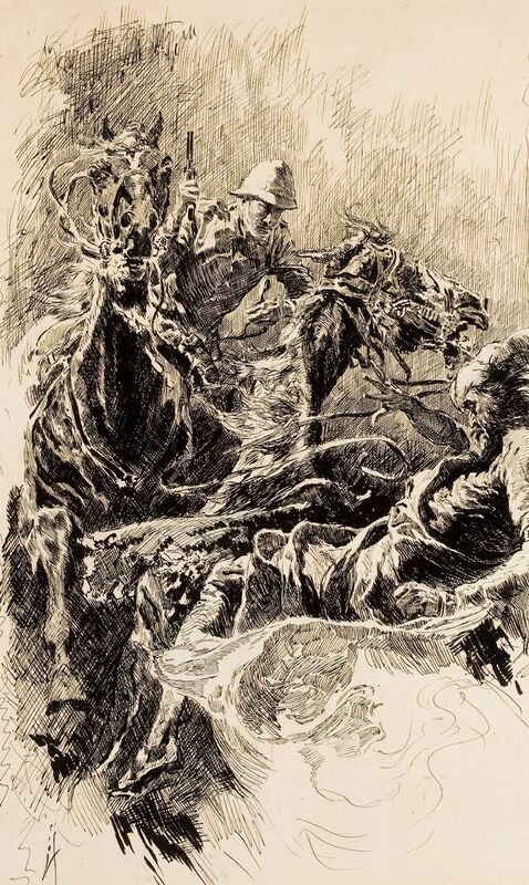
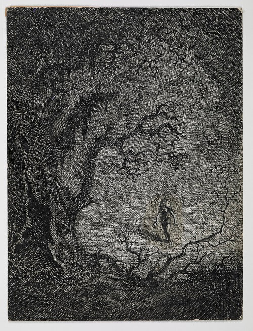
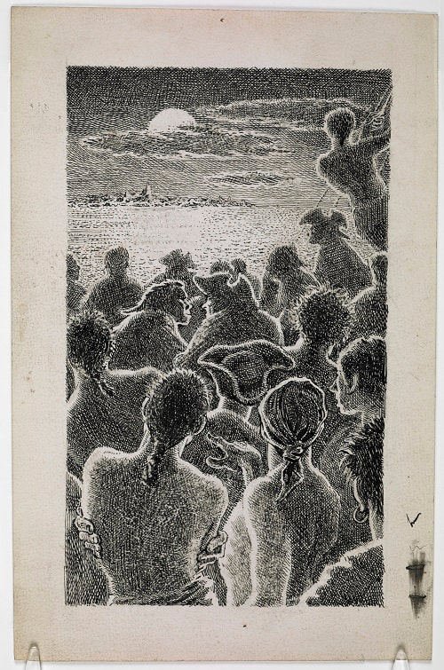
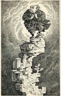
I researched pen and ink illustrators for this project as I intend to create my illustrations for this project using dip pen and ink, I love the way all of these illustrators work. I will use all of these illustrators to inspire my illustrations, I think the contrast between black and white is wonderful and is perfect for a ghost story.
I researched pen and ink illustrators for this project as I intend to create my illustrations for this project using dip pen and ink, I love the way all of these illustrators work. I will use all of these illustrators to inspire my illustrations, I think the contrast between black and white is wonderful and is perfect for a ghost story.
Initial Ideas and Visual Research
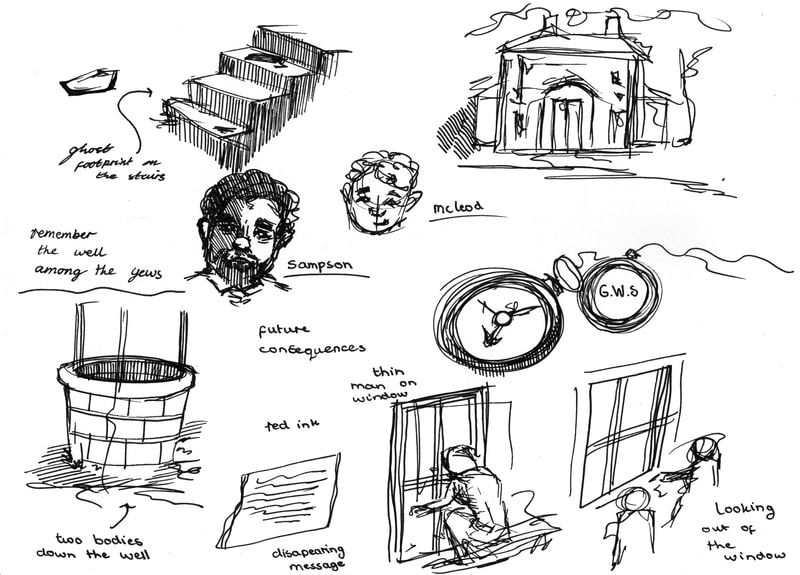
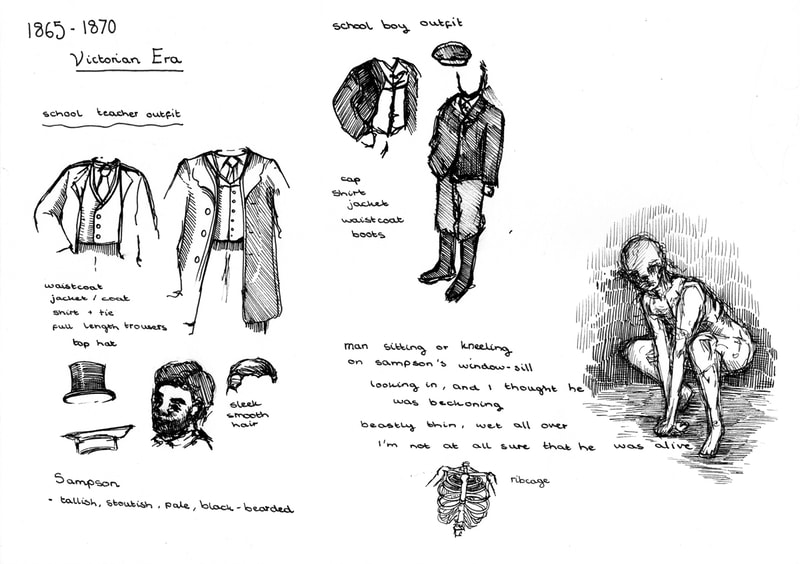
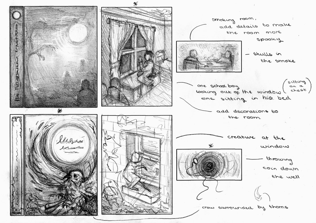
To start this project I listened to the audio version of the "School Story" by M.R.James and sketched as the story played to try and capture the main points of the story. After I did that I then moved onto creating some sketches that captured the style of Victorian England. I found this very helpful to give me and idea of how I would need to draw any people with my illustrations.
To start this project I listened to the audio version of the "School Story" by M.R.James and sketched as the story played to try and capture the main points of the story. After I did that I then moved onto creating some sketches that captured the style of Victorian England. I found this very helpful to give me and idea of how I would need to draw any people with my illustrations.
Book Cover and Spine Development
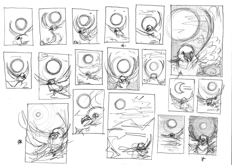
To create the design for my front cover and spine I created some thumbnails, I put stars beside my favourite thumbnails. I then developed these favourite thumbnails further to try and decide which idea to take into the final illustration. My person favourite design is the crow design however it isn't directly related to the ghost stories of M.R.James however crows are commonly used as a symbol of death and foreboding so it could work as a symbol. I also like the tree with hands, and a person in the fog which I think might work better as a cover of a ghost story book.
To create the design for my front cover and spine I created some thumbnails, I put stars beside my favourite thumbnails. I then developed these favourite thumbnails further to try and decide which idea to take into the final illustration. My person favourite design is the crow design however it isn't directly related to the ghost stories of M.R.James however crows are commonly used as a symbol of death and foreboding so it could work as a symbol. I also like the tree with hands, and a person in the fog which I think might work better as a cover of a ghost story book.
Chapter Heading Development
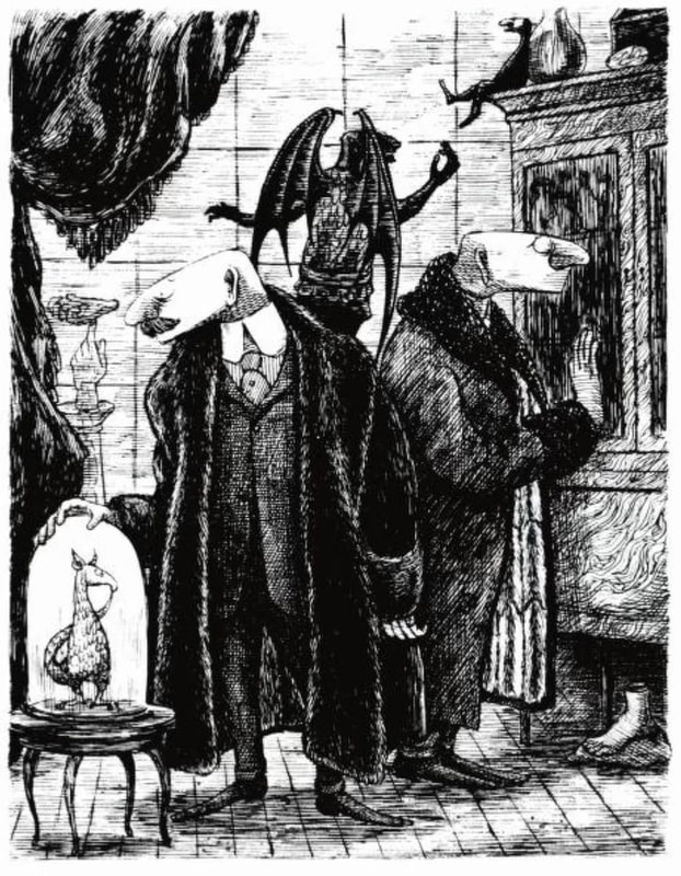
For the chapter heading I created multiple thumbnails for different ideas related to the overall story. After the thumbnail and developments for this idea I like the way the smoking room scene works best, I think the idea of faces in the smoke could portray the idea of two men sitting together telling ghost stories really well.
For the chapter heading I created multiple thumbnails for different ideas related to the overall story. After the thumbnail and developments for this idea I like the way the smoking room scene works best, I think the idea of faces in the smoke could portray the idea of two men sitting together telling ghost stories really well.
Full Page Illustration Development
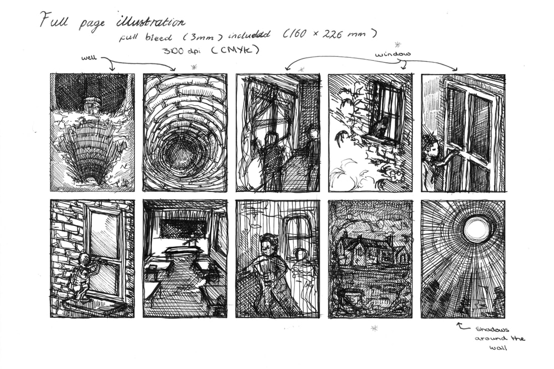
For the full page illustration my favourite design is the idea of the well, however I do think this gives away too much about the ending of the story to be the chosen illustration. Other than this idea my second favourite image was of the school boys looking out of the window, I just need to make sure that this image will give across the feeling of a ghost presence around the school.
For the full page illustration my favourite design is the idea of the well, however I do think this gives away too much about the ending of the story to be the chosen illustration. Other than this idea my second favourite image was of the school boys looking out of the window, I just need to make sure that this image will give across the feeling of a ghost presence around the school.
Final Design (Mini Mock Up) and Final Thumbnails
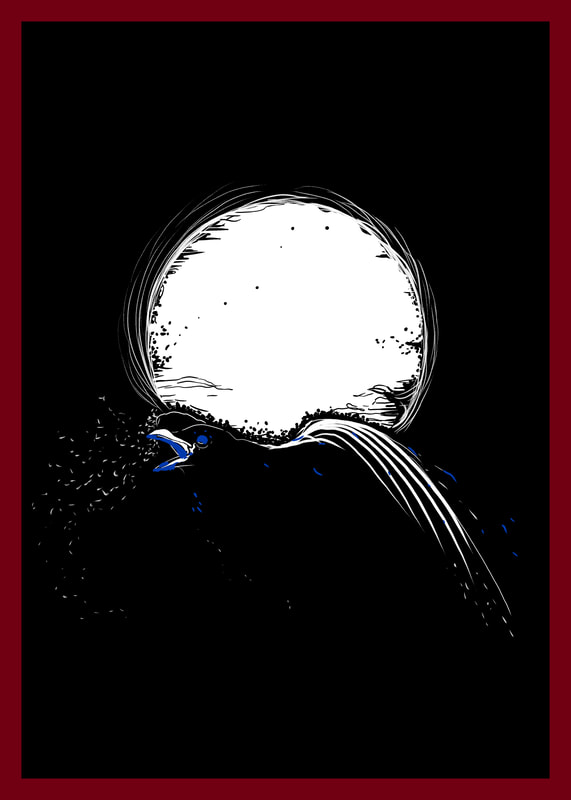
Before I moved onto creating my final illustrations I sketched out two possible combinations, which I coloured digitally. I like the red, black and white cover but I think that the background might look better as black with white and red accents. I think that more natural colours work better for the full page illustration, I would prefer if I could make this illustration black and white like the vignette.
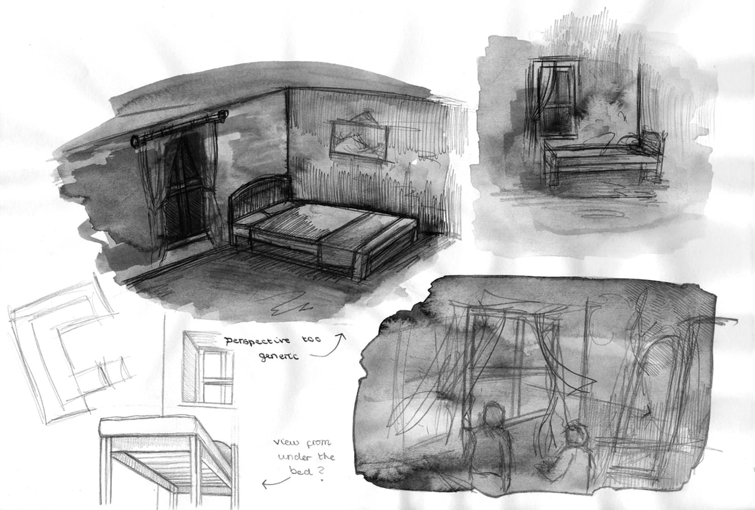
I also created some final quick thumbnails to work out the composition and perspective of the illustrations, I found this helpful but I think I will move this quick stage to the start of my project next time instead of it being at the end. Like Dwayne said you need to think with your pen, and get your thoughts on the page and that is what I plan to do in the next project.
Ghoul Attempt (working back into the project)
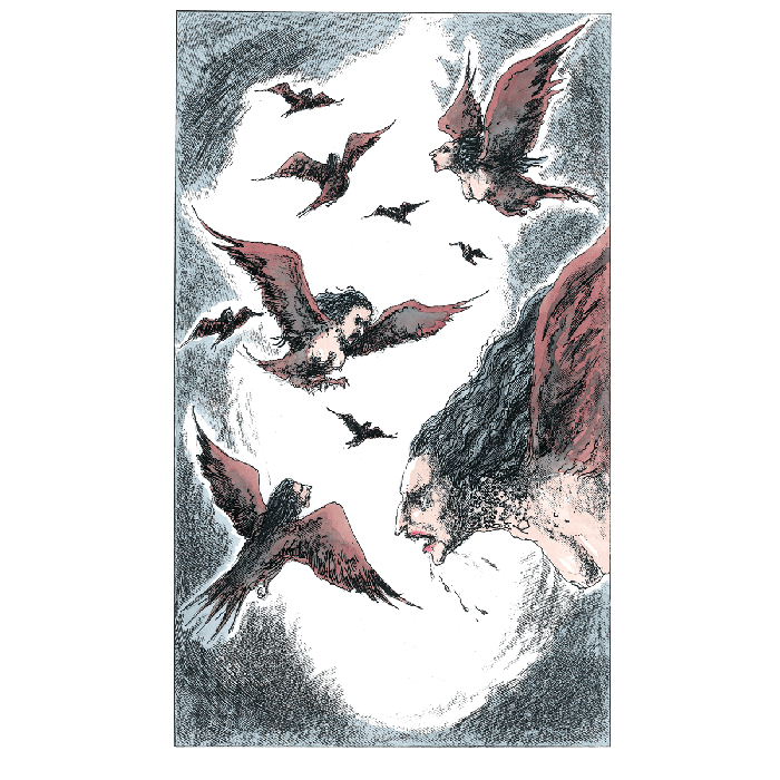
After Dwayne's feedback that my original final illustration was not scary enough I tried to create an illustration that was more outwardly spooky, but I just don't like it as much.
I think that my original final piece works better because the story I was assigned was "A School Story" which is all based around school boys.
Final Illustrations
Book Cover Development
This is the process of creating my book cover, I created a GIF of the stages after Dave's session on Animation I think it helps to show off the steps that I took to create the final image.
This is the process of creating my book cover, I created a GIF of the stages after Dave's session on Animation I think it helps to show off the steps that I took to create the final image.
|
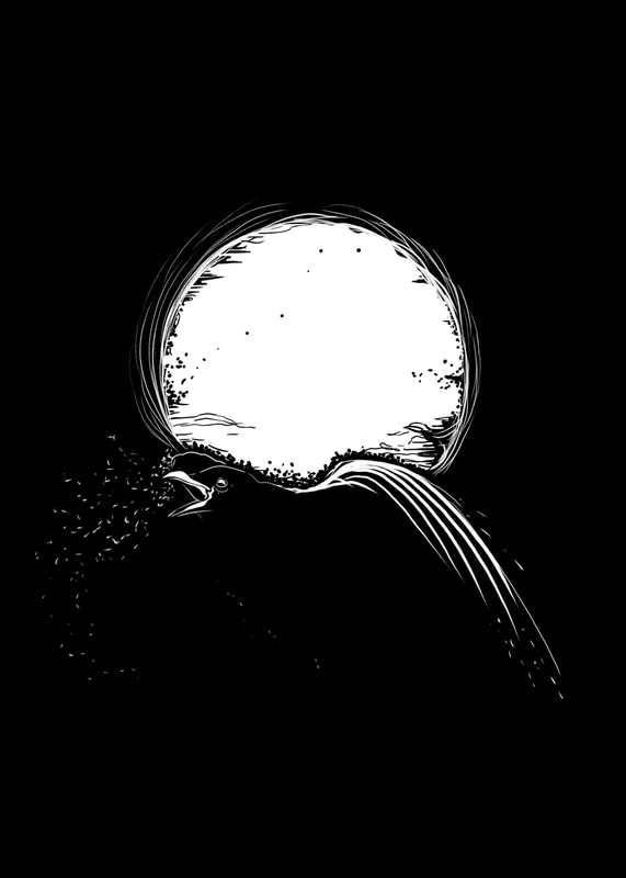
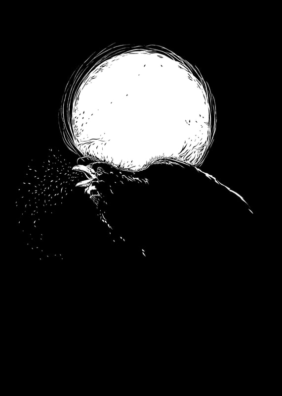
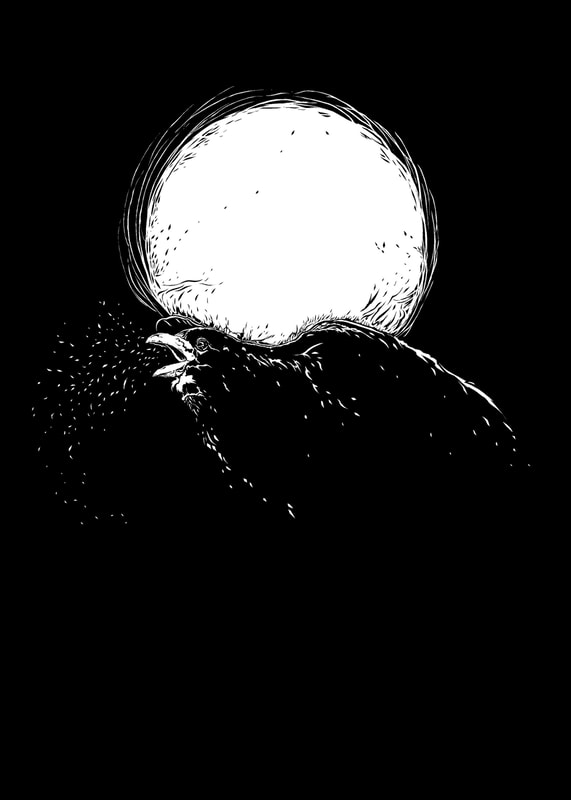
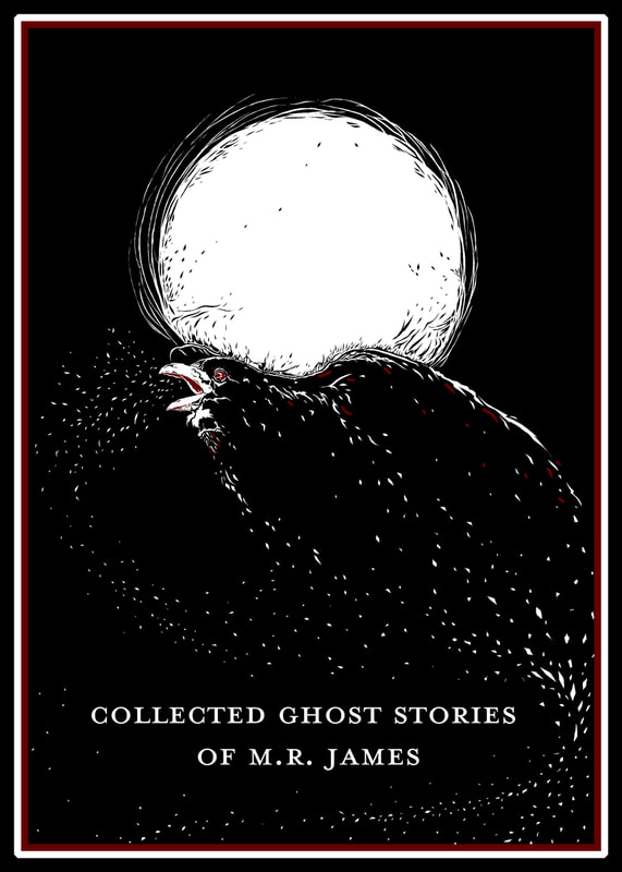
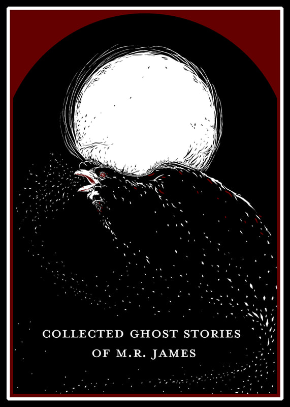
Final Book Cover and Spine For my book cover and spine design I picked to design it around a Raven, Ravens are commonly liked with death and ghosts in myths and superstitions. I also chose to create the cover using black as a background colour (fabric colour) using red and white to create the images and the writing. It was a struggle to create this but I am very pleased with how the cover turned out, I am definitely glad I took Tony's advice to make the image more simplified because I think it is a strong image that integrates with the text inside of fighting against it. I added the speckles coming out of the Raven's mouth, this was inspired by a video that I watched of a crow breathing in the frosty air. I also think that the speckles look like the raven is fragmenting and this reminds me of ghosts as they are ethereal and untaggable. Additionally I added the red round at the top of my front cover and I think that this gives the image the appearance of a doorway, I like that this helps to transport me into the illustration and want to read the book. The spine was also created to try and tie in with the front cover so I added a little raven and some speckles at the bottom. |
Vignette
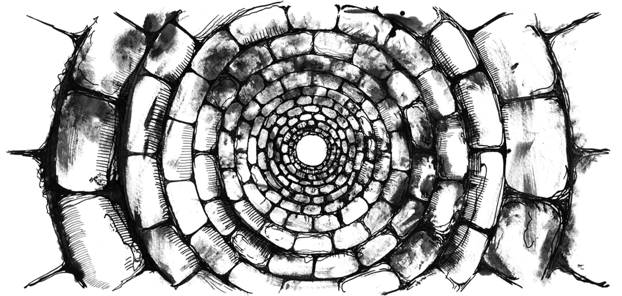
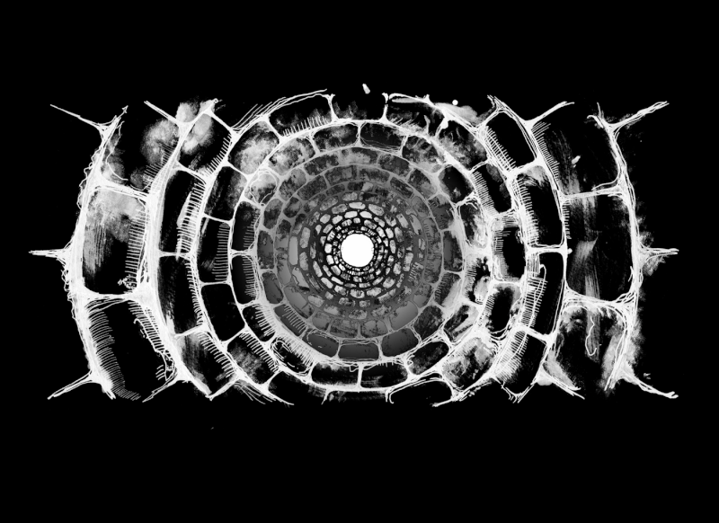
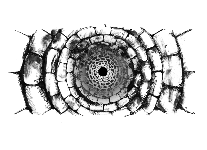
For my vignette I chose to create an image of a well, I created this using ink initially I was going to create a controlled dip pen illustration however I accidently smudged it. I actually really liked how the smudging looked so I continued to smudge as I created the lines, I ended up with ink stained fingers but it was definitely worth it because I really like how it turned out.
For my vignette I chose to create an image of a well, I created this using ink initially I was going to create a controlled dip pen illustration however I accidently smudged it. I actually really liked how the smudging looked so I continued to smudge as I created the lines, I ended up with ink stained fingers but it was definitely worth it because I really like how it turned out.
Full Page Illustration - Original Illustration
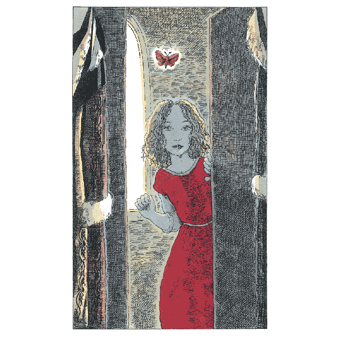
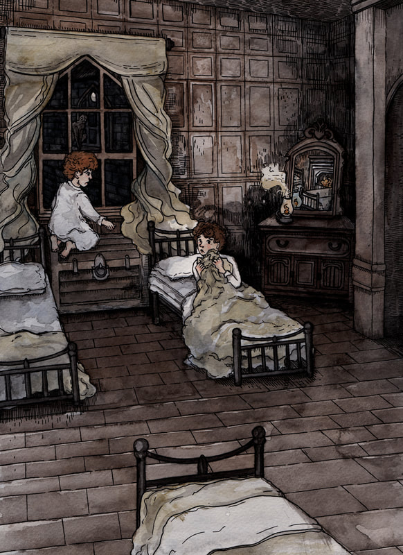
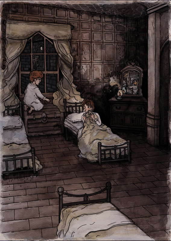
This is my original final illustration for this project, I scanned it as a pencil image, then as a pen and ink line art image, and finally as a painted watercolour image. This helped me to document my illustration process and it gave me opportunity to work into the line art image during the editing that followed the final painting.
This is my original final illustration for this project, I scanned it as a pencil image, then as a pen and ink line art image, and finally as a painted watercolour image. This helped me to document my illustration process and it gave me opportunity to work into the line art image during the editing that followed the final painting.
Full Page Illustration (Editing)
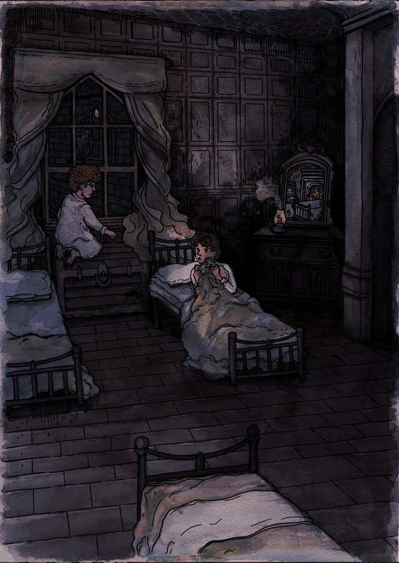
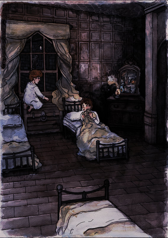
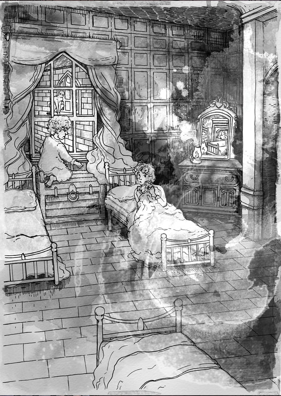
Following the formative feedback I decided to try and make my final illustration creepier looking, Dwayne said it looked too "jolly" so I tried to darken the colours to make the image have a more ghostly appearance. I like some of the more experimental edits of this illustration however I don't think that they work very well in the context of this story.
Following the formative feedback I decided to try and make my final illustration creepier looking, Dwayne said it looked too "jolly" so I tried to darken the colours to make the image have a more ghostly appearance. I like some of the more experimental edits of this illustration however I don't think that they work very well in the context of this story.
|
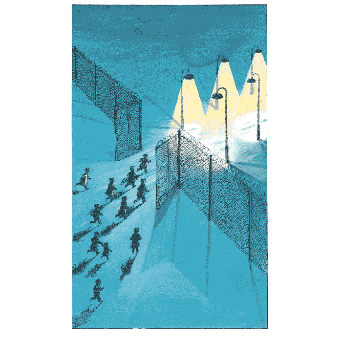
Final Full Page Illustration I like how my final illustration turned out, I think that the more blue hues in this illustration definitely add to the ghostly environment. I also tried to highlight the monster out of the window a bit more because I was unsure if everyone had noticed it during feedback. The story I was given for this project was "A School Story" by M.R. James, this is a story based in a boarding school so I chose to create the illustration in a more children's illustration style inspired by Enid Blyton. I think that it looks good and fits well with the actual story, as the story isn't very graphically scary it is more just an environment of unease and mystery. It my final illustration that I edited I overlaid a black ink painted layer over my watercolour illustration digitally, I think that this definably added contrast to my illustration that I did not have before. Overall I am very pleaded with how this illustration turned out, I am pleased that I got to work with perspective some more as I think the space at the front of the illustration actually adds to the feeling of unease. I am also pleased that this illustration seems spooky but it doesn't overtly give everything away which is what I wanted. As I want the illustration to compliment the story without giving away all of the content of the story. |


