- COMMUNICATION -
Action, Body Language and Communicative Colour
Week 9: Action
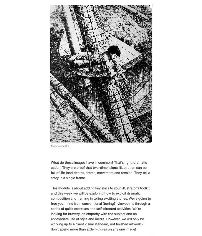
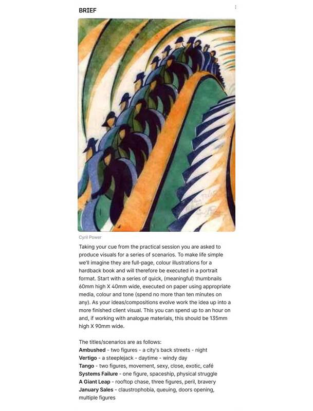
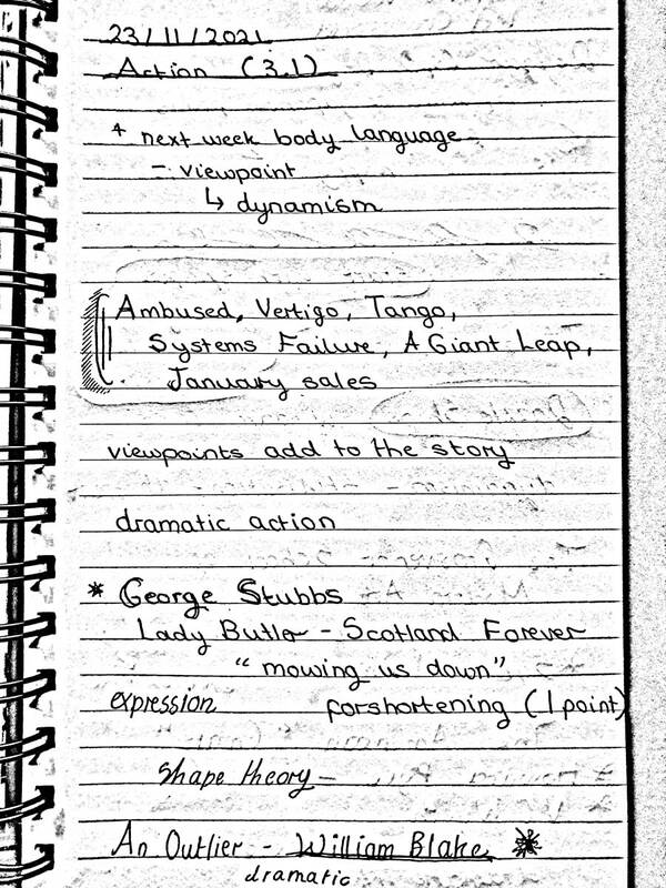
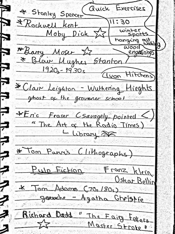
Project Brief and Lecture Notes
|
|
|
Tony's Tuesday Task
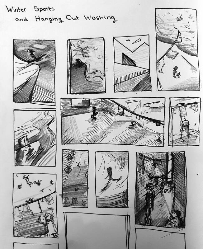
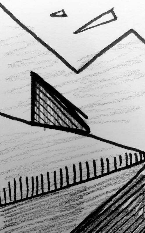
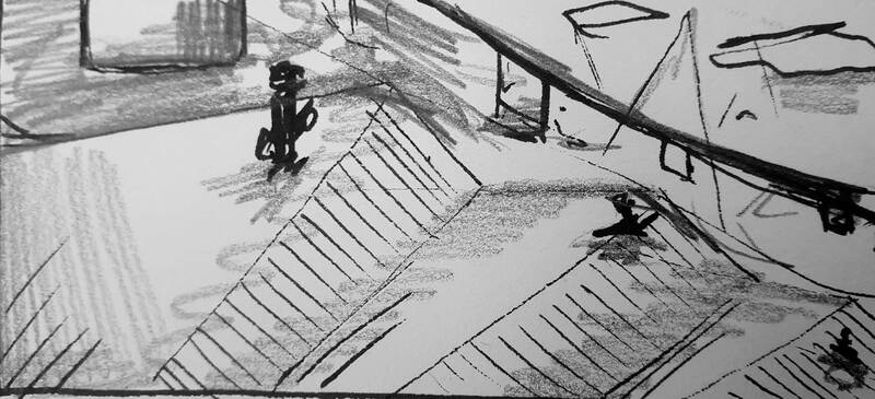
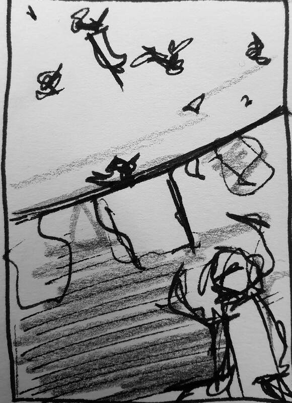
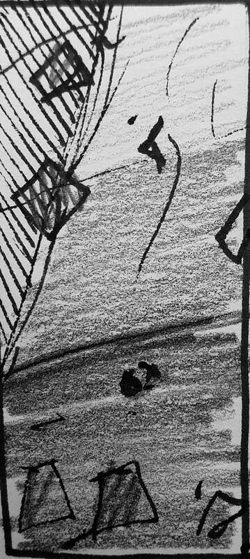
After the project briefing for the "Action" project we were asked to quickly create a collection of thumbnails based on the concepts of "Winter Sports" and "Hanging Up The Washing". I am pleased with how they turned out and it was a good opportunity to loosen up and just experiment with angles and dynamic composition. I still have a long way to go but I am looking forward to creating a collection of quick visuals for this project that will hopefully help me to think outside the box.
After the project briefing for the "Action" project we were asked to quickly create a collection of thumbnails based on the concepts of "Winter Sports" and "Hanging Up The Washing". I am pleased with how they turned out and it was a good opportunity to loosen up and just experiment with angles and dynamic composition. I still have a long way to go but I am looking forward to creating a collection of quick visuals for this project that will hopefully help me to think outside the box.
Book Research
When I was in the library looking at books to influence my drawing project "Out of Lockdown Diary" I found two books that I thought were perfect research for this project.
When I was in the library looking at books to influence my drawing project "Out of Lockdown Diary" I found two books that I thought were perfect research for this project.
Thumbnails
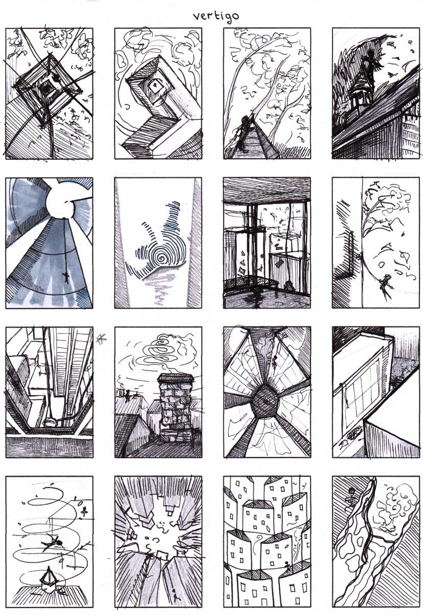
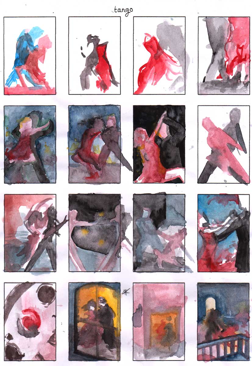
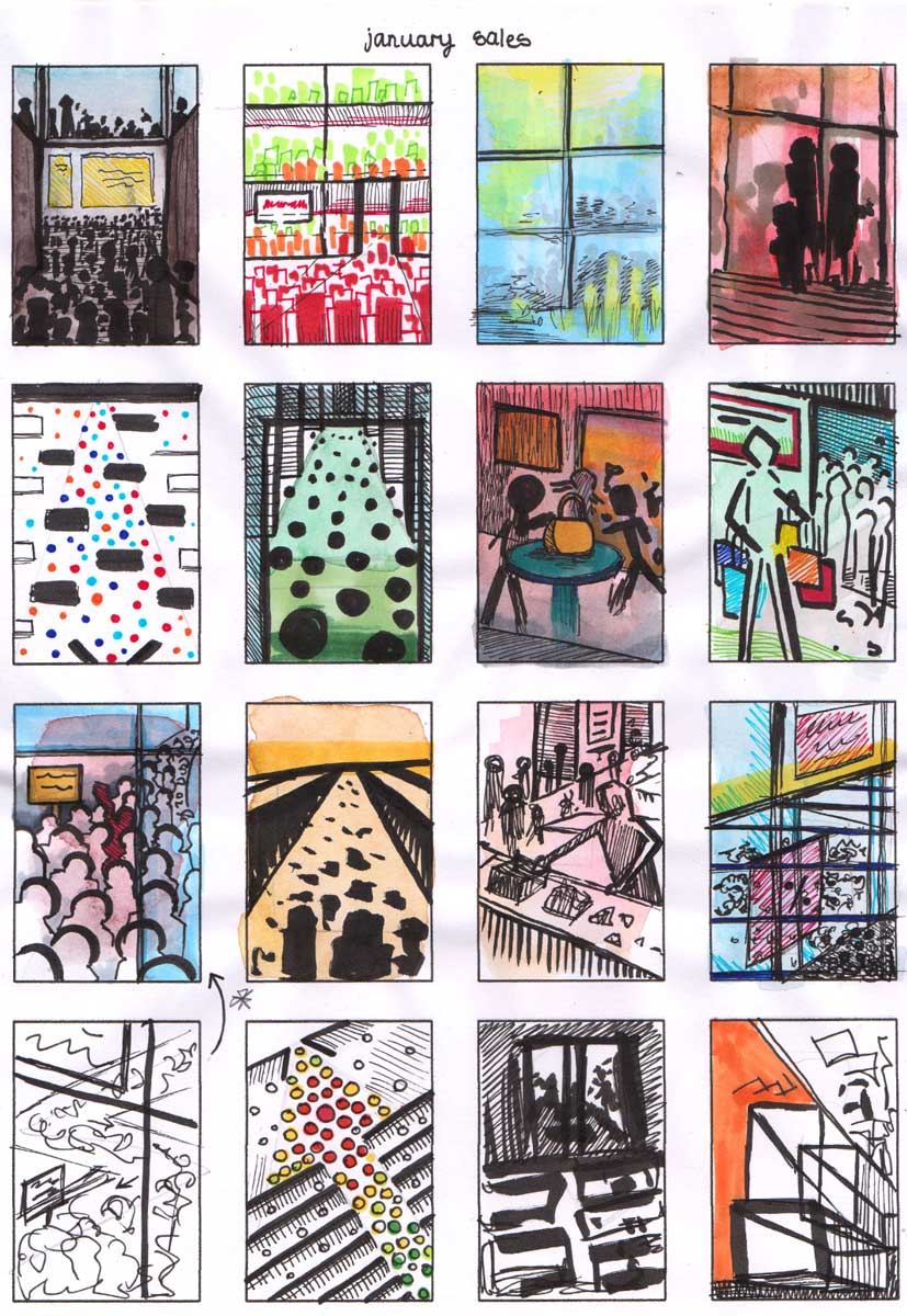
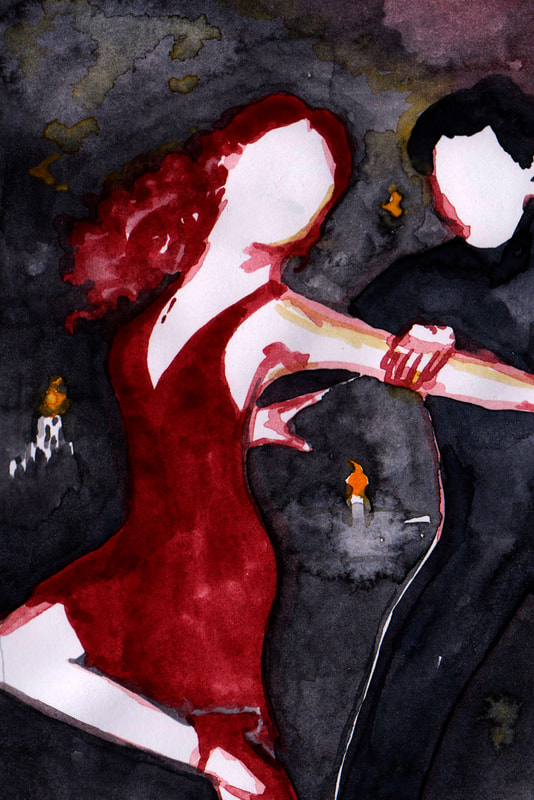
I created a collection of thumbnails for each of the action topics to get a feel of how each movement could look, I found the extra stage directions the hardest to follow. However I am very happy overall with how these thumbnails turned out, I attempted to use multiple different types of materials to create these thumbnails dependant on what I thought matched the action best. Using watercolour for the tango theme really brought the thumbnails to life.
I created a collection of thumbnails for each of the action topics to get a feel of how each movement could look, I found the extra stage directions the hardest to follow. However I am very happy overall with how these thumbnails turned out, I attempted to use multiple different types of materials to create these thumbnails dependant on what I thought matched the action best. Using watercolour for the tango theme really brought the thumbnails to life.
Client Visual Pages
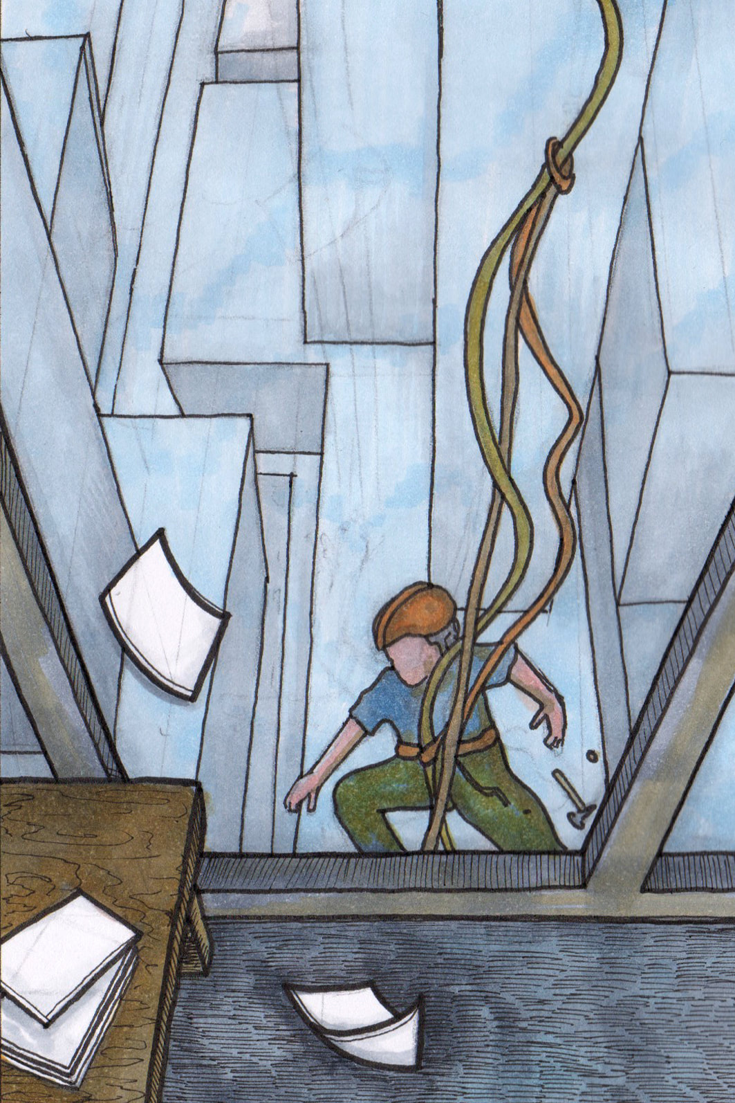
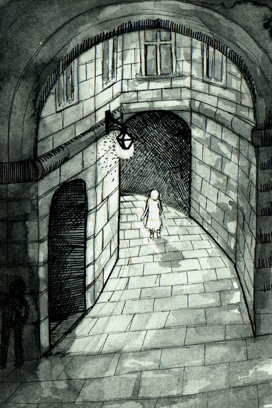
I planned to create one client visual for each of the action topics, however I ended up having to make two for both ambushed and tango because I wasn't very happy with them. I am still not very happy with the ambushed client visual, I much preferred my thumbnails so I think must have just picked the wrong one to turn into a larger image.
I planned to create one client visual for each of the action topics, however I ended up having to make two for both ambushed and tango because I wasn't very happy with them. I am still not very happy with the ambushed client visual, I much preferred my thumbnails so I think must have just picked the wrong one to turn into a larger image.
Finished Client Visuals
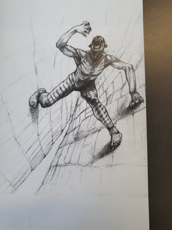
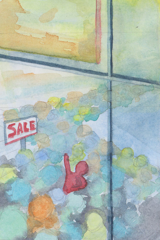
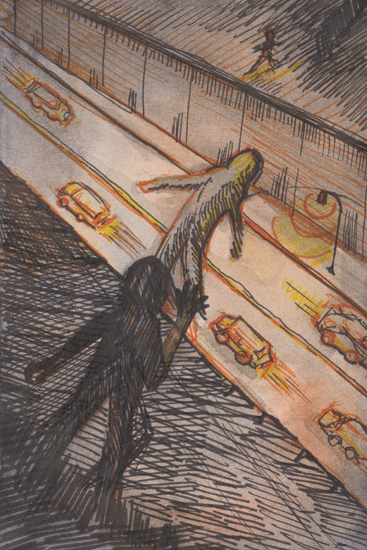
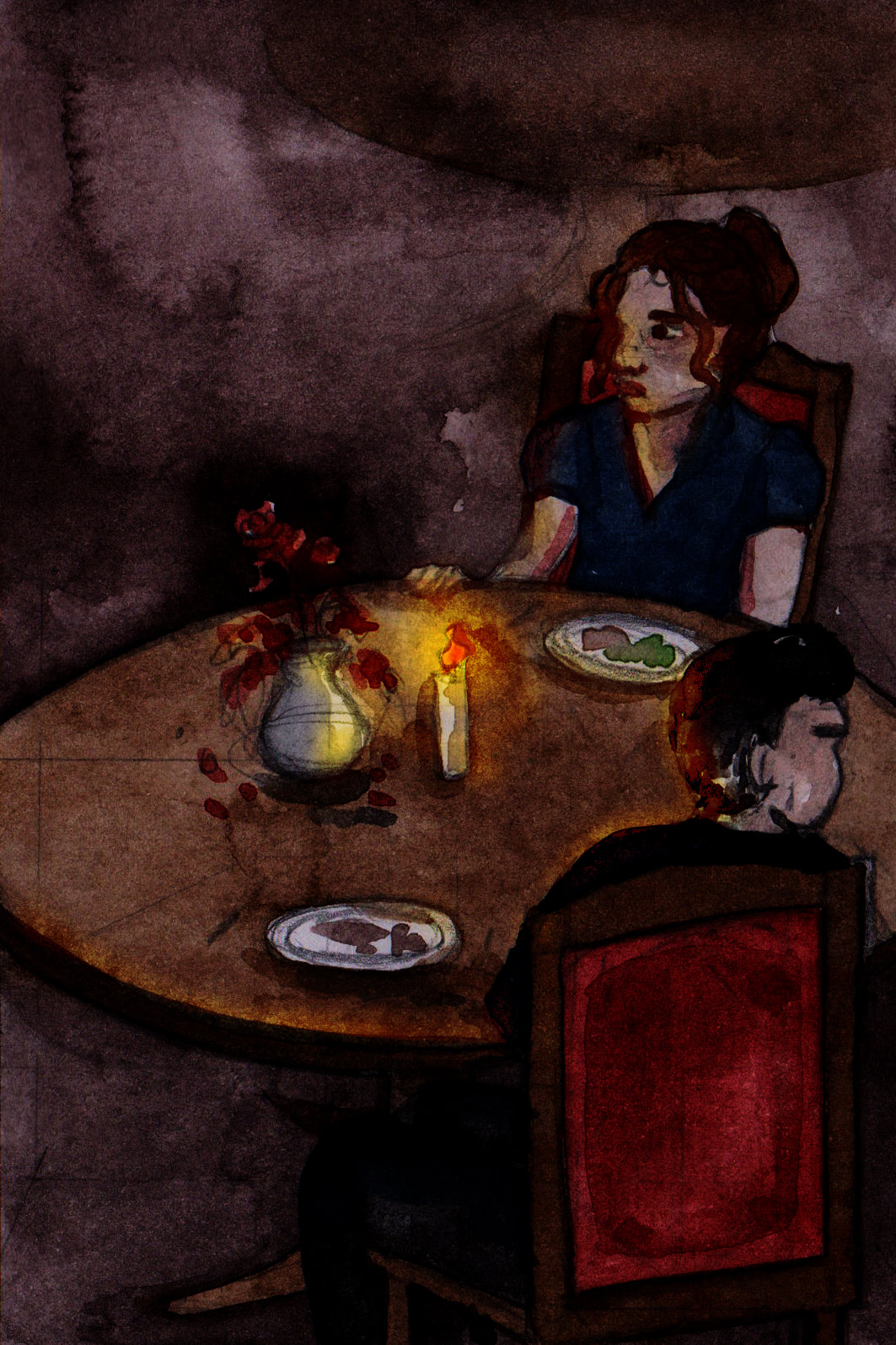
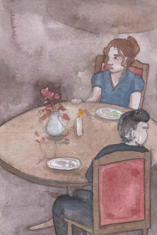
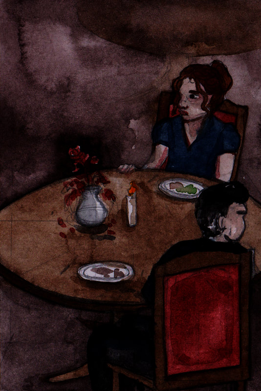
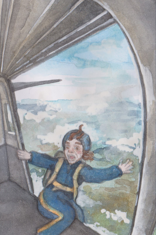
Out of all of the client visuals my favourite is the tango visual, the powerful contrast between black and red helps to draw attention to this illustration. The candle lights in the background help to add some interest too, and create the atmosphere of a café which this action scene was meant to be set within. I also liked the way the January sales image ended up looking, it is quite simplistic however I do think it gets across the idea of a sea of people sweeping someone away. Also I found the vertigo image fun to draw however I do think the colours may be too static so that the vertigo image doesn't get the benefit of the windy atmosphere which it would have benefited from greatly.
Out of all of the client visuals my favourite is the tango visual, the powerful contrast between black and red helps to draw attention to this illustration. The candle lights in the background help to add some interest too, and create the atmosphere of a café which this action scene was meant to be set within. I also liked the way the January sales image ended up looking, it is quite simplistic however I do think it gets across the idea of a sea of people sweeping someone away. Also I found the vertigo image fun to draw however I do think the colours may be too static so that the vertigo image doesn't get the benefit of the windy atmosphere which it would have benefited from greatly.
Process and Extra Client Visuals
This shows my process of editing these images alongside the extra client visuals that didn't make it to the main selection.
This shows my process of editing these images alongside the extra client visuals that didn't make it to the main selection.
|
Additional Designs Created After Formative Assessment I created some more designs after the formative assessment with Dwayne, to try and show more action in the designs that I thought were lacking such as "a giant leap" rooftop chase and "ambushed" which were lacking in my original client visuals. I think these work a lot better I just wish I had the chance to develop them into more finished designs. |
Week 10: Body Language
Week 10: Body Language
Tony's Tuesday Task
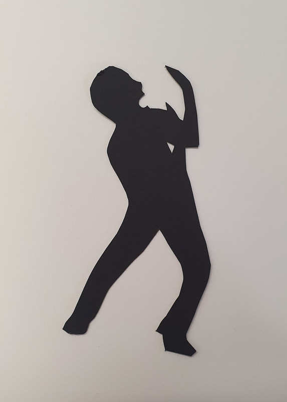
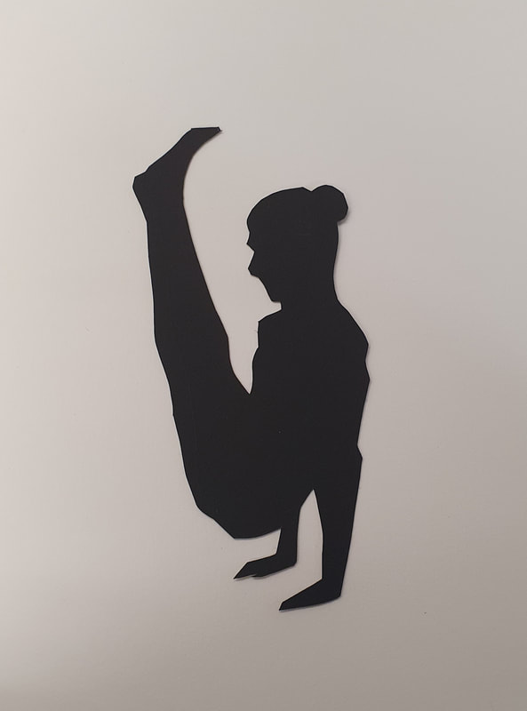
After the project briefing for the "Body Language" project we were asked to quickly create a collection of silhouette drawing or cut outs that showed different emotions. Joy, Fear, Boredom, Anger, Strength and Frailty. I found this task very enjoyable, and I almost wish I had just continued working in black paper cut outs because I think they look a lot more successful than the visuals I created.
After the project briefing for the "Body Language" project we were asked to quickly create a collection of silhouette drawing or cut outs that showed different emotions. Joy, Fear, Boredom, Anger, Strength and Frailty. I found this task very enjoyable, and I almost wish I had just continued working in black paper cut outs because I think they look a lot more successful than the visuals I created.
Thumbnails
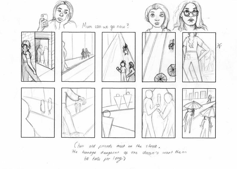
I found the body language section of this project even more difficult that action I think, I didn't manage to capture the body language as dramatically as I hoped. Most of the illustrations I created look a be stiff. This could be from my lack of observation of how the human body actually moves. I much prefer drawing and painting animals but I think I need to work of action and body language some more in the future to try and improve my understanding and ability to communicate through my illustrations.
I found the body language section of this project even more difficult that action I think, I didn't manage to capture the body language as dramatically as I hoped. Most of the illustrations I created look a be stiff. This could be from my lack of observation of how the human body actually moves. I much prefer drawing and painting animals but I think I need to work of action and body language some more in the future to try and improve my understanding and ability to communicate through my illustrations.
Thumbnail Development
After I picked my favourite thumbnail I used it to create six further thumbnails with small differences to try and work out the best design to transfer into larger client visuals.
I think this was a helpful process that let me test multiple small alterations to each of my selected designs.
After I picked my favourite thumbnail I used it to create six further thumbnails with small differences to try and work out the best design to transfer into larger client visuals.
I think this was a helpful process that let me test multiple small alterations to each of my selected designs.
Client Visual Pages
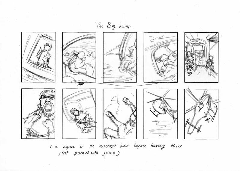
After talking to Dwayne for feedback he said that these designs could have been improved by adding more clear and accurate body language into them, so after I finished uploading my original visuals to the blog I went back and created an extra page of visuals for both "action" and "body language" using fine liners to speed up the process.
After talking to Dwayne for feedback he said that these designs could have been improved by adding more clear and accurate body language into them, so after I finished uploading my original visuals to the blog I went back and created an extra page of visuals for both "action" and "body language" using fine liners to speed up the process.
Finished Client Visuals
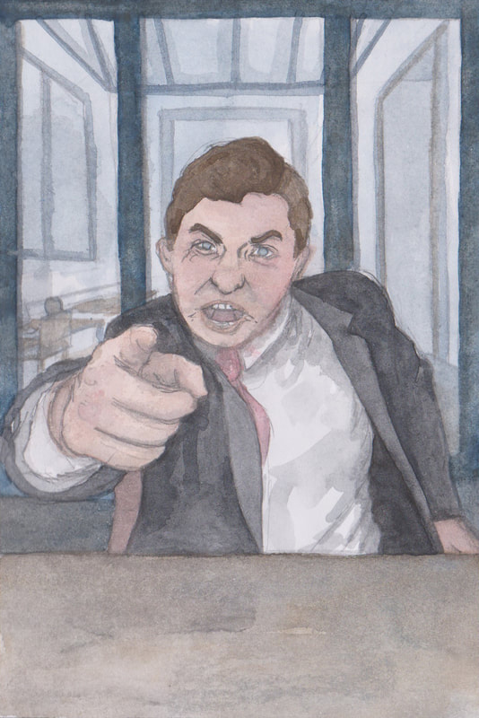
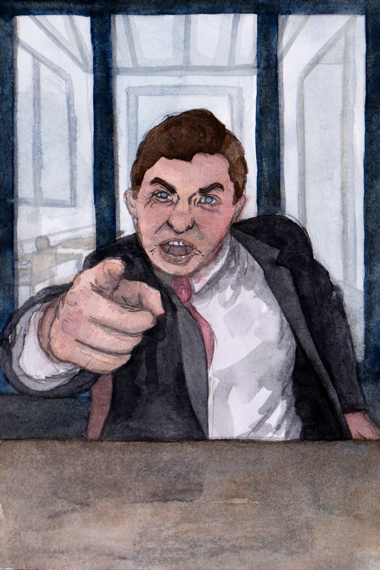
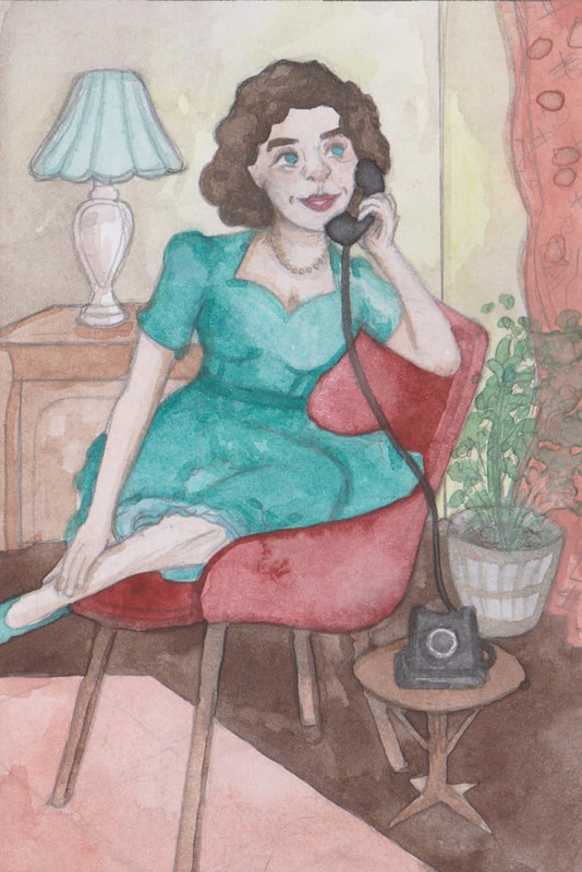
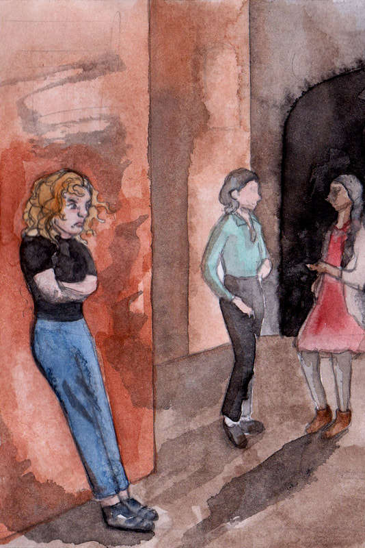
My favourite client visuals are definitely angry boss and the big jump; I think that these show off the dramatic body language best, especially regarding the angry boss. However I had to put the second figure in the background as opposed to putting them directly in the frame. I also tried to focus a lot on the colours of the the images to try and get across the concept of each of the scenarios.
My favourite client visuals are definitely angry boss and the big jump; I think that these show off the dramatic body language best, especially regarding the angry boss. However I had to put the second figure in the background as opposed to putting them directly in the frame. I also tried to focus a lot on the colours of the the images to try and get across the concept of each of the scenarios.
Process
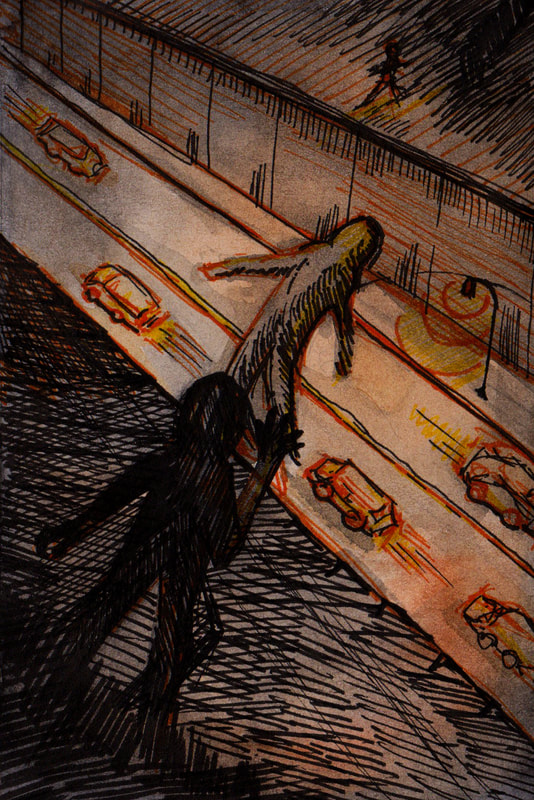
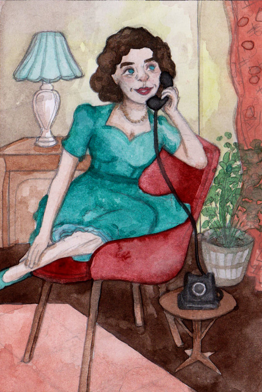
This is to show the process of editing my client visuals, they definitely looked a lot better when I darkened the colours.
This is to show the process of editing my client visuals, they definitely looked a lot better when I darkened the colours.
|
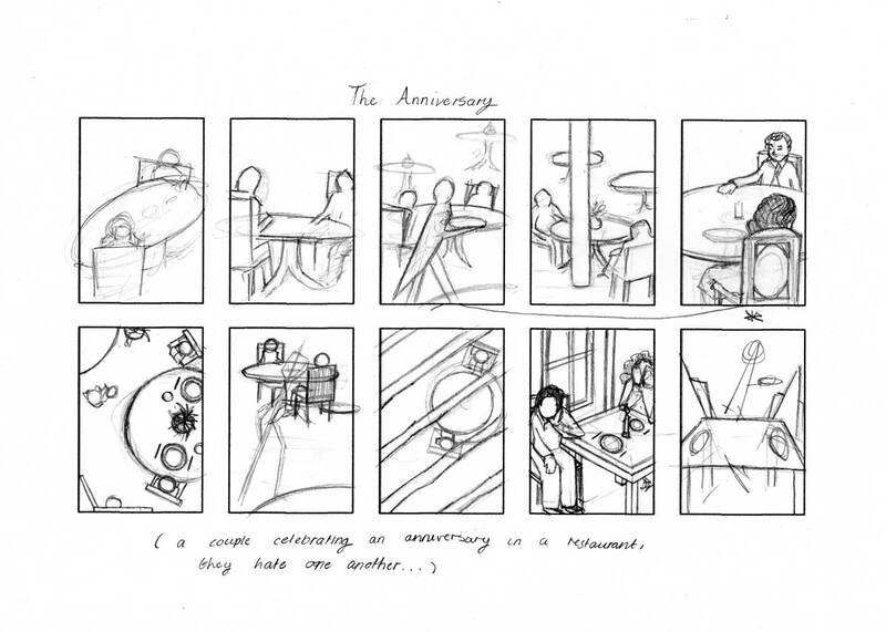
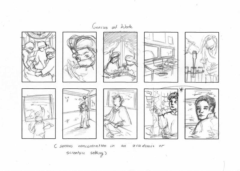
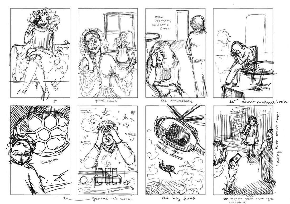
Additional Designs Created After Formative Assessment I worked on adding some more personality into these like I did with the action thumbnails, I especially liked how "The Anniversary" turned out because it wasn't that much of an interesting design previously. I also think that I managed to improve the "Genius at Work" and "Good News" significantly. So I am a lot more pleased with my outcomes now. |
Week 11 and 12: Communicative Colour
Artist Research Colour
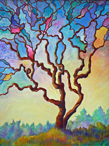
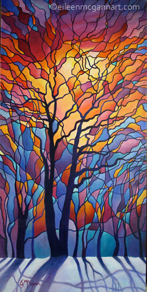
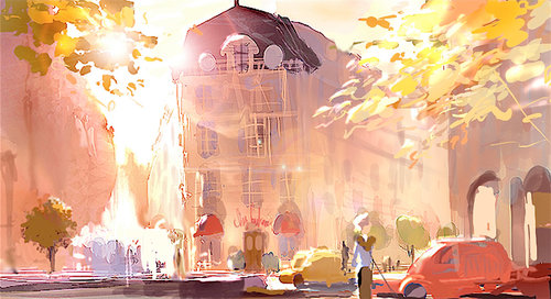
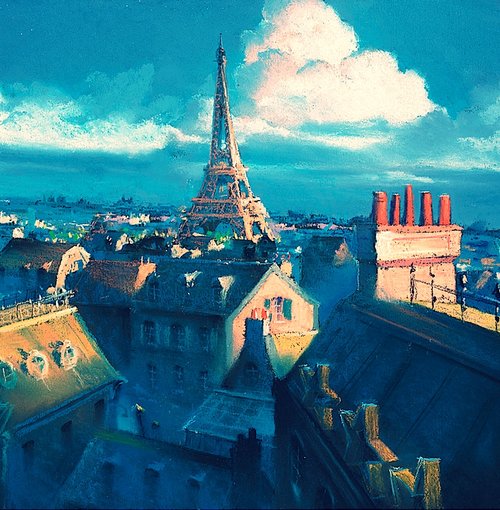
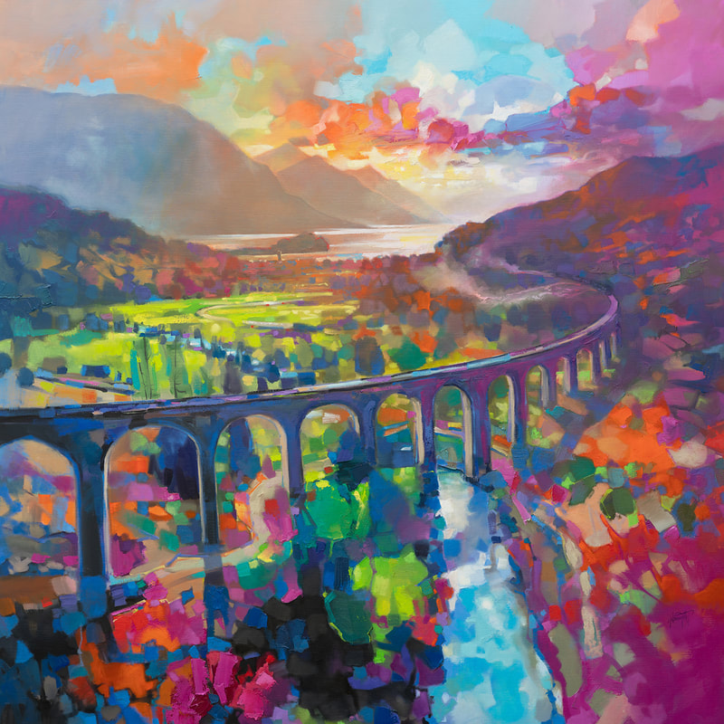
I searched for artists that use colour heavily and I found these three examples of magical colourful illustrations brimming with life and joy. All of these artists also use lighting very effectively.
I searched for artists that use colour heavily and I found these three examples of magical colourful illustrations brimming with life and joy. All of these artists also use lighting very effectively.
Watercolour Thumbnails
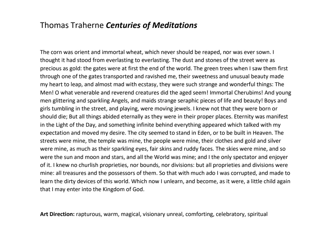
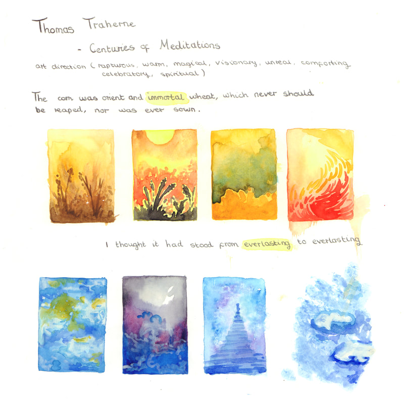
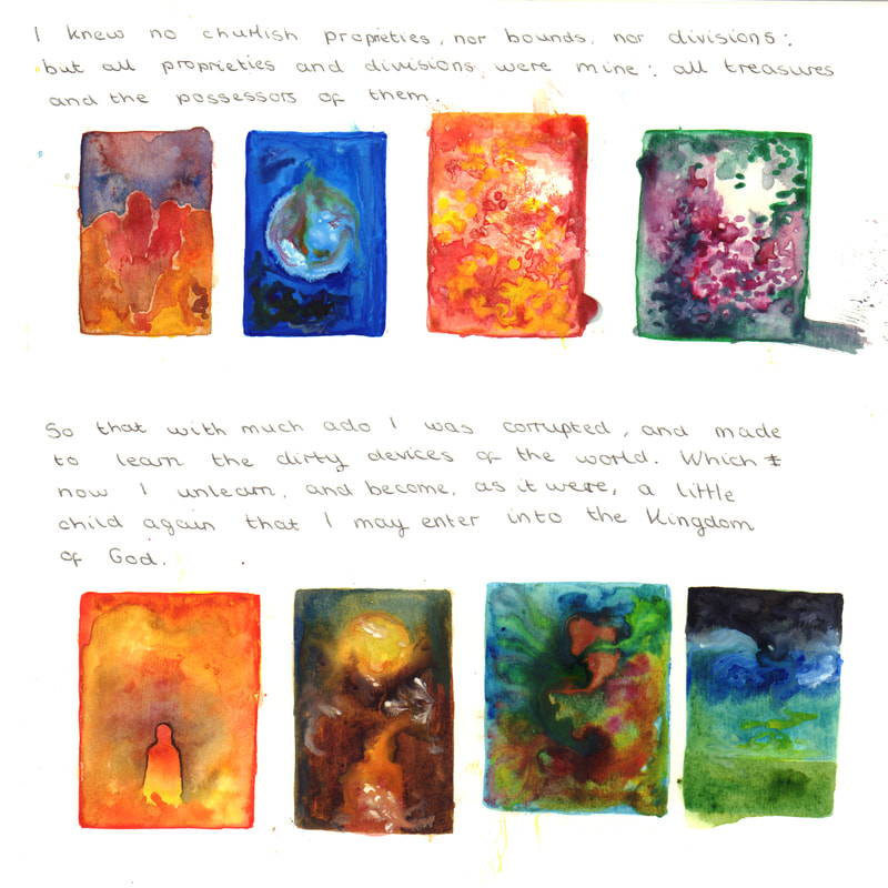
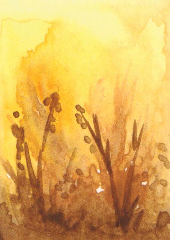
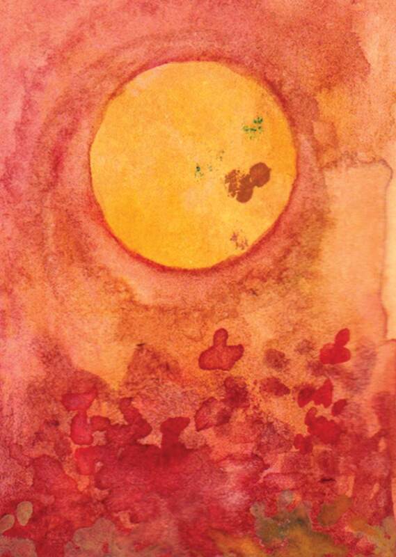
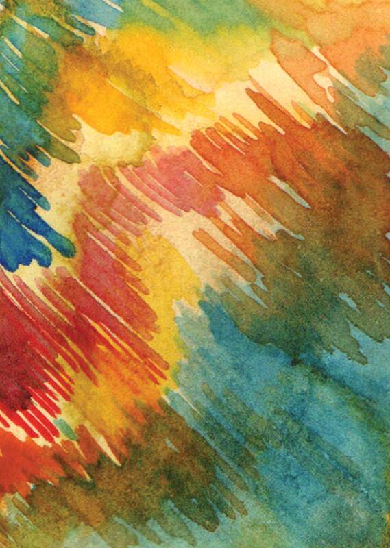
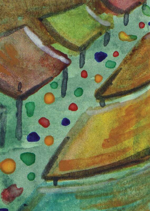
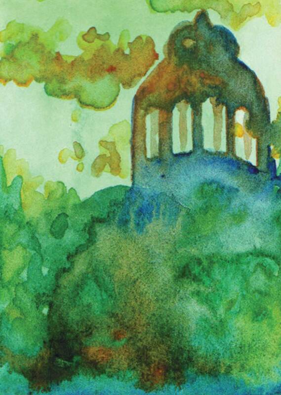
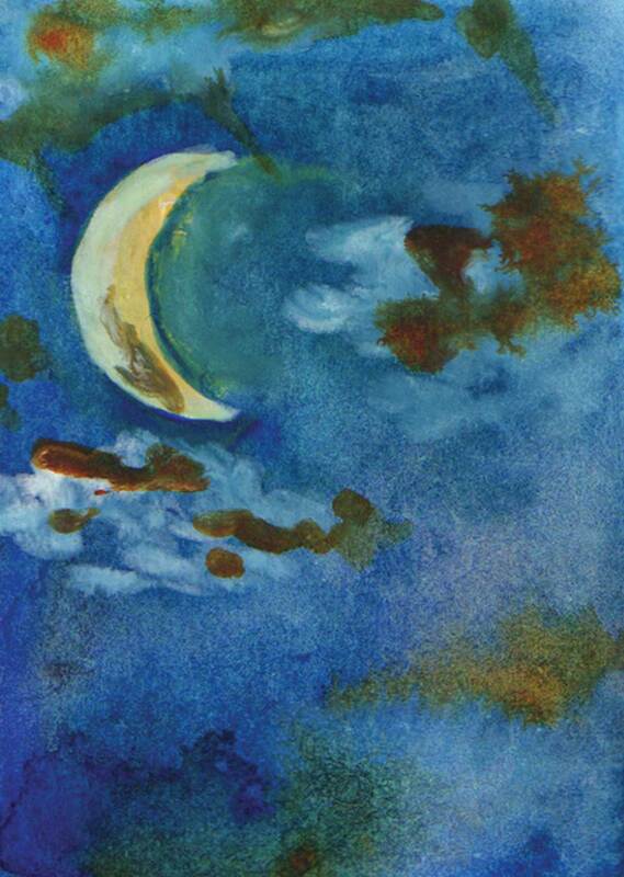
To start off this project I took each part of "Thomas Traherne's Centuries of Meditations" and created coloured thumbnails for each line of text. I loved this process because it allowed me to just play around with colours and see what kind of colour schemes came to me after I read the text. I would definitely do this again because I found it more interesting and freeing to create thumbnails without sketching the designs first. After looking at all of my thumbnails I noticed that yellow, orange and green-blue appear most frequently
To start off this project I took each part of "Thomas Traherne's Centuries of Meditations" and created coloured thumbnails for each line of text. I loved this process because it allowed me to just play around with colours and see what kind of colour schemes came to me after I read the text. I would definitely do this again because I found it more interesting and freeing to create thumbnails without sketching the designs first. After looking at all of my thumbnails I noticed that yellow, orange and green-blue appear most frequently
My Favourite Thumbnails
Ink Thumbnails
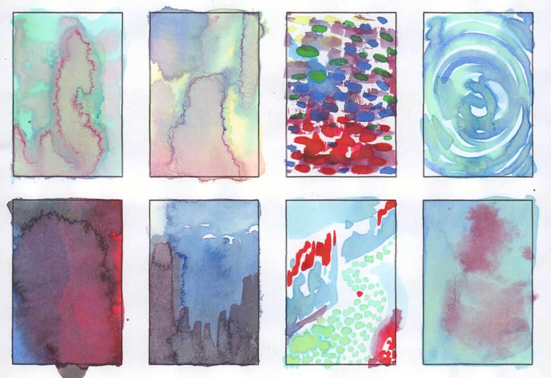
In addition to the watercolour thumbnails I used some ink to create some extra more abstract thumbnails. These weren't anywhere near as helpful as the watercolour thumbnails however I really liked the top left thumbnail the green lines remind me of some kind of magical emerald castle which inspired me into thinking of a castle design.
In addition to the watercolour thumbnails I used some ink to create some extra more abstract thumbnails. These weren't anywhere near as helpful as the watercolour thumbnails however I really liked the top left thumbnail the green lines remind me of some kind of magical emerald castle which inspired me into thinking of a castle design.
|
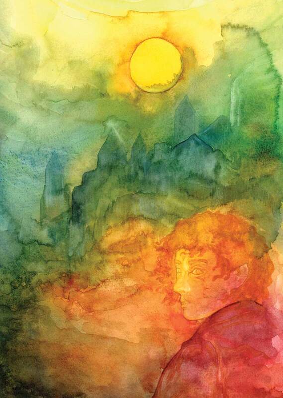
Watercolour Final Piece Before my feedback with Dwayne where it was suggested that I use some acrylics. I had already started to create a watercolour final piece inspired by my impression of the text, I really like how the colours look and I think it has a whimsical dream like quality which I think reflects the nature of Thomas Traherne's text. I would usually work into a watercolour painting much more than I did for this piece however due to time restrains and the fact I didn't want it to look overdone and literal I stopped painting sooner than I would usually. I think the fact I left this piece quite gestural helps to make the piece seem immaterial and otherworldly, which I think helps to tie it to the original text. |
|
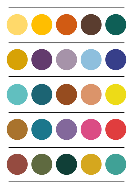
Colour Pallets During a feedback session with Dwayne we agreed it would be helpful to create colour palettes inspired by "Thomas Traherne's Centuries of Meditation" digitally. I intend to create some more colour designs, using a few of these colour pallets to colour them. This way I can pick the most effective colour combination for my final illustration. |
Acrylic Painting Tests
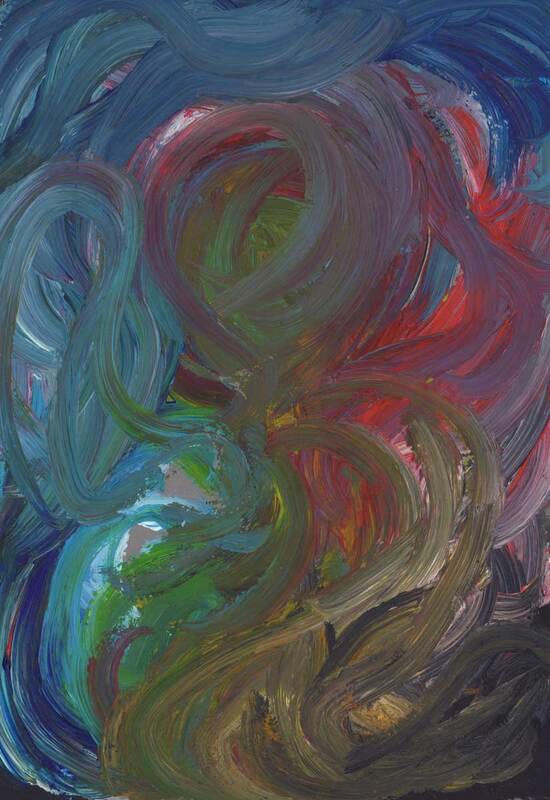
I really don't like using acrylic, I find it so difficult I don't know why maybe I am just not patient enough because I always seem to end up with muddied paint. But I did try my best to make them look good, my favourite is the second along on the top layer I painted it using my fingers so it has a swirly effect to it. Also I decided that for my final acrylic piece that the colours would need to be a lot brighter to even get close to trying to reflect the original text that was assigned to me.
I really don't like using acrylic, I find it so difficult I don't know why maybe I am just not patient enough because I always seem to end up with muddied paint. But I did try my best to make them look good, my favourite is the second along on the top layer I painted it using my fingers so it has a swirly effect to it. Also I decided that for my final acrylic piece that the colours would need to be a lot brighter to even get close to trying to reflect the original text that was assigned to me.
Acetate Layers
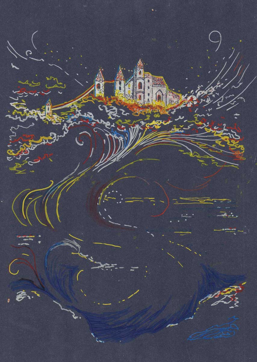
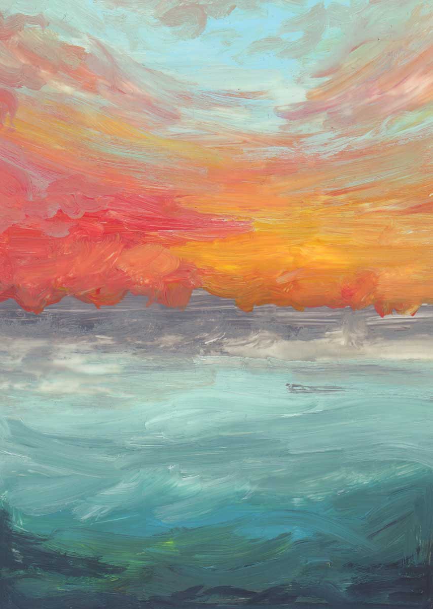
This is a prime example of a happy accident, over the holiday I have been tidying and I found a folder with a few sheets of acetate in it, so I thought why not and decided to paint with acrylic on acetate, I started out with the background then I decided to build up from there using multiple layers of acetate, I am very happy with how this technique worked.
This is a prime example of a happy accident, over the holiday I have been tidying and I found a folder with a few sheets of acetate in it, so I thought why not and decided to paint with acrylic on acetate, I started out with the background then I decided to build up from there using multiple layers of acetate, I am very happy with how this technique worked.
Final Illustration Process
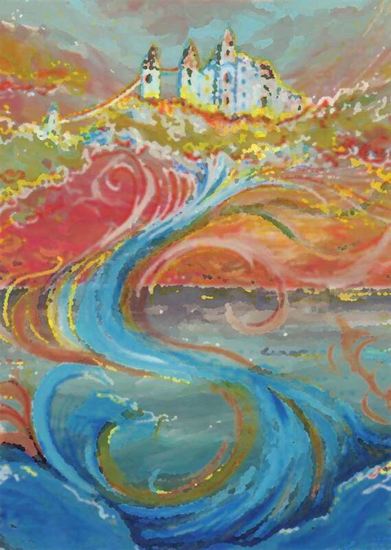
These are scans of the layers of my acetate design, I am very pleased with the warm colours and how it looks quite magical.
This isn't something I would have thought of doing for this project but it has worked well and I enjoyed the process.
These are scans of the layers of my acetate design, I am very pleased with the warm colours and how it looks quite magical.
This isn't something I would have thought of doing for this project but it has worked well and I enjoyed the process.
Edits of the Final Design and the Layers
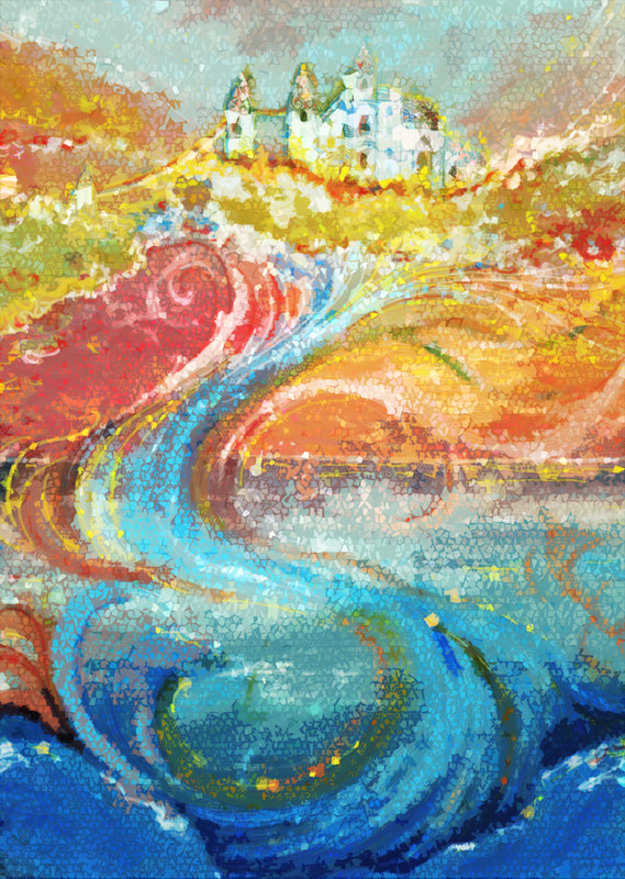
After I had the finished design I decided to edit it in photoshop and play around with the illustration I have created, I ended up liking the original design best but it was nice to edit it none the less. I have added in a gif to demonstrate how the layering process works, it works quite well but unfortunately the layers of paint makes the acetate together.
After I had the finished design I decided to edit it in photoshop and play around with the illustration I have created, I ended up liking the original design best but it was nice to edit it none the less. I have added in a gif to demonstrate how the layering process works, it works quite well but unfortunately the layers of paint makes the acetate together.
|
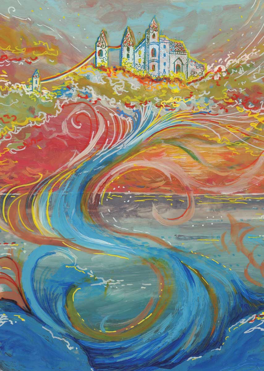
Communicative Colour Final Illustration This is my final piece for the Communicative Colour project, I love how the colours turned out after I added in all the layers, I think the highlights of yellow across the whole illustration helps to tie the whole illustration together. I also added in the white highlights to make the castle and clouds pop out more, I think that it all works well together. However if I was to change anything I would have given a larger space above the castle in the sky to balance the image better in the page. The way that the dark blue works coming up from the bottom of the illustration helps to lead the eye upwards and loops your eye around the illustration and I hope it helps to convey a beautiful magical world full of wonder and joy. |


