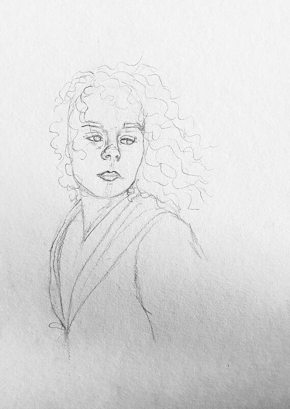
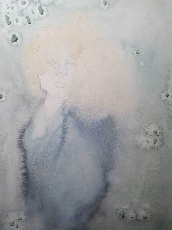
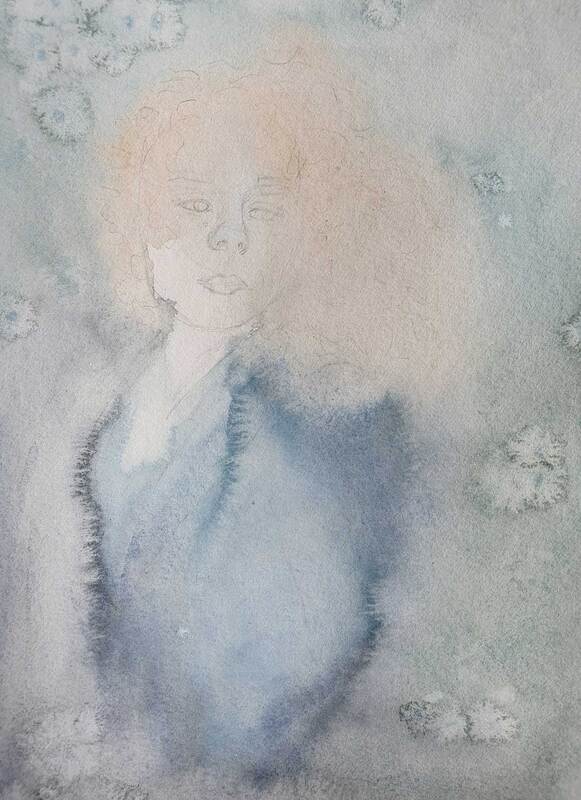
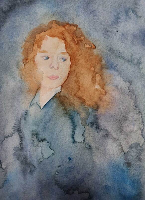
- ANALOGUE -
Ink, 3D Model Making and Painting
Week 1: Ink
|
|
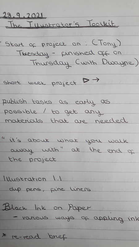
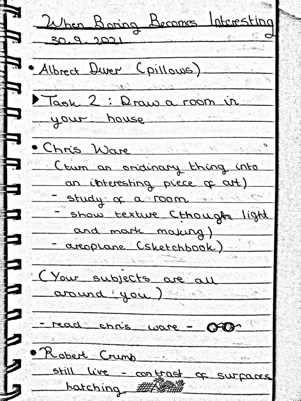
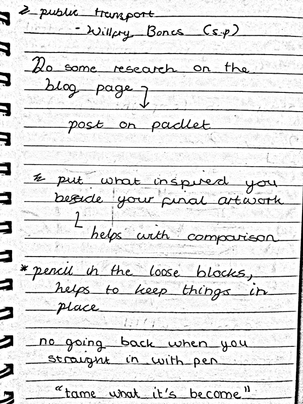
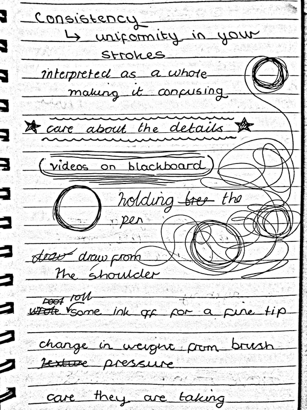
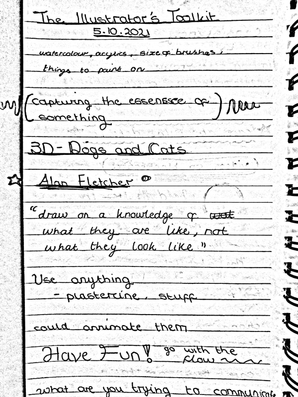
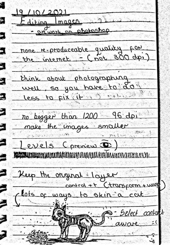
Lecture Notes |
Research
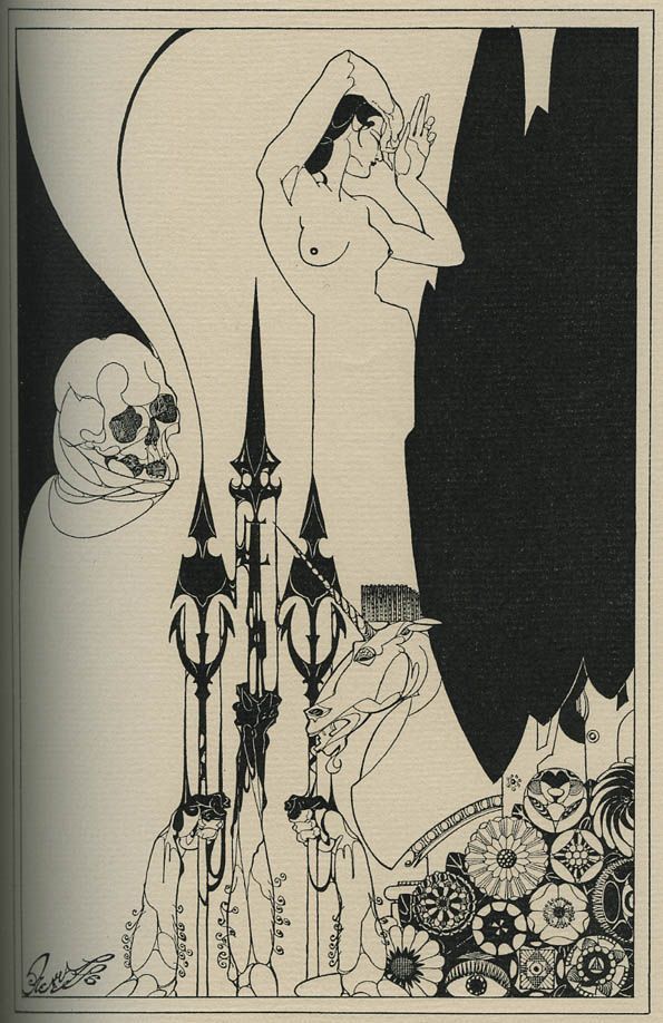
(Artist's From Tony's Lecture)
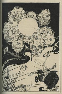
(Artist's From Tony's Lecture)
|
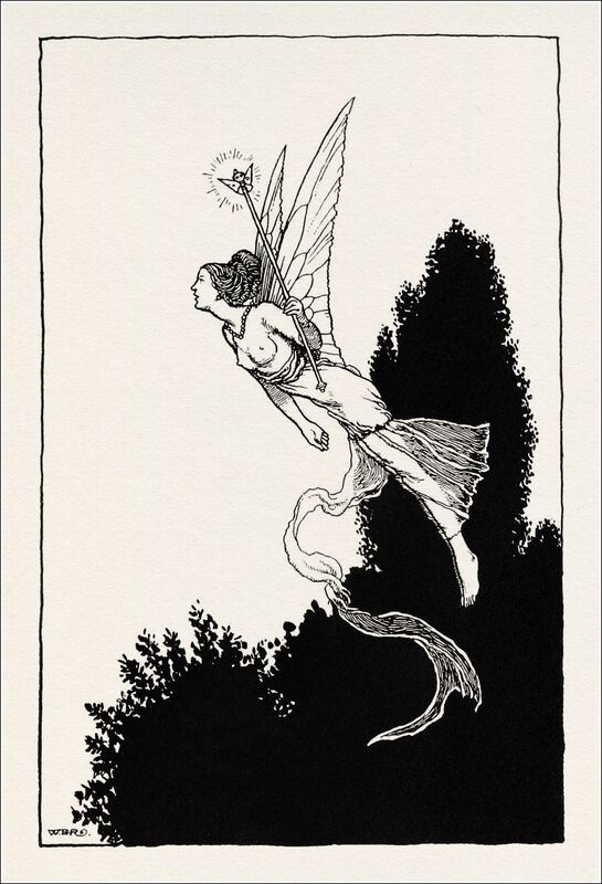
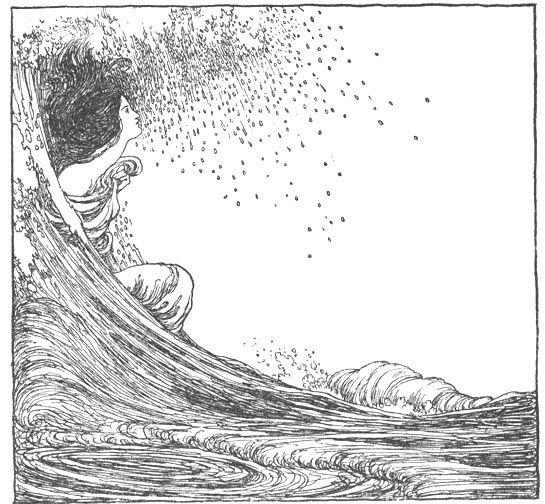
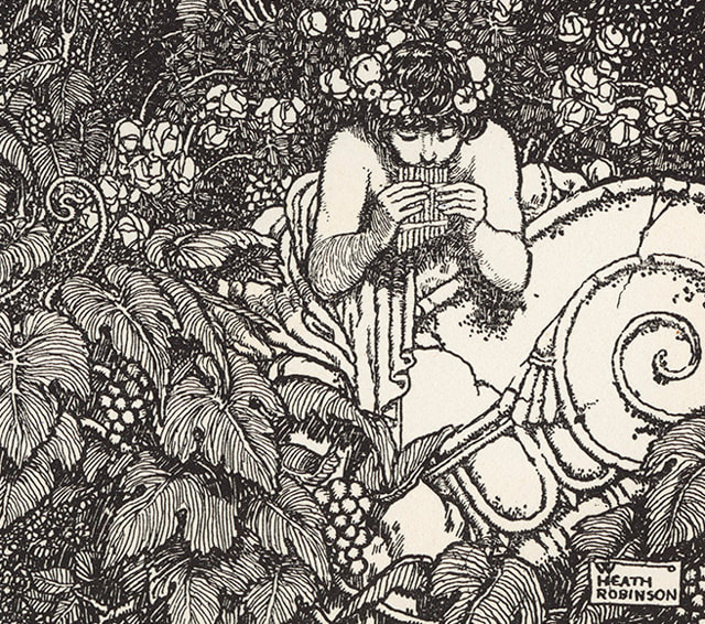
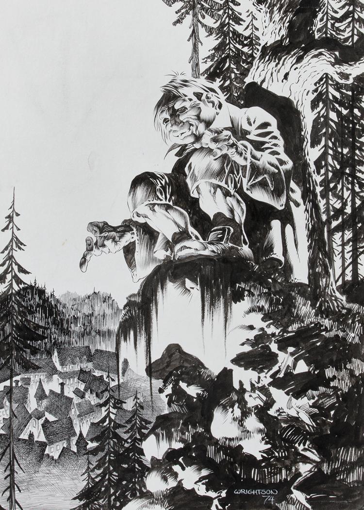
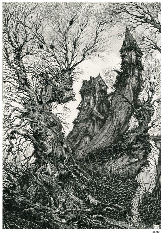
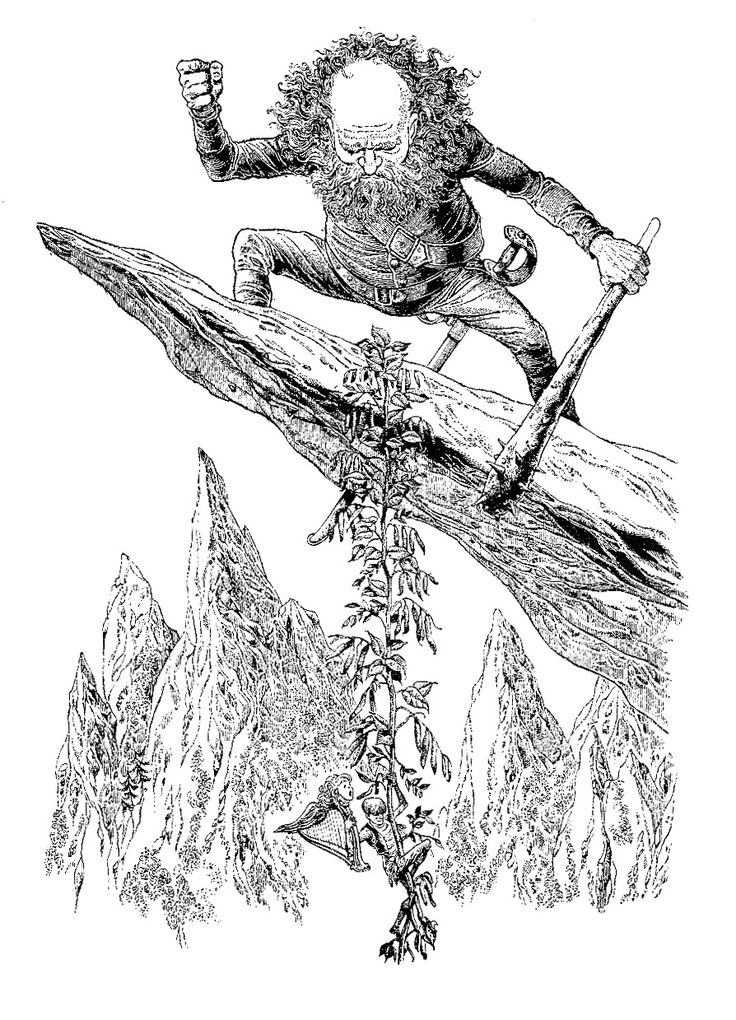
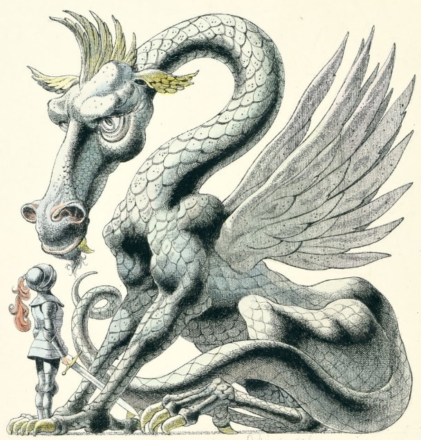
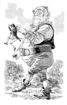
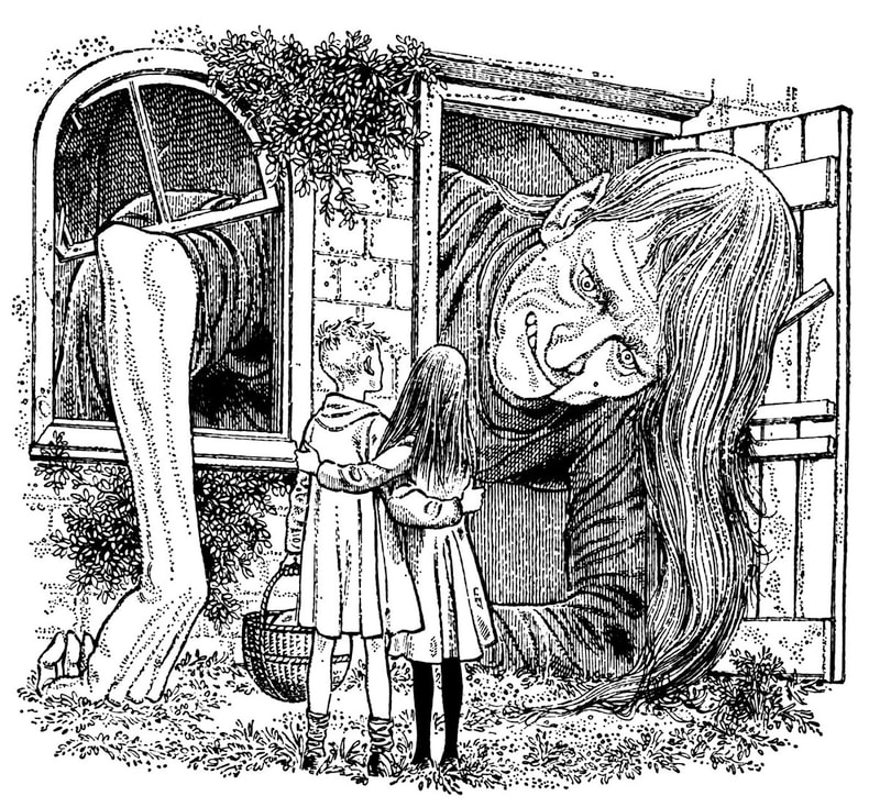
I like the whimsical style of this artist, the beauty of this artwork is contained within the contrast of these illustrations. The way black and white are used is lovely.
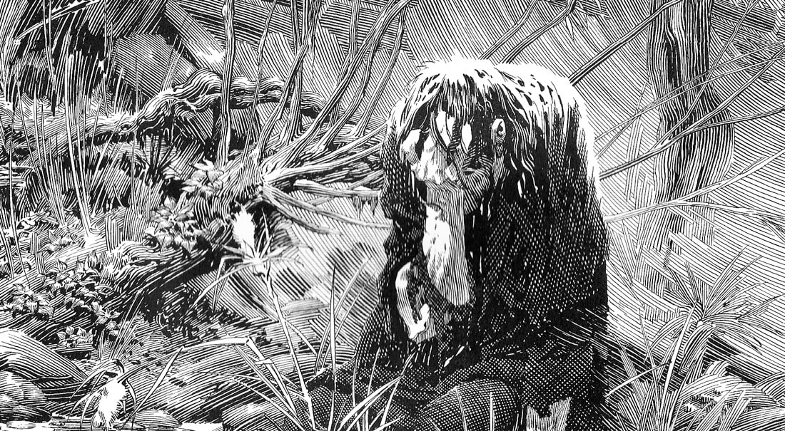
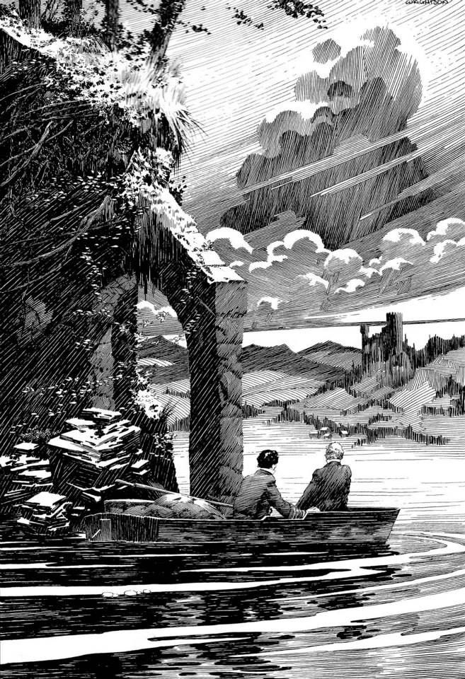
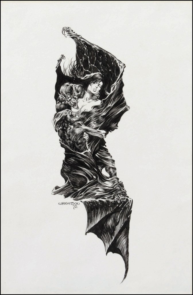
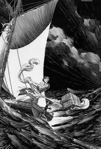
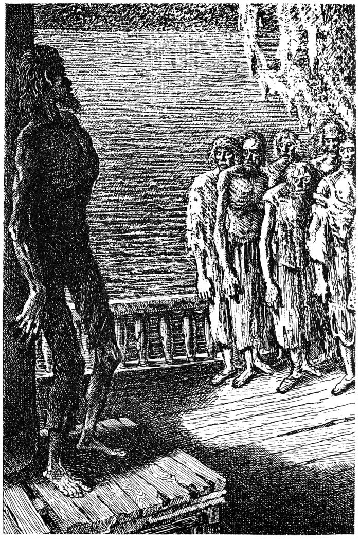
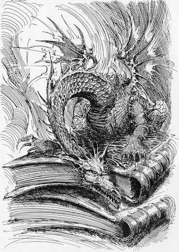
The lighting within Bernie Wrightson artwork places a key role in it's effectiveness. It creates an atmosphere that dramatically effects the feeling that the images portrays.
|
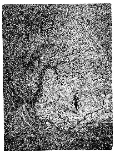
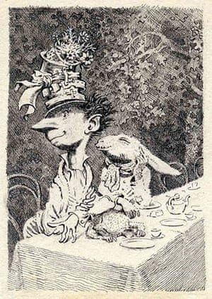
I find Mervyn Peak's style fascinating, the way there aren't any definitive lines is unique. Recreating a piece of his work last year helped me to understand his technique more.
I think this style is beautiful, the lines are well thought out and applied with care. I just wonder how many attempts there were to make something that looks this effortless.
|
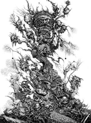
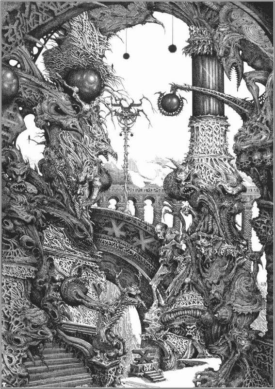
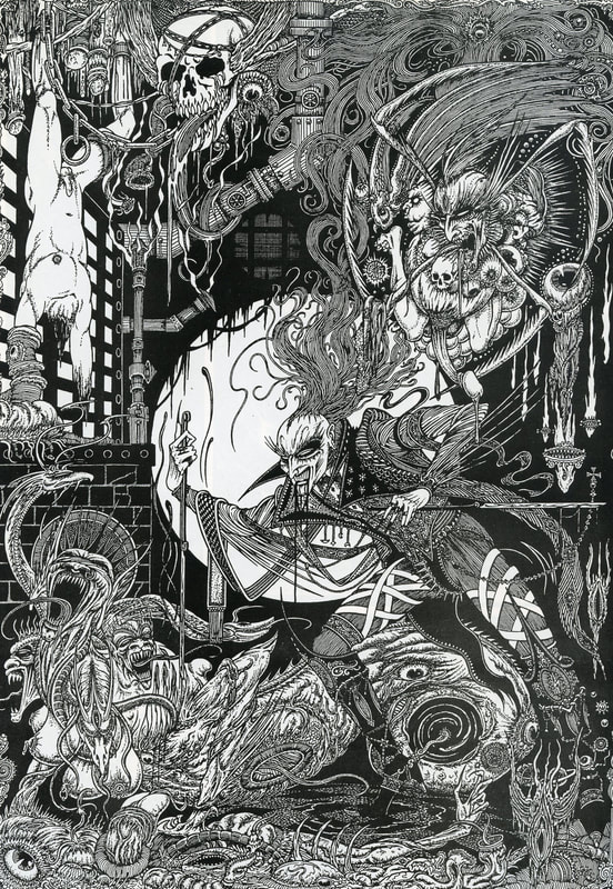
Ian Miller has a very detailed style, the way that he
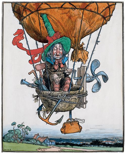
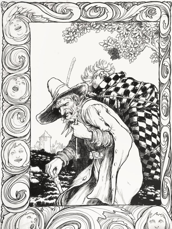
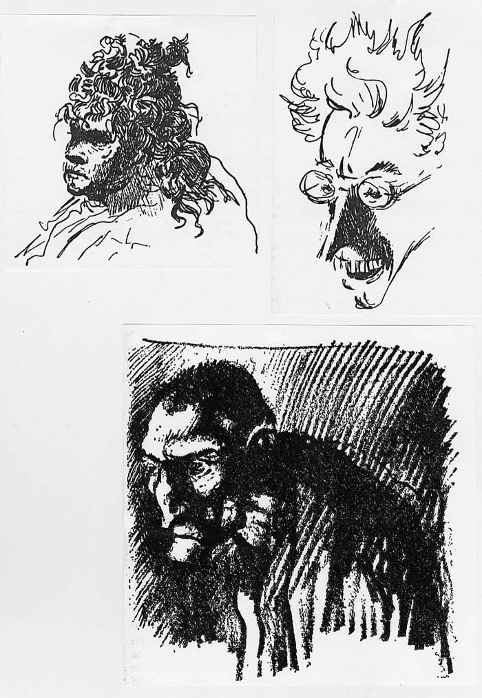
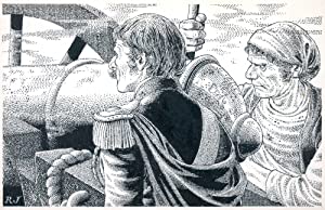
creates a fantasy world through pen and ink is wonderful. His illustrations based on the work of Tolkien are fantastic. I really like how Robin Jacques creates a sense of shadow,
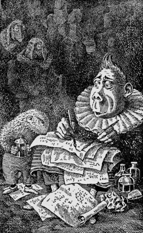
it is very effective and really helps the subject stand out within the page. It's contrast really makes this art beautiful. |
More Independent Artist Research
After researching some artists from Tony's lecture I started to look at some artists that I found myself.
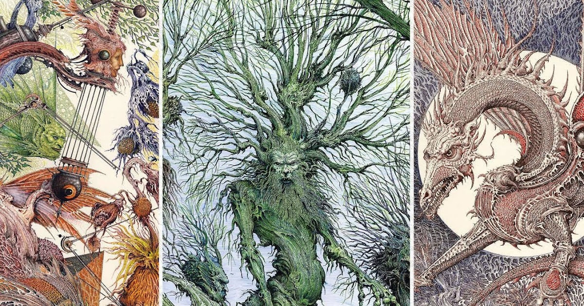
I really like all of these and I think they are all unique, I would like to create a still life in the style of Bruce Bondy within this project.
After researching some artists from Tony's lecture I started to look at some artists that I found myself.
I really like all of these and I think they are all unique, I would like to create a still life in the style of Bruce Bondy within this project.
|
Self Portraits
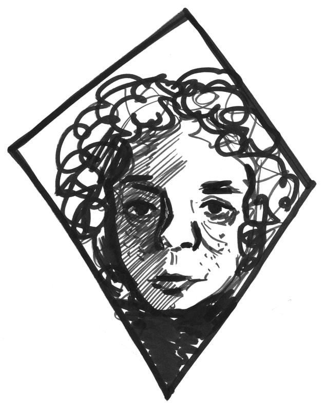
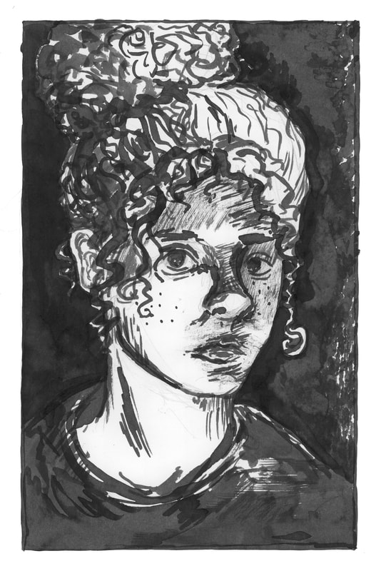
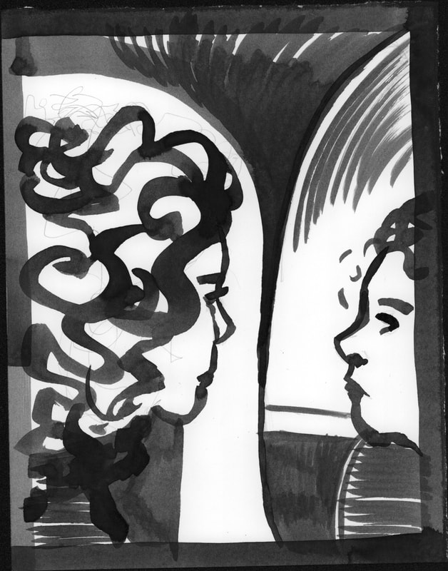
Part of this weeks task was to use ink to create a self portrait. I created a few self portraits, none of which I am entirely happy with because it is hard to draw your own face, but I like the one of the left best because I think that the magnifying glass is an interesting addition to the self portrait. To create this image I used a bamboo ink pen, this allowed me to keep a steady line thickness throughout the image. For the top two self portraits I used pens, the for the two underneath I used brushes. I prefer using brushes and dip pens far better than fine liners and thicker pens. Because I feel like they give me more freedom to experiment. |
|
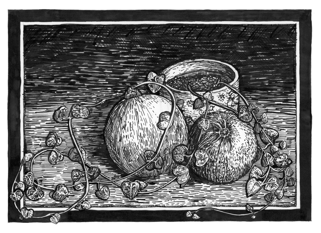
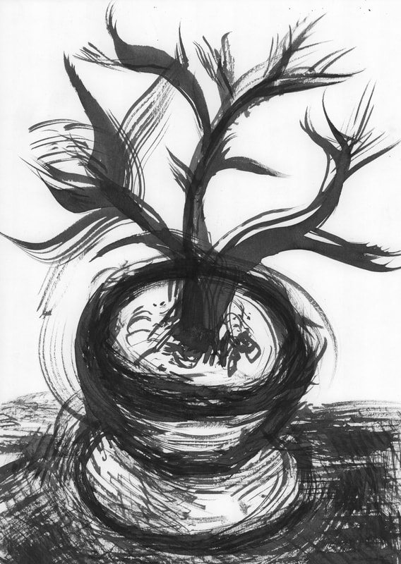
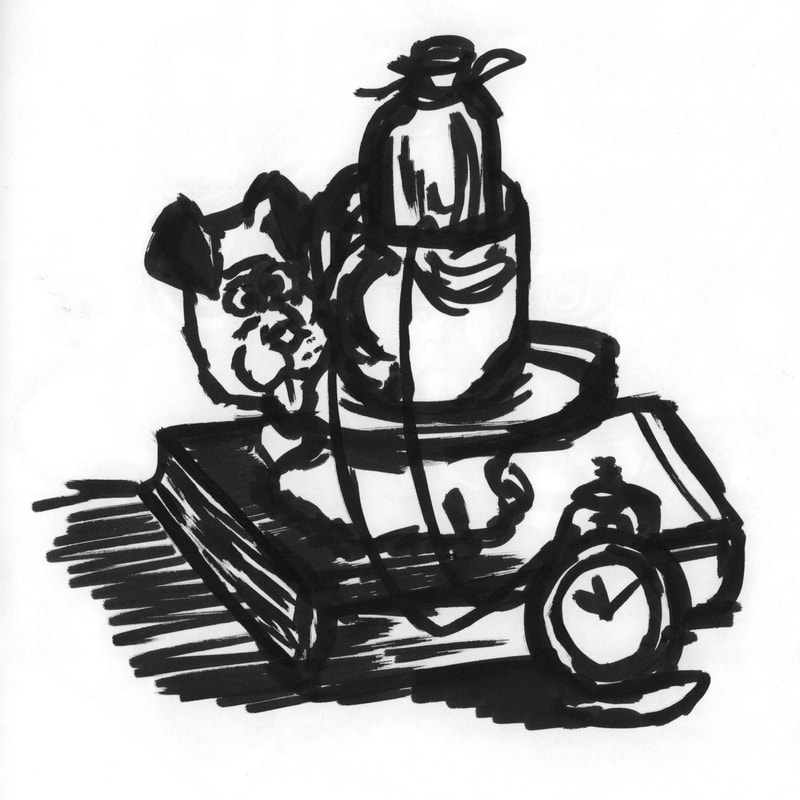
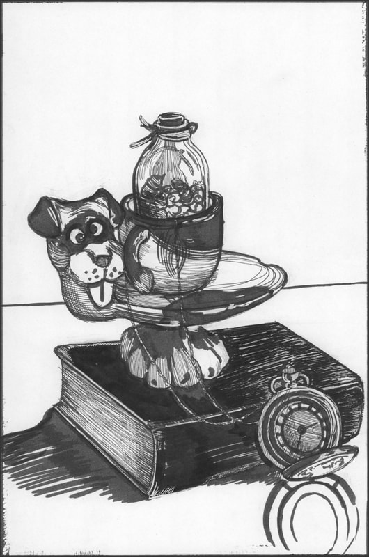
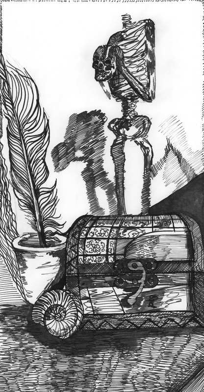
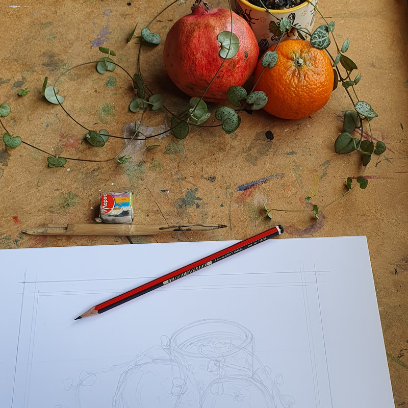
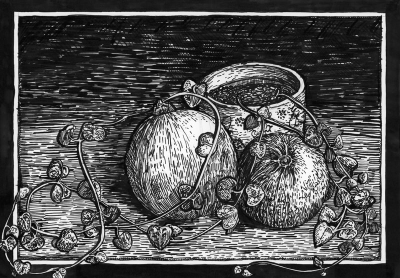
Still Life We were also asked to create some still life drawings this week, I created a mix of brush, pen, dip pens and fine liners. I created the still life of a plant pot, pomegranate and an orange after the Thursday session when Dwayne mentioned that you can tell when inkwork has been rushed. I realised that I had been rushing my still life, so I went back and took my time with this one. I also painted a pocket watch with a handmade brush that I created from my dog Fae's hair. Whilst I was creating these illustrations I took progress pictures. As I have been uploading these images to my blog I realised a lot of them don't have much contrast within them, so when I next create some pen and ink illustrations I intend to add in some more solid black. |
Ink Project (Part Two)
|
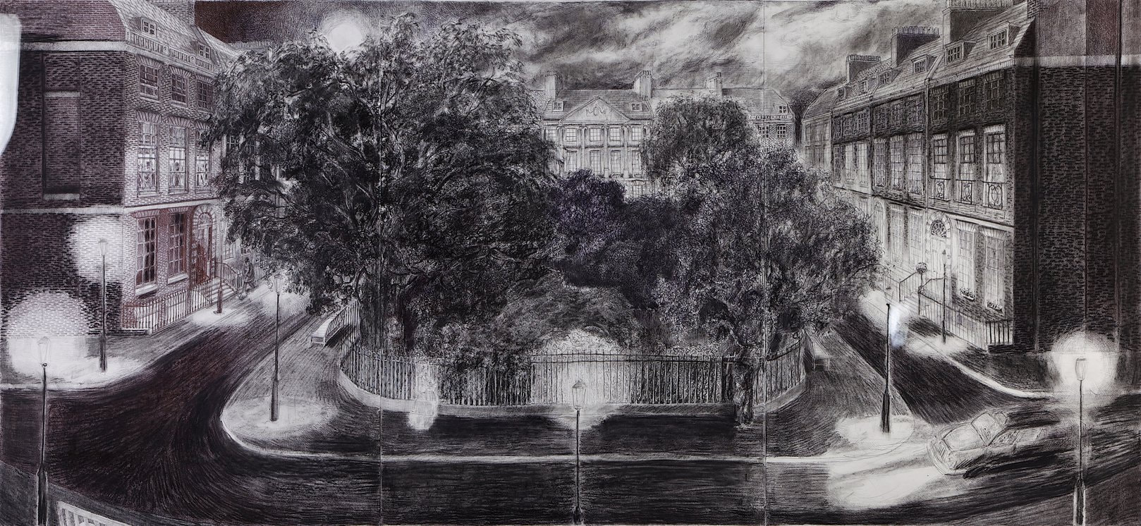
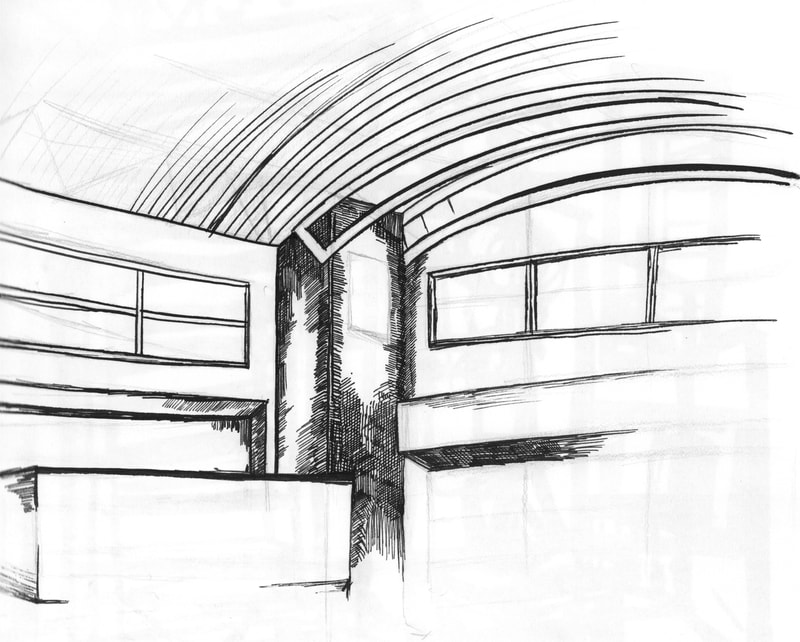
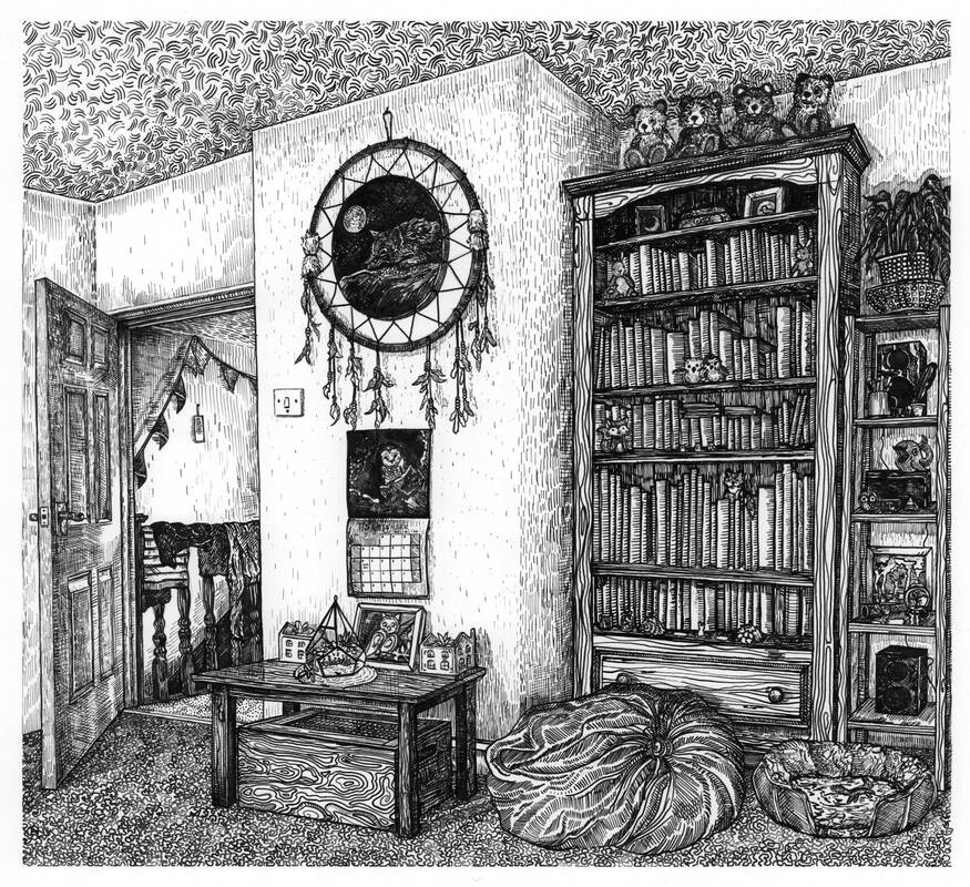
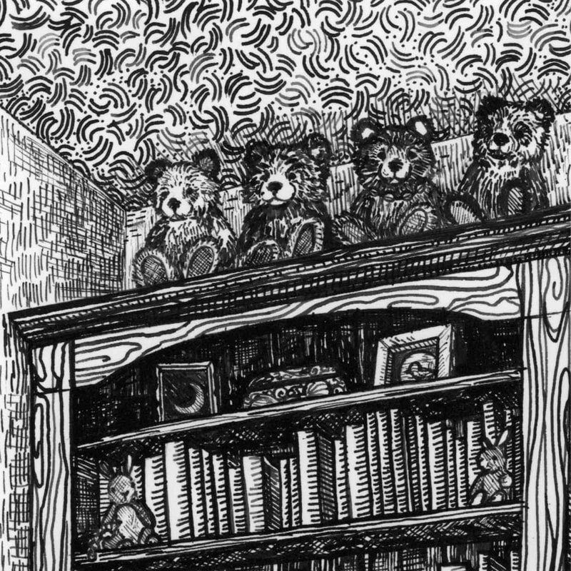
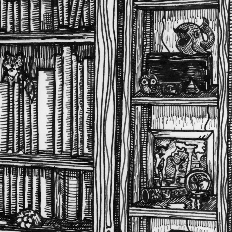
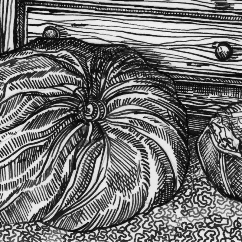
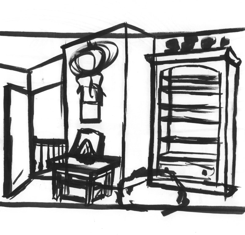
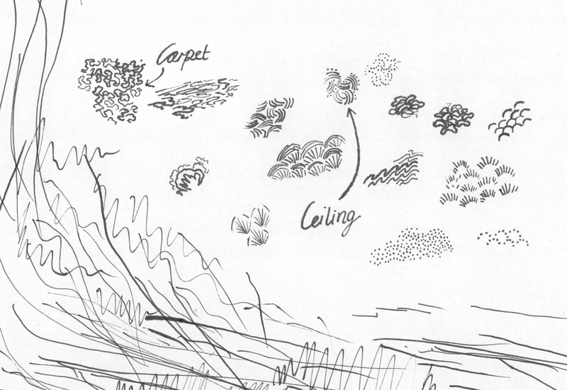
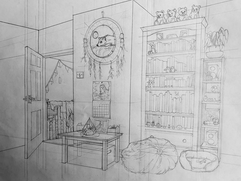
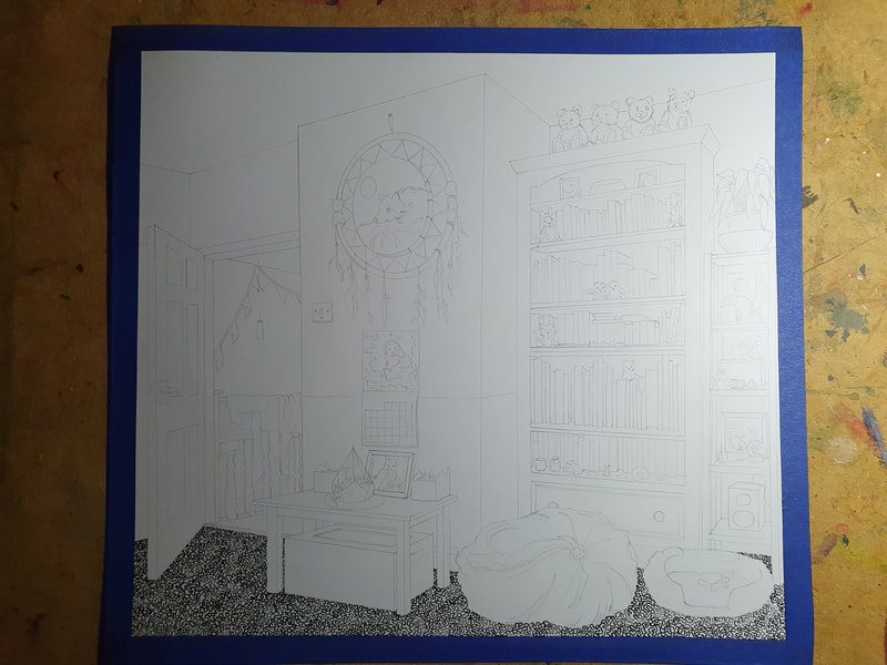
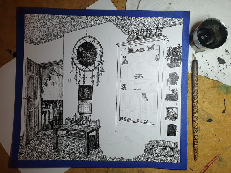
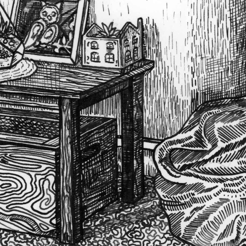
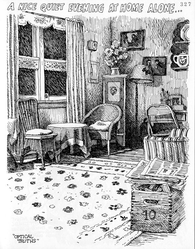
Pen and Ink "Drawing of my Room" I decided to take my time with this drawing, in total it took me about three and a half days from starting my initial sketch, working out perspective and then to completing this illustration. Under my final room illustration I have added in some close up images of my illustration to show the details, as well as some progress images and some of the pre production sketches and working out of which textures to use. I tried really hard to reflect the lighting within my room, like the lighting on the wall in the hallway and on the door. As well as the shadows on the carpet and on the walls. There are obviously things that I would do differently next time, but I am happy with how this illustration looks overall. I feel like I have learned a lot about how to work with ink during this week, especially through this final illustration. I am very happy about the range of textures I was able to create within an illustration, but still keep it as one uniform illustration that is complimentary. |
Process Images
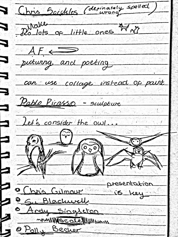
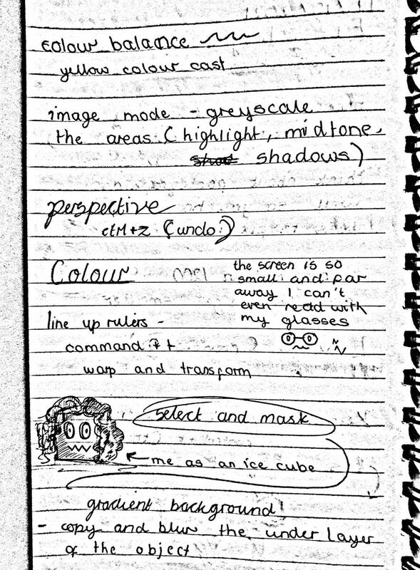
Lecture Notes
A Comparison of Techniques
For the blog task this week we were asked to compare the artists that inspired us alongside our illustration.
To discuss what we learned from them, and any issues we faced, and pros and cons related to the technique.
For the blog task this week we were asked to compare the artists that inspired us alongside our illustration.
To discuss what we learned from them, and any issues we faced, and pros and cons related to the technique.
|
|
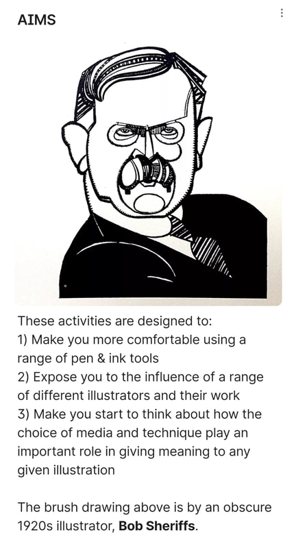
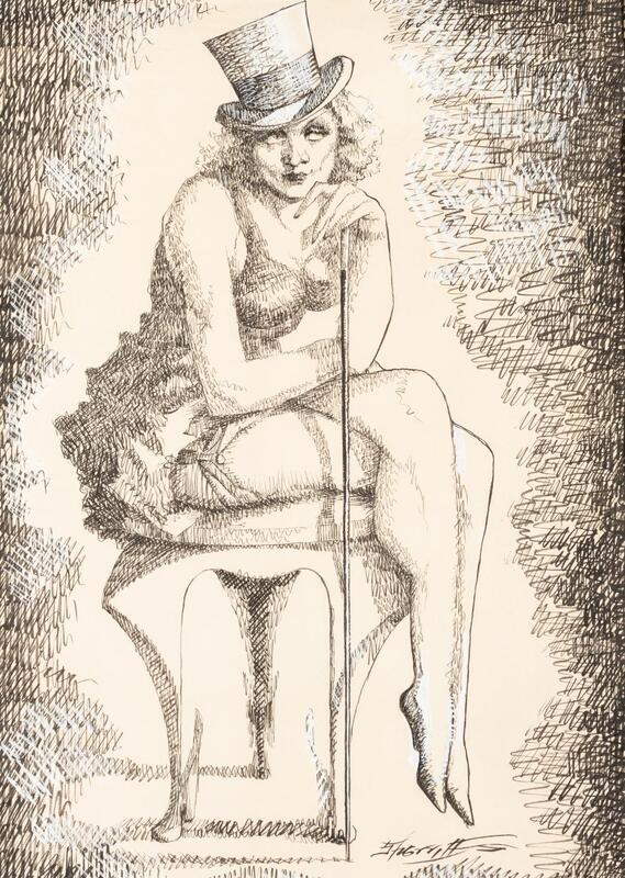
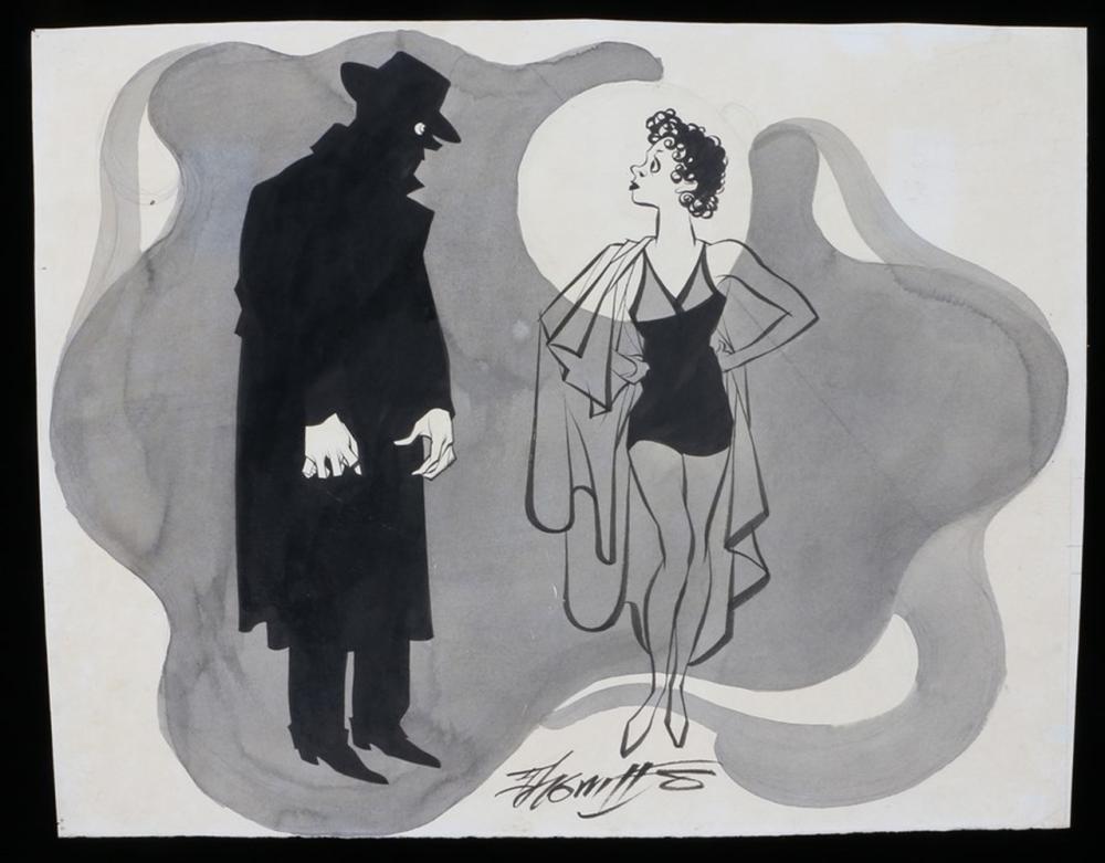
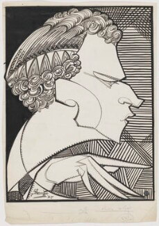
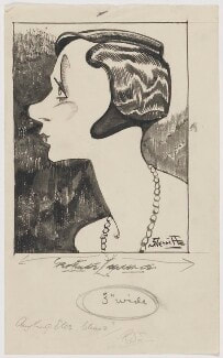
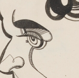
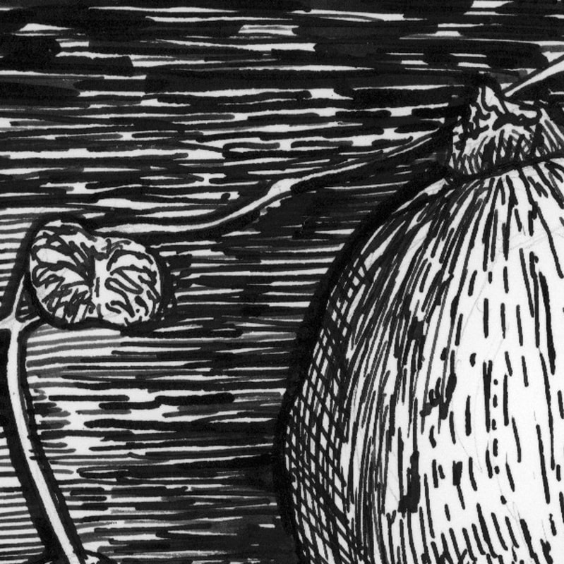
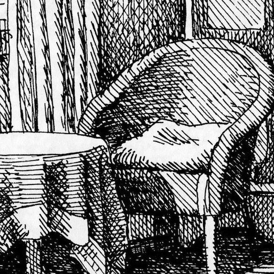
I have toned the paper on my illustration to make it easier to compare. This is an illustration of a man that was created by Robert Sheriffs, he originally used brushes to create this image. However I used a brush pen and fine liners because I was experimenting with them at the time. As you can see my self portrait lines are a lot more darker, however that is understandable as it was created using a pen instead of black ink. I prefer Sheriffs illustration by far because of the slightly transparent brush strokes that allow the paper colour to shine through. I think if I were to do this again I would definitely use a brush, however I have learned from trying to emulate his style that different thicknesses of line next to each other are really effective. This style is very effective for creating a visually striking image of a person, however it cannot be used to create an illustration of a realistic person. I used an artist that I found called "Bruce Bondy" for the inspiration for my still life, I tried to recreate the lines that he used in my version. But I couldn't figure out how to make the gaps in the lines work properly. This is something I would like to work on further, because it is a really amazing effect that lets you show the shape of an object alongside the light and shadow. Additionally I really like the way that the border on this image looks, it grounds the whole illustration and provides a level of contrast that really improves the image. I do still like my final image even though it is significantly different to the original inspiration illustration, I really liked drawing the leaves of my string of hearts plant. For my pen and ink drawing of my room I used an illustration created by Robert Crumb as inspiration. When comparing a close up of his illustration alongside my finished illustration I can see that Crumb has used more cross hatching than I have. But the overall effect is quite similar. I really like how my final room illustration looks, however this technique takes such a long time to achieve. I spent almost four days on this illustration, I'm sure that this technique will become quicker within time. This technique has taught me to slow down and consider each texture individually, this has been very helpful by furthering my understanding of how to use ink in an effective way. |
Week 2: 3D Illustration
Masking Tape
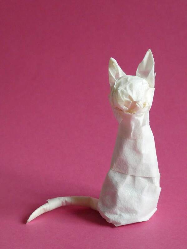
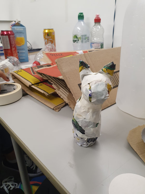
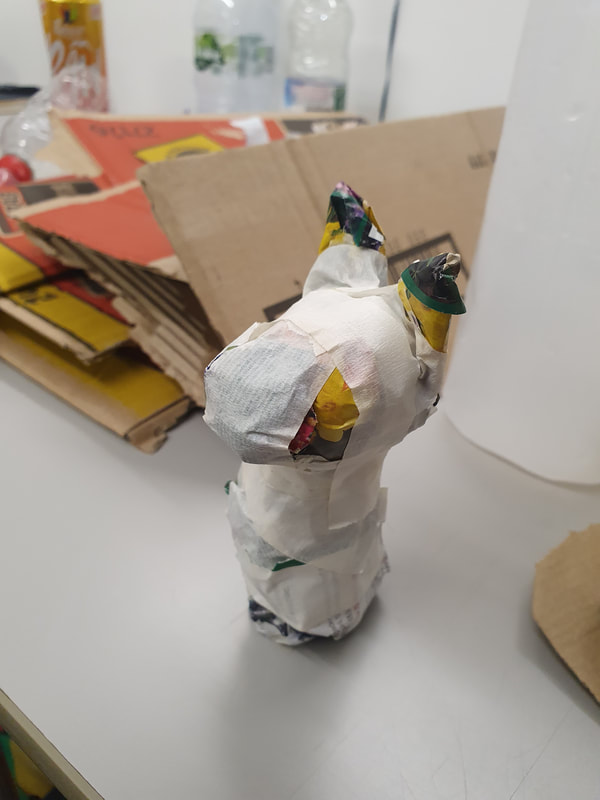
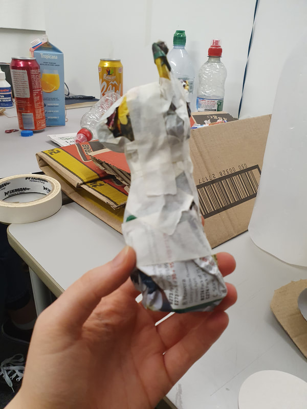
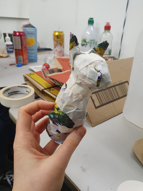
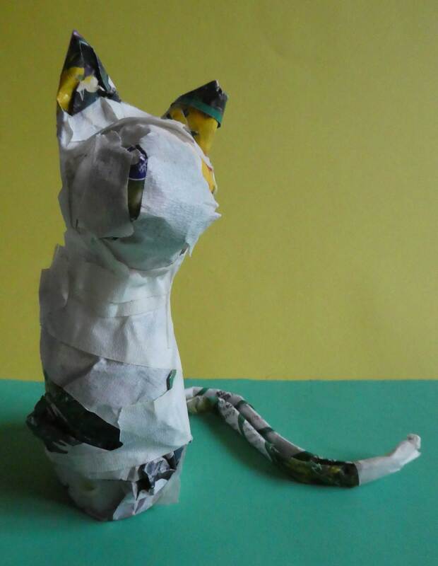
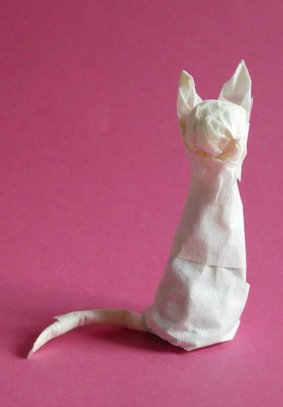
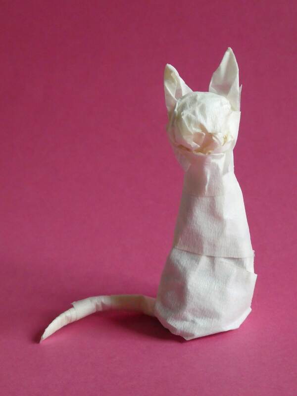
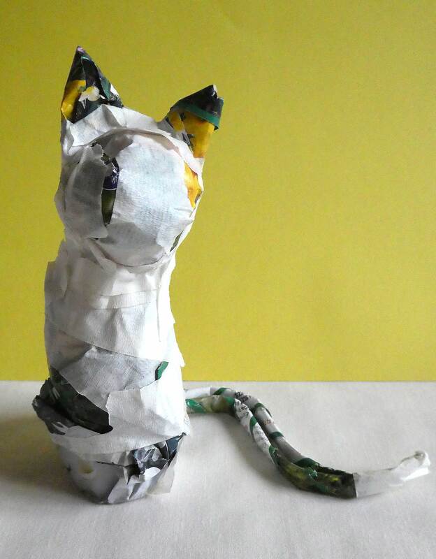
I created two cats out of masking tape, one which was created completely out of tape and another that was made of crushed magazine pages wrapped in masking tape.
I decided to photograph all of the cats and dogs on colourful backgrounds, I really like how the smaller cat photographed in front of a pink background.
The bright pink colour gives the otherwise plain cat a bit of personality, which I was really pleased with.
Plastic (Balloons and Gloves)
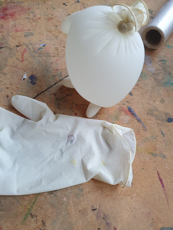
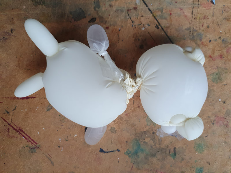
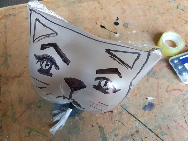
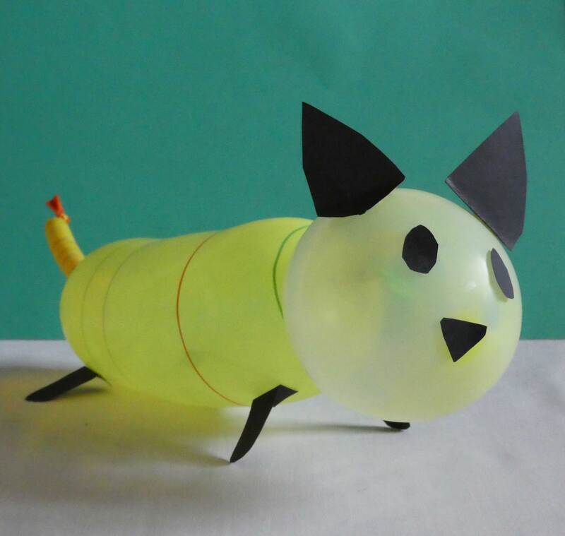
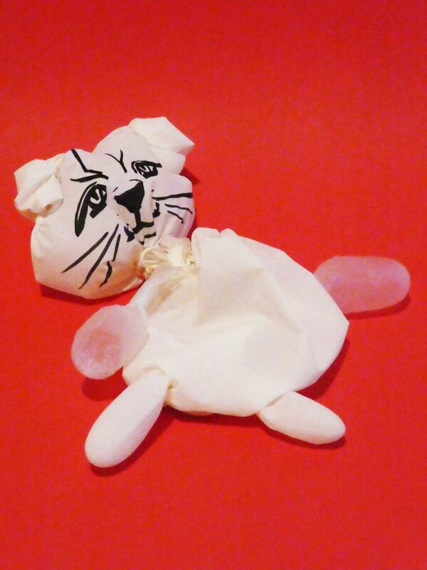
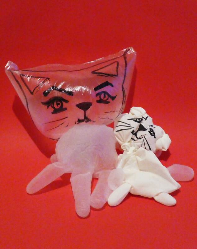
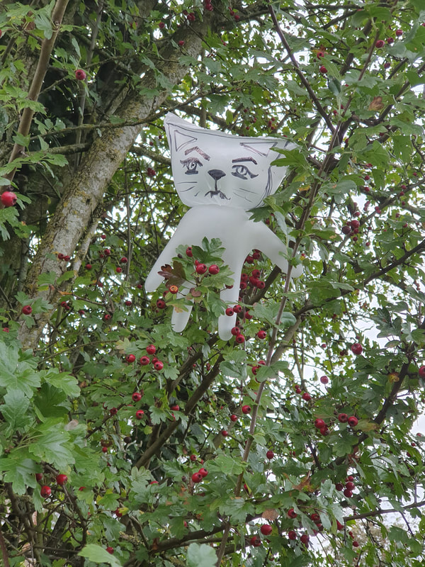
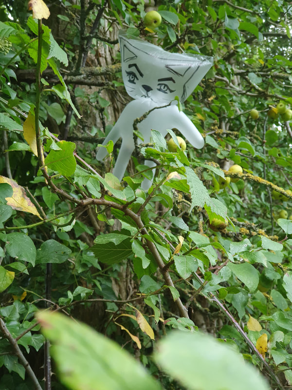
I decided to try and use some old balloons and a pair of painting gloves to create some more cats. I actually liked making some cats out of balloons
even though they actually ended up deflating and looking a bit sad after a few days. It was quite fun taking one of them out for a walk and put it into a tree.
Wire
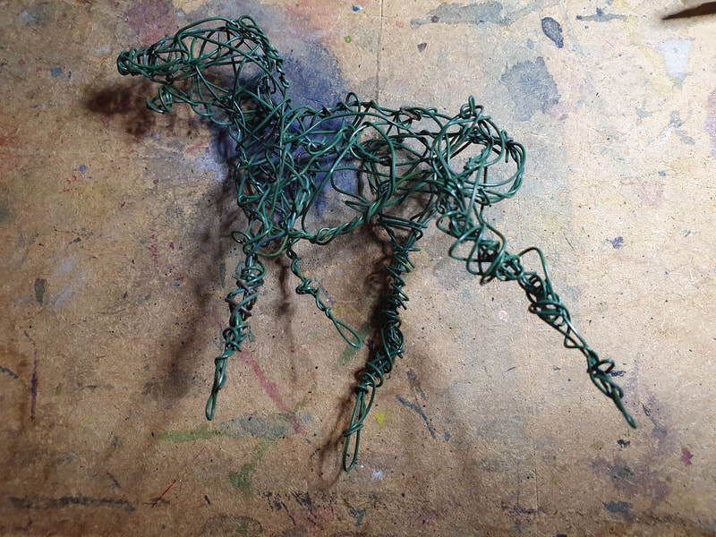
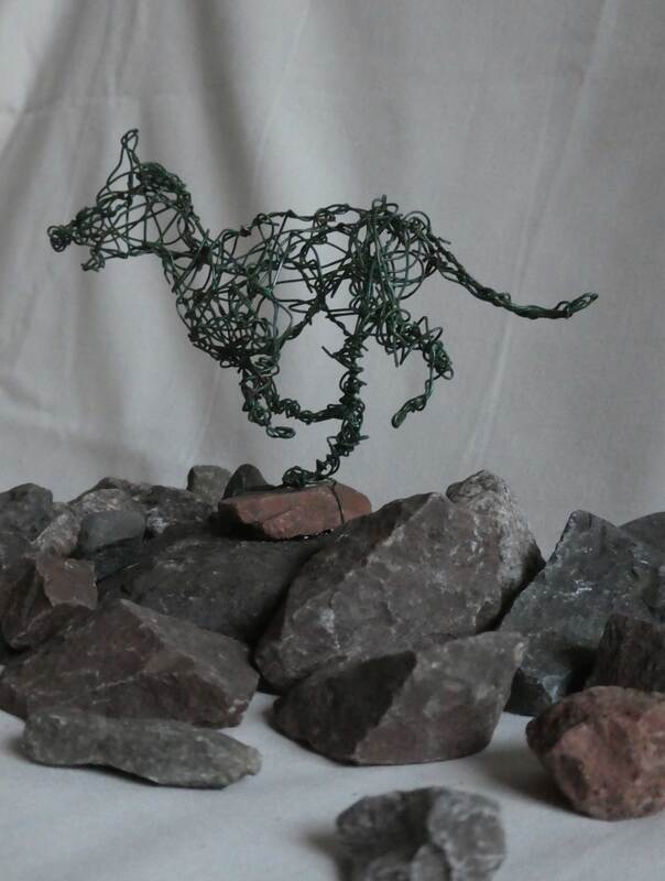
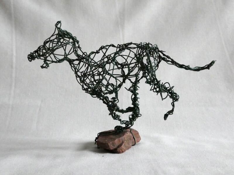
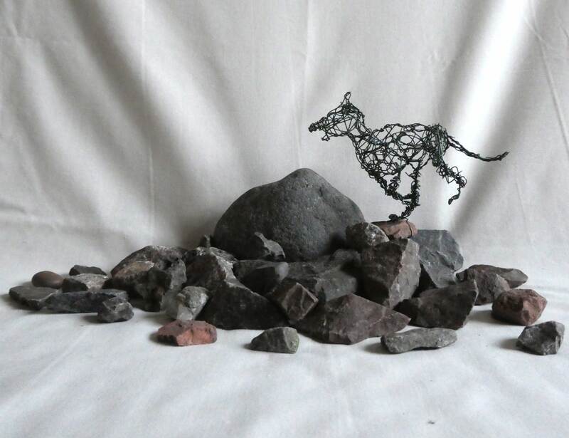
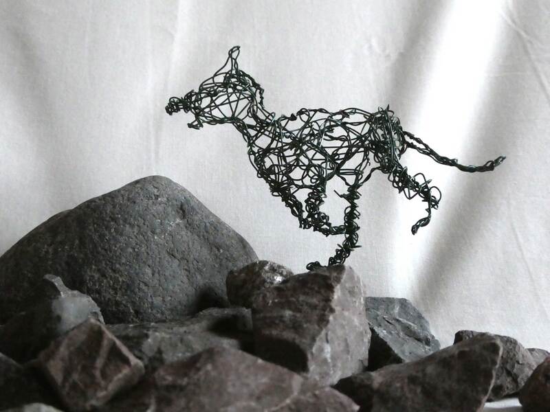
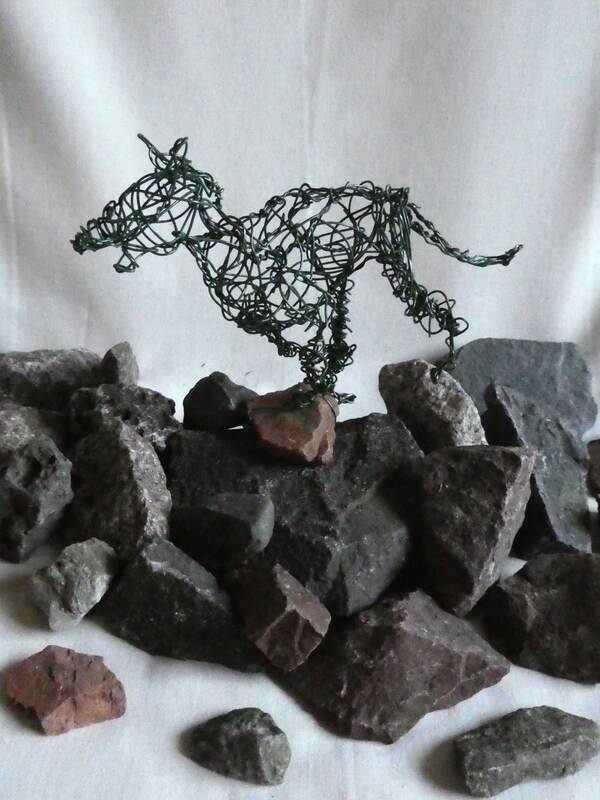
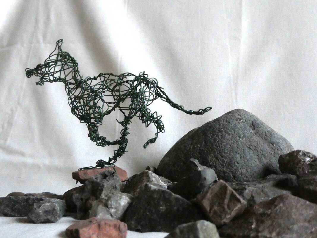
I like working with wire so I decided to use some to create a sculpture of a running dog. I then attached it to a stone for stability, this then sparked the idea to put the dog among more stones.
I really like how these pictures turned out because it looks like the dog is running down a mountain, I used a white sheet behind the rocks and I think the folds ended up looking a bit like patches of sunlight streaming down. Maybe this image could have looked better on a flat white background however I couldn't find a piece of paper big enough.
Clay
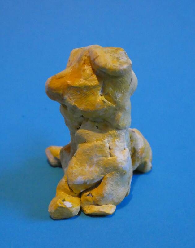
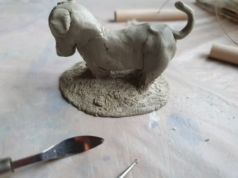
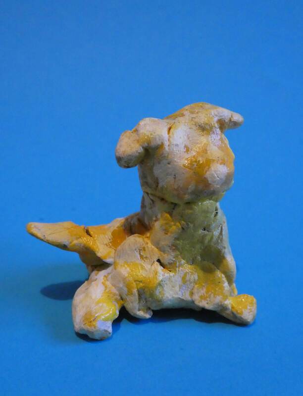
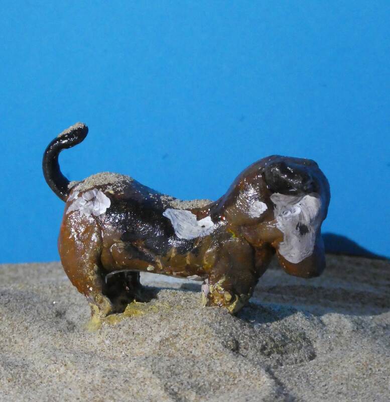
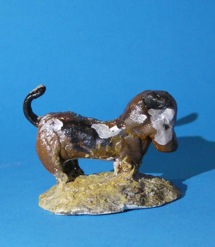
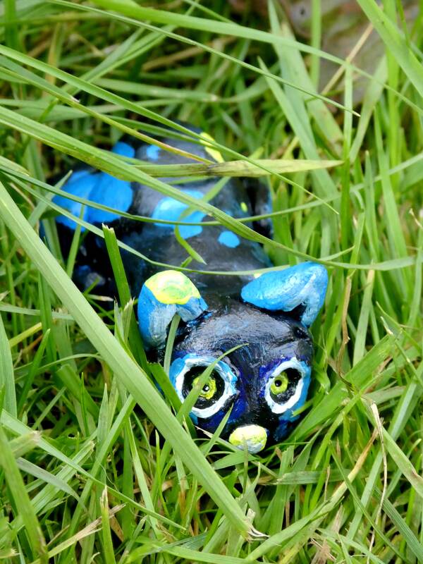
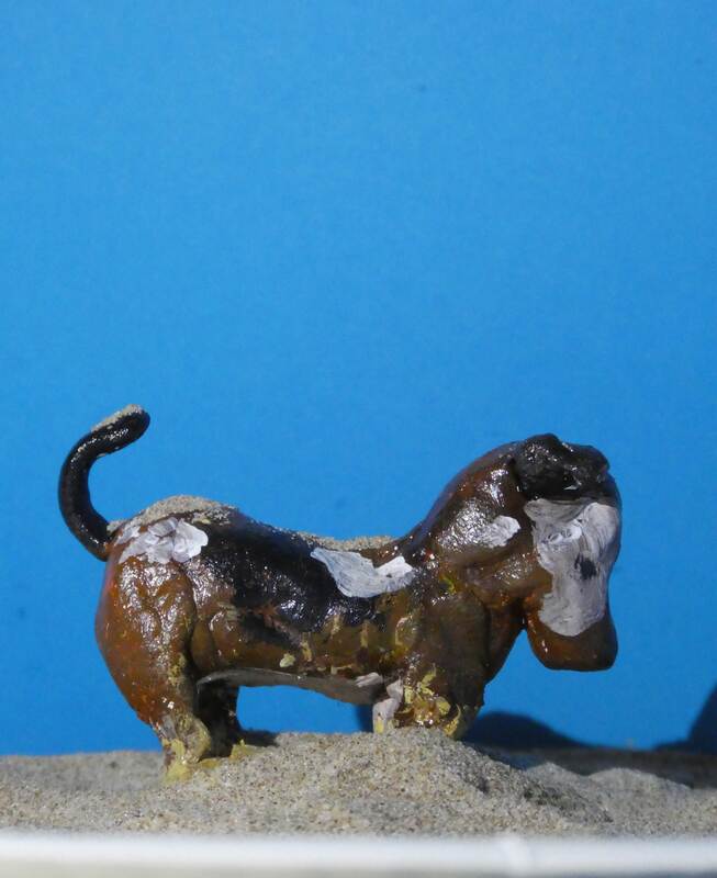
I decided that working with clay for a few little cats and dogs would be a fun thing to do. I'm not really sure what the yellow dog is meant to be, but to me it looks like a little puppy that wants to play and will wag its tail. I also created a prowling cat that I placed in the grass, I really liked how that turned out and I definitely think it gets across the feeling of a sneaky cat. Finally I made a little dog digging into a pile of dirt, for the photograph I got a bit of sand and placed the dog into it so it looked like it fit into its environment.
I decided that working with clay for a few little cats and dogs would be a fun thing to do. I'm not really sure what the yellow dog is meant to be, but to me it looks like a little puppy that wants to play and will wag its tail. I also created a prowling cat that I placed in the grass, I really liked how that turned out and I definitely think it gets across the feeling of a sneaky cat. Finally I made a little dog digging into a pile of dirt, for the photograph I got a bit of sand and placed the dog into it so it looked like it fit into its environment.
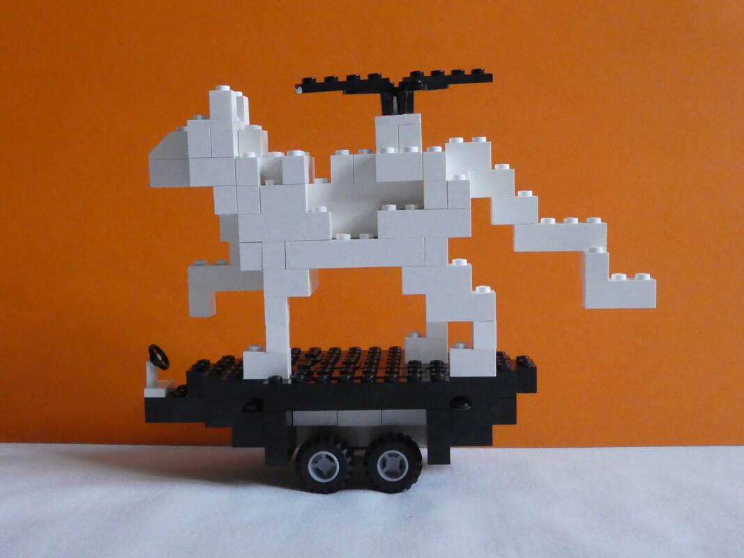
Lego Cat
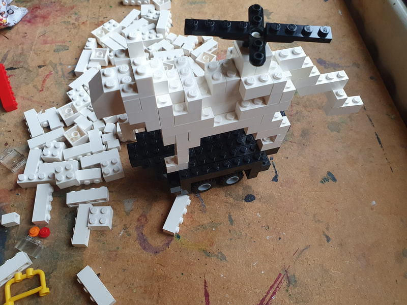
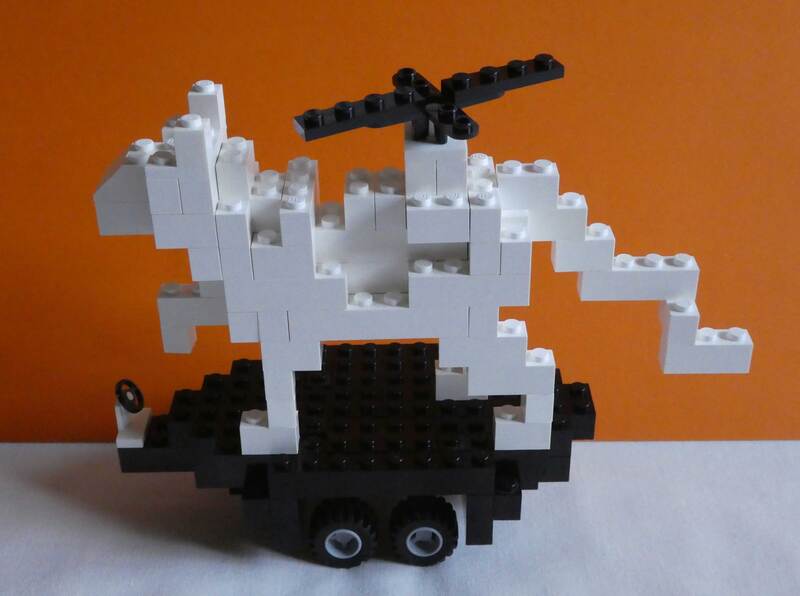
I also decided to try and create a cat out of Lego, I gave it a propeller and wheels because I truly believe that a cat would enjoy being able to just stay still
and float to anywhere they need to go. Additionally I chose to photograph the Lego cat in front of an orange background, I think it really helped to make the cat stand out
A Miscellaneous Menagerie of Objects
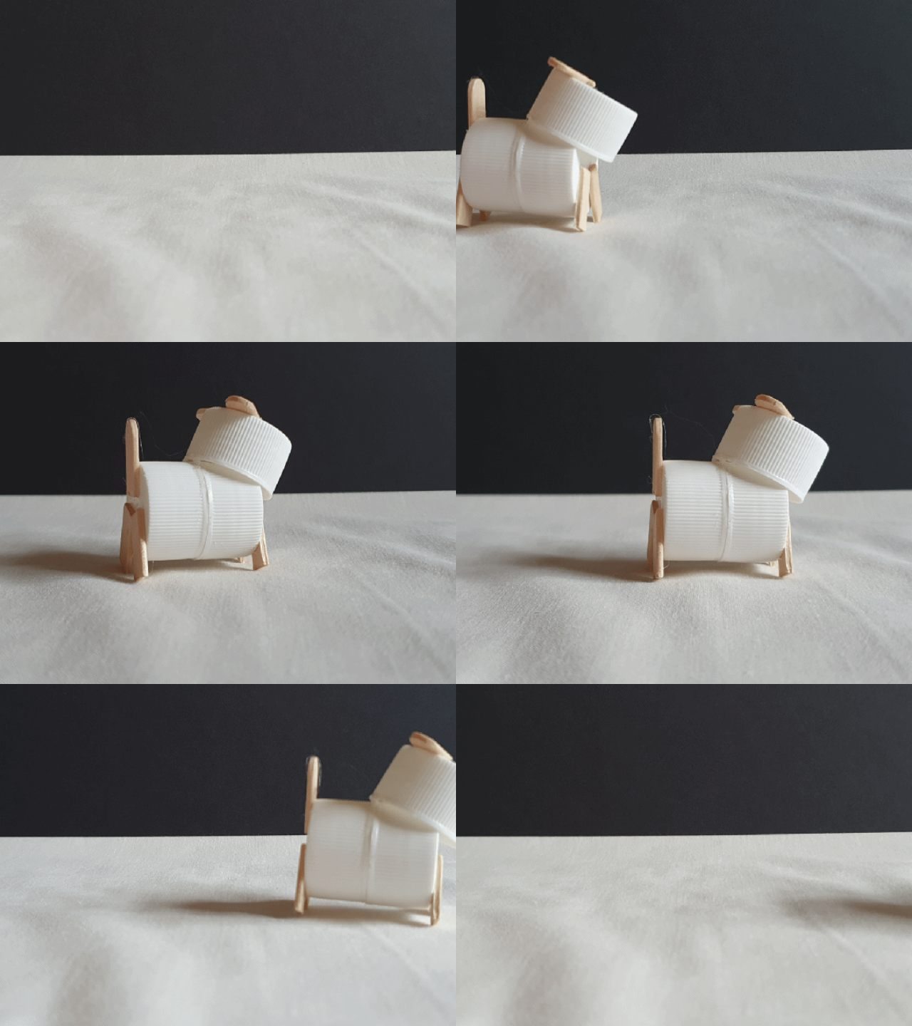
I created a little dog out of bottle tops and a lollypop stick, it didn't have much personality so I created a little gif of it moving across the screen which I think helped to animate it a bit.
I created a little dog out of bottle tops and a lollypop stick, it didn't have much personality so I created a little gif of it moving across the screen which I think helped to animate it a bit.
Pinecone Dog
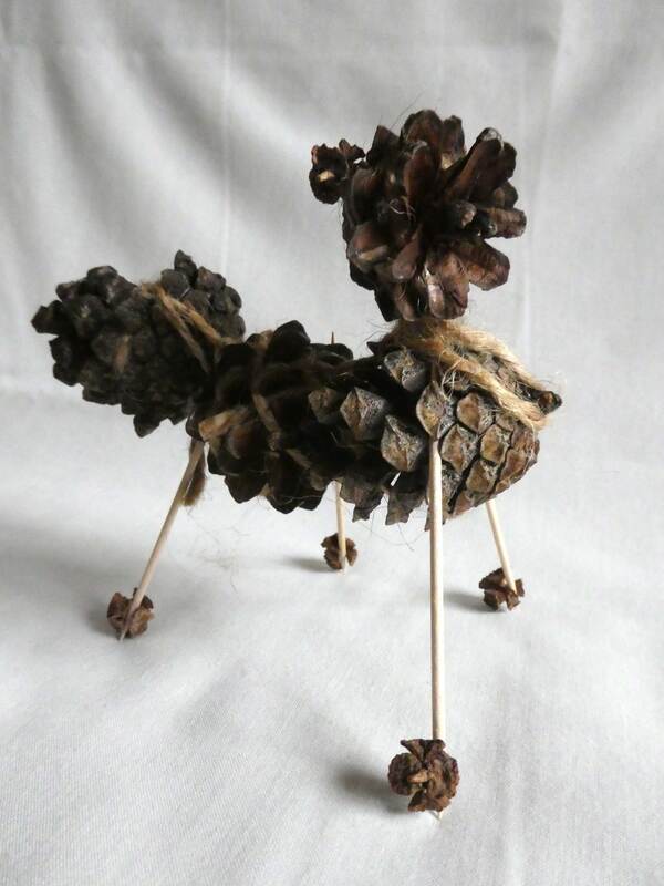
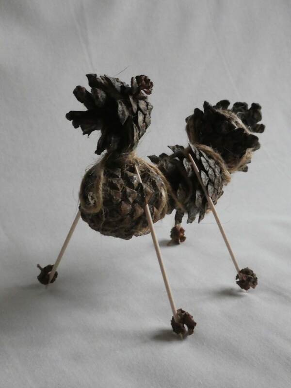
I gathered some pinecones as I went for a walk which I then turned into a dog with the addition of cocktail stick and some string. The pinecone head really helped to bring this dog to life because it actually looks a bit like a cartoon type of fur to me, the colour variations helped to bring it to life too I think.
I gathered some pinecones as I went for a walk which I then turned into a dog with the addition of cocktail stick and some string. The pinecone head really helped to bring this dog to life because it actually looks a bit like a cartoon type of fur to me, the colour variations helped to bring it to life too I think.
The Weeing Dog
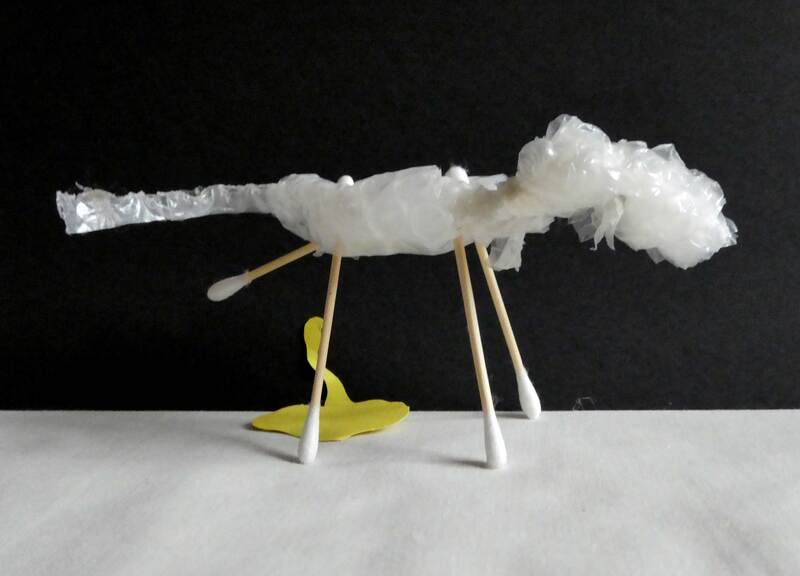
A very dog like behaviour is to pee on things, so I chose to make a dog in a peeing position. I added a little piece of yellow card for the photo to help to bring this idea to life.
A very dog like behaviour is to pee on things, so I chose to make a dog in a peeing position. I added a little piece of yellow card for the photo to help to bring this idea to life.
The Sheepdog
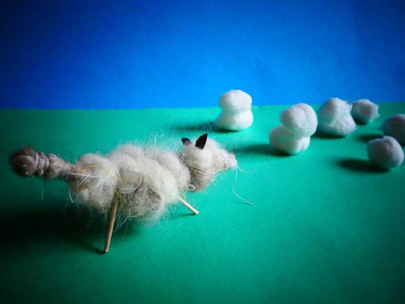
I created a Collie dog out of my dogs hair (thank you Fae). Initially I created a little wire structure and wove the hair onto it to give the dog a fluffy texture. To bring the whole image together I got some cotton wool balls to act as sheep, finally I added a piece of green and blue card to be the grass ad the sky. Overall I really like how it turned out.
I created a Collie dog out of my dogs hair (thank you Fae). Initially I created a little wire structure and wove the hair onto it to give the dog a fluffy texture. To bring the whole image together I got some cotton wool balls to act as sheep, finally I added a piece of green and blue card to be the grass ad the sky. Overall I really like how it turned out.
Hotdog and Stone Dog
I used an old recyclable tube to create the body of a Dachshund and then I used earbuds and paper to create the tail, legs and head of the dog. I picked the colours out to represent tomato sauce and mustard, the red also ended up reflecting off the dogs stomach, and I love the effect that it has created. This is probably one of my favourite dogs from this week.
Additionally I stuck together three stones to make a Scotty dog which I then put in warm toned fabric to make the image seem warm and comforting.
"It wasn't me, I promise"
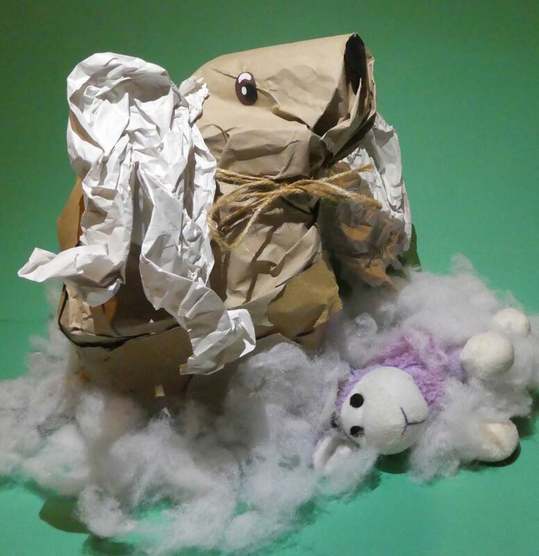
This dog was created to represent the look that a dog gets when you come home to see that they have destroyed something, the look of guilt is undeniable but they still think that they can pretend that the weren't responsible for the chaos. I used one of my dogs toys as a prop for the photo as well as some stuffing and my jumper. I really like the end result of the image and I think it portrays the feeling that I wanted it too so I'm happy. After I finished creating all the cats and dogs I then put them all around Fae so I could see them all as on collection.
This dog was created to represent the look that a dog gets when you come home to see that they have destroyed something, the look of guilt is undeniable but they still think that they can pretend that the weren't responsible for the chaos. I used one of my dogs toys as a prop for the photo as well as some stuffing and my jumper. I really like the end result of the image and I think it portrays the feeling that I wanted it too so I'm happy. After I finished creating all the cats and dogs I then put them all around Fae so I could see them all as on collection.
3D Project: The Mask
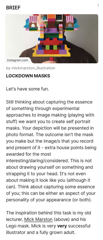
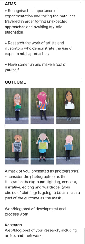
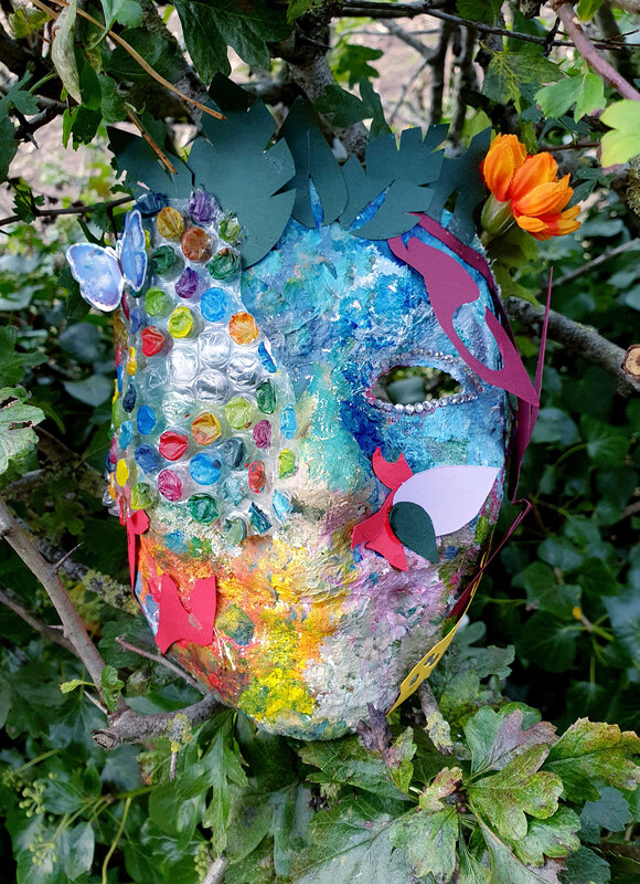
I started this mask making process by casting my own face in Modroc, after it dried I took it off and decorated it within the session. To try and get across a part of my personality within this mask I decided to just go with the flow and let the process be as creative as possible. My favourite bit of the mask is the bubble wrap that I added and then painted, in the end the mask looks extremely colourful but it fits with the outdoor environment which I think looks quite good. Finally to photograph the mask I tried to create a shape of an eye through the masks eye hole, I managed to use leaves to create that. I am still not completely happy with the mask so if I get a chance I will go back and create another mask at some point.
I started this mask making process by casting my own face in Modroc, after it dried I took it off and decorated it within the session. To try and get across a part of my personality within this mask I decided to just go with the flow and let the process be as creative as possible. My favourite bit of the mask is the bubble wrap that I added and then painted, in the end the mask looks extremely colourful but it fits with the outdoor environment which I think looks quite good. Finally to photograph the mask I tried to create a shape of an eye through the masks eye hole, I managed to use leaves to create that. I am still not completely happy with the mask so if I get a chance I will go back and create another mask at some point.
Week 3: Painting
Artist Research
For this project we were asked to look into four different artists styles to experiment with during this project.
For this project we were asked to look into four different artists styles to experiment with during this project.
|
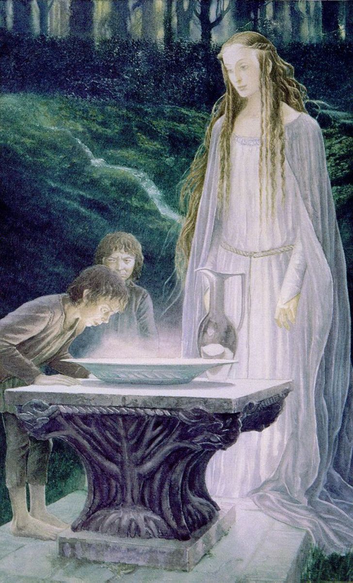
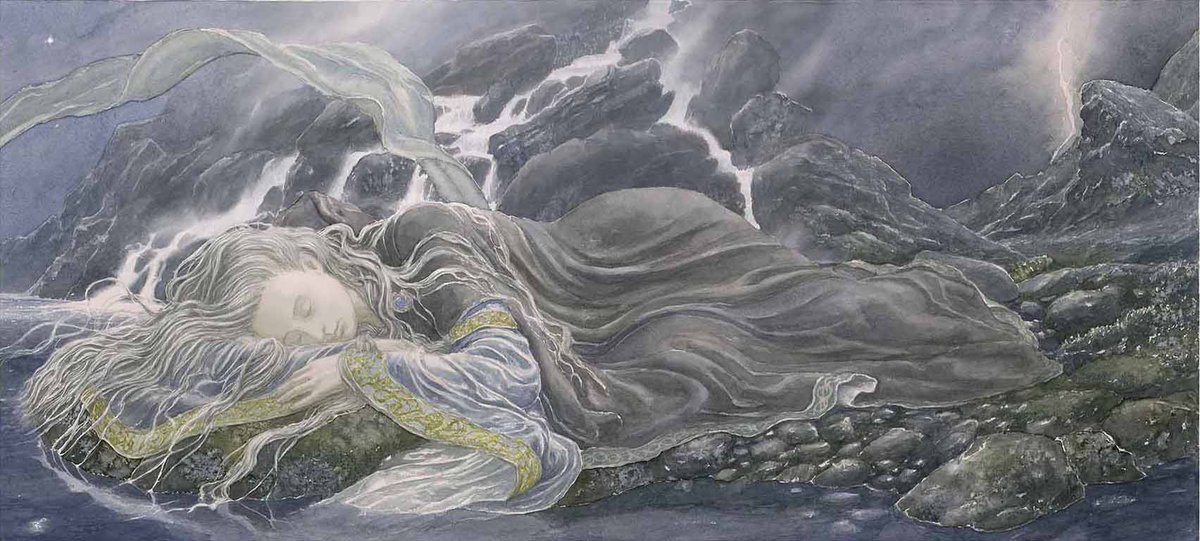
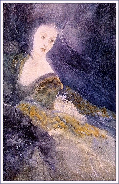
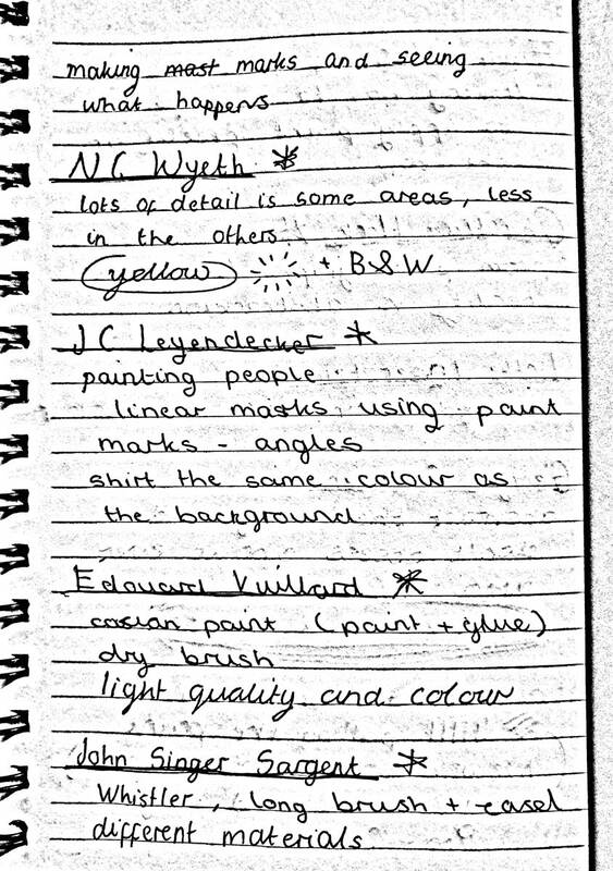
I love the illustrations that Alan Lee creates, they just have a beautiful quality to each image. The colour use is also exquisite, and the way that he creates such intricate stories without over detailing is impressive.
|
- John Singer Sargent -
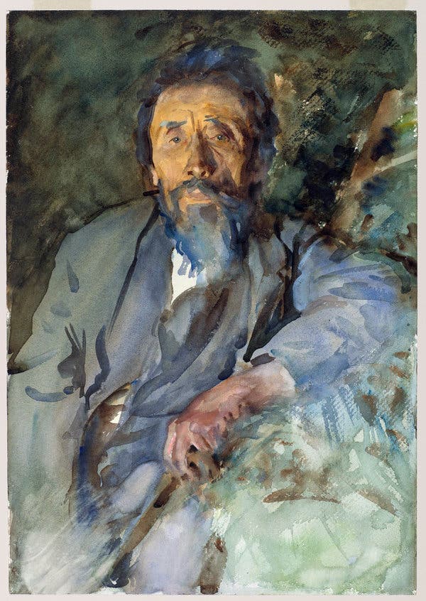
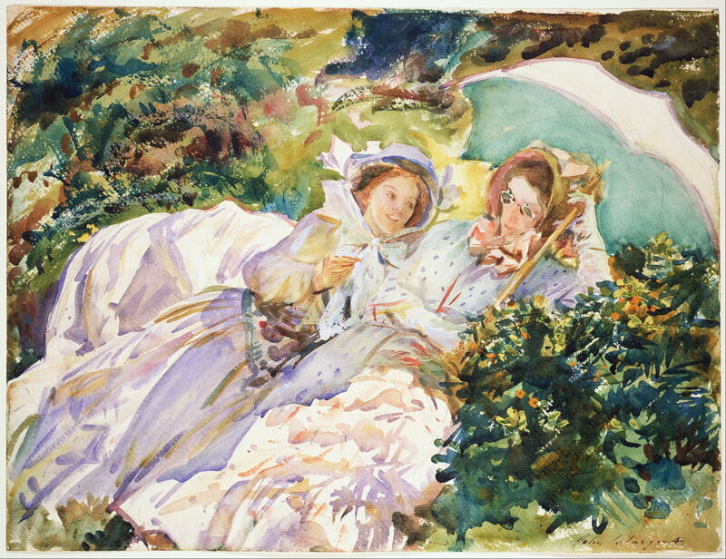
I really like the painting of the man above, it has a large amount of depth even though the image isn't over detailed. So I thought this would be a nice style to try out. |
- Newell Convers Wyeth -
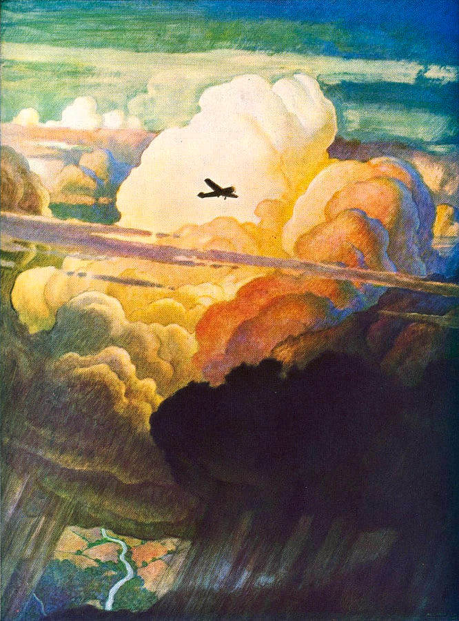
The colours and angles are what makes these stand out, so I picked this as one of the styles to try. I especially like the painting of a giant. |
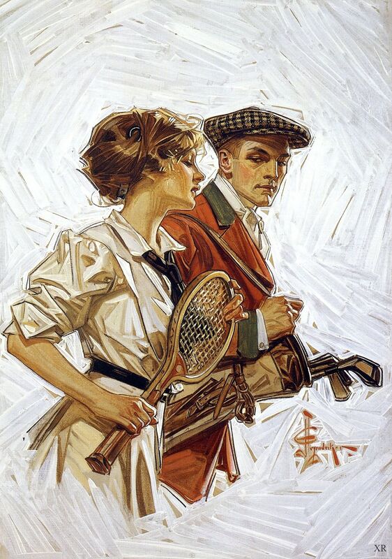
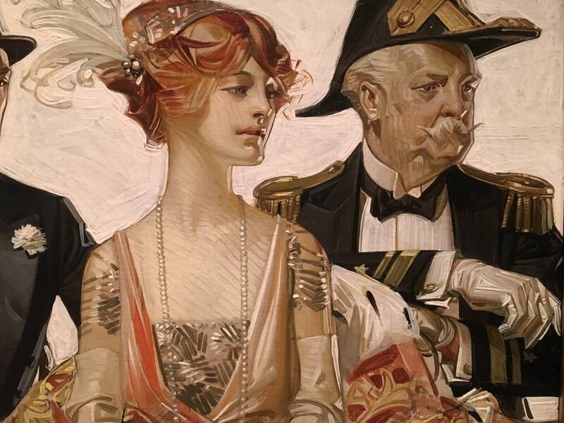
- Joseph Christian Leyendecker -
This style is vey interesting, it has very flat colours yet still maintains a feeling of texture and movement. I don't think I will be able to recreate this properly but I can try. |
Painting - Self Portraits
|
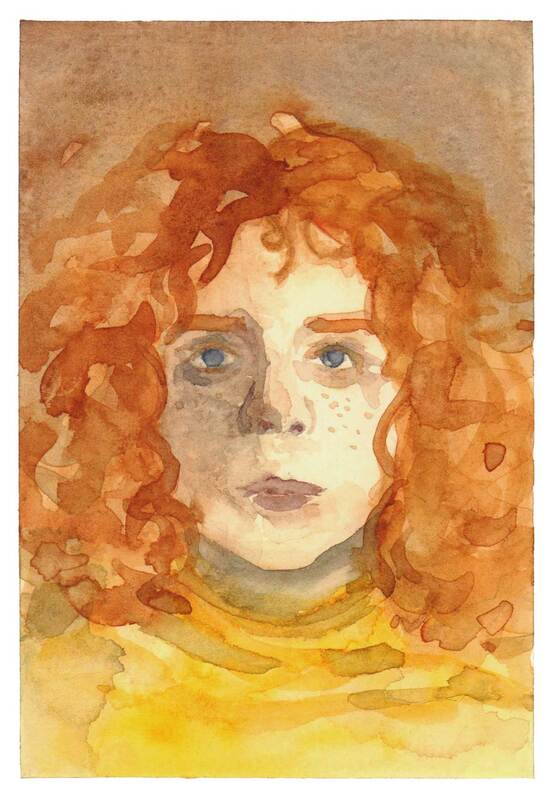
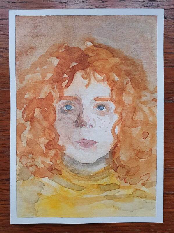
Watercolour Self Portrait - Inspired by John Singer Sargent
I think this is probably my most successful self portrait for this project because it fits the theme of being expressive and using large brush strokes. I really love how this portrait turned out, it actually looks more like me the further you get away from it. I think that I should definitely try to make some more of these little watercolour paintings, it was very fun to do also it wasn't as much pressure as painting very precise and detailed paintings usually are. This painting took three layers, however I think it would be interesting to also try this same technique but as a wet on wet painting.
|
|
Watercolour Self Portrait - Inspired by John Singer Sargent
I don't think this came out very much like John Singer Sargent's illustrations but it is definitely less detailed than the watercolour paintings that I usually create. I think the pose is also a weird one, my idea was to create an interesting pose to make the painting better. However I think it just complicated things greatly to the point that I spent more time trying to get the pose right than actually letting myself be more free with the paint.
I do still like the colour overall, and the painting was quite fun to make especially the wave like lines of watercolour at the bottom of the page. I found that I actually like using more expressive brushstrokes. But I also love detail so I am curious whether I can find a middle ground to make the watercolour work for me. |
|
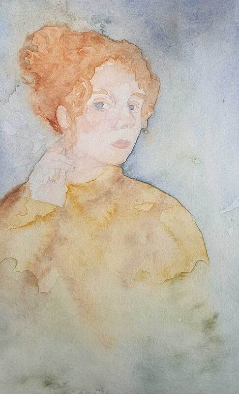
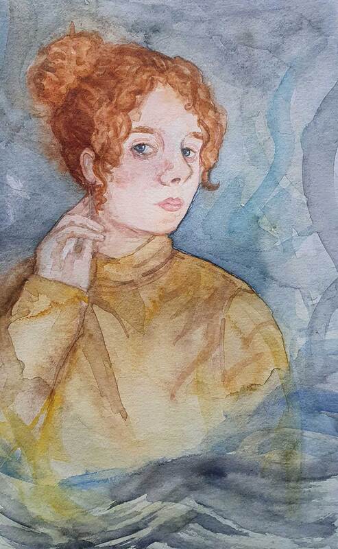
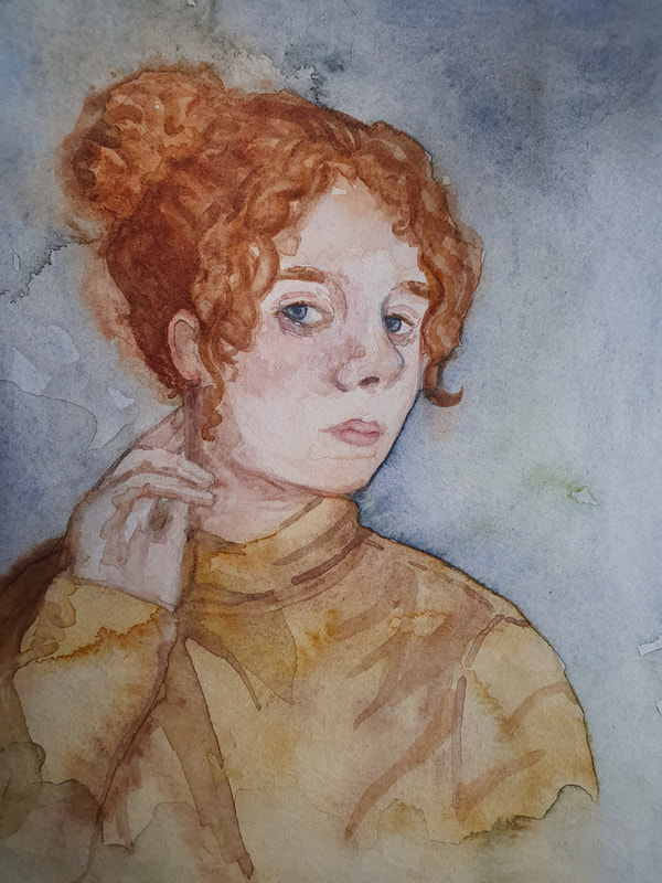
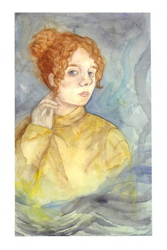
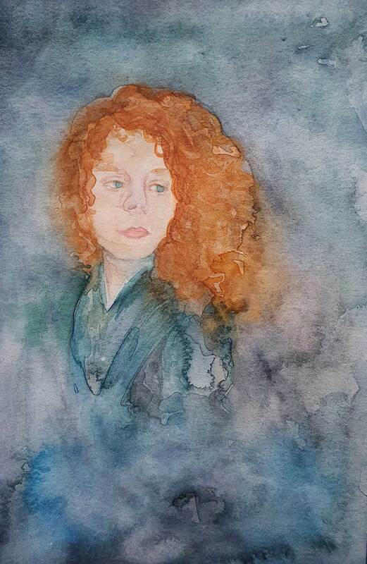
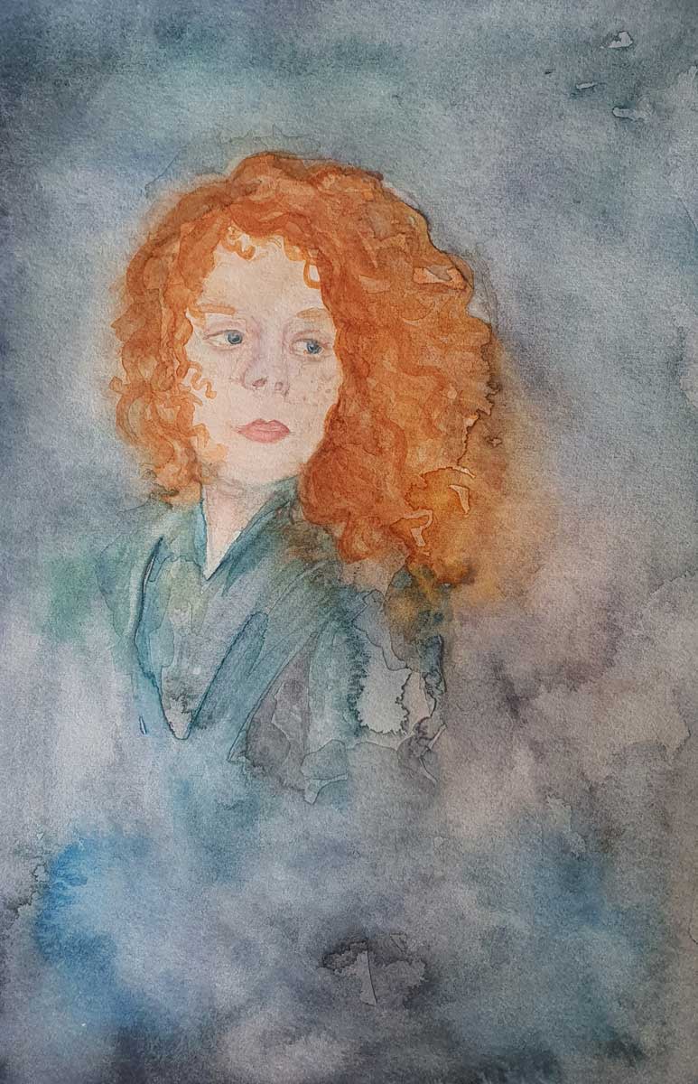
Watercolour Self Portrait - Inspired by Alan Lee
This watercolour painting is inspired by Alan Lee, I took inspiration from a painting of a lady that he created. My idea was to try and incorporate an environment into the painting but just loosely. Additionally I think that I have managed to create a feeling of a stormy day in this painting which I am very pleased about. This is definitely my favourite self portrait from this task. I also really liked taking inspiration from Alan Lee, which I knew I would as he is an illustrator that I greatly admire. |
|
Acrylic Self Portrait - Inspired by N C Wyeth
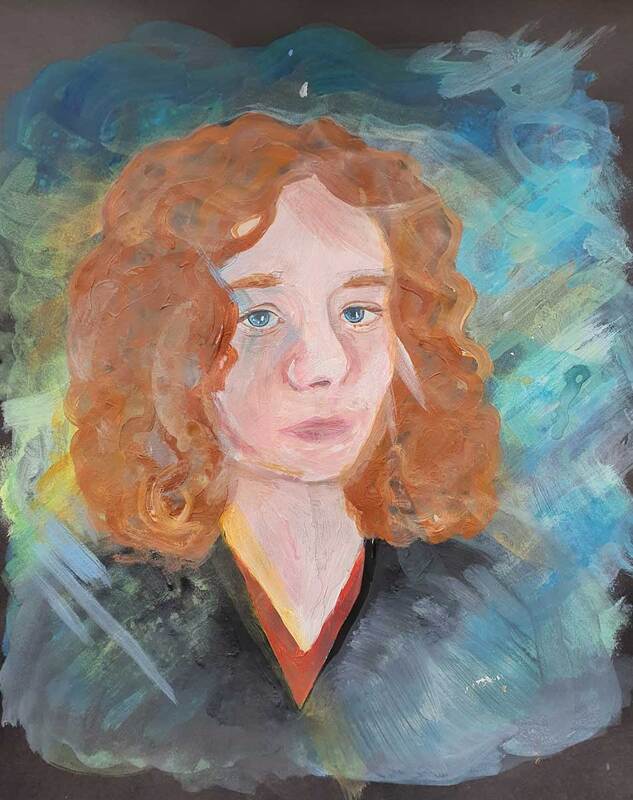
This acrylic self portrait was inspired by the artwork of N C Wyeth, it didn't actually turn out looking anything like his illustrations. However I tried to embrace his sense of fun and colour instead. Initially I had made this portrait too smooth and impersonal, but after I decided I really disliked how much this painting was starting to look like a plastic doll I decided to to go for it and attack the page with colour.
|
|
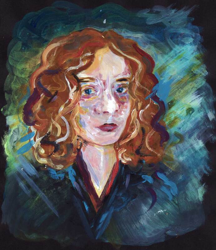
Acrylic Self Portrait - Inspired by J C Leyendecker
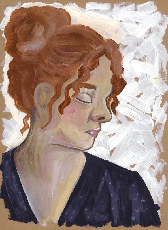
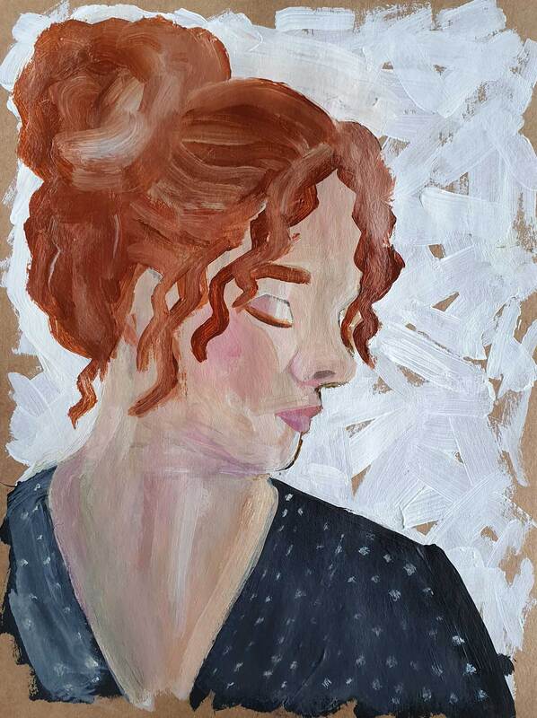
For this self portrait I chose to paint on top of a brown paper background, this was quite interesting however I do think that a different background could have looked better on this occasion. Having my ginger hair on a brown background has created a lack of contrast within the image so I think it could have looked better on a blue or teal background.
I like the white brushstroke background and the texture of my dress best in this painting, I think this is something I could expand upon if I were to use acrylic again. I think I should try to find a balance between detail and texture for future paintings. |
|
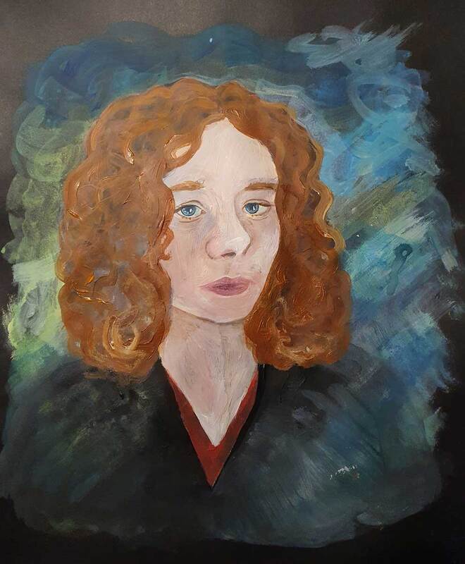
Acrylic Self Portrait - Inspired by J C Leyendecker
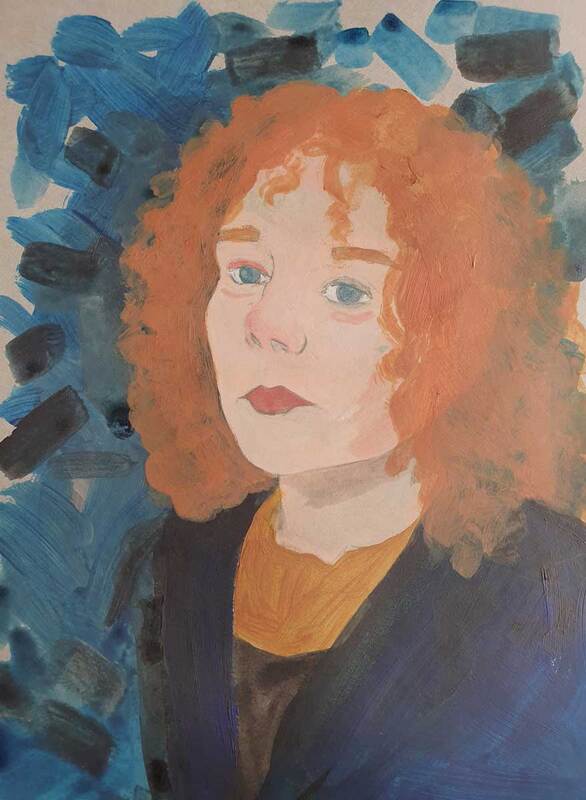
I think in this painting I have made myself too pale, I do think this is something to do with painting on top of a grey paper background. My favourite thing about this painting is my hair texture and colour, but overall I don't think its very good.
|
Painting - Still Life
|
Watercolour Still Life - Inspired by Alan Lee
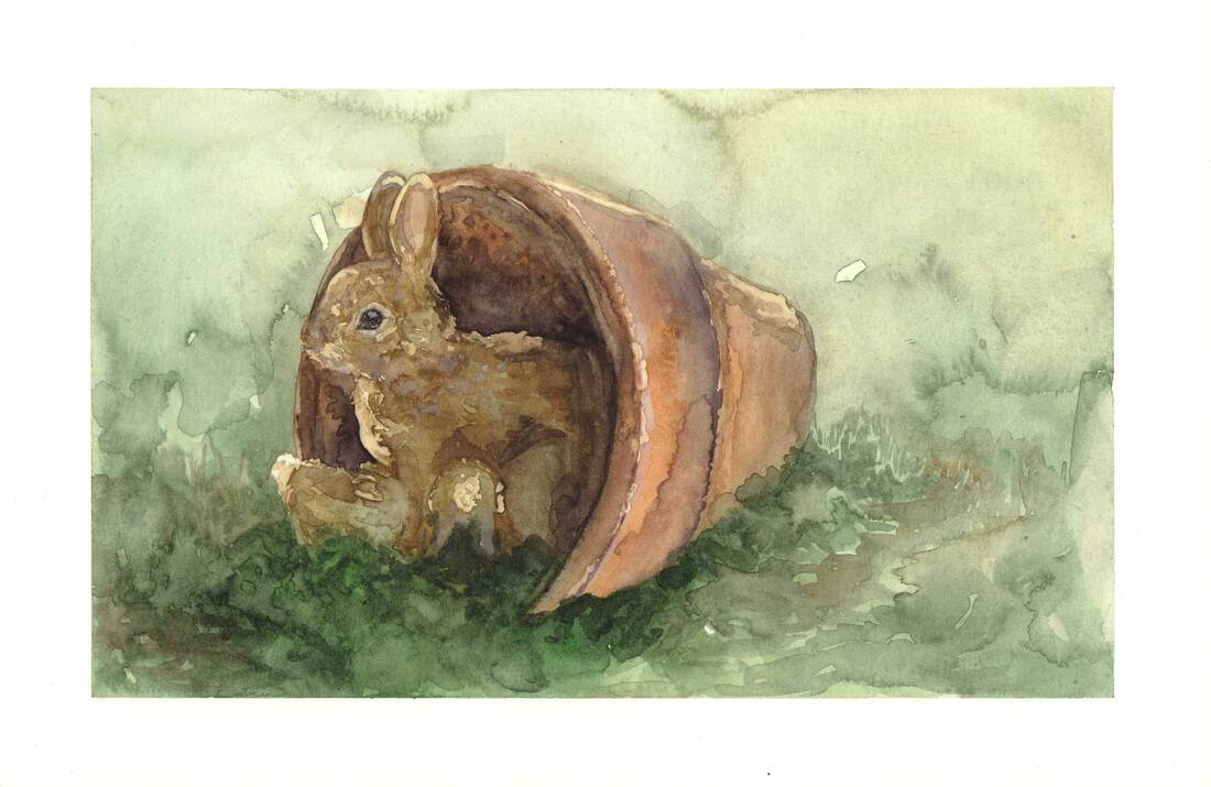
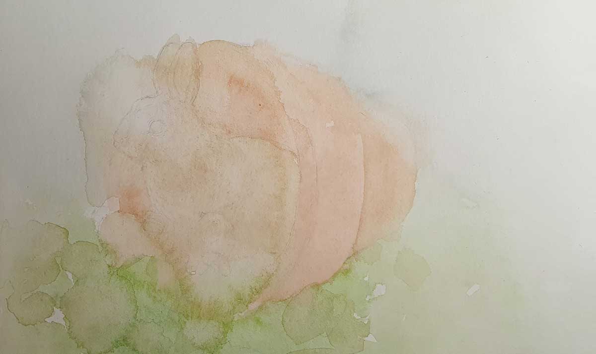
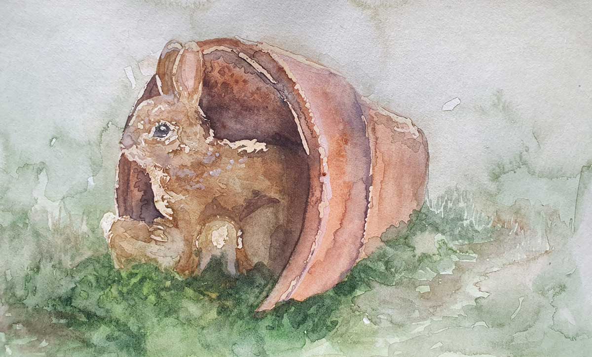
I used masking fluid on this painting to experiment with it, I enjoyed painting an animal again after so long. I don't necessarily think this painting looks that much like an Alan Lee painting, but it was very enjoyable to paint. My favourite part of this painting is the grass in the background, it seems lie a small thing but it was actually interesting to try another technique for illustrating grass.
|
|
Watercolour Still Life - Inspired by John Singer Sargent
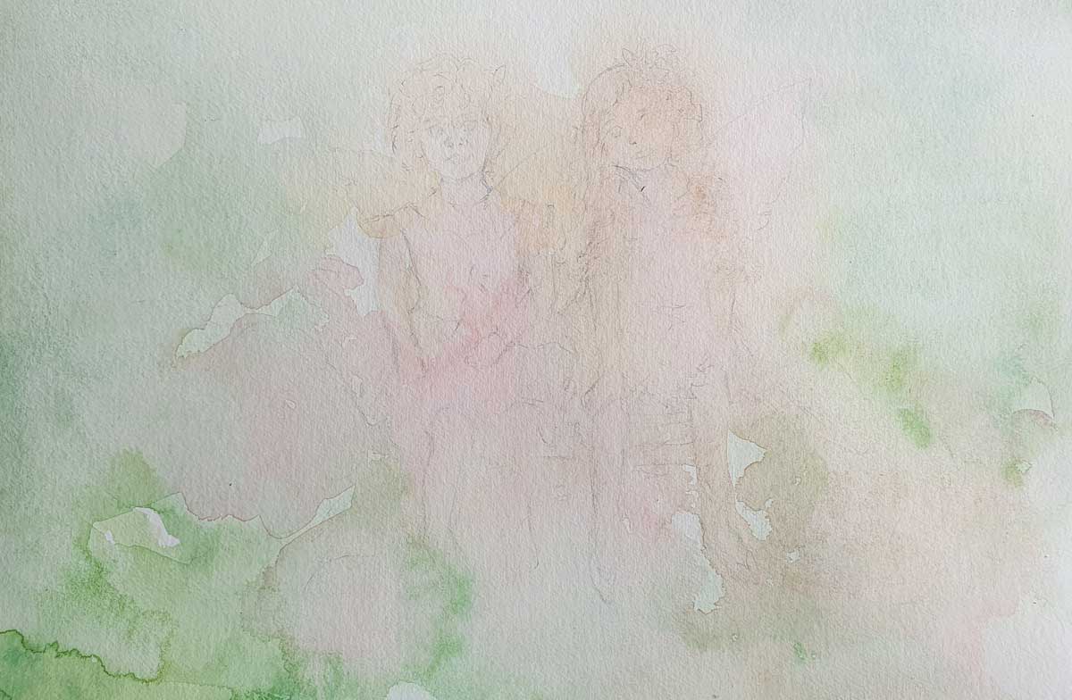
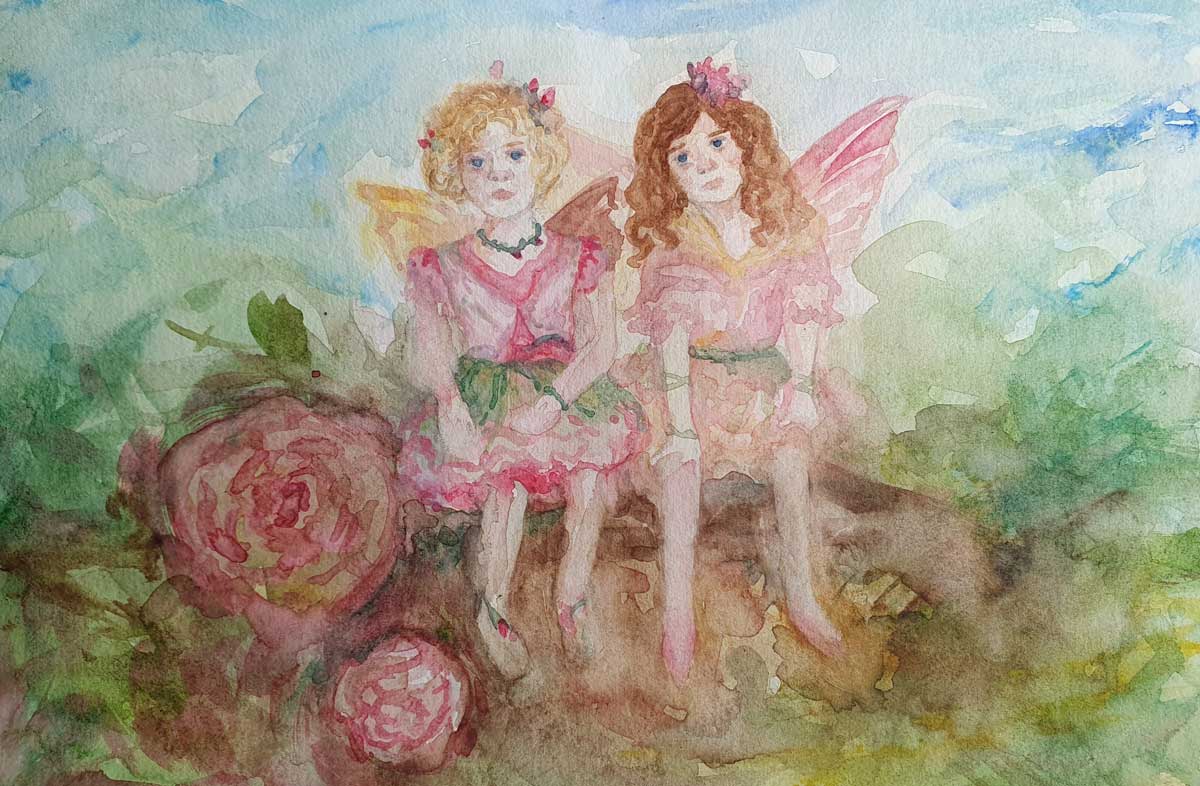
This is my least liked watercolour still life, although it does remind me of Sargent's illustrations I have somehow made the fairies look a bit more muddy that his artwork. I think this is just something I would need to practice if I wanted to get closer to the intended style. The colour pallete is something that I do like about this illustration, as well as the faces I think they are enough to indicate a person but not overly detailed at the same time.
|
|
Watercolour Still Life - Inspired by Alan Lee
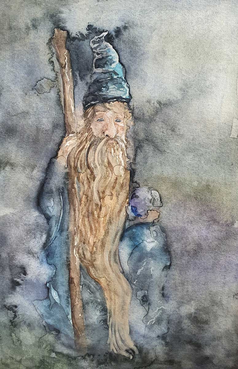
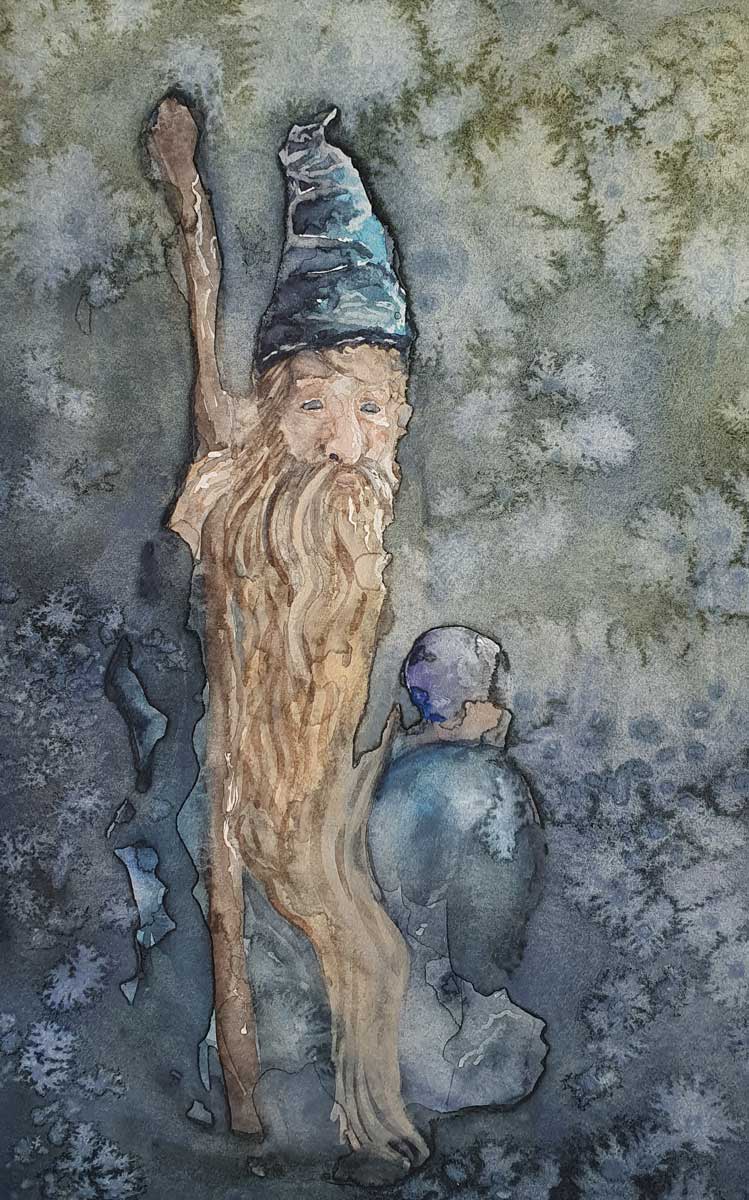
I chose to create a still life based upon ornaments this time to make them different from the ink still lives. I thought this wizard ornament fit with the theme of Alan Lee's illustration. This took a lot of layers and I experimented with salt to create some interesting watercolour effects within the final illustration.
For this illustration I picked some more earthy colours and a lot of Payne's grey. This illustration took quite a long time to create with the drying times between layers. I wouldn't say that it was my favourite, if this project wasn't all about being expressive with brushstrokes I would love nothing more than to add more details. But for what it is I am pleased, I know that I have a lot still to work on but it is only by trying things that I can possibly get any better and learn to become skilled in the material that I choose. My favourite part of this illustration is the way the water and salt have reacted in the bottom left corner, I think it looks really atmospheric. |
|
Acrylic Still Life - Inspired by N C Wyeth
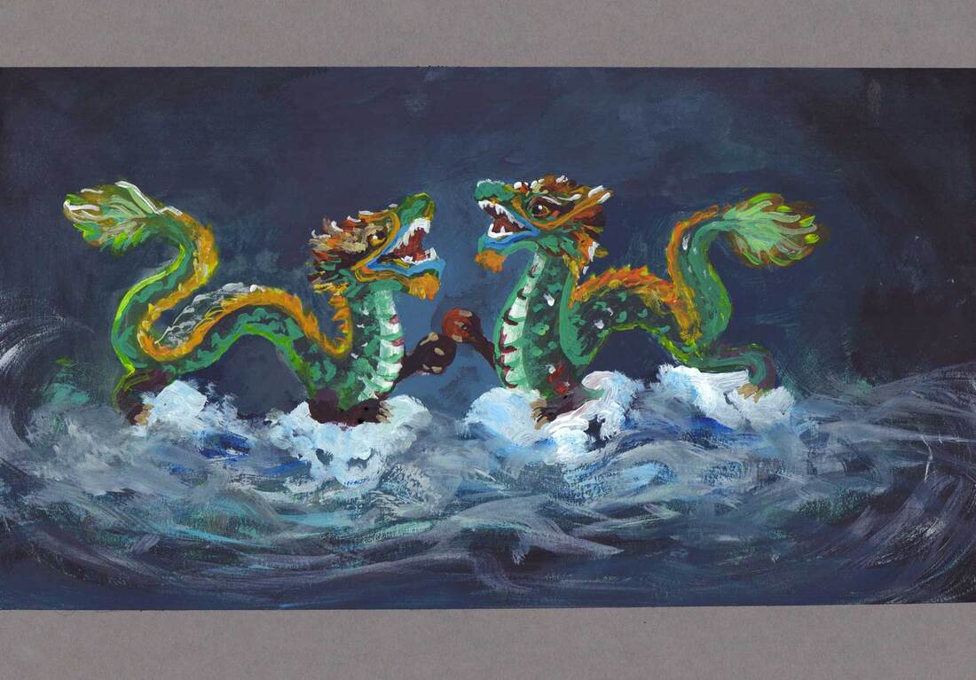
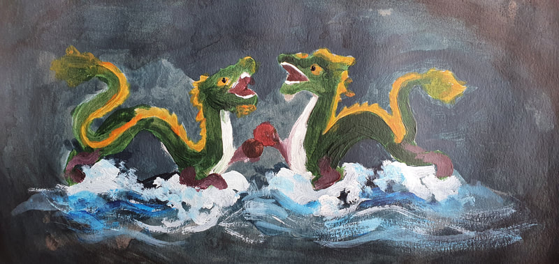
This is by far my favourite acrylic painting from this project, I loved adding so many colours onto these dragons based on an ornament that I own. I took inspiration from Wyeth's colours and the fact he painted a dragon in the background of one of his illustrations.
I also really love how the water turned out in this painting, I had a lot of fun creating the brushy texture on the water that contrasts with the stronger more definite marks that I used for the details on the dragon. |
|
Acrylic Still Life - Inspired by N C Wyeth
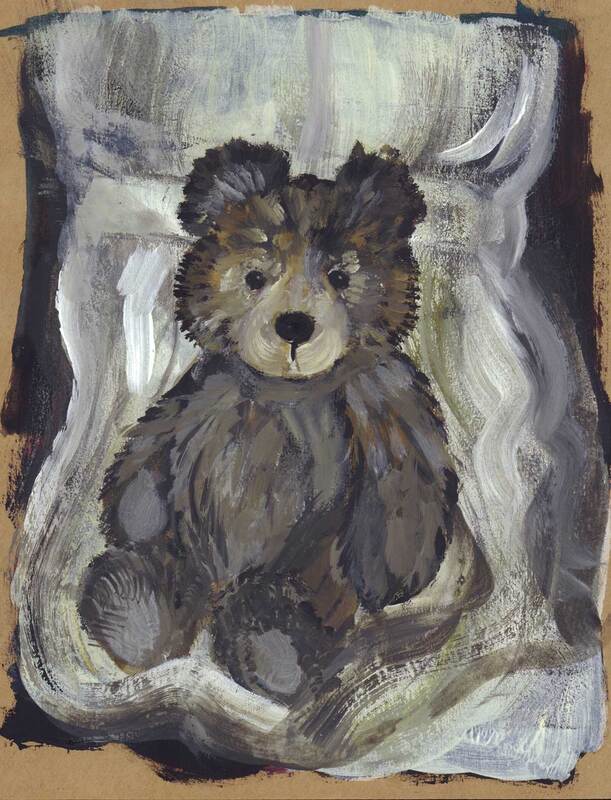
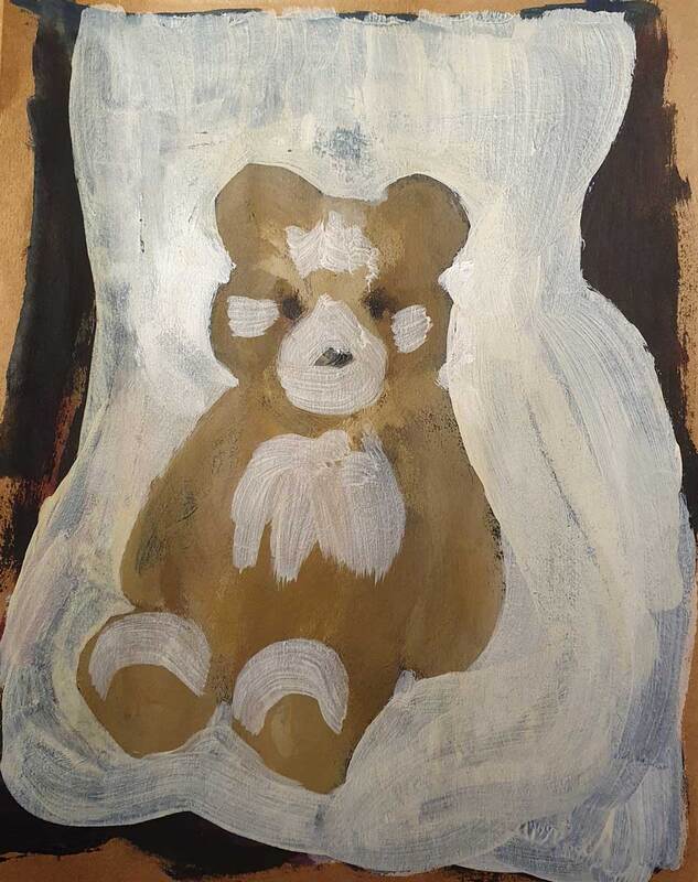
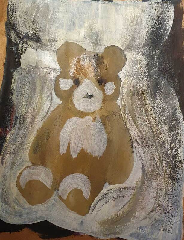
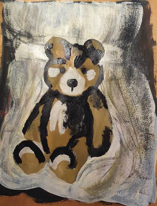
I don't mind how this painting turned out, it is a painting of a Charlie Bear so ideally I would have like to add in all of the individual hairs. However I think the scrubby texture that I managed to create using a straight edged brush helps to elude to the texture of fur without complicating the image. I actually also like the process image on the right before I blended the colours together. However I think I do prefer the final image to the process images.
|
|
Acrylic Still Life - Inspired by J C Leyendecker
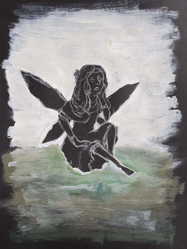
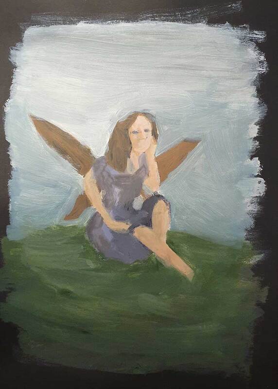
This painting is also based upon an ornament, this time of a fairy. I've always thought she seemed a bit fed up so I decided to get her to sit on a grassy mound and look at the sky. I don't particularly like how this turned out but I do like the way the grass and shadow look, I just think the fairy looks a bit out of place in the image. I think this is because I haven't grounded her well in the image. But it could also be that this style is just not for me
|
|
|
|
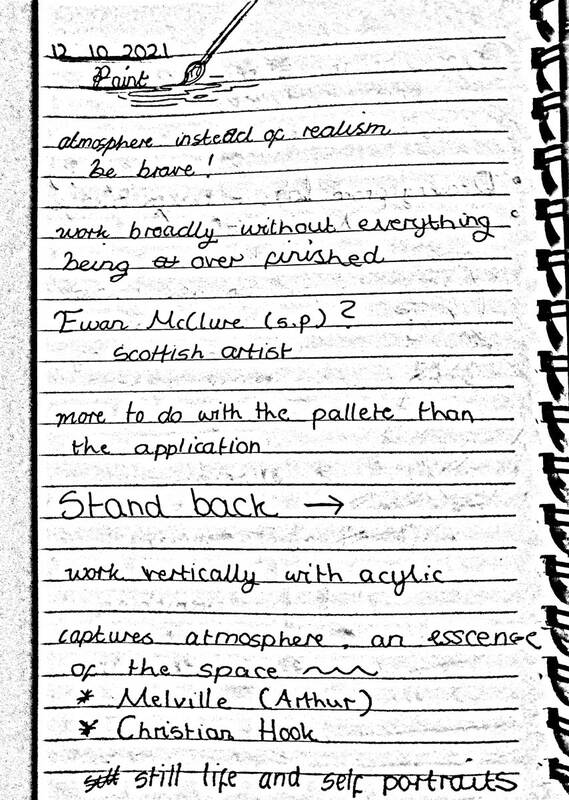
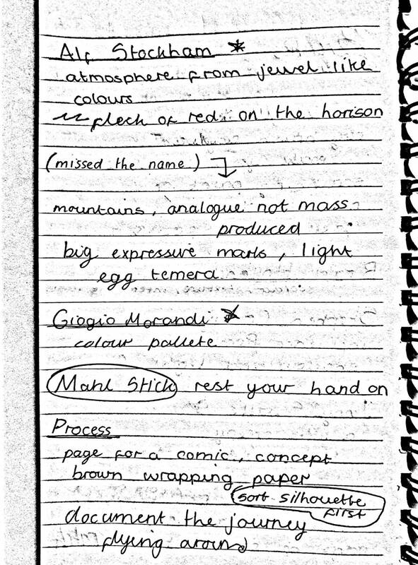
- Painting Project (Notes) -


