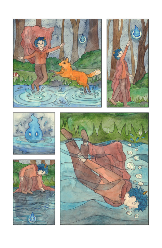
- EXPERIMENTAL COMIC -
Ideas
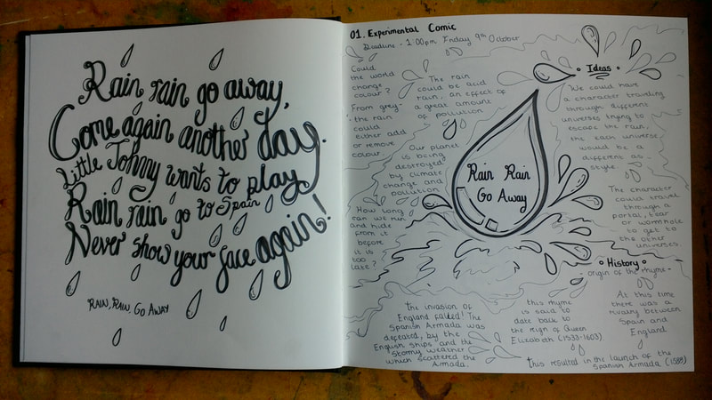
I started this process by writing down my ideas for the "Rain, Rain, Go Away" nursery rhyme.
We then came together as a group to discuss our ideas - I think this is where we tripped up as a group. We all remained quite separate after this point, and worked on the project individually; which meant that our final design looks like the work of four different people and was just randomly put together.
We then came together as a group to discuss our ideas - I think this is where we tripped up as a group. We all remained quite separate after this point, and worked on the project individually; which meant that our final design looks like the work of four different people and was just randomly put together.
Primary Research
I then moved onto primary research, to explore the different ideas that the group had came up with.
These aren't resolved pieces of artwork because I just wanted to get a feel for the ideas in a wide sense instead of committing to one idea at this stage.
These aren't resolved pieces of artwork because I just wanted to get a feel for the ideas in a wide sense instead of committing to one idea at this stage.
Secondary Research
For my secondary research I looked at some work that had been created by comic artists.
I liked the work of Bruno Munari "Circus in the Mist" which was a comic artist that was introduced during the project briefing, I went on to test his style during my development.
I also liked the way that watercolour could be used for comics, it was untraditional but still gave the images the appearance of a comic.
Development
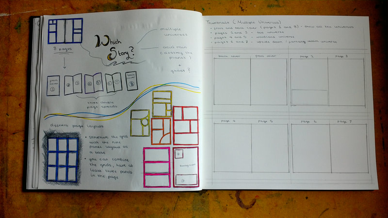
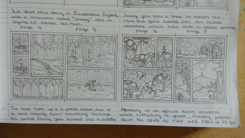
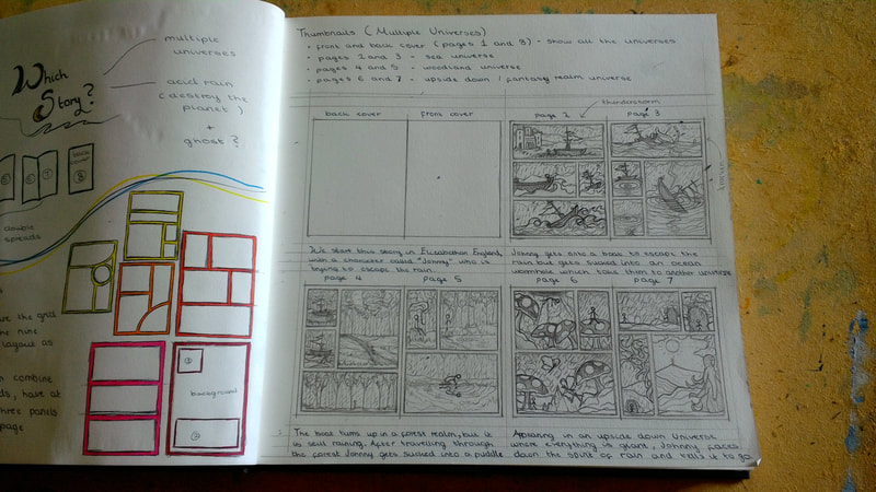
To start my development process I looked into how to lay out a comic, this helped me as I went onto creating some thumbnail ideas for the story (I have since learned to always render thumbnails in colour - but at this point I just created them in pencil). The group ended up picking my thumbnailed idea because we had struggled to communicate and make decisions.
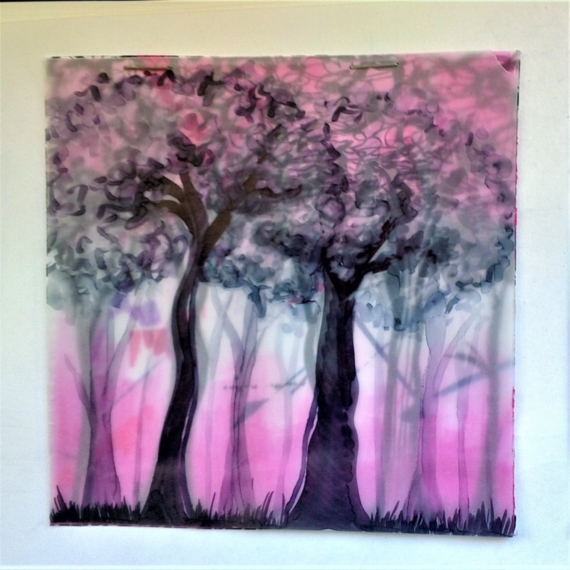
I tested if I could get anywhere close to the style of "Bruno Munari" at this stage, I used tracing paper and copic markers to create this effect.
I really enjoyed the appearance of this however it didn't seem to fit with the storyline. This style is something I would like to go back and explore further in the future.
I really enjoyed the appearance of this however it didn't seem to fit with the storyline. This style is something I would like to go back and explore further in the future.
At this point I tried to work on character design, I don't usually draw people because I prefer to illustrate animals, so this was a strange thing to do.
After testing different character designs I decided that a style that is less realistic would be best for illustrating the person.
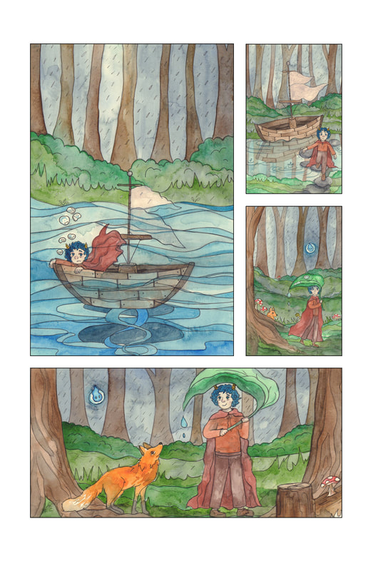
I then picked two page layouts that I liked and created thumbnailed designs within the layouts.
After testing different character designs I decided that a style that is less realistic would be best for illustrating the person.
I then picked two page layouts that I liked and created thumbnailed designs within the layouts.
Comic Book Images
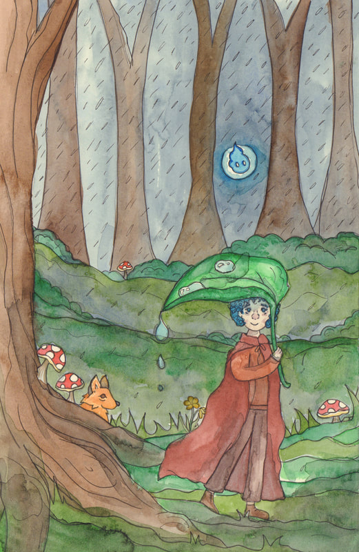
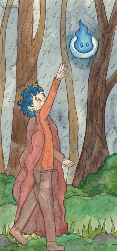
These first two images are the ones that I ended up liking the best out of my illustrations within the comic.
I don't think they are that good overall, however there is something about the expression on the characters face that is amusing.
I don't think they are that good overall, however there is something about the expression on the characters face that is amusing.
I believe that these illustrations would have looked a lot better if they had been created with something more pigmented than watercolour.
I feel that there is nothing special about these images, as they don't demand attention and are not visually interesting.
If I where to create these illustrations again I would look at the colour tones within the images as well as the overall composition.
Also now I know to thumbnail in colour I think that would have really helped me to work out a colour scheme that would have enhanced the concept of the images.
Comic Pages
