- COLOUR, COMPOSITION AND LINEAR NARRATIVE -
Exercise 1:
Analogue Activities
Analogue Activities
I found the task of making colour scheme squares very interesting, I haven't used acrylics much before this point so I didn't know how many colours I could create out of just the primary colours (with black and white). My favourites are Mumbai and Misty Morning, I think that they really get across the feeling of the place through colours.
To work out which colours to use I first created a digital colour palette, influenced by the colours of images that reflected the different places.
I then tried my best to recreate those colours through mixing - I think this process worked well overall.
I am not sure about my own personal colour palette, I think some of the colours are very similar to each other.
If I were to do this task again I would plan these colours out digitally beforehand.
Exercise 2:
Composition Warm Up
Composition Warm Up
I really like how my composition for "Aggression" turned out. I created custom patterned paper using red and black pens on white paper.
I think that these patterned pieces really added to the overall appearance of this image.
My other favourite is the collage for Tokyo, I tried to created the appearance of the the coloured lights and billboards using coloured squares of paper.
I did the same in this collage, using my pens to make custom coloured strips.
Exercise 3:
Designing with Type
Designing with Type

To start this task I experimented with which of the fonts fit best with the
themes that we were given. I also looked into colour schemes that I thought
could reflect the themes well.
I also had to replace Helvetica with Arial because I couldn't find Helvetica
anywhere on the internet. After research I found out that Helvetica is only
available in Photoshop on Macs, not on a Windows system.
Scale
I was really happy with how my type design for "Scale" turned out. I used a gradient of colours from dark blue to yellow, on top of a black background to allow my letters to stand out. I was inspired by "The Matrix" for this scale design, I decided to use the letters Y and Z because they are both hard and angled shapes so it is vey easy to see even the smallest change in size.
I especially liked how the set of three z's getting smaller looked, it really showed off the gradual decrease in size.
Playful
I found this type design very strange overall, to make the image playful I decided to add in a lot of colours that would clash against each other.
I also used the italic setting to make the type look a bit more fun. I was really pleased when I realised that I could line up the S with another S to make a nice wobbly line.
I think that overlaying lots of letters really helped to created the kind of image that I wanted to make.
I also tried to use letters that had rounded shapes such as s, o, q and u.
Power
This is my favourite out of all of the type designs that I created, I used the Rockwell font so that the letters had a powerful presence.
I used "I" to abstractly represent people, I placed one "I" alone on top of the large "T" this really helped to represent a power dynamic.
After I added all of the letters I think that the image ended up looking like a typographic city scene that
shows a single figure on top of a tall building looking down onto the city and people below them.
Additionally, I used a powerful colour scheme, using reds, blacks and purples.
However I think that the addition of white helped to create a contrast within the image.
Pattern
I used the typeface "Bodoni" because it lined up well to make a pattern; I especially liked how the "M" and "V" worked, I think that when they are flipped and lined up they make really nice lines of pattern. Additionally I used a collection of colours that I think went quite well together for the pattern type design.
Feminine
This design really confused me and it took me a long time to work out what to do with the structural formation.
It started out a lot differently to how it turned out and I am quite happy with how it evolved.
I don't think it is a very strong design, however the colour scheme works quite well for the "feminine" theme.
Masculine
I really like the colour scheme of the "Masculine" design a lot.
I tried to keep the design more spread out overall, this really helped to create the appearance of a masculine form.
What made me love this design is the transparent border around the edge of the final image,
it really helped the letters to stand out, even though the colours are quite muted.
Exercise 4:
"Working in the style of"
"Working in the style of"
|
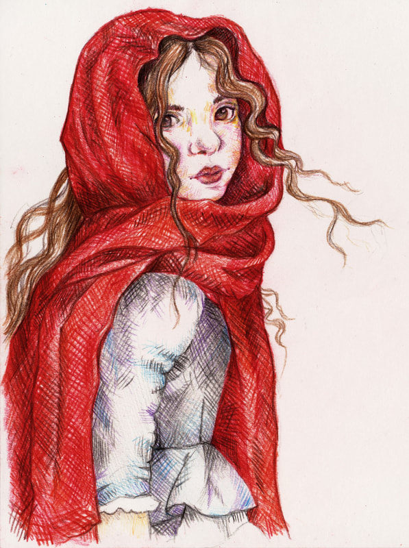
Anne Yvonne Gilbert To find out about Anne Yvonne Gilbert’s artwork I read an interview called “Colour Pencil Magic”. From this interview I have learned what kind of materials this artist uses. To prepare to create an illustration Gilbert starts by doing research, then she picks out costumes and props. After which she photographs her model/s. There is also a lengthy process that comes before starting the final illustration; this preparation consists of roughs, e-mailing clients, finding costumes and props, as well as models and references. Gilbert says it takes her approximately one week to finish a moderately detailed illustration. Gilbert tends to put more focus into the subject of the artwork and takes up the greatest amount of space with the human subject and the backgrounds are less important within the overall image. I was very interested to learn why Gilbert uses pencils within her illustrations, to me pencils have always been a medium that causes me a lot of issues. But interestingly the reason that Gilbert uses pencils is because she prefers her work to be neat and clean. She is attempting to not create any texture within her artwork, using the hardest pencils and soft paper she is able to create the kind of illustration that she likes. Anne Yvonne Gilbert has used other mediums such as watercolours within other work, however instead of painting with the medium she has bent it to her will and drawn with the paintbrushes. She has actually created a whole book with watercolour called a “Baby’s Book of Cradle Songs and Lullabies”. To correct any mistakes within the finished coloured pencil drawing Gilbert will use Photoshop, however to avoid this situation she prepares lines on tracing paper which she sends away to get approved this helps to avoid any rubbing out. From the interview I learned that Gilbert thinks that coloured pencil are a clean medium, she used Prismalo Caran D’ache and Schwan Stabilo pencils because she has found that these brands have the hardest leads. Which means that you can use the pencils with a sharper point without the pencils breaking. However pencils are sometimes quite light, so she edits the illustrations within Photoshop to create her trademark style. I have found out that she tended to use the pencils on a smooth paper – however this paper can’t be shiny. Gilbert said that she uses Wiggons Teape paper called a popset weave. She has found that this is the best way to not show the grainy texture that pencils can create. Gilbert was influenced by the artwork of Arthur Rackham, Heath Robinson and Edmund Dulac. |
Information from the Brief:
"Anne Yvonne Gilbert uses good quality pencil crayons on watercolour board (textured watercolour paper bonded to a heavy card backing).
She bases her work on reference photographs of her friends which will be traced/projected onto the board."
|
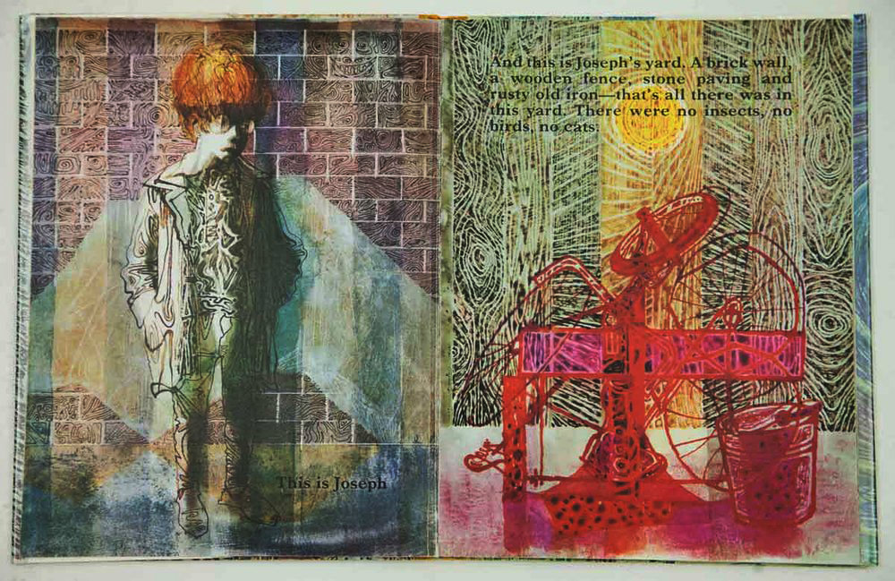
Charles Keeping Charles Keeping was born in 1924 in London. Keeping left school at the age of 14, then he went onto study art by correspondence. He started to work for a book printer, followed by a munitions company, then a gas company. After which he joined the Royal Navy in 1942 at the age of 18, he spent four years in the Navy. After returning home after a lot of work he managed to secure a grant which he used to study at the Regent Street Polytechnic, whilst there he studied both illustration and lithography. For Keeping’s technique he used a great array of vibrant colours, and he made use of the new printing techniques that were coming out between 1960 and 1980. He created his artwork using a wide variety of different mediums including watercolours, inks, gouache and tempera. He was a great fan of Plasticowell which are grained plastic sheets, these were originally designed by Cowells of Ipswich who were a printing firm of lithographic illustrations. |
Information from the Brief:
"Charles Keeping uses a wide variety of papers (from smooth and shiny to rough) and a combination of mixed-media (mostly inks and watercolour)
applied with a wide range of pens and brushes. He uses a combination of reference images and his imagination to create his powerful illustrations."
|
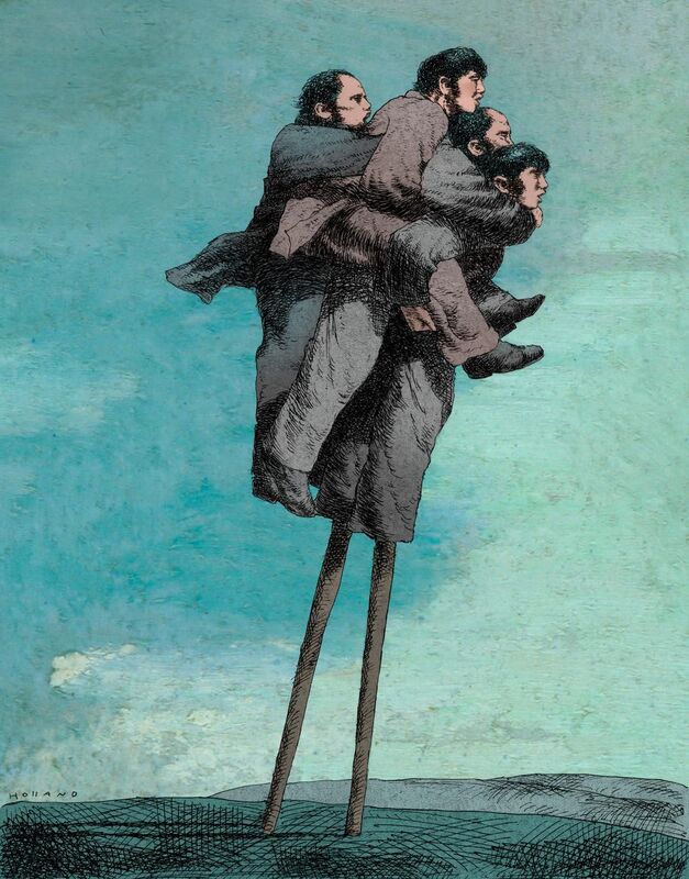
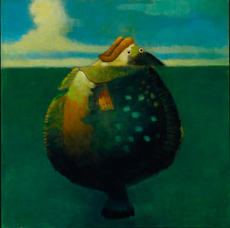
Brad Holland To learn about Brad Holland’s process I looked at an interview that he did in 2008. Brad Holland’s first break in the art industry was when he got hired to work at a small studio in Michigan Avenue. Which led to his later art related breaks into the industry, including some regular work in the New York Times and Playboy. Holland said that the assignment that he is giving doesn’t in itself need to be exciting, because the artwork becomes interesting by trying to find a way to make the image interesting. Within the article Holland also discussed the fact that he doesn’t get ideas saying “I don’t get ideas, I have them. The trick is to remember where I’ve put them”. I found this very interesting because he is in fact finding a way to take the brief that he has been given and bend it into something that would be considered to be exciting and visually interesting. Illustrations are sometimes very literal so we have to work to the dictations of the people who commissioned the illustration, so when we have the freedom to let our ideas free, we should seize the opportunity. Within the interview Holland mentioned that most of his work begins as art that hasn’t been commissioned. This came about after he made the decision that he would only make the kind of art that he wanted, this made him lose a lot of jobs at first, but after he gained popularity with the brands I mentioned before Brad Holland began to be commissioned to do the type of art that he loves. He says that his biggest influence was also one of his first influences, he was strongly influenced by the short stories that Nathaniel Hawthorne wrote, these short stories resemble a more subtle version of a folk tale. I found it interesting that in the interview Brad Holland mentioned that he hasn’t used a great deal of yellow in his paintings, he thinks that this colour doesn’t seem to fit the type of illustration that he creates. This was a really good thing to learn, because removing yellow from the colour palette makes it less likely that I would use Holland’s style for the Children’s Book cover. |
Information on the Brief:
"Brad Holland uses an acrylic ‘drybrush’ technique (little or no water) when ‘scrubbing’ his paint (with a brush) onto canvas.
You don’t need to buy a canvas, just glue some fabric to a wooden board (or two or three sheets of card glued together) using PVA glue and paint it white."
Drawing in the style of Anne Yvonne Gilbert
Material Testing
To start this process I tried to work with pencils, I have never liked using coloured pencils as my drawings always looked like a 5 year old had made them.
However, I feel like I have found a whole new medium to explore through this project, this is a new way of using pencils that I had never occurred to me before.
Replicating Examples
I decided to use two different types of pencils on this page, on the left I used a set of watercolour pencils which are very easily breakable, however they have a large range of colours.
On the right I used a smaller set of normal colouring pencils which are harder.
However I decided not to use them going forwards because the limited number of colours meant that I couldn't do much with them.
The Power of Editing
Through reading the interview with Anne Yvonne Gilbert I learned that she edits her pencil drawings to enhance the colours.
So I tried to follow the same process and see how close I cold get to the colour profile of her original image.
Painting in the style of Charles Keeping
Material Testing
To work out what surface to paint onto I tested a variety of papers, I started by testing normal paper and then I used a slippery paper.
However it was photograph printing paper that gave me a result that was the closest to the art of Charles Keeping.
Replicating Examples
I learned from trying to replicate examples that I should definitely use the photo paper for the final book cover
which will be in the style of "Charles Keeping" because normal paper doesn't work the way I would like it to with ink.
which will be in the style of "Charles Keeping" because normal paper doesn't work the way I would like it to with ink.
Painting in the style of Brad Holland
Material Testing
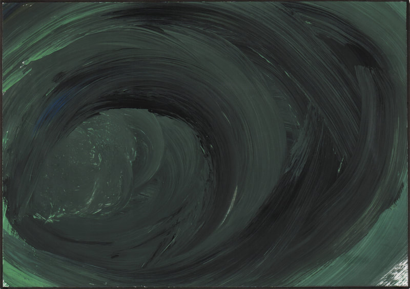
I really don't like using acrylic paints, they never seems to go right for me. I have found the dry brush technique even harder than using acrylic normally.
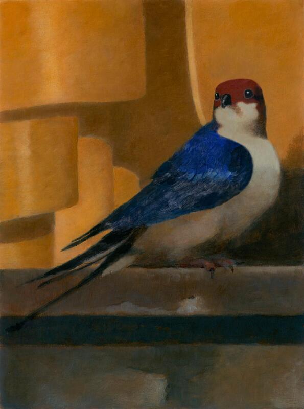
Replicating Examples
I like the way that the bird looks, but I don't think it is a very successful recreation.
Book Covers (Genre Research)
To help me to work out which artist's style would work best for the different genres of book covers that we have to create for this brief.
I have researched the kind of art and book covers that are common within the book genres of Children's, Science Fiction and Psychological Horror.
Children's Book
Children's book covers seem to all be quite sweet looking with mostly bright colours, even with a dark background they seem to be illustrated in a way that makes the images look friendly.
So, I think it would be best to use bright happy colours for the Children's Book cover as well as a style that children will appreciate.
There is also some white spaces in some of the covers to make space for the text. The artist that does a similar thing is Anne Yvonne Gilbert,
in her Robin Hood illustration the forest ground is tapered off into a point - she also did something similar in the Little Red Riding Hood illustration.
Science Fiction
The colour scheme of this genre of books is very varied, it obviously includes the blues and purples that are most commonly associated with space.
However there are also other colours included within this selection, like reds and yellows.
I think that this book cover would be rendered best with an interesting and vibrant art style.
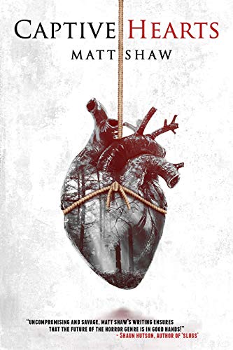
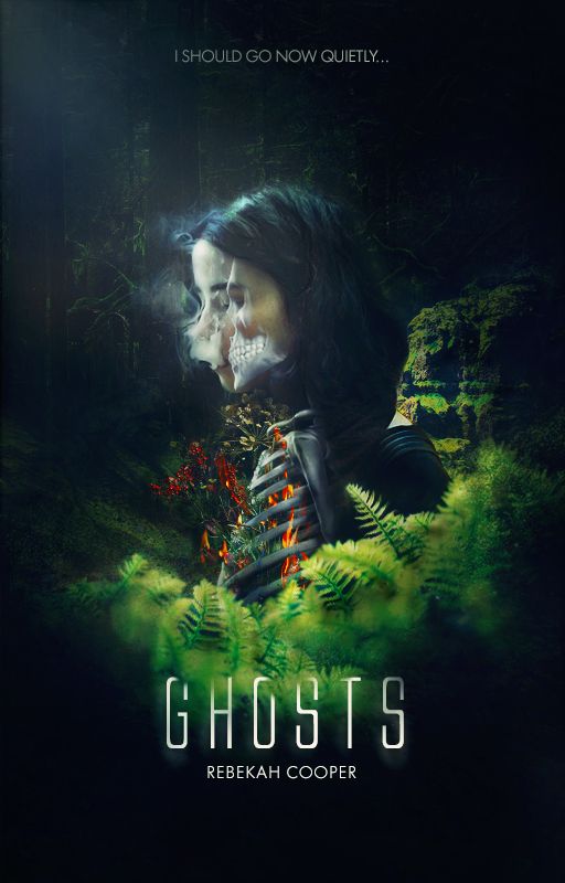
Psychological Horror
I noticed that the colour scheme that is present within this selection of book covers is more subtle than I had expected, other than the pops of red that are in some of the covers.
The imagery is not that of an outright "horror", it is more refined and elegant - showing the "horror" through subtlety and mystery.
I think that an art style that can come across as eerily beautiful would be best for this genre of book illustration.
Thumbnail Visuals
I started my thumbnail visuals by creating some images for the Children's Book cover. To make them all seem like children's books I tried to keep all of the colour schemes warm.
I have selected my three favourite thumbnails from this section below.
I have selected my three favourite thumbnails from this section below.
Influenced by my research I made the colour schemes of the Science Fiction book covers very vibrant,
using the usual darker colours of space to act as a contrast to the brighter more rainbow colours.
I have selected my three favourite thumbnails from this section below.
using the usual darker colours of space to act as a contrast to the brighter more rainbow colours.
I have selected my three favourite thumbnails from this section below.
I created a mix of more visually "horror" images and some that are more "psychological", I feel like the thumbnails that aren't as obtrusive worked better in the end.
I have selected my three favourite thumbnails from this section below.
I have selected my three favourite thumbnails from this section below.
Development
For my development pages I developed my favourite design from each thumbnail page into different layouts.
Then I created my favourite design in each of the artists styles to see which would work best for each design.
I have put the three thumbnails I developed below.
For my development pages I developed my favourite design from each thumbnail page into different layouts.
Then I created my favourite design in each of the artists styles to see which would work best for each design.
I have put the three thumbnails I developed below.
Children's Book
I decided that I liked this design best when it was rendered in pencil, I thought that this medium would work best for a children's book cover.
I decided that I liked this design best when it was rendered in pencil, I thought that this medium would work best for a children's book cover.
Science Fiction
I liked the ink design in the style of Charles Keeping best out of this selection, the night sky looked this darkest in this version which I think worked best for a science fiction book cover.
I liked the ink design in the style of Charles Keeping best out of this selection, the night sky looked this darkest in this version which I think worked best for a science fiction book cover.
Phycological Horror
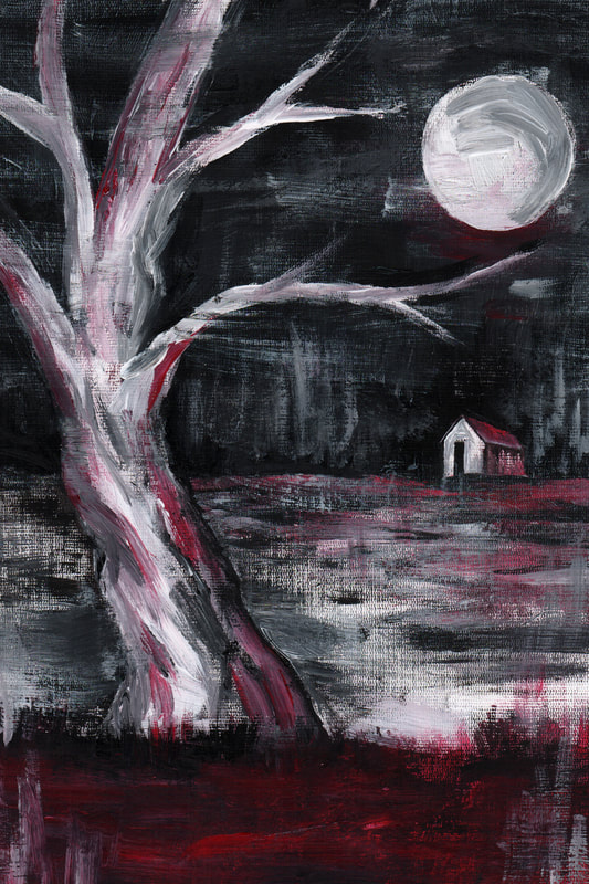
After developing this design I liked the acrylic painting best out of this selection, however I still don't think I am very good at working in this style or with acrylics in general.
After developing this design I liked the acrylic painting best out of this selection, however I still don't think I am very good at working in this style or with acrylics in general.
Final Book Covers
Children's Book
I created the pencil children's book cover using greens for the leaves, but when I scanned it I decided I didn't like it that much.
So I changed the colour scheme completely using Photoshop. I am much happier now that it is a red tree.
Science Fiction
After I finished this book cover I both scanned and photographed it on top of my light box because I thought it accentuated the patterns that the ink had made when reacting with the photograph paper. Although this doesn't look exactly like the artwork of Charles Keeping, it has been an interesting thing to do and it is definitely something I wouldn't have thought of doing before this project.
Psychological Horror
After I scanned my canvas, I decided to play around with colours and filters in Photoshop, but in the end I liked how it looked originally best.


