- MOVING ILLUSTRATION -
Week 1
Project Introduction
In both Graphic Design and Illustration, the ability to create animated work is, in today's contemporary, creative marketplace, more or less essential. The exponential development of
software has meant that producing simple animation is an increasingly straightforward task, whilst digital media and the internet provides an almost infinite scope to implement the
use of animation and animated elements. For this 4D component we won't be looking to create complex animations or short films; you won't be asked to learn a new and blood
pressure raising-ly complex piece of software (Adobe After Effects, anyone?). Instead, we will be looking to use familiar software to create simple, playful but none
the less effective animated design and illustration. You will work through a short series of exercises before beginning a larger project.
During the introduction we were asked to create a rotating GIF of ourselves, I have added this gif along with my notes on the project briefing. I was unsure how to approach the challenge
of making a GIF of my own face, so I chose to use some photos to trace them. Then I applied an under layer of colourful brushstrokes to make the background have some personality.
|
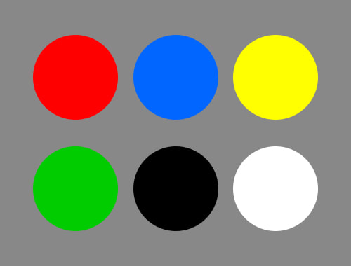
Lockdown Inspired GIFs Following on from Monday's workshop you are to create 10 animated gifs following these requirements. Size Each Gif must be 500 × 500px Colour Use only the following hexadecimal colours #ff0000 #0066ff #ffff00 #00cc00 #000000 #ffffff Frames Create 1 Gif each for the following 2 frames, 3 frames, 5 frames, 6 frames, 8 frames, 9 frames, 10 frames, 12 frames, 15 frames, 20 frames |
Research
When I found out about this task I decided to research some GIFs on Instagram that used a limited colour pallete.
I really like the simplicity of the moon GIF and the colours in the geometric pattern GIF. If you click on one of the pictures it will open the Instagram post in another tab.
When I found out about this task I decided to research some GIFs on Instagram that used a limited colour pallete.
I really like the simplicity of the moon GIF and the colours in the geometric pattern GIF. If you click on one of the pictures it will open the Instagram post in another tab.
Initial Idea Exploration
To make my decision of which words to use I decided to sketch what came to my mind when I thought about each word.
I really enjoyed doing this as it gave me a good place to expand from, I also liked sketching with my Bic Pens again.
To make my decision of which words to use I decided to sketch what came to my mind when I thought about each word.
I really enjoyed doing this as it gave me a good place to expand from, I also liked sketching with my Bic Pens again.
Thumbnails
After I had chosen which words would line up with the amount of frames I spent some time thumbnailing my designs, some of these changed a lot when I made them into digital designs.
However I found that this was a very helpful thing to do, because previous to thumbnailing my ideas I had no idea how to begin any of the GIFs.
Coffee
(Two Frames)
For my first GIF I created a coffee design, at this point I was under the impression we could use different opacities of the colours we were given.
I have later been told that that is not the case, However Dwayne did say we didn't need to get rid of any made while we thought that was allowed so I decided to keep it.
I initially tried to make the smoke be a solid white line however it just didn't get across the idea of warmth at all. I quite like how this turned out at my first proper GIF,
and I was especially please with how to managed to layer up red, yellow, blue, green and black to make an illusion of a browner colour.
Bubble
(Three Frames)
For the GIF of bubble I decided to give the middle bubble subtle movements whilst adding more smaller bubbles into the background.
I also used one of the Kyle Ultimate Screen tones brushes to add that dappled effect to the background of the largest bubble, this really helped to make it stand out from the background.
Stargazing
(Five Frames)
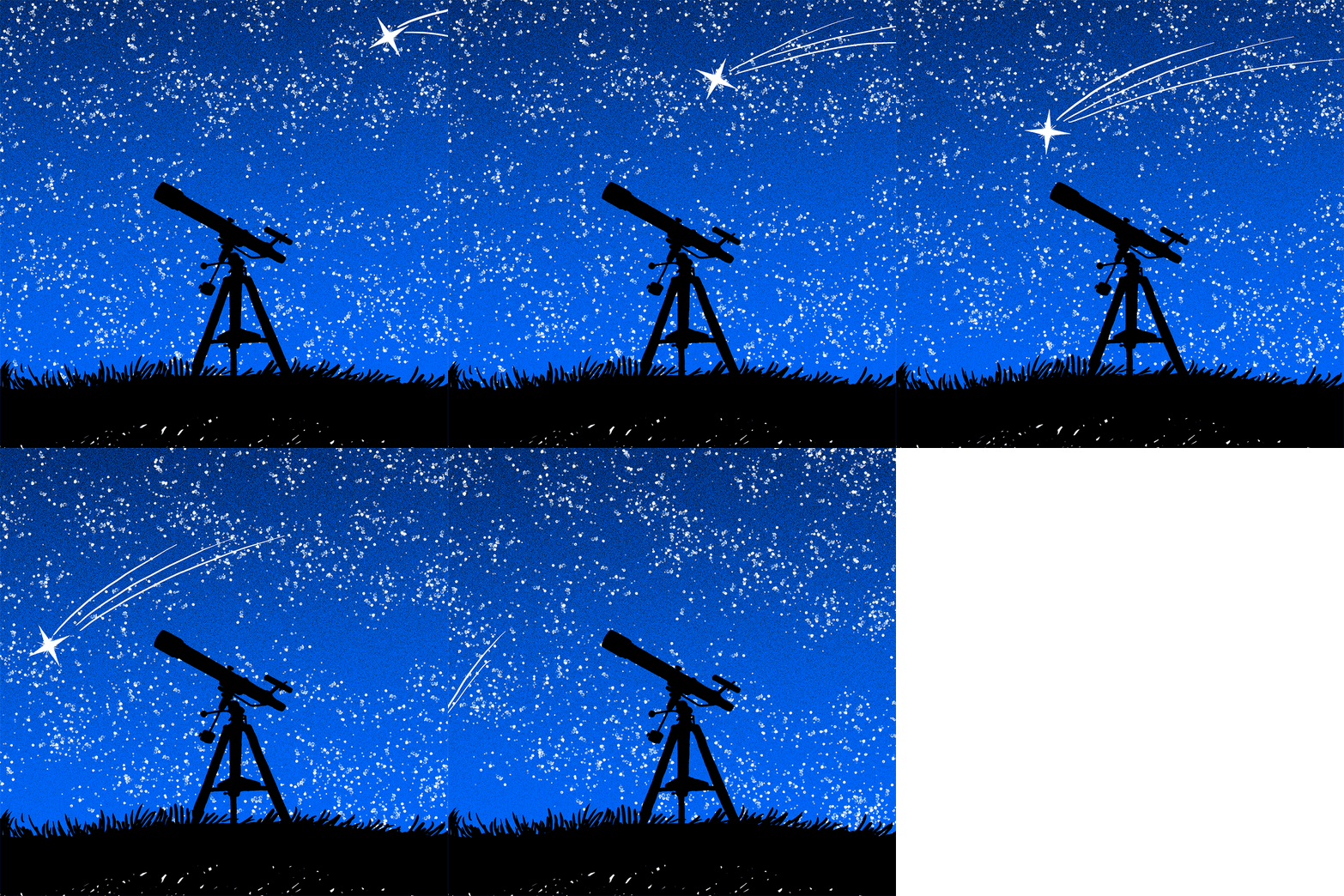
At first I was quite unhappy with how this GIF was going until I found out there is layer filter called dissolve, this allowed me to overlay black spots onto the bright blue background.
I really like how that worked because it allowed me to give the sky the appearance of a colour gradient while no using any other colours. Additionally I used a white
watercolour brush to create the dappled effect of the stars which I rotated to give the frames more movement.
Houseplant
(Six Frames)
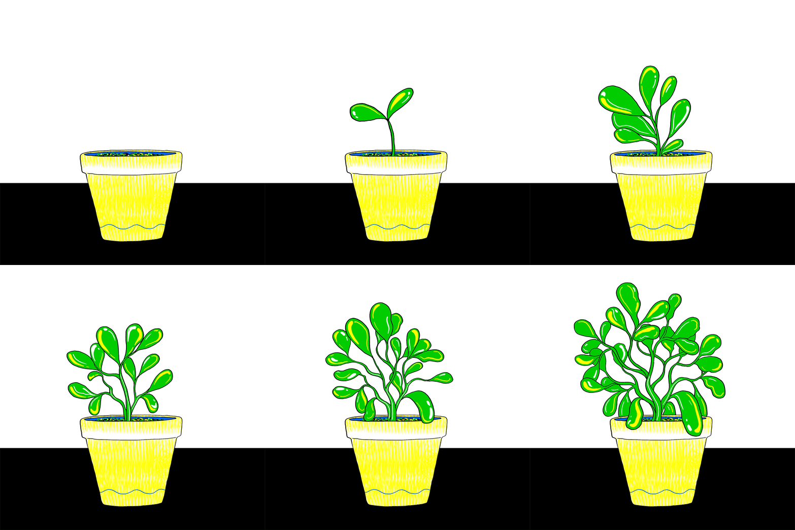
As you will be able to see from the first process images this GIF was meant to have more that one plant in it, however after working on the one plant I decided that if I
added any more like I was going to it would have detracted from the theme of the GIF. In this case was definitely more.
I also included two versions of this GIF, one that has no border and one with more details. Personally I prefer the one with the blue wave because I think it make the plant stand out more.
Repetition
(Eight Frames)
I started this GIF using traditional ink and paper, which I then scanned and used a filter to turn them into solid objects that I could fill in.
The bright green grass was frustrating me so when I found a brush within Kyle's Inkbox called Lines I was very happy. This brush allowed me to create the illusion of darker grass by overlaying black lines on top of the green bas colour. I am really pleased with this GIF overall and I enjoyed the process of starting the GIF using inks and brushes instead of doing it all on the computer.
Stuck
(Nine Frames)
After how much I enjoyed starting the previous GIF on paper I decide to try it again, but this time I used the natural qualities of ink to my advantage.
By wetting the outline of a bottle on paper and then using a pipette to add onto the paper I managed to photograph the process of edit it into a digital gif.
Additionally I created the butterfly out of paper and photographed it in different positions, which I then cut out and edited it to make the butterflies blue.
I really enjoyed how the bottle appears around the butterfly and traps it, this was a fun gif to work on and bring together.
Time
(Ten Frames)
This is my least favourite GIF out of all the ones I have created, it looks quite childish to me. However I much prefer the night time cycle. I found it to be very difficult to show a change in time without being able to change the vibrancy of an image, so this is a GIF I think would have worked better without and colour restrictions.
Escapism
(Twelve Frames)
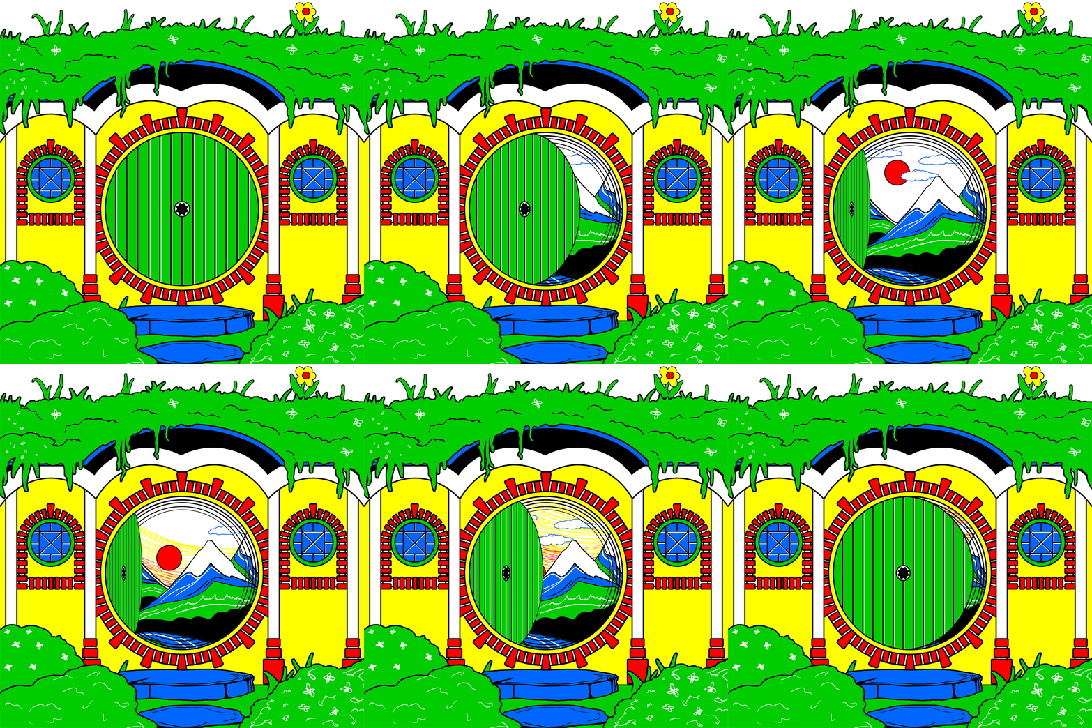
I was inspired by a "The Lord of the Rings" for the word Escapism, I love "The Lord of the Rings" so I thought this would be the perfect time to make a Hobbit Hole.
I decided to add a world behind the door for some extra escapism. Overall I am pleased with how this GIF turned out, however for a
Hobbit Hole I would have loved to have made the whole image less vibrant and more earthy toned.
I found this more blocky style to be quite strange to work with, however I do like how repeating shapes made it possible to create neat bricks.
Upon reflection I think if I were to change something about the final GIF I would like to attempt to make the door handle 3D as the door opens and closes.
Reading
(Fifteen Frames)
This GIF was inspired by "A Song of Ice and Fire" which I have been reading throughout lockdown. I changed the quote slightly to apply to a wider audience, but this is the original quote.
“A reader lives a thousand lives before he dies, said Jojen. The man who never reads lives only one.”
- George R.R. Martin, A Dance with Dragons -
I really enjoyed working on this GIF, it was lot of work and I got quite confused with the amount of layers, and how to align the different moving parts together.
So I ended up needing to use sixteen frames to make the GIF run smoothly. I have added the fifteen frame version to the side of the main image, however I much prefer the longer version.
This is one of my favourite ideas that came from working with a limited colour scheme, the red, black and white is all that was needed to create the appearance of a weirwood tree.
Outside
(Twenty Frames)
For this GIF I went back to creating the frames with ink on paper then editing the images to be solid black and white.
Unfortunately the GIF is a bit jittery in some places but for a first attempt at a looping animation I am quite happy with how this turned out.
Additionally I have included the original ink illustrations as a GIF on their own, however I actually think I prefer the edited black and white images.
The texture that the effect created on the grass is also very pretty, and I like how the whole image looks like it is moving during the GIF.
Originally I was going to add some colours onto the illustrations, however after I had the images all in front of me I decided I liked the simplicity of the black and white images.
Week 2
Title Sequence
"Over the last year we've all watched A LOT of TV. We've absorbed boxsets, true-crime documentaries, hotly anticipated series have come and gone, films have begun to premier in our
own homes; and all this time we've been skipping title sequences. Go back and take a look at those pesky title sequences and you'll find a world of design, illustration, photography and
animation that deserves far more than the 'skip intro' option provides it. In this project, you're going to look at title sequences and you're going to create one."
Initial Research
I started my research by finding YouTube videos of some of my favourite TV show introductions that I never skip. I love every one of these introductions,
I have also included the end credits of "The Lord of the Rings" and "The Hobbit" because these are the closest equivalent to TV Show introductions that films have.
|
|
|
|
|
|
|
|
|
|
|
|
|
|
|
|
|
|
|
|
Making a Title Sequence
After finding a collection of introductions that I liked I decided to look more closely into how some of them were made.
After finding a collection of introductions that I liked I decided to look more closely into how some of them were made.
|
|
When I first saw this title sequence it amazed me, the way the ink moved and flowed creating moving images that seem to exude life. I had never seen a title sequence made using traditional painted mediums before, so it made me consider the fact I could make a title sequence for the first time. I found a documentation of the process that Mill+ took to create this title sequence, it was very interesting to see the options that they had considered before picking a way in which to do their final animation. The aspect ratio used in this title sequence is (1.78: 1) |
|
|
One of my favourite illustrators is Alan Lee, the skill he has is astounding! Every sketch has life breathed into it through the tones and marks that are used within the images. It feels like an injustice to call these images "sketches" because even on their own they are a masterpiece in my eyes. Alan Lee created all of the character illustrations that feature at the end of "Lord of the Rings, Return of the Ring", these were featured alongside some of the concept art created during the production of Lord of the Rings. The character illustrations were created after a suggesting by Ian McKellan to Alan Lee, these character sketches were created from a production still of each actor and presented to them after filming ended. |
|
|
I have always found the Game of Thrones introduction very impressive, however it is incredibly digital and for this project I think I want to take my title sequence in a more traditional way. I have considered trying to mix traditional painting or drawing with digital editing to create a more interesting sequence. I especially like how this title sequence has moving parts within it, however I think this would be incredibly difficult to do traditionally. The aspect ratio used in this title is also (1.78: 1) |
|
I have loved this title sequence ever since I first saw it, the way that it blends a design that is inspired by linocut and woodblock prints, with wonderful digital textures is fantastic. The addition of the accompanying soundtrack just completes this title sequence, I have found that the addition of music isintegral to the effectiveness of any title sequence. I love the ribbon effect within the His Dark Materials title sequence, along with the colour scheme. But what really brings this sequence to life is the lighting effects within it, the blue and golden lighting brings an elegance to the whole thing. |
I love the colours within this title sequence, it has a lovey warm colour scheme. I also really like that the items within this title sequence has the appearance of a design plan. This design has always reminded me of the planning drawing of Leonardo Da Vinci, the addition of some Star Trek music makes this one of my favourite sci-fi title sequences. By looking at the Vikings title sequence I have got to see a direct comparison between the original photographs and the edited ones from the final sequence. I also really liked the way that the team made a mood board to inspire themselves. |
How to Make a Title Sequence
After I looked at the creation of a few different title sequences I decided to look for a few tutorials that focus on how to create
After I looked at the creation of a few different title sequences I decided to look for a few tutorials that focus on how to create
|
|
|
My Title Sequence Ideas
After seeing the way that the "Vikings" used a mood board to inspire the title sequence I have decided to create a small mood board for each of the
ideas that I have come up with, I hope that this will help me to decide which of the ideas to pick. Once I have picked I will move onto thumbnailing my designs.
|
Echo - Supernatural Horror
Echo would focus on the echoes of the past such as ghosts, set in 18th century England there would be a lot of events surrounding those who did not want to move on. Elemental/Five - YA TV Series
This series would be a magical series focused of the five elements within Pagan beliefs. Fire, water, air, earth and spirit. The title sequence would focus heavily on colours. |
Crimson - Costume Drama
A historical drama, with costumes, mystery, intrigue, murder and backstabbing. This drama is certain to get the blood flowing. Ashes - Costume Drama
This is a story based on the rise and fall of the Viking invasion of Britain, a story of blood and destruction, of family and friends. A story of what people would do to survive. |
Nine Worlds - YA TV Series
Focused on the nine worlds of Norse mythology, this would be a series based in Niflheim, Muspelheim, Asgard, Midgard, Jotunheim, Vanaheim, Alfheim, Svartalfheim and Helheim. Wings - Costume Drama
A historical drama based of Leonardo Da Vinci's and the design of his ornithopter (flying machine) making references to the "Codex on the flight of birds" |
Additionally I had two other ideas for the title sequence concept however I decided I didn't like them enough to create a mood board for each of them.
Ivy - Sci-Fi: In a post-apocalyptic world recovering from the devastating effects of a nuclear meltdown, the plants have started to take back the planet.
Forgotten Places - Costume Drama: Based on a Druid community, and all of the forgotten places they inhabited.
Ivy - Sci-Fi: In a post-apocalyptic world recovering from the devastating effects of a nuclear meltdown, the plants have started to take back the planet.
Forgotten Places - Costume Drama: Based on a Druid community, and all of the forgotten places they inhabited.
Flipbooks
When I first heard of the 4D project my first thought was of flick books, these are two flipbooks I have had since childhood. I couldn't find any videos of these specific books online so I filmed a video then converted it to a GIF so I could add it to here. I love the way flipbooks work, and they are the type of animation that makes the most sense to me. I think I would like to test out a flip book within my testing part of this project, because I find it to be an interesting idea. However I am not sure which one of my concepts it would fit best.
When I first heard of the 4D project my first thought was of flick books, these are two flipbooks I have had since childhood. I couldn't find any videos of these specific books online so I filmed a video then converted it to a GIF so I could add it to here. I love the way flipbooks work, and they are the type of animation that makes the most sense to me. I think I would like to test out a flip book within my testing part of this project, because I find it to be an interesting idea. However I am not sure which one of my concepts it would fit best.
|
|
|
|
Adobe Audition
When I was looking for an audio editing software I came across "Adobe Audition" this was a big mistake, I have never seen such a confusing piece of software in my life. I'm sure that if
you took the time to learn how to edit sound properly it would become like second nature. However to me this was an incredibly confusing thing to attempt.
However I did manage to edit a few audio clips that I recorded into an audio clip so I think that is progress.
|
The Ratio I realised that before I could start my thumbnails I had to find out what ratio to use, I had noticed that most of the television shows I researched had an aspect ratio of 1.78: 1. But through research I realised that this is the same ratio as 16:9, then came the challenge of getting a photoshop document that was that size. I couldn't work this out on my own so I researched which document to use, I have decided to use a document that is 1920x1080 square pixels. This would be a for a HD quality television show. |
Concept Storyboards
For the next set of my process I chose my favourite four ideas and made a storyboard for each of them.
I created more slides in these storyboards than would fit into a title sequence, however this process has really helped me to pick
out which idea I want to carry forward. I have chosen "Ashes" as the title sequence concept that I am going to take forward.
The next step for me is to plan out how I want the image to move and refine my selection of slides to include.
"Ashes" Storyboard Development
Following on from the concept storyboards, I created two more realistic storyboards for the "Ashes" concept.
For this concept I looked into Viking imagery as well as Celtic borders, ornamentation and patterns.
I am still finding the idea of making an animated title sequence very confusing, despite planning and researching other methods.
So I think that my next step should be to test different methods, then I can decide which method will work best for me.
Ornamental Design Testing
After sketching an ornamental pattern inspired storyboard I decided to start some testing of how a design like that would look.
I scanned this drawing both before and after I added shading, I definitely like the shaded version more because it stands out better.
Additionally I used my finished image to create some edits using some royalty free fire images, it I were to use this as a final concept I would take some videos of fire myself.
Out of the edits I like the silhouetted design most, so that could possible be something I can explore more as I continue to test methods in which I could create my title sequence.
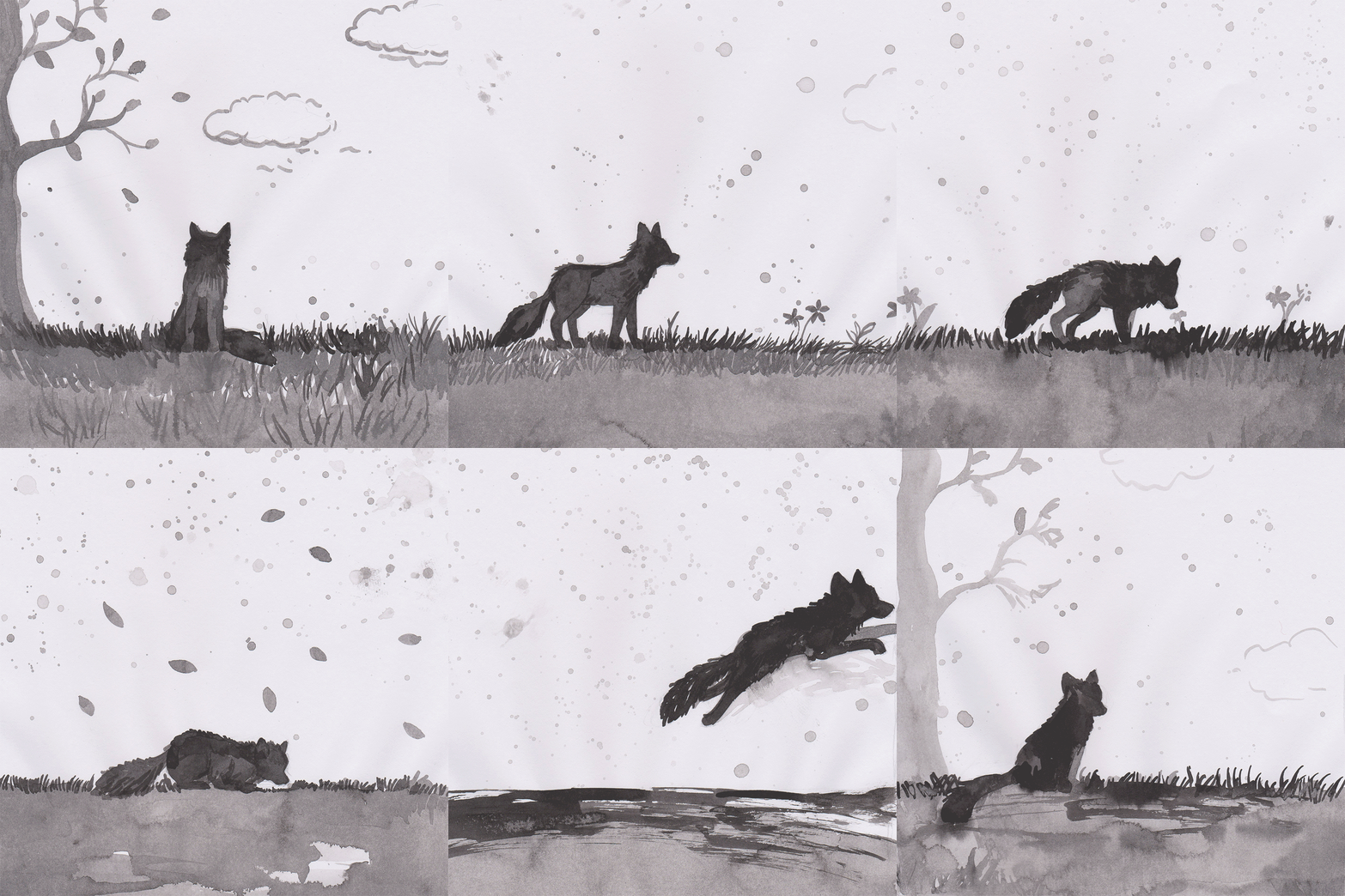
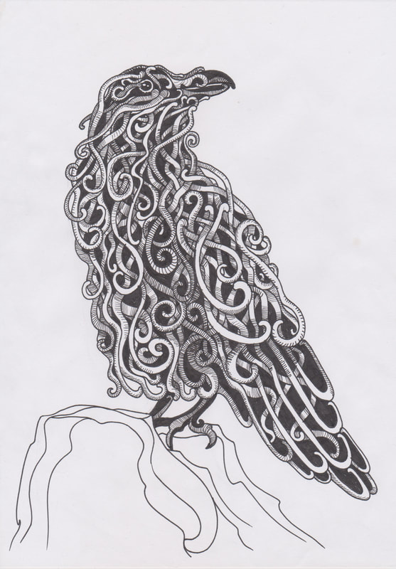
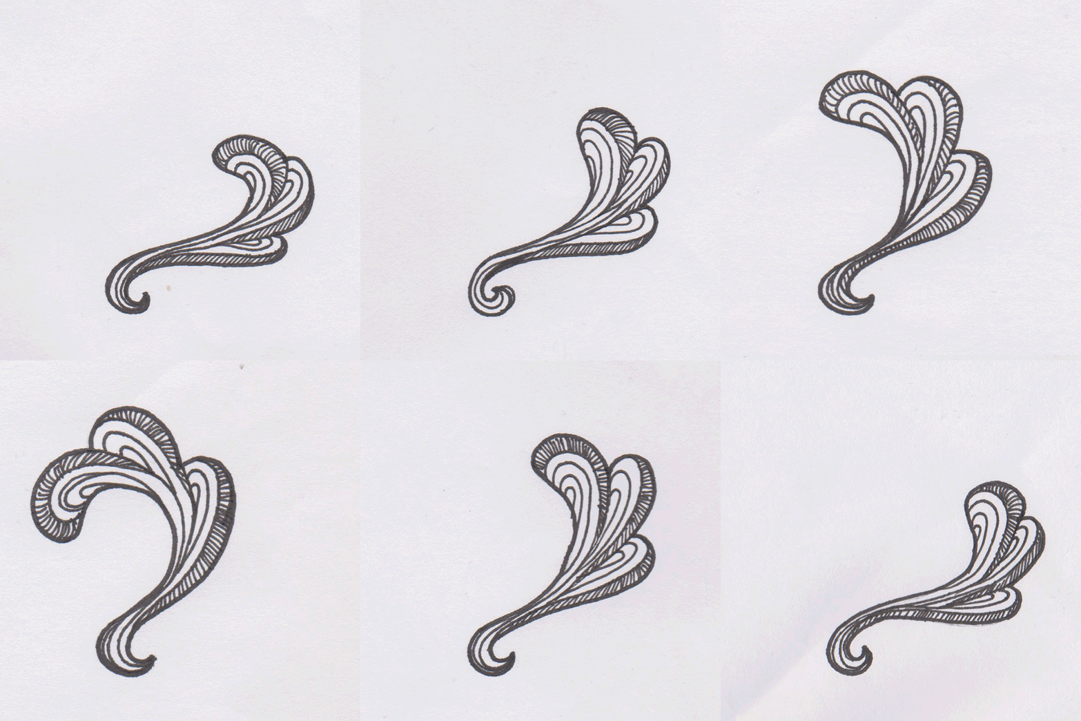
After I created a full drawing of a Raven I decided to create a simple moving part to see how difficult this style would be to animate. Overall this was quite simple to make however
it did take six frame to make this small moving part. So I may have to simplify this style if I decide to use it, so I can create a whole moving title sequence within the time frame.
it did take six frame to make this small moving part. So I may have to simplify this style if I decide to use it, so I can create a whole moving title sequence within the time frame.
Week 3
|
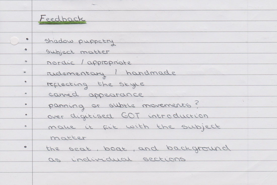
Title Sequence Feedback From the feedback that Dwayne and Jim gave me on Monday, I noted down that I should look into keeping the style fitting the subject matter like the Nordic inspired Raven that I worked on. Additionally it was suggested that I look into shadow puppets, separating the sections of the images so that I can move them around separately. I also think I should work with more subtle or panning movements instead of making the transitions smooth, because I am doing this traditionally I think that it would take for too long to animate at a high frames per second. Also Dwayne sent me two videos that relate to my project, I especially like the Noggin the Nog video. It was quite subtle with it's movements which really appealed to me as Vikings wouldn't have been able to create advanced digital animations so I think it would be interesting if I respected that and tried not to over digitise my title sequence. |
|
|
|
Animation created Traditionally using Pens, Pencils or Paint
I collected a few examples of animations that were created using traditional materials, they helped me to see how a hand drawn traditional animation will work.
I collected a few examples of animations that were created using traditional materials, they helped me to see how a hand drawn traditional animation will work.
|
|
|
|
|
|
|
|
|
|
I researched Viking styles of artwork so I could base my illustrations upon one set style of Viking artwork.
After shadow puppetry was mention during my feedback I went on to research "shadow play" and I found the work of Andersen M Creative Studio.
This artwork is beautiful and entrancing, also the way that the design moves but doesn't change could be a wonderful way for me to take my title sequence
as it would allow me to make a smaller about of detailed illustrations and still have them move in interesting ways.
This artwork is beautiful and entrancing, also the way that the design moves but doesn't change could be a wonderful way for me to take my title sequence
as it would allow me to make a smaller about of detailed illustrations and still have them move in interesting ways.
Boat Movement Test
Before I moved onto creating my Viking boat with pens I decided to test how rudimentary subtle movements would work to create a title sequence, although the movements do look a bit jarring I don't mind how this has turned out at all. Also for the final title sequence I would be moving the boat through the use of a higher amount of frames so that the animation looks a bit more fluid.
However because I am trying to capture an essence of Viking art and life, along with an inspiration of shadow play I don't mind it looking less continuous as I am creating all of the pieces of my animation by hand then piecing them together in Photoshop. Additionally I added some free textures to the background however I am not sure whether I will do this in the final animation.
Final Storyboard Plan
Before I started to create my final title sequence I created a final storyboard plan of how the movements within my title sequence will work.
This has really helped me to understand how each image will flow into the next, and to work out the order of my title sequence.
I am still finding this to be a daunting task so I will be trying to keep the animated movements as simple yet effective as I possibly can.
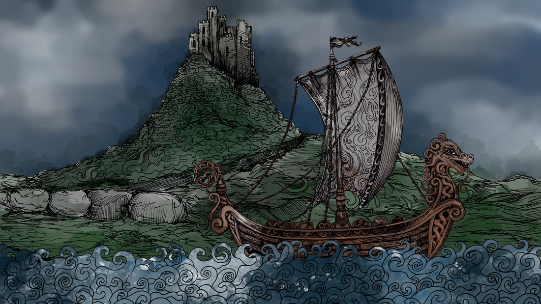
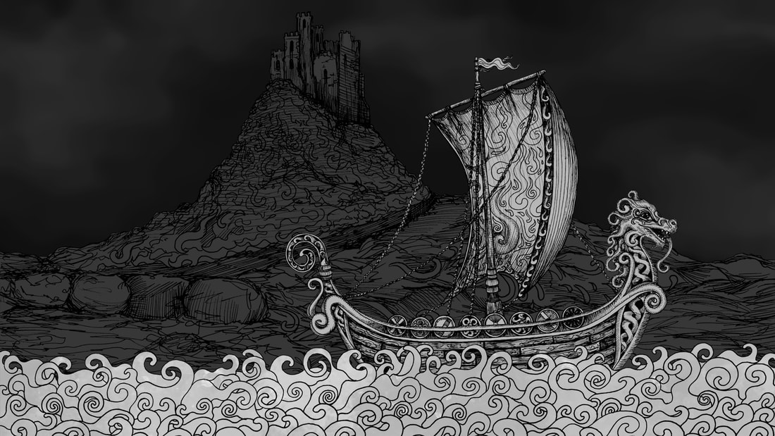
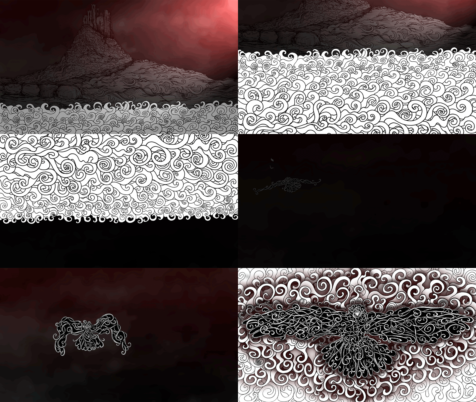
Section 1: Longboat sailing by Lindisfarne
I chose to put Lindisfarne in the background of a Viking longboat sailing because it was one of the first landing sights of the Vikings.
So I thought this would be a good way to show the Vikings arriving upon our shores within the time frame of a title sequence.
I have created the parts that I will need for this first sequence separately so I can piece them together to animate the boat moving.
Colouring the Background
I was unsure if I wanted to add colour to the image or leave it black and white so I tested what I coloured background would look like.
Overall I think I prefer having less colour on the image, however I think I should wait until I have all all of the animation slides created before making my final decision.
Overall Design Testing
After testing what it looked like when I added colour to the background I decided to bring all three parts of the design together and see if I could create a mock up design that I liked.
My favourite design that I managed to create is the black and white design with a red gradient applied on top of it. I think that the red hue really brought the image to life.
Section 2: Raven in Flight
|
I was unsure how to start this section so I started by researching a Raven in flight, I found a few good videos to look at how flight movements work. I used one of these videos as a direct reference. After I picked the video to look at I sketched out twenty two frames to show the raven in flight and the feathers expanding at the end. Using this I am going to draw out each frame within the Nordic decorative style that I drew the boat in. |
|
|
|
|
|
Week 4
Section 2: Raven in Flight (Continued)
After I sketched the basic shapes for the frames last week, I moved onto creating them in the "Nordic" style that the boat was created in.
I liked how these images turned out, my they took a long time to create.
After I sketched the basic shapes for the frames last week, I moved onto creating them in the "Nordic" style that the boat was created in.
I liked how these images turned out, my they took a long time to create.
|
|
|
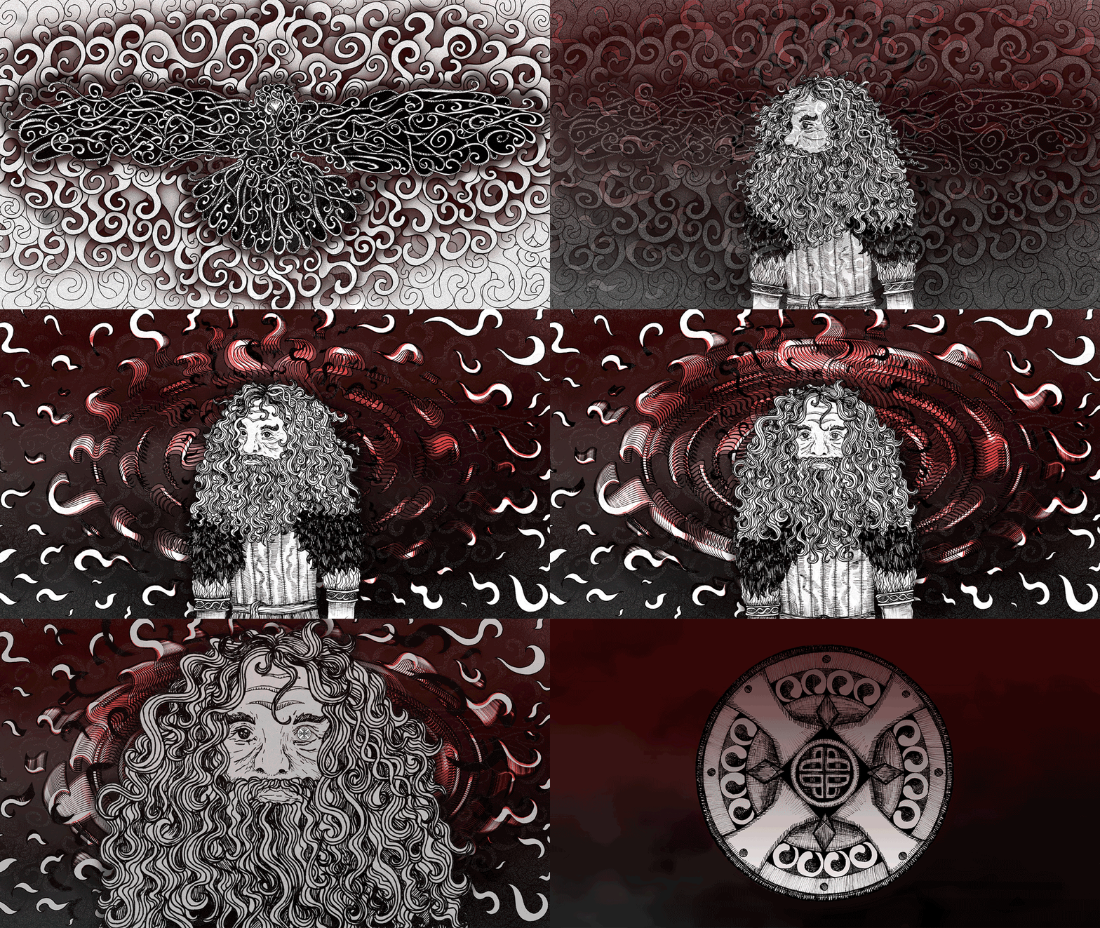
Section 3: Viking Man
After I created the ravens I moved on to creating multiple versions of the same Viking warrior, unfortunately some of these didn't turn
out as expected so I decided to only use my three favourites that matched each other best in the final title sequence.
After I created the ravens I moved on to creating multiple versions of the same Viking warrior, unfortunately some of these didn't turn
out as expected so I decided to only use my three favourites that matched each other best in the final title sequence.
Section 4: Shield and Fire
I created these images of fire growing to engulf the shield in flames during my animation, I have found it to be very difficult to create an animation by hand then digitise it.
It was definitely an interesting process, but I am far more comfortable with static one off illustrations.
I created these images of fire growing to engulf the shield in flames during my animation, I have found it to be very difficult to create an animation by hand then digitise it.
It was definitely an interesting process, but I am far more comfortable with static one off illustrations.
Background Creation
I created a mottled background for my title sequence animation using some grey tones and a blending tool, this is the whole process that when into creating this background.
Unfortunately when I compressed the image to upload it to my blog it reduced the quality an changed how the images looked, however I think you can still see the process.
Lighting and Layers
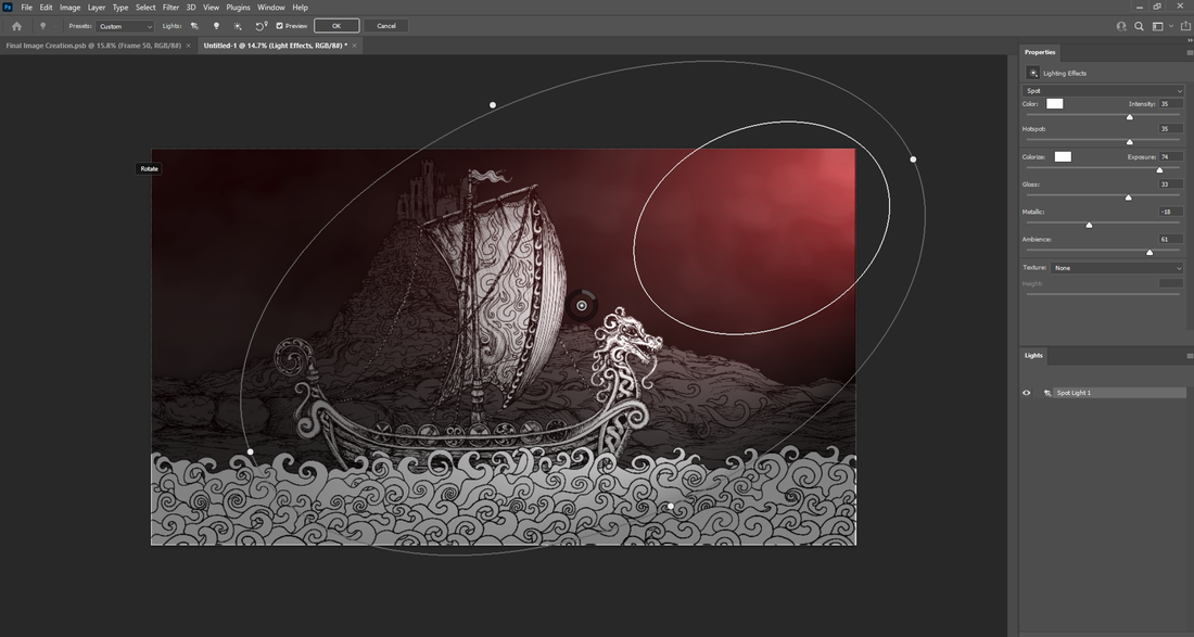
I have included a screenshot of the lighting effect I used to create the atmosphere in the first scene, to create his effect I altered the intensity and the ambience
Additionally I hav included screenshots of the one hundred and sixty frames that make up my title sequence.
I have included a screenshot of the lighting effect I used to create the atmosphere in the first scene, to create his effect I altered the intensity and the ambience
Additionally I hav included screenshots of the one hundred and sixty frames that make up my title sequence.
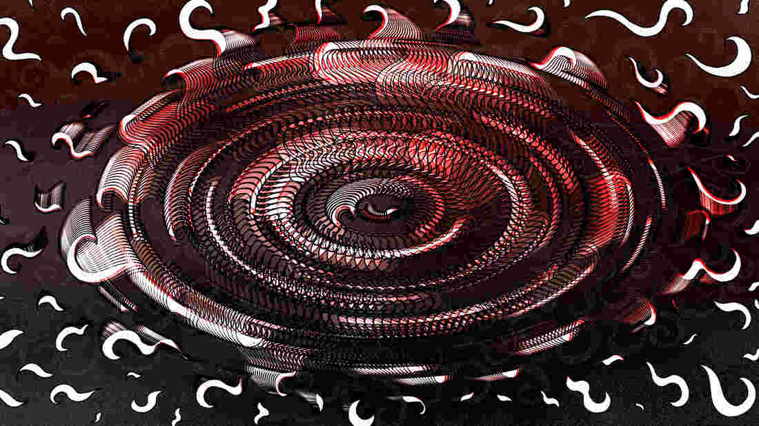
Creating a Swirl
For the section of the title sequence that focused on a Viking warrior I needed to do some tests to help me work out how much of the previous design show show through.
For the section of the title sequence that focused on a Viking warrior I needed to do some tests to help me work out how much of the previous design show show through.
Font Testing
I used one of the frames I made throughout this process to test some fonts on, in the end I chose to use "Newcomen" because it fit better
with the aspect ratio of my animation, however personally I preferred the general appearance of "Talon" more.
I used one of the frames I made throughout this process to test some fonts on, in the end I chose to use "Newcomen" because it fit better
with the aspect ratio of my animation, however personally I preferred the general appearance of "Talon" more.
Music
For my animation I mixed two royalty free YouTube songs together, I was initially planning on making the music myself,
however the actual animation took me far longer than expected which meant I didn't have extra time to make my own music,
For my animation I mixed two royalty free YouTube songs together, I was initially planning on making the music myself,
however the actual animation took me far longer than expected which meant I didn't have extra time to make my own music,
|
|
|
Final Title Sequence
I'm not sure how I feel about my title sequence overall, it was a lot of work but I think I overestimated hoe many frames
you need for an animation of this length. Therefore my animation ended up looking rushed in some places.
I am pleased I managed to animate and illustration however, but I don't think it will be something I will be trying again any time soon.
Overall I found this project to be the most confusing out of the multi dimensional illustration, however I must admit it did make me smile to see one of my drawings move.
Parts of the Title Sequence
I have separated the different sections of my title sequence into four different smaller GIFs.
I have separated the different sections of my title sequence into four different smaller GIFs.


